Method 1 – Plotting a Linear Equation in Excel
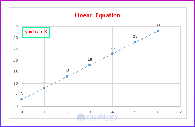
Generally, linear equations are the most common type of equation in Excel. We use them on a regular basis. Moreover, it is best for linear data. For the purpose of demonstration, we have used the following equation.
y = 5x + 3
Now, follow the steps accordingly.
Steps:
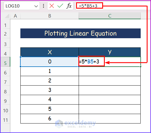
- Write down the following formula into the formula bar according to the sample equation.
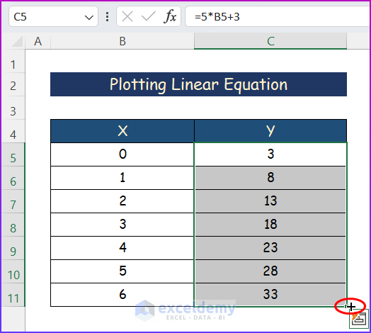
=5*B5+3
- Press Enter and use the AutoFill tool to apply the formula to the whole column.
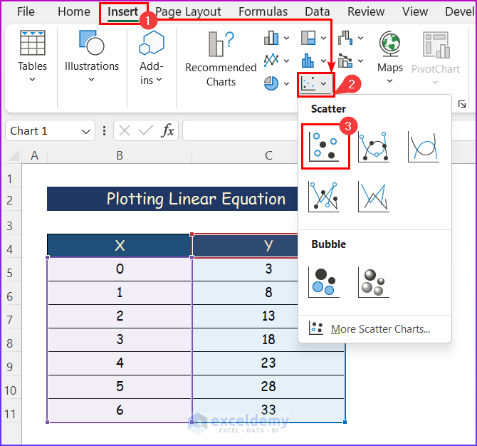
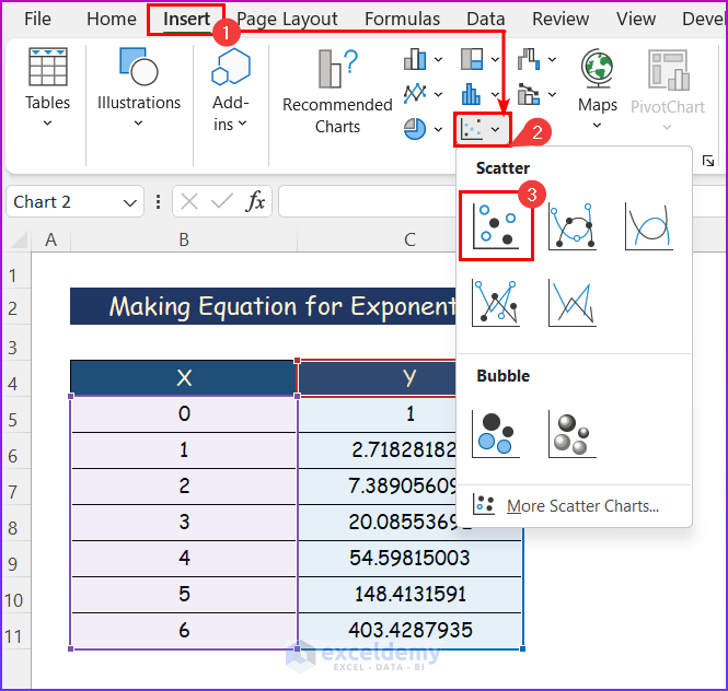
- Select any cell within the data and click the Insert tab.
- Click on the Scatter command from the Charts group of commands.
- A drop-down menu will appear; select the first one, simply the Scatter chart.
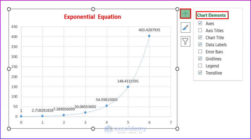
- A chart will appear. Select the chart and click on the + symbol.
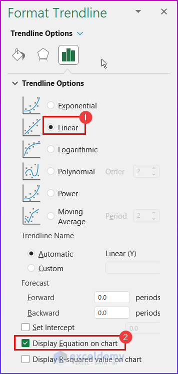
- Click on the Chart Elements as shown below.
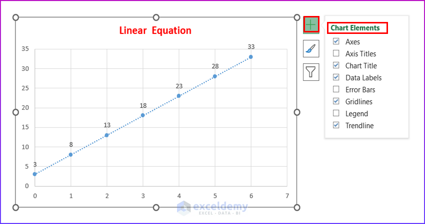
- From the Format Trendline, select Linear and Display Equation on Chart.
- Get the graph of Linear Equation below.
Method 2 – Generating an Exponential Equation in Excel
Steps:
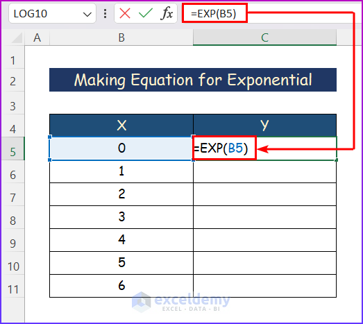
- Put the following formula according to the equation we have taken.
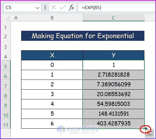
=EXP(B5)
- Hit Enter Get the full dataset by using the AutoFill tool.
- Select any cell within the data.
- Click the Insert tab and select the Scatter command from the Charts group of commands.
- Select the first one, simply the Scatter chart from the drop-down menu.
- A chart will appear. However, select the chart and click on the + symbol.
- Click on the Chart Elements as mentioned below.
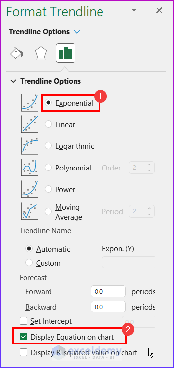
- Select Exponential and Display Equation on Chart from the Format Trendline option.
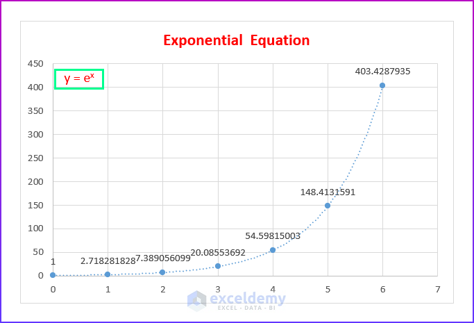
- The Exponential Equation will appear.
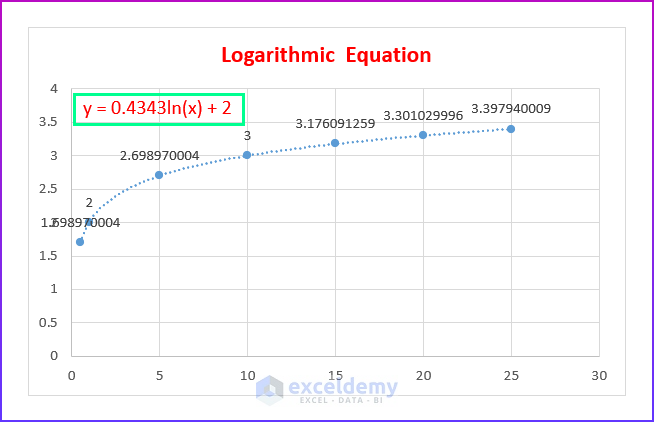
Method 3 – Creating Logarithmic Type Equation
Steps:
- Write the formula below and press Enter.
=LOG10(B5)+2
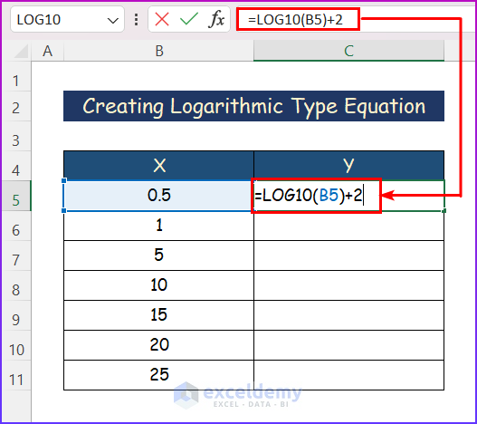
- Use the AutoFill tool to do the same for the rest of the data.
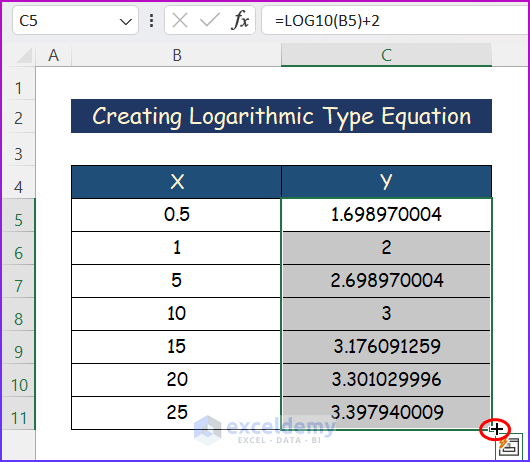
- Select any cell within the data.
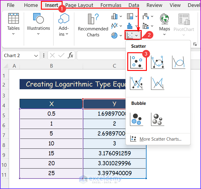
- Click on the Insert tab.
- From the Charts group of commands, select the Scatter command.
- Select the Scatter chart from the Scatter command.
- A chart will appear. Again, select the chart and click on the + symbol.
- Mark the Chart Elements as shown below.
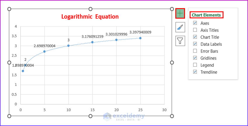
- Select Logarithmic and Display Equation on Chart.

- Get the Logarithmic Equation in the following image.
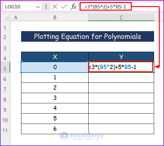
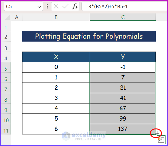
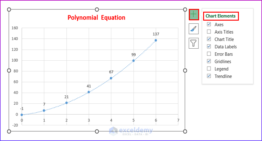
Method 4 – Plotting Equation for Polynomials in Excel
Steps:
- Write the following formula in the formula bar and hit the Enter key.
=3*(B5^2)+5*B5-1
- Use the AutoFill tool similarly to generate the total sample dataset.
- Select a cell from the given data.
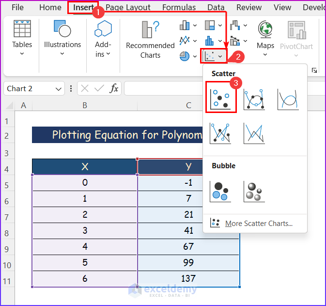
- Click the Insert tab.
- From the Charts group of commands, select the Scatter command.
- A drop-down menu will appear; select the Scatter chart.
- Click on the + symbol after selecting the chart.
- Cick on the Chart Elements as shown in the image below.
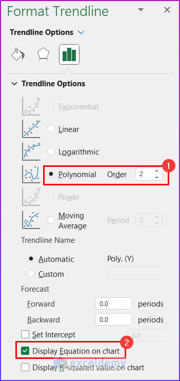
- Select Polynomial of Order 2 and Display Equation on Chart from the Format Trendline Option accordingly.
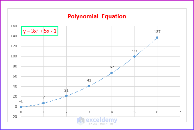
- Find the Polynomial Equation in the below picture.
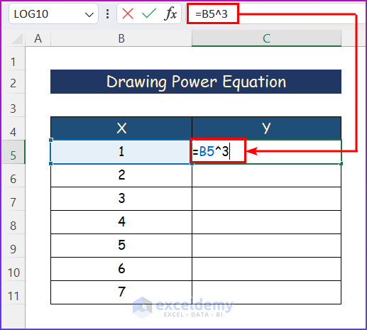
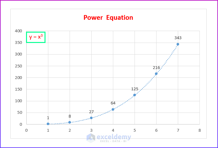
Method 5 – Drawing Power Equation
Steps:
- Input the formula below according to the sample equation and press the Enter button.
=B5^3
- Use the AutoFill tool to complete the dataset.
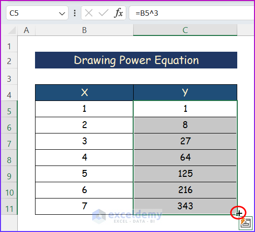
- Select any cell from the data.
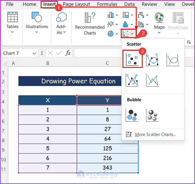
- Click on the Insert tab. Moreover, click on the Scatter command from the Charts group of commands.
- Select the Scatter chart.
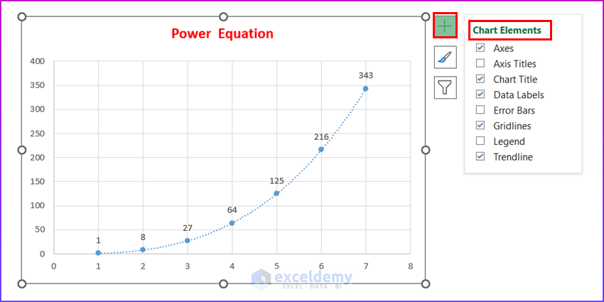
- A chart will appear.
- Select the chart and click on the + symbol.
- Click on the Chart Elements mentioned in the image below.
- From the Format Trendline Option, select Power and Display Equation on Chart.
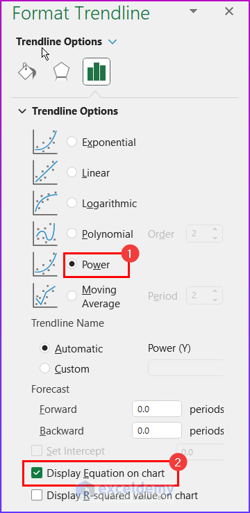
- Get the Power Y Equation as in the image below.
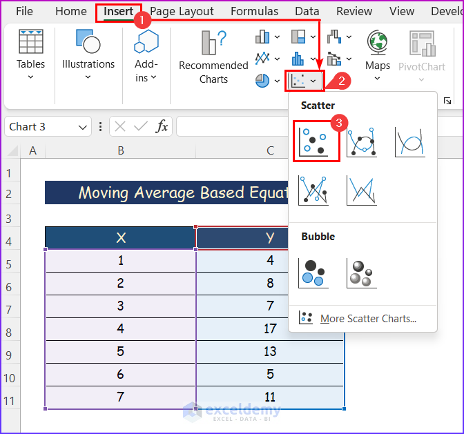
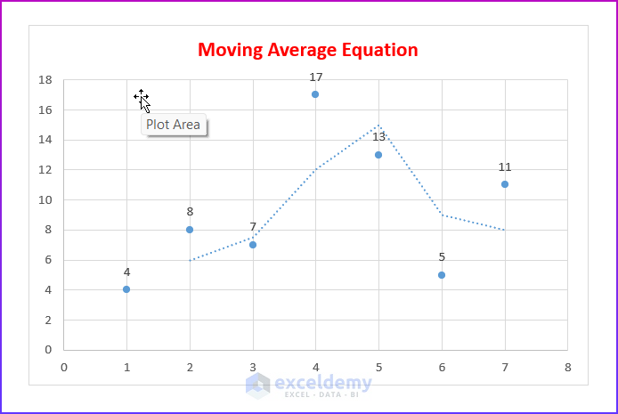
Method 6 – Making an Equation Based on Moving Average
Steps:
- Click on any cell within the data.
- Press the Insert tab.
- From the Charts group of commands, select the Scatter command.
- Select the first one, simply the Scatter chart.
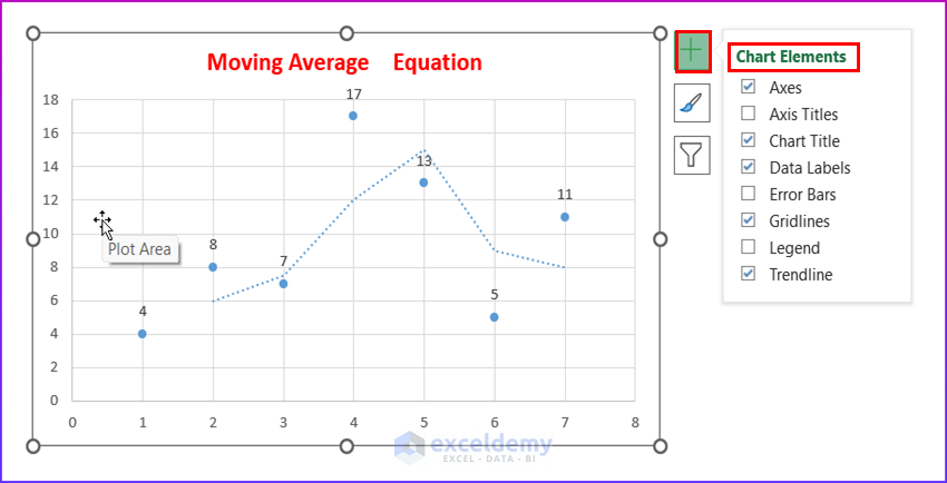
- Click on the + symbol after selecting the chart..
- Select some of the Chart Elements as shown below.
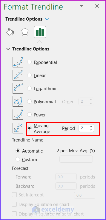
- Select Moving Average of Period 2 and Display Equation on Chart from the Format Trendline option.
- Get the Moving Average Equation as mentioned in the below image.
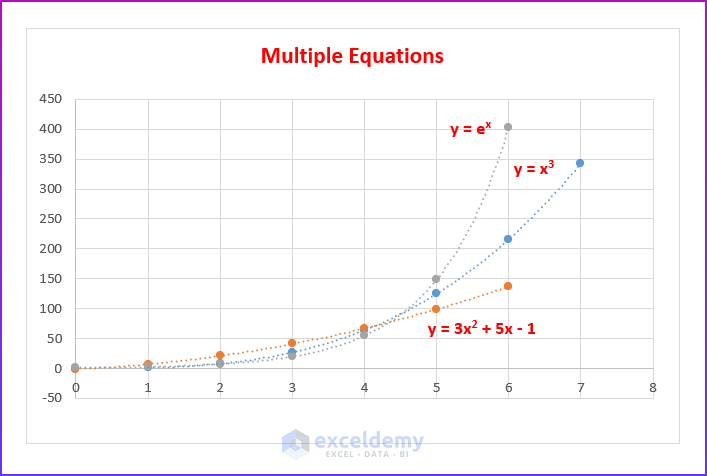
How to Plot Multiple Equations on a Single Chart in Excel
Combine multiple equations into a single chart. It is as simple and quite easy as before. 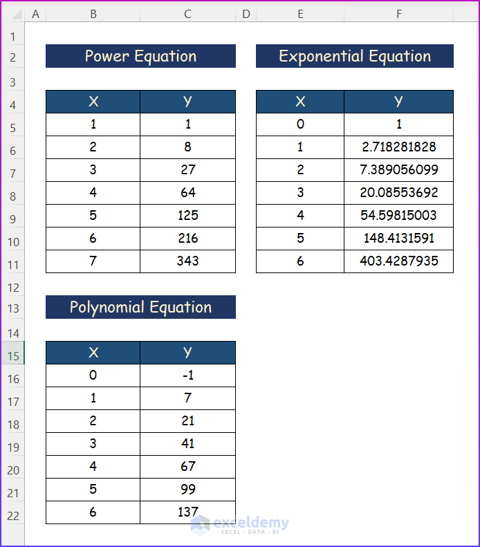
Steps:
- Draw the power equation by following the steps in Method 5.
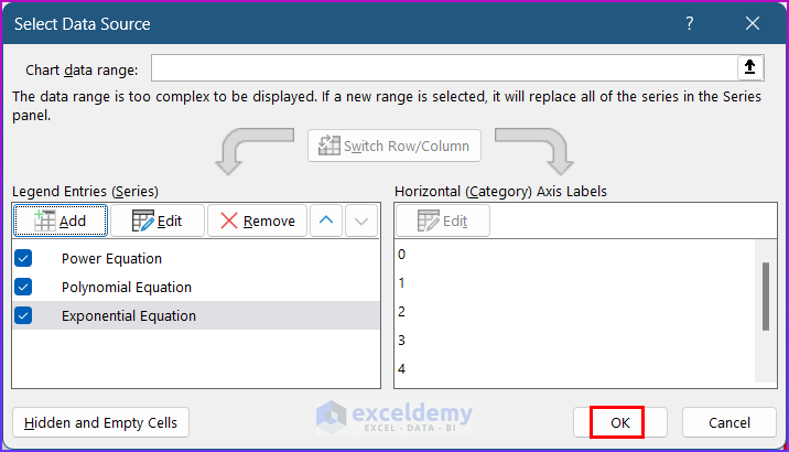
- Select the graph and press Select Data from the filter option.
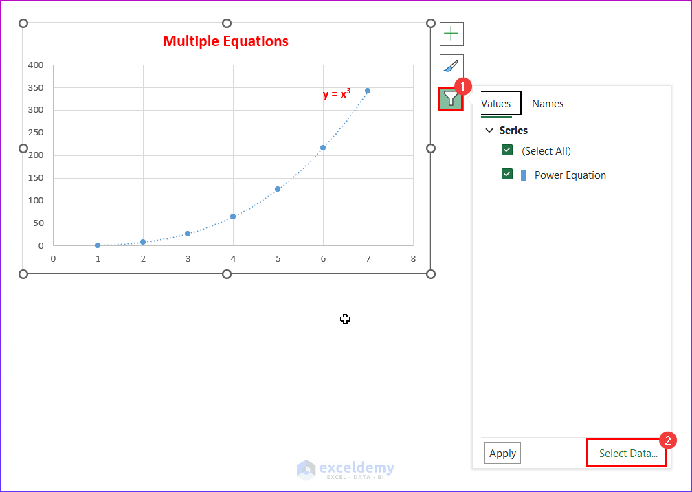
- Click on the Add option.
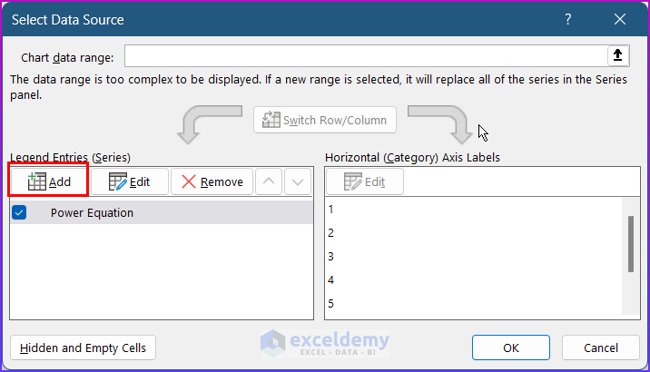
- Select the X values and Y values to the range for the other two equations as in the picture below. Press OK.
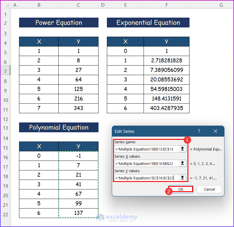
- Press OK.
- Find the three quotations plotted on the same chart.
Download Practice Workbook
You can download the workbook used for the demonstration from the download link below.
Plot an Equation in Excel: Knowledge Hub
<< Go Back to Excel Charts | Learn Excel
Get FREE Advanced Excel Exercises with Solutions!
