Step 1 – Find the Value of the Dependent Variable
We want to graph the following equation: y = 3x + 5. The figure below explains how to produce the values of dependent variables for this linear equation in Excel, using an x-value range of 1 to 10:
- We assign the x values shown in the illustration.
- Insert the following equation to obtain the y values that correspond to the supplied x values:
y = 3x + 5
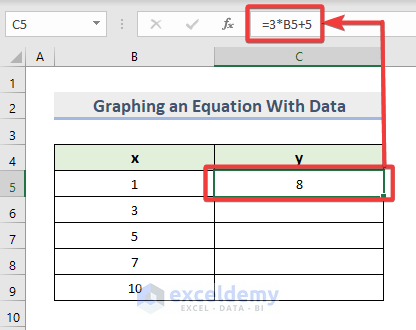
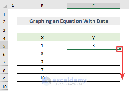
- Drag the fill handle to complete the data range.
Step 2 – Select Range and Choose a Suitable Graph Type
- Select the values from B4 to C9.
- Choose the Insert tab.
- Select the Scatter plot option from the Charts category.
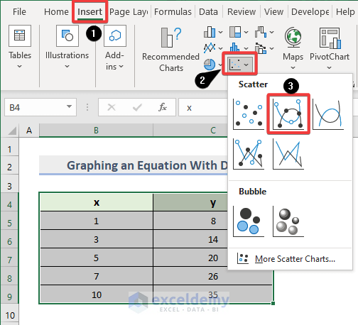
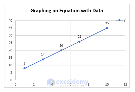
- The corresponding plot will be generated automatically:
Read More: How to Display Equation of a Line in Excel Graph
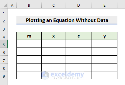
How to Plot a Linear Equation in Excel Starting from No Data
Steps:
- We will plot an equation that has the following general formula:
y= m*x + c
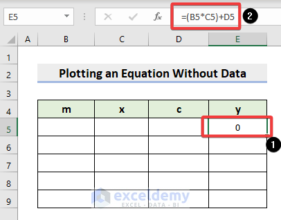
- Enter the following formula cell E5:
=(B5*C5)+D5- Press Enter. Because we haven’t yet entered the cell values, it will return 0.
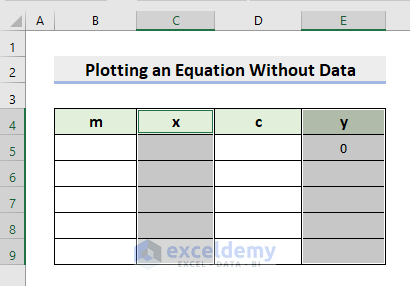
- Select the range C4:C9.
- Press and hold down the Ctrl key.
- Select the range E4:E9.
- Go to the Insert tab.
- Go to the Scatter plot.
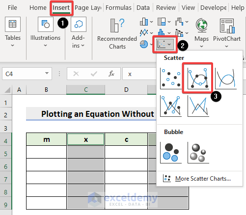
- You’ve made the graph. However, because we have an empty dataset, there will be no plotting for now.
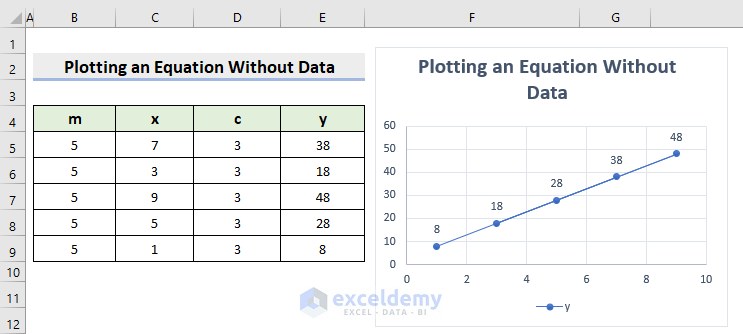
- Place the value of m as 5 for all the cases.
- Type your desired values for the independent variable x.
- Insert the value of c as 3.
- Apply the AutoFill tool to get the outcomes of the range E5:E9.
- It’ll return the accurate outputs for the y variable.
See the dataset below.
Read More: How to Graph an Equation in Excel Without Data
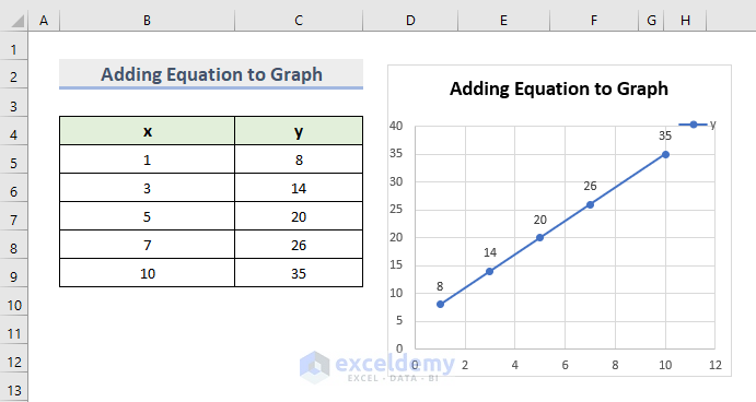
How to Add a Equation to a Linear Graph of Excel
Steps:
- Our data will be tabulated in two columns. We will pick the “scatter chart” button to display a graph after selecting our complete table and clicking “insert.”
- To edit our graph,
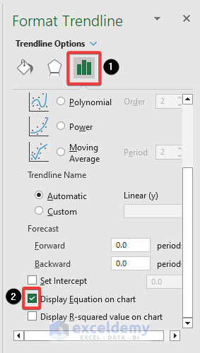
- Click on the “+” symbol next to the chart and then Trendline to More Options…
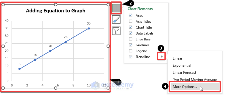
- After the sidebar appears in Excel, add the chart’s equation by selecting “Display Equation on Chart.“
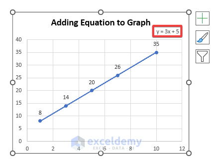
- The equation of the formula appears in the graph shown in the red box. This usually helps the users when they are bound to demonstrate only graphs in their projects.
Read More: How to Graph Two Equations in Excel
Download the Practice Workbook
You can download the workbook to practice
<< Go Back to Plot an Equation | Excel Charts | Learn Excel
Get FREE Advanced Excel Exercises with Solutions!
