Excel is an excellent tool for plotting equations in a graph as it offers various types of graphs and many customizing features. If you are wondering how to graph two equations in Excel, you have come to the right place. Today I will show you how to graph two equations in Excel with 3 easy steps.
How to Graph Two Equations in Excel: 3 Easy Steps
Let’s say we have two equations like these below:
f(x)=x^2+3
g(x)=3x+5
Now, we want to plot both equations in Excel in a single graph. To do this, follow the steps below.
Step 01: Create a Table with Proper Parameters
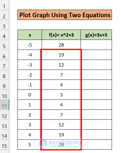
- To graph equations in Excel, firstly, we have to make a data table containing a specific range of x values and find their corresponding values of f(x) and g(x).
- Hence, first, open a blank Excel sheet.
- Secondly, choose any suitable position to give the heading x. Under the heading x, a range of x values will be listed. (see the figure below)
- Thirdly, write the two equations in the two adjacent cells.
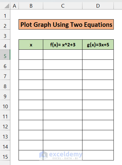
- Here we have chosen B4, C4, and D4 for x, f(x), and g(x),
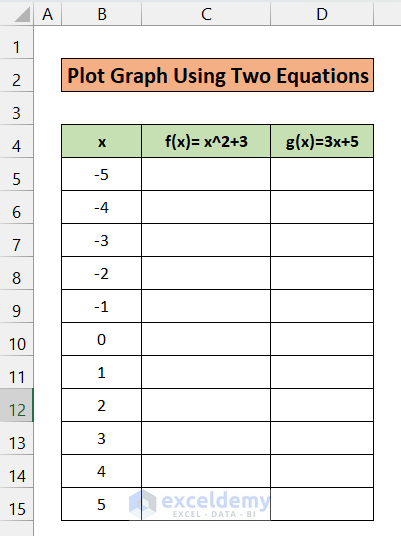
Step 02: Make a List of Values of X, F(x), G(x)
- Now we have to choose a range for values of x.
- Here we have chosen -5 to +5, a total of 11 points. You can choose at your convenience.
- Then, we will put the formula in the corresponding columns of f(x) and g(x).
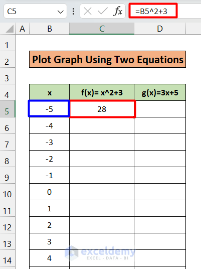
- In cell C5, under the heading of f(x), write down the formula:
=B5^2+3- You will get 23 as a result. This is the value of f(x) when x= -5. (See the figure below)
- Now, use the Fill Handle to AutoFill up to C15
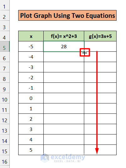
- This will give all the corresponding values of f(x) for each value of x.
- Now write down the following formula in cell D5 under g(x)
=3*B5+5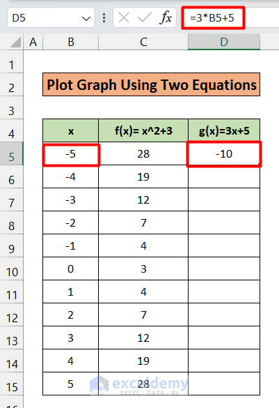
- You will get the value of g(x) for x=-5.
- Then use the Fill Handle to AutoFill up to D15.

- So up to this, we have successfully prepared our table to plot the graph.
Step 03: Create a Scatter Plot from Two Equations
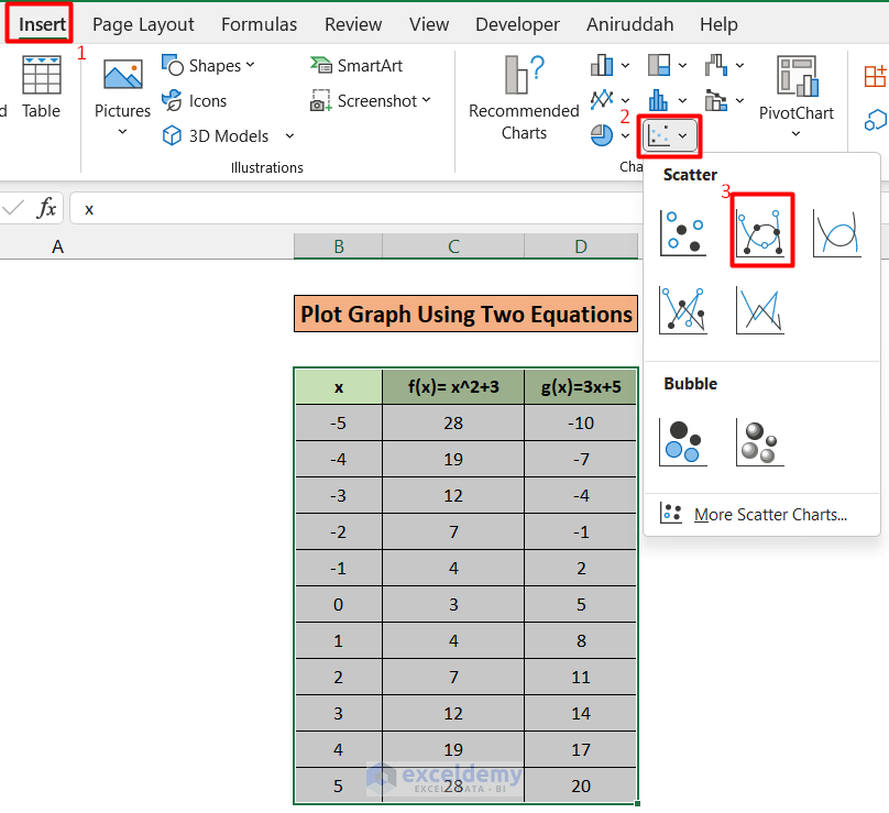
- Select cell B4 to D15
- Now, click on the Quick Analysis tab at the bottom of the D15 cell. Alternatively, you can also type Ctrl+Q to launch this Tab.

- Here, you will see different tabs. Click on
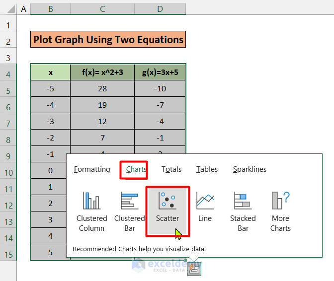
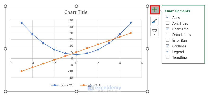
- Under the charts, click on Scatter. And here, we got our desired graph for two equations.
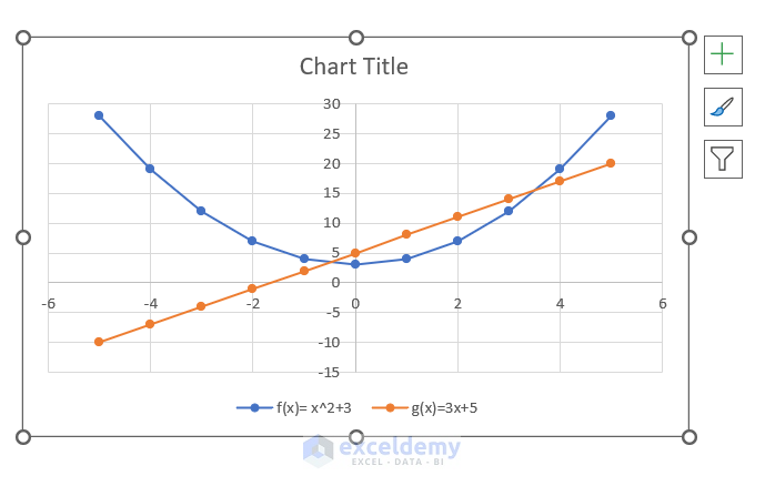
- As the legends suggest, the blue curve is for f(x), and the orange curve is for g(x).
- This is the quickest way to plot a chart.
- Furthermore, there is an alternative that offers much more flexibility than this approach.
- In the alternative approach, after selecting the data table, go to Insert Tab; click on the Scatter plot in the Chart Now, choose any suitable style for the scatter plot.
- In this way, you will get the same result.
Read More: How to Graph a Linear Equation in Excel
Things To Remember
- In addition to this, we can further customize it and add other elements such as Axis Titles, Chart Titles, Data Labels, Error Bars, and Trend Line to enhance the representation of our chart.
Download Practice Workbook
Download this practice workbook to exercise while you are reading this article.
Conclusion
This is the end of this article. Thanks for reading. If you find this article helpful, please share this with your friends. Besides, do let us know if you have any further queries.
Related Articles
<< Go Back to Plot an Equation | Excel Charts | Learn Excel
Get FREE Advanced Excel Exercises with Solutions!
