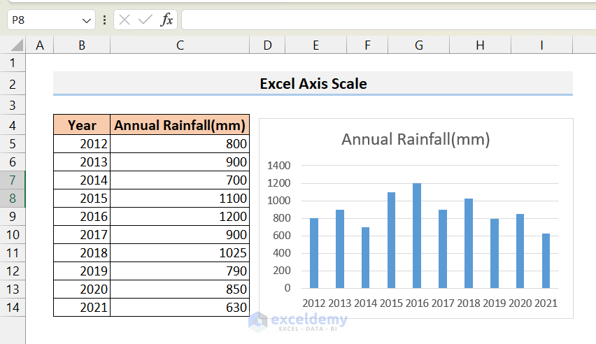
Let’s use a dataset that contains information about annual rainfall for a decade and converts that into a column chart to demonstrate how to scale and change the axes.
Download Practice Workbook
How to Change the Axis Scale in Excel?
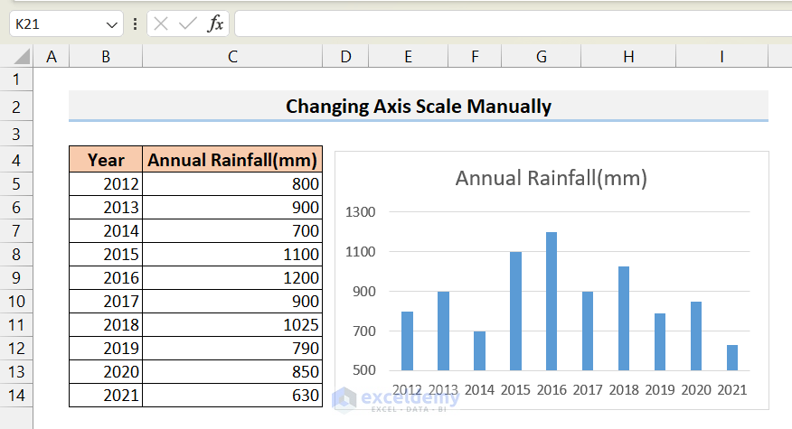
We have created a column chart from the following dataset.
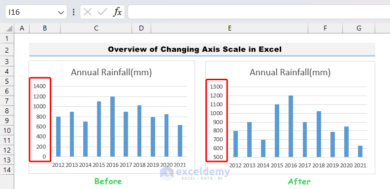
We can see that the Y axis starts at 0 and ends at 1400. On this scale, the differences between years are not very apparent.
If we change the scale of the Y axis in such a way that the starting point of the Y axis is higher, then the differences will be more obvious, and we can interpret the graphs quickly.
Method 1 – Changing Axis Scale Manually via the Format Axis Menu
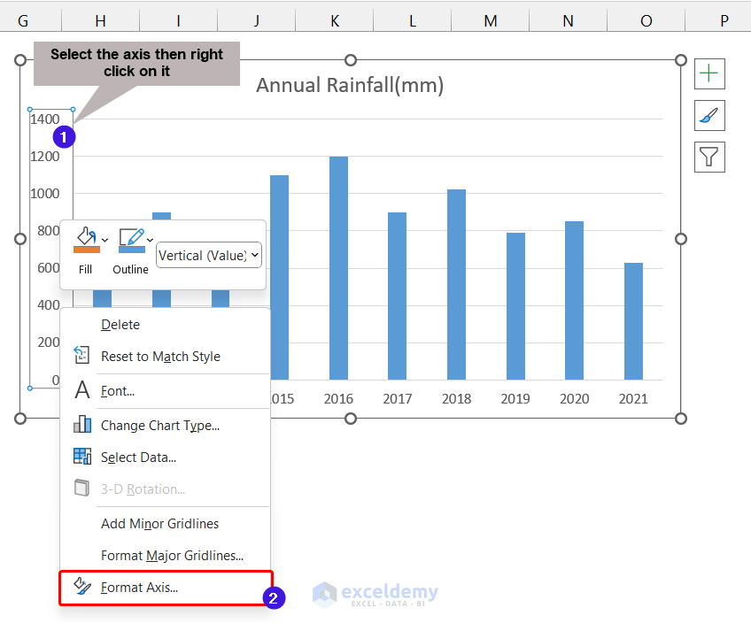
- Click on the axis whose scale you want to change, then right-click on it.
- Choose Format Axis from the context menu.
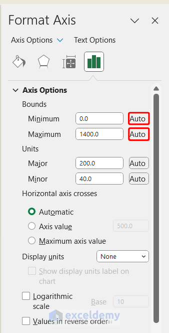
- As a result, the Format Axis menu will be displayed on the right side.
- Click on Axis Options.
- Change the Maximum and Minimum bounds of the axis. We set the Minimum bound to 500 as the data points start at 630.
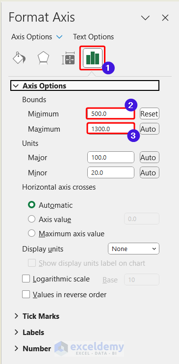
- The Y axis is rescaled, and it looks like this:
Method 2 – Changing Axis Scale Automatically
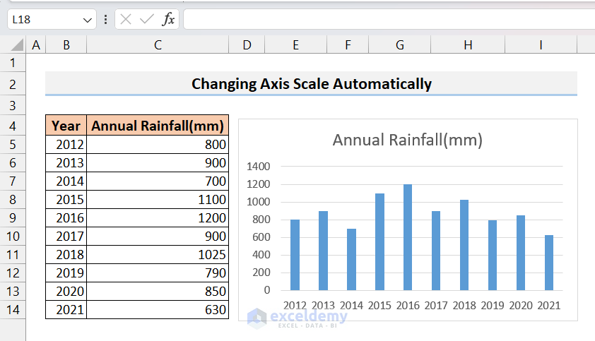
- Go to the Format Axis menu again as mentioned above.
- Click on Auto on the Maximum and Minimum bounds.
- The scale of the axis will be automatically set up by Excel.
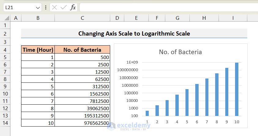
Method 3 – Changing Axis Scale to Logarithmic Scale
Consider the dataset and chart where the growth of bacteria in a cultured medium is shown. As bacterial growth rate is an exponential function the number of bacteria will have a very large range. The lower data points are, therefore, almost invisible in the normally scaled Y-axis.
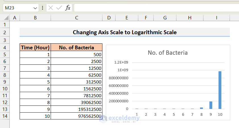
- Similar to the first example, open the Axis Format menu.
- Check the Logarithmic scale option.
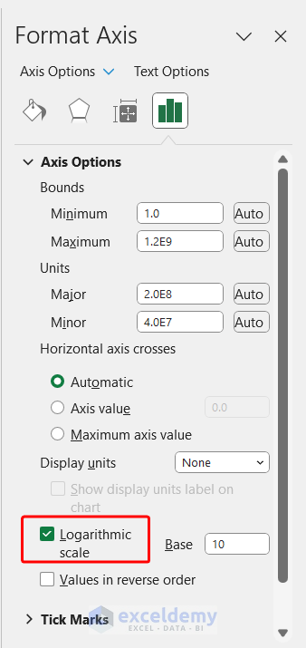
- You can easily view all the data points in a proper manner.
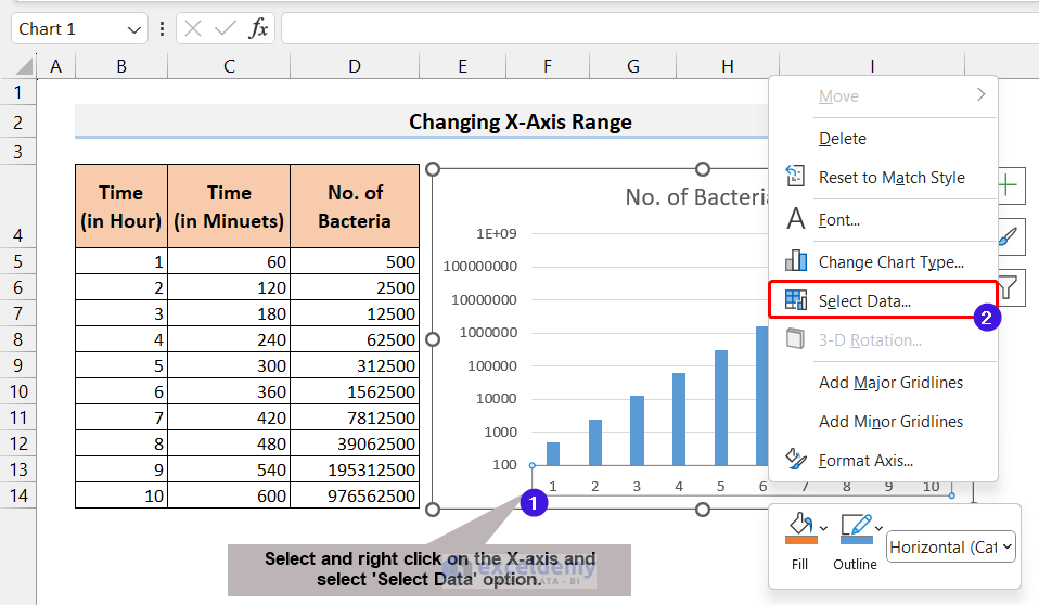
How to Change the X-Axis Values in Excel?
- Select the X-axis on the chart, then right-click.
- From the context menu, select the “Select Data” option.
- Click on the Edit option from the Horizontal Axis Labels.
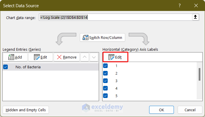
- Select the new range of data points and click OK.
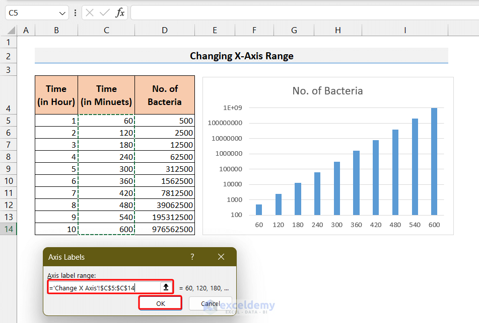
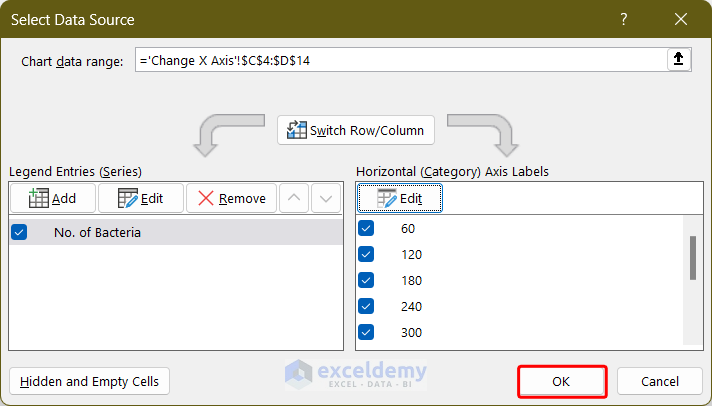
- Click OK again on the Select Data Source window.
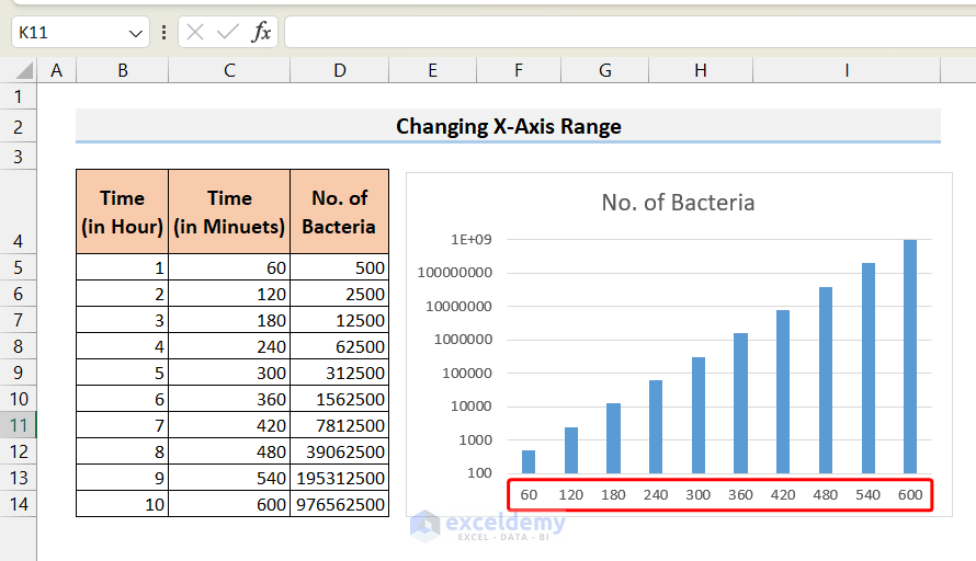
- The X-axis range has changed.
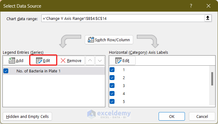
How to Change Y-Axis Values in Excel?
- Select the Y-axis on the chart and right-click.
- Click on the Select Data option from the context menu.
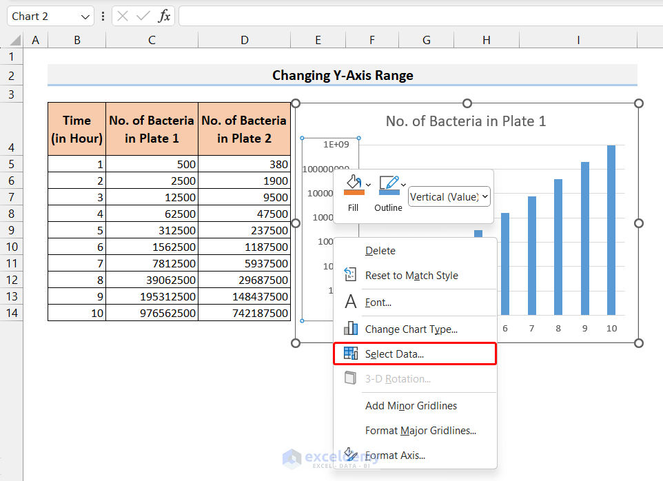
- The Select Data Source window will open up.
- Click on the Edit option from the Legend Entries (Series).
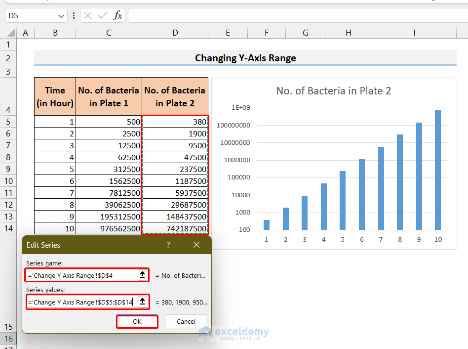
- The Edit Series window will open up.
- Select the new range for the Series name and Series values and then click OK.
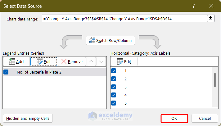
- Click on OK in the Select Data Source window to confirm the change.
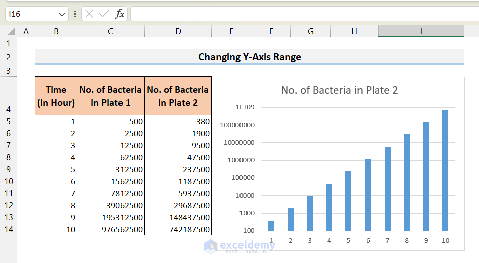
- The data points of the Y-axis will change as expected.
Things to Remember
- You can also access the Format Axis menu by first selecting the axis and going to the Format tab and selecting Format Selection.
- You can add different elements to the chart (Axis titles, Data labels, etc.) to further beautify the chart.
Frequently Asked Questions
1. Can I switch between a linear and logarithmic axis scale in Excel?
You can click on the Logarithmic Scale in the Format Axis menu to switch the axis scale to a log scale with the desired base.
2. Can I change axis values on an existing chart in Excel?
Yes, you can change axes values using the Select Data Source menu.
3. Can I switch the axis in the Excel chart?
You can switch axes using the same Select Data Source menu.
Excel Axis Scale: Knowledge Hub
<< Go Back to Excel Charts | Learn Excel
Get FREE Advanced Excel Exercises with Solutions!
