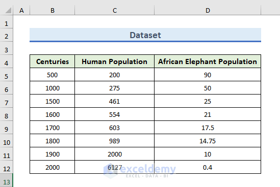
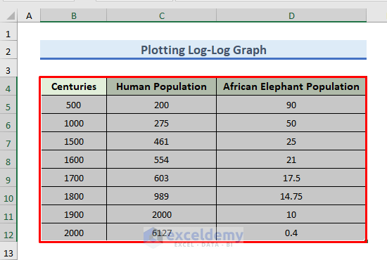
STEP 1 – Prepare the Dataset
- In this dataset, there is information about the population of humans and African Elephants over a large range of time.
- We will plot the change in the population of humans and elephants over this range.
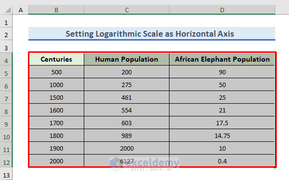
- As we are working with a large range of time, it will be helpful for us to set the logarithmic scale in the horizontal axis of time.
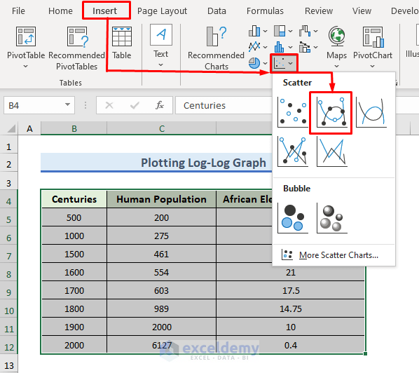
STEP 2 – Insert a Scatter Chart
- Select the data. We have selected the B4:D12 range with headers.
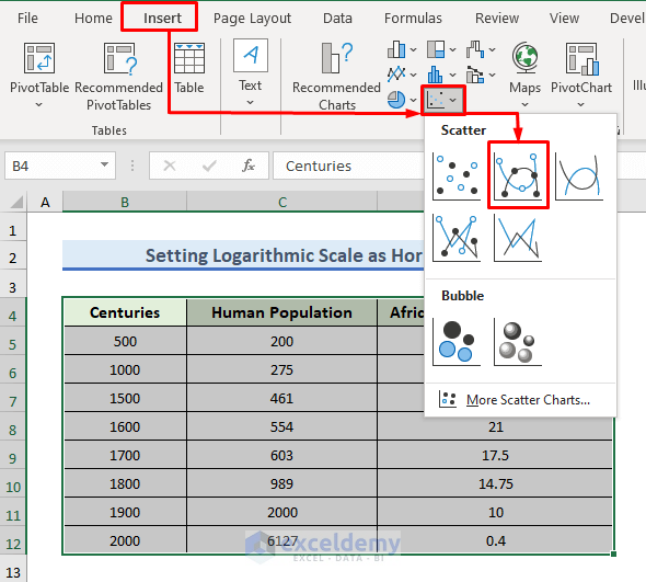
- Go to the Insert tab.
- From the Charts group, click on the drop-down menu of Insert Scatter (X, Y) or Bubble Chart.
- Select the second option.
- For setting the logarithmic scale on the horizontal axis, you need to select Scatter or Bubble charts. Other types of charts provide the logarithmic scaling on the vertical axis, but they do not provide logarithmic scaling on the horizontal axis.
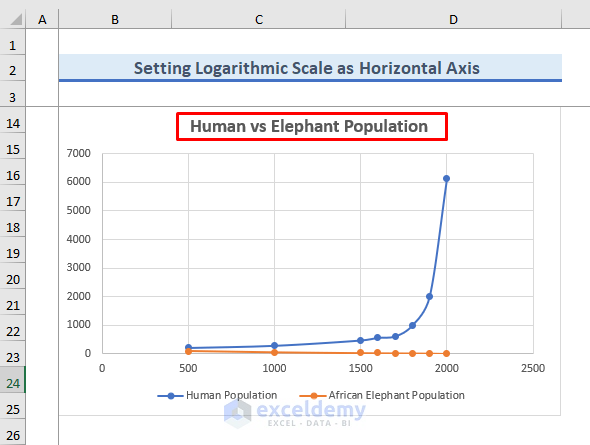
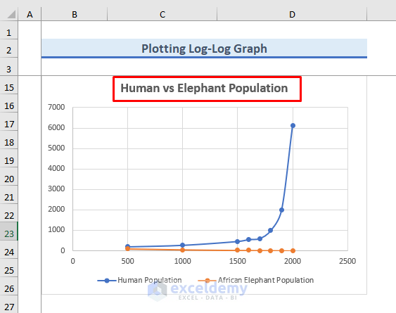
- The chart will show up.
- Click on the title of the chart and edit the title of the chart.
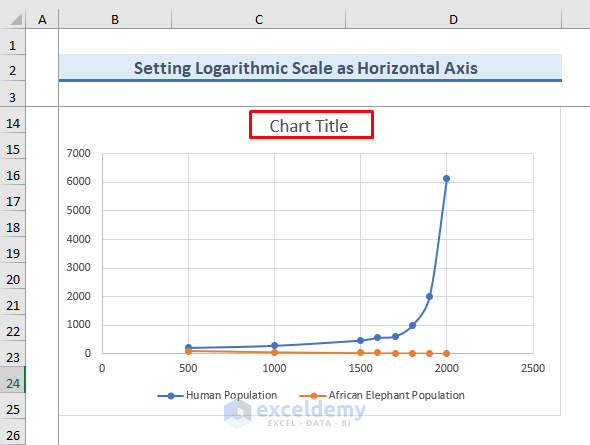
- We are showing the comparison between humans and African Elephants. We have provided the title Human vs Elephant Population.
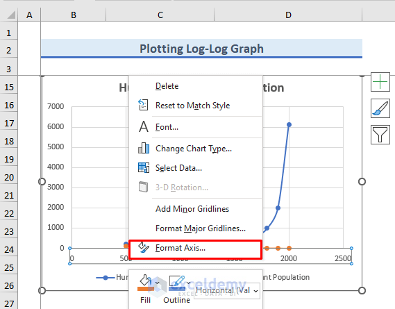
STEP 3 – Format the Horizontal Axis to Set a Logarithmic Scale on It
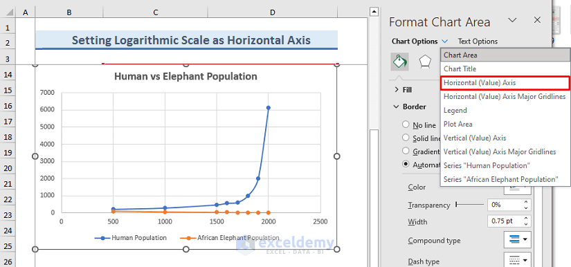
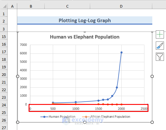
- Double-click on the chart.
- The Format Chart Area window is on the right-hand side of the Excel sheet.
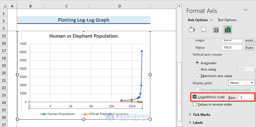
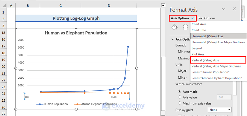
- Click on the drop-down menu of Chart Options and select Horizontal (Value) Axis.
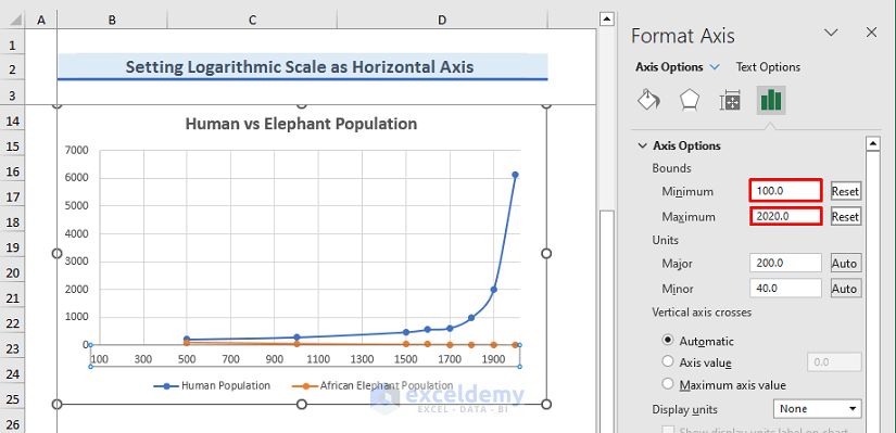
- Select the Axis Options icon.
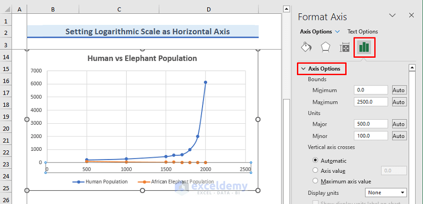
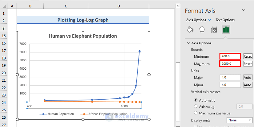
- We have inserted 100 in the minimum and 2020 in the maximum field.
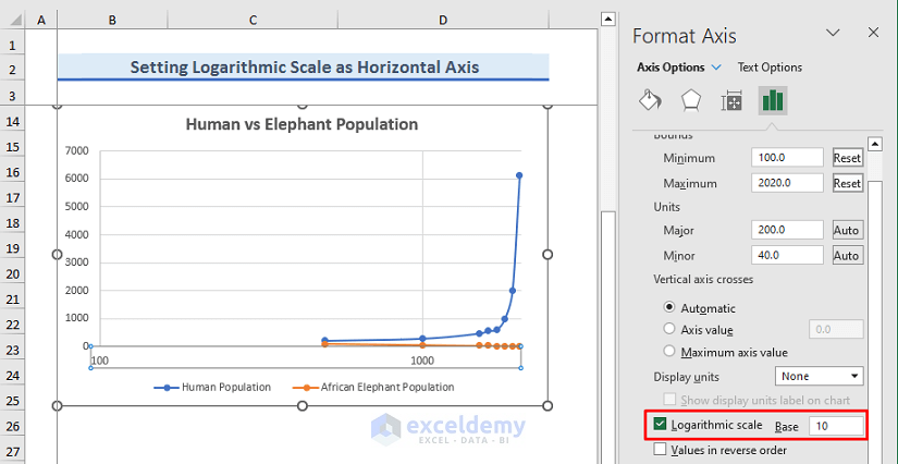
- Check Logarithmic scale.
- The horizontal axis has changed to the 10-base Logarithmic scale.
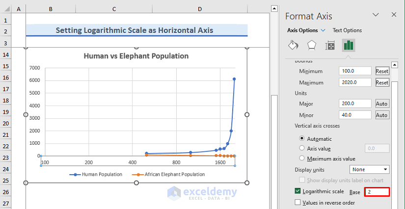
- You can also change the base. We have changed the base to 2 from 10.
Final Output
- The horizontal axis is set to the logarithmic scale.
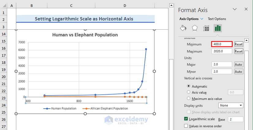
- You can modify the range. For a better view, we have changed the minimum range of the horizontal axis to 400.
How to Plot a Log-Log Graph in Excel
STEP 1 – Insert a Chart in Excel
- Select the dataset with the headers.
- Go to the Insert tab.
- From the Charts group, click on the drop-down menu of Insert Scatter (X, Y) or Bubble Chart.
- Select a Scatter or Bubble chart.
- The chart will show up.
- Click on the title of the chart and edit the title of the chart.
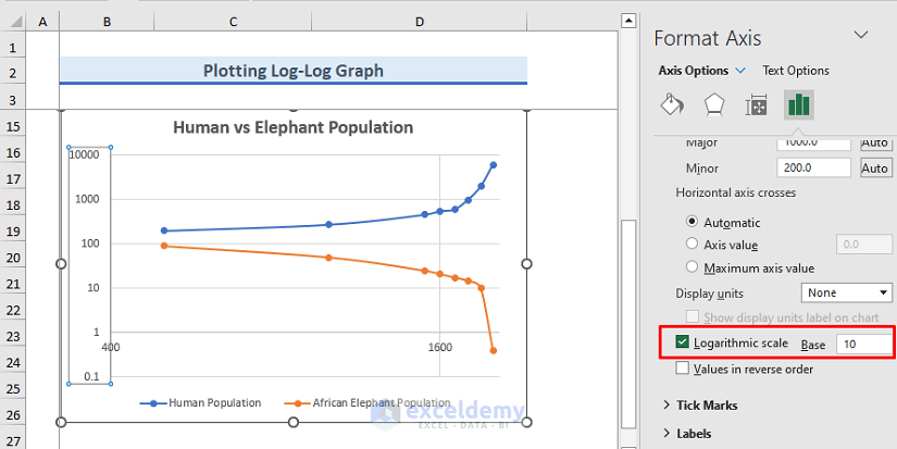
STEP 2 – Modify the Axes for a Log-Log Graph
- Click on the horizontal axis.
- Right-click on the axis.
- A dialog box will pop out.
- Select Format Axis.
- You’ll get the Format Axis panel.
- Check Logarithmic scale.
- The horizontal axis is converted into the Logarithmic scale from the Decimal scale.
- Choose your base.
- Define the minimum and maximum range of the Horizontal axis to change the Horizontal axis or the x-axis scale. We have set 400 AD as the minimum and 2050 AD as the maximum.
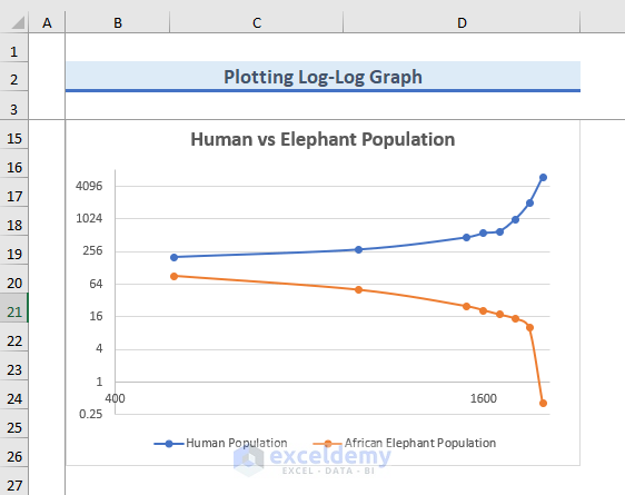
- We will change the scale of the Vertical axis or the y-axis.
- Go to the drop-down menu of the Axis Options and select Vertical (Value) Axis.
- Check Logarithmic scale.
- The Vertical axis is also converted into the Logarithmic scale.
- Here’s the result.
Download the Practice Workbook
Related Articles
- How to Change Axis Scale in Excel
- Automatic Ways to Scale Excel Chart Axis
- How to Scale Time on X Axis in Excel Chart
- How to Break Axis Scale in Excel
- How to Set Intervals on Excel Charts
<< Go Back to Excel Axis Scale | Excel Charts | Learn Excel
Get FREE Advanced Excel Exercises with Solutions!
