The scale for a graph axis is crucial for maximizing data visualization because it can have a big impact on how an audience understands a message. The scale chosen for a graph axis is crucial for maximizing data visualization since it significantly affects how the audience understands the message. When creating a chart in Excel, the scale of the axis may occasionally be too tiny to clearly display all of the units. In this article, we will show you how to change the axis scale in Excel.
How to Change Axis Scale in Excel: with Easy Steps
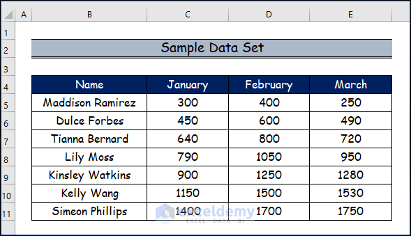
Changing the axis in the Excel graph helps you to read your graph easily. So, In the following steps below, we will discuss how to change the axis scale in Excel by utilizing the Format Axis option. Let’s suppose we have a sample data set.
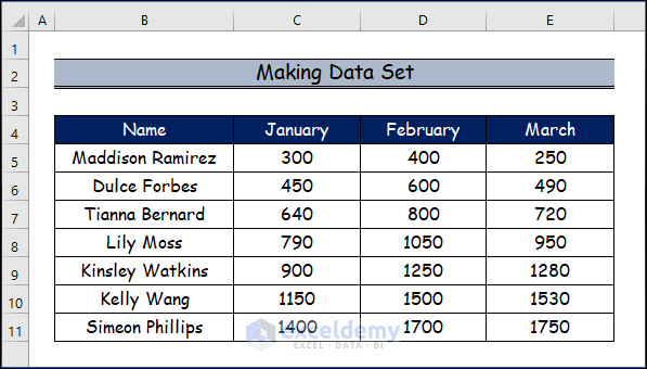
Step 1: Making Data Set
In this step, we will create our data set including some people’s names and their personal expenses over three months.
- In order to create a chart, we will first create a data set first.
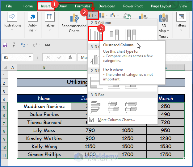
Step 2: Utilizing Charts Group
Excel’s charts group provides a range of chart types. Particularly, many charting tools enable users to visualize complex data in straightforward, graphical forms.
- Firstly, go to the Insert tab after selecting the data range from the given data set.
- Secondly, choose the Insert Column or Bar Chart from the Charts group.
- Thirdly, select the Clustered Column option from the 2-D Column.
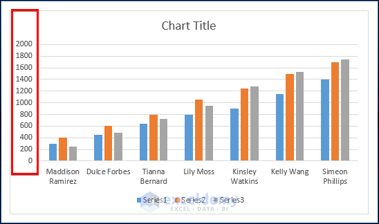
Step 3: Creating Bar Chart
When comparing precise data groups like frequency, quantity, range, or measurements, bar charts can be helpful. They are also employed to show patterns.
- As a result, you will see the output graph in the below image.
- Also, you will observe here that the gap between the Y-axis values is very small which is somewhat congested.
- So, we want to change the gap between the Y-axis values to read more perfectly.
Step 4: Using Format Axis Option to Change Axis Scale
To understand how to format a chart axis, we will use an example of a column chart. By modifying the axis parameters under the Format Axis option, we will modify the axis scale in this case.
- Therefore, right-click on the Y-axis.
- Then, select the Format Axis option from the options below.
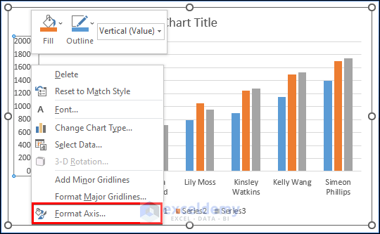
- Here, you will find the Format Axis options window.
- Then, see the gap is 200 (by default) for Major Units.
- So, we would like to change the value for a better understanding of the above graph.

- Then, we will increase the value to 400 for Major Units.

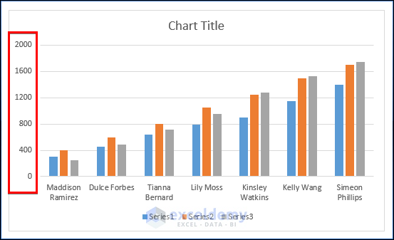
- Finally, you will see the y-axis scale is changed here for the graph.
- And, you will read it clearly.
Read More: How to Change X Axis Scale in Excel
Download Practice Workbook
Conclusion
In this article, We’ve covered the step-by-step process of how to change the axis scale in Excel. We sincerely hope you enjoyed and learned a lot from this article. If you have any questions, comments, or recommendations, kindly leave them in the comment section below.
Related Articles
- Automatic Ways to Scale Excel Chart Axis
- How to Scale Time on X Axis in Excel Chart
- How to Set Logarithmic Scale at Horizontal Axis of an Excel Graph
- How to Change Axis to Log Scale in Excel
- How to Break Axis Scale in Excel
- How to Set Intervals on Excel Charts
<< Go Back to Excel Axis Scale | Excel Charts | Learn Excel
Get FREE Advanced Excel Exercises with Solutions!
