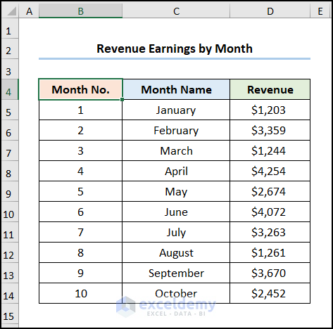
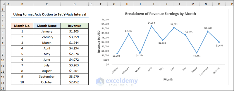
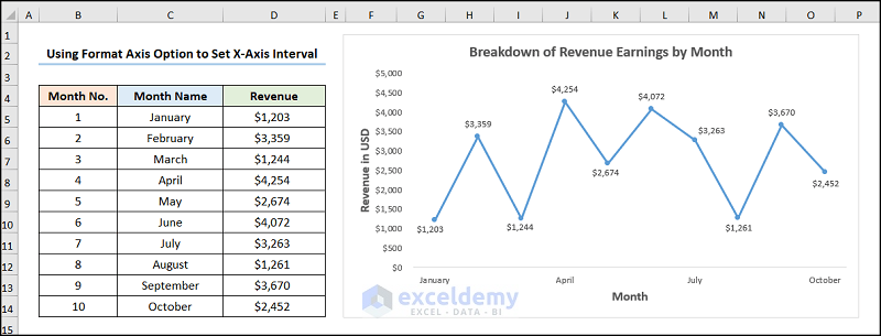
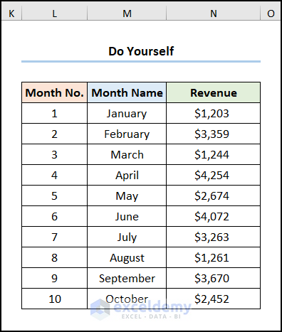
Let’s consider the Revenue Earnings by Month dataset shown in the B4:D14 cells. We have the Month Numbers, the Month Names, and the Revenue earnings in USD, respectively.
Example 1 – Set Y-Axis Intervals with the Format Axis Option
We’ll change the scale of the vertical axis for a better fit.
Steps:
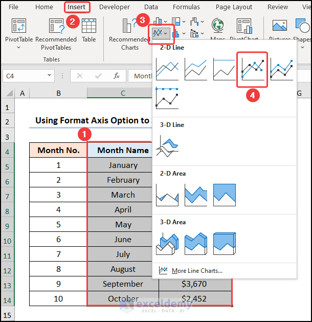
- Select the B4:D14 cells.
- Go to the Insert tab.
- Click the Insert Line or Area Chart dropdown.
- Select the Line with Markers option.

This inserts the Line Chart as shown in the picture below.
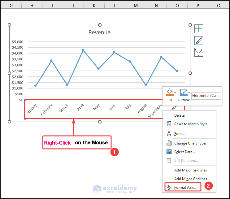
- Right-click on the vertical (Y) axis and select the Format Axis option.
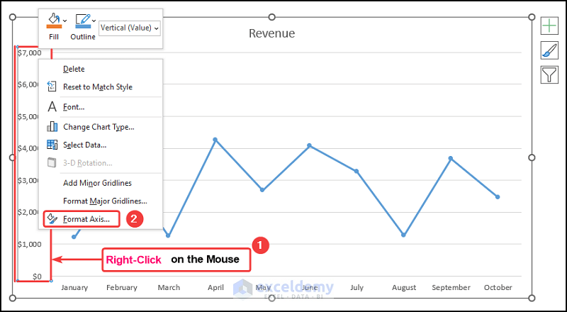
This opens the Format Axis pane on the right.
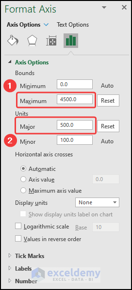
- Set the Maximum Bound to 4500 and the Major Units to 500.
The y-axis scale changes as shown in the image below.
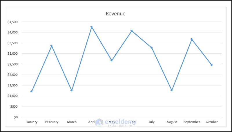
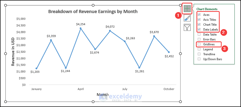
Add formatting to the chart using the Chart Elements option.
- Enable the Axes Title to provide axes names. Here, it is Revenue in USD and Month.
- Add the Chart Title, for example, Breakdown of Revenue Earnings by Month.
- Disable the Gridlines option to give your chart a cleaner look.
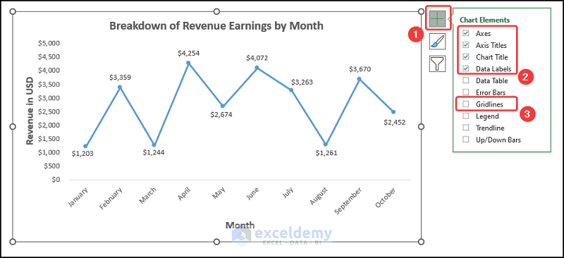
Your chart should look like the screenshot given below.
Example 2 – Set Intervals on the X-Axis with the Format Axis Option
Steps:
- Select the B4:D14 cells.
- Go to the Insert tab.
- Press the Insert Line or Area Chart dropdown.
- Choose the Line with Markers option.
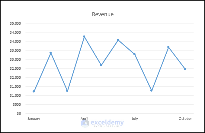
This should generate the Line Chart as shown in the image below.
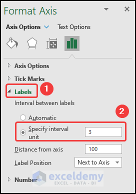
- Right-click on the horizontal (X) axis and select the Format Axis option.
This opens the Format Axis pane on the right side of the spreadsheet.
- Click the Labels drop-down and set the Specify interval unit to 3.
The changed horizontal axis should look like the screenshot below.
- You can format your chart with the Chart Elements option, adding Axis Titles, Chart Title, and removing Gridlines.
Your output should look like the picture shown below.
Read More: How to Change Axis Scale in Excel
Practice Section
We have provided a Practice section on the right side of each sheet so you can practice setting intervals for the axes.
Download the Practice Workbook
Related Articles
- Automatic Ways to Scale Excel Chart Axis
- How to Scale Time on X Axis in Excel Chart
- How to Set Logarithmic Scale at Horizontal Axis of an Excel Graph
- How to Change Axis to Log Scale in Excel
- How to Break Axis Scale in Excel
<< Go Back to Excel Axis Scale | Excel Charts | Learn Excel
Get FREE Advanced Excel Exercises with Solutions!
