Month and Net Sales are columns in the following dataset. It is crucial to notice that the dataset we will work with has some numeric values that are ...
If you are looking for how to change the X-axis scale in Excel, then you are in the right place. You are not alone in facing problems of not finding ...
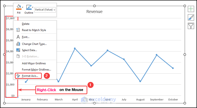
While working in Microsoft Excel with the sales-related worksheets, sometimes we need to change the Y-axis scale for the convenience of our work. The ...
Let’s consider the Revenue Earnings by Month dataset shown in the B4:D14 cells. We have the Month Numbers, the Month Names, and the Revenue earnings ...