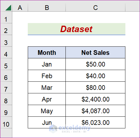
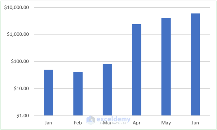
Month and Net Sales are columns in the following dataset. It is crucial to notice that the dataset we will work with has some numeric values that are remarkably less than the others. Using the dataset’s information, we will design a typical Clustered Chart. The lower values will not have a better view in the chart. You should employ a logarithmic scale if the difference among values is huge or whether the data showing is much smaller or larger than the overall data.
Method 1 – Utilize the Format Tab to Turn the Axis into a Logarithmic Scale in Excel
STEPS:
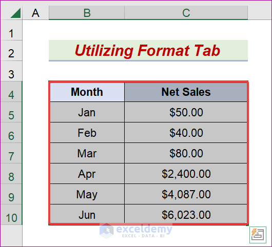
- Select the B4:C10 range.
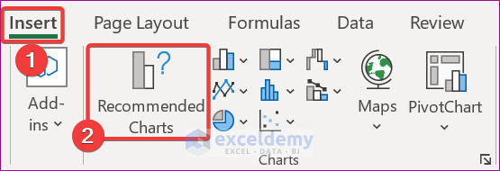
- Go to the Insert tab.
- Go to, Insert → Charts → Recommended Charts
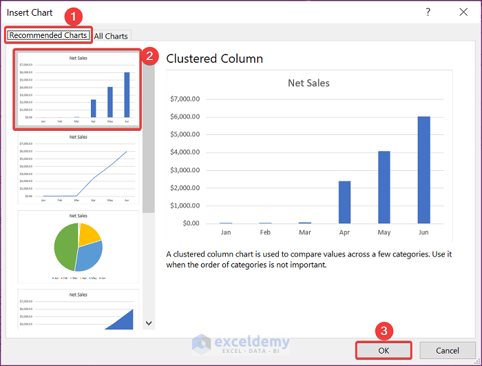
- The Insert Chart window will open.
- Go to the Recommended Charts tab.
- Pick the Clustered Column chart and press OK.
- The intended chart will appear like the one below.
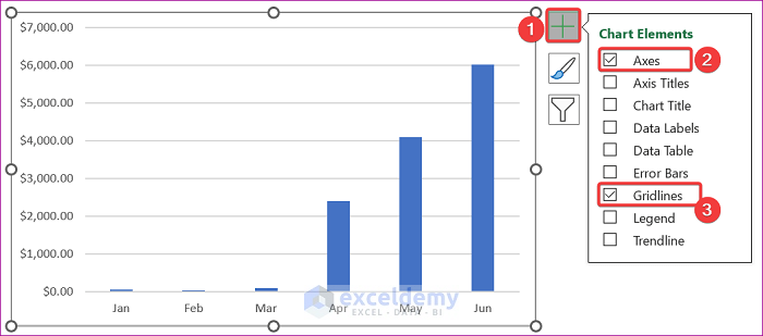
- Click the Plus symbol.
- From the Charts Elements, check Axes and Gridlines.
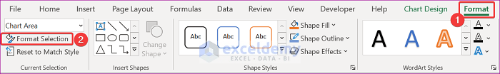
- Click on the chart area and go to the Format tab, followed by Format Selection.
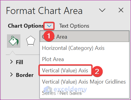
- Pick the Down Arrow icon of the Chart Options and choose Vertical Axis.
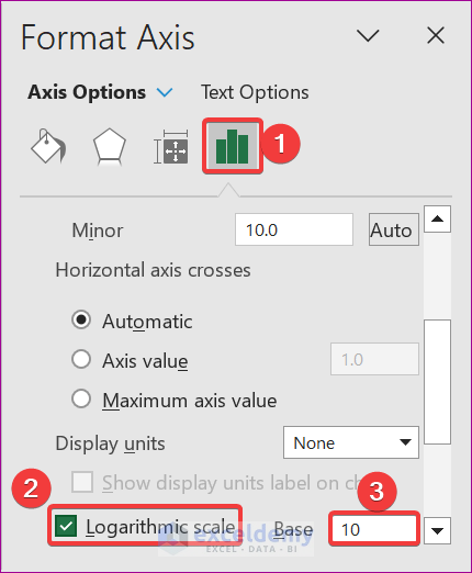
- Select the Axis Options icon.
- Check the Logarithmic scale and input 10 in the Base section.
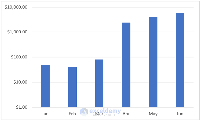
- The desired output will display like the one below.

Method 2 – Using the Context Menu to Establish Log Scale to Excel Chart Axis
STEPS:
- Select the B4:C10 field.
- Go to the Insert tab and click Recommended Charts.
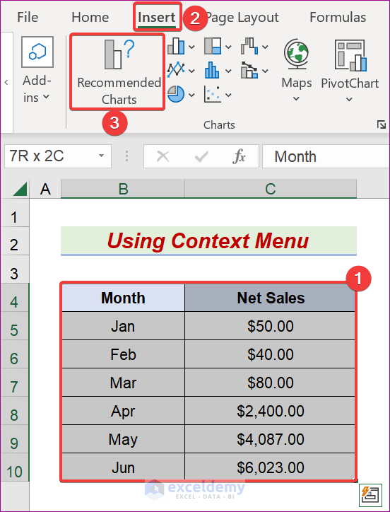
- The Insert Chart window will open.
- Go to the Recommended Charts.
- Choose the Clustered Column chart and press OK.

- The expected chart will appear.
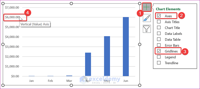
- Click the Plus icon.
- From the Chart Elements, check the Axes and Gridlines options.
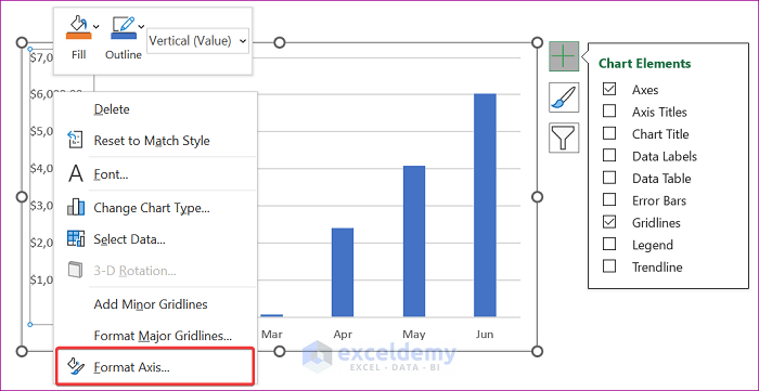
- Right-click on any value of the Vertical Axis.
- A context menu will pop up, and choose Format Axis.
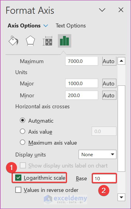
- The Format Axis pane will appear.
- Check the Logarithmic scale and write 10 in the Base option.
- A chart like the following will be provided.
Method 3 – Run Excel VBA Code to Change an Axis into a Log Ratio in Excel
STEPS:
- Choose the desired sheet as the Active sheet.
- Go to the Developer tab and pick the Visual Basic symbol.
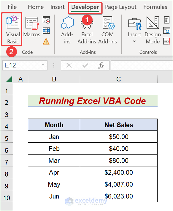
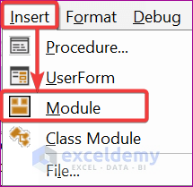
- Click on Insert → Module
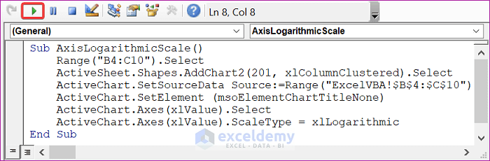
- Enter the following formula into the Module box:
- It is essential to modify the range and sheet name as you need.
Sub AxisLogarithmicScale()
    Range("B4:C10").Select
    ActiveSheet.Shapes.AddChart2(201, xlColumnClustered).Select
    ActiveChart.SetSourceData Source:=Range("ExcelVBA!$B$4:$C$10")
    ActiveChart.SetElement (msoElementChartTitleNone)
    ActiveChart.Axes(xlValue).Select
    ActiveChart.Axes(xlValue).ScaleType = xlLogarithmic
End Sub- Press F5 or click the Run symbol.
- As a result, the expected output is shown below.
Download the Practice Workbook
Related Articles
- Automatic Ways to Scale Excel Chart Axis
- How to Scale Time on X Axis in Excel Chart
- How to Break Axis Scale in Excel
- How to Set Intervals on Excel Charts
<< Go Back to Excel Axis Scale | Excel Charts | Learn Excel
Get FREE Advanced Excel Exercises with Solutions!
