If you are looking for how to change the X-axis scale in Excel, then you are in the right place. You are not alone in facing problems of not finding the range or intervals on the X-axis or not being capable of customizing your X-axis scale. In this article, we’ll try to discuss how to change the X-axis scale in Excel.
How to Change X Axis Scale in Excel: 2 Methods
In Excel, we have different types of values on both of the axes when we use charts. Sometimes it is in the date or text form and sometimes it is in the number form. We have to change the axis scale of the chart for better visuals. We have two different ways to change the scale on the X-axis by scaling dates or text and even the numbers.
In the case of using numbers in the X-axis while using a Scatter Chart or Bar Chart we need to follow the system which is different from using categories/text labels (including date) while using Line or Column Charts.
1. Scaling Dates and Text on the X Axis
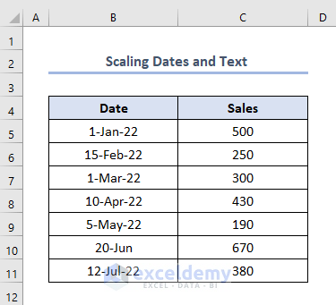
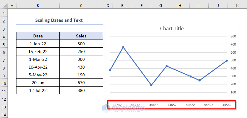
When we have dates or text to place on the X-axis, we need to use line or column charts. Suppose we have the dataset below which includes column headers as Date and Sales.
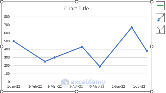
We have created a line chart based on the dataset above which is like this.
Eventually, we can see that on the X-axis we have Dates. We need to change this scale or customize the scale according to our requirements.
Step-01: Working with Format Menu and Selecting Horizontal (Category) Axis
- Firstly, select the chart.
- Secondly, go to Format > click the drop-down button shown in the figure > choose Horizontal (Category) Axis.
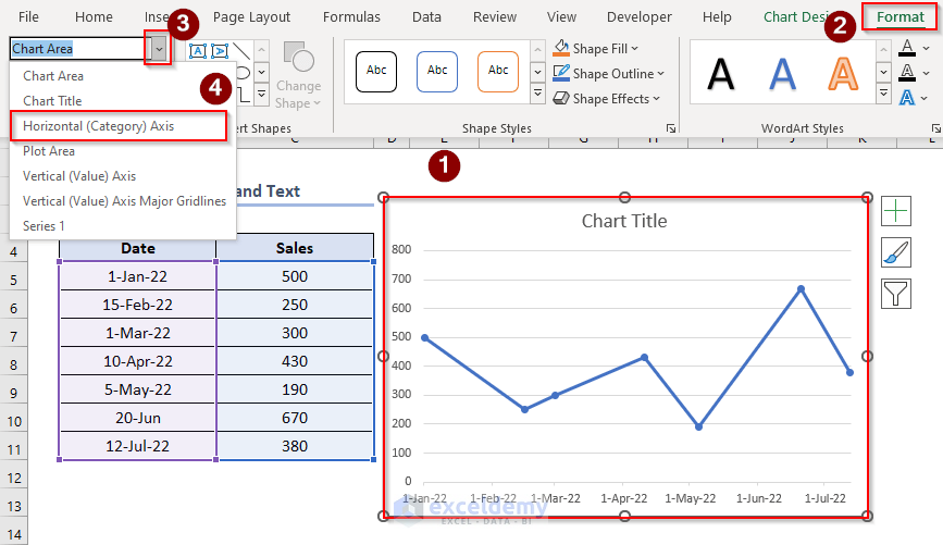
- Thirdly, select Format Selection.

Step-02: Dealing with Format Axis Window
- After selecting the Format Selection, consequently, a Format Axis window will appear.
- Now, firstly, click the Date axis in the Axis Type
- Secondly, select the range in the Bounds In this case, we have selected 1/1/2022 as Minimum and 7/12/2022 as Maximum.
This range in the Bounds box mainly defines the scaling limit of the X-axis.
- Thirdly, change the Major and Minor in the Units box into Days. Change Major to 30 and Minor to 10. Or you can change the values according to your requirements.
- Fourthly, click Between dates in the Vertical axis crosses
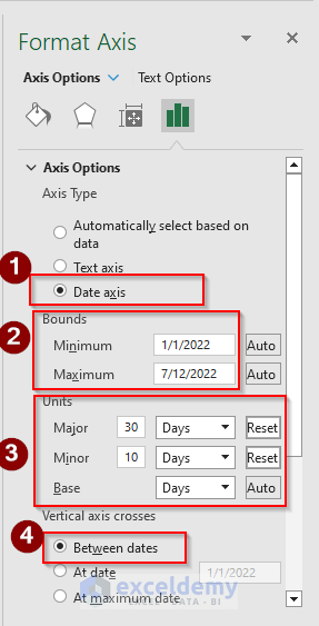
- Importantly, if we need to reverse the axis, then select Dates in reverse order.
- Fifthly, in the Tick Marks box change the Major Type and Minor Type box to None.
- Sixthly, select General in the Category box of the Number

Eventually, the chart axis will look like this.
The problem here we might face is that the formatting of the X-axis is different. We just need to fix this.
- To fix the formatting of the X axis, change the Category box to Date.
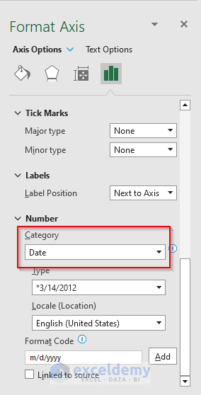
- Importantly, change the Type to 14-Mar-12. You can select any of the options according to your requirements.

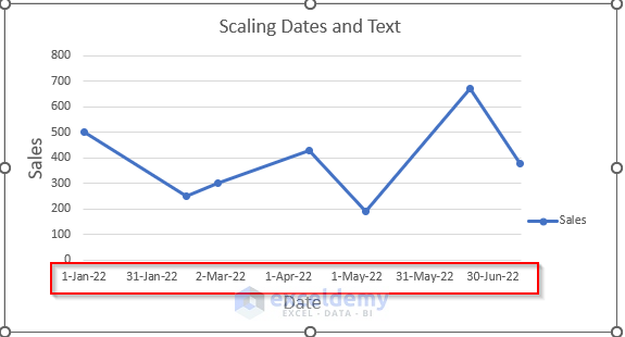
- Consequently, the X-axis of our chart will be like this now.
Read More: How to Change Y Axis Scale in Excel
2. Scaling Numbers on the X Axis
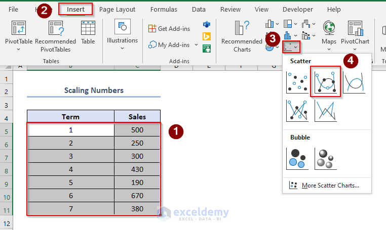
When we have numbers to set on the X-axis, we need to make an X-Y Scatter chart or Bar chart. Suppose we have the following dataset, including column headers as Term and Sales.
- We will make a chart based on this first. So, select the cells which we want to include in the chart.
- Second, go to Insert > select the drop-down bar of the Scatter chart > choose the scatter chart shown in the figure.
- Eventually, our Scatter Chart is like this where we have numbers on the X axis.

Step-01: Working in the Format Option
- Now, to change the scale of the X axis, firstly, select the chart > go to Format > click the drop-down option shown in the picture > choose Horizontal (Value) Axis.
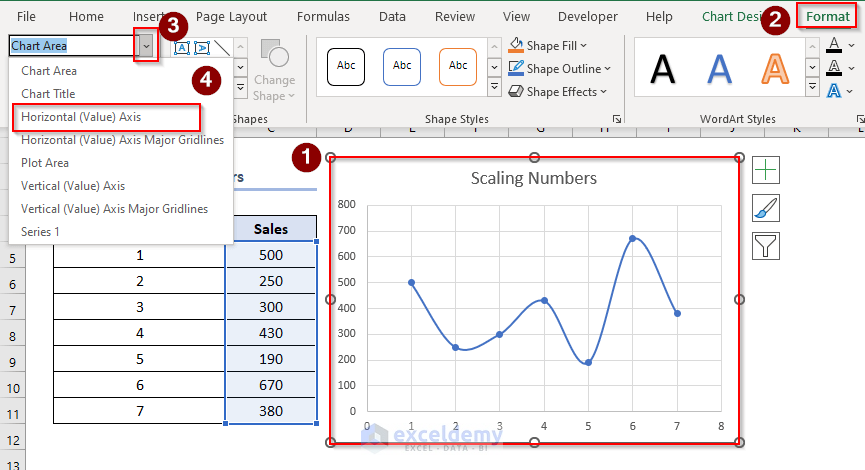
- Secondly, select Format Selection.

Step-02: Working with Format Axis Window
- Eventually, a Format Axis window will appear after selecting the Format Selection.
- Now, in this step, firstly, take 0 as Minimum and 7.0 as Maximum in the Bounds box in the Axis Options. You can take these values according to the character of your chart.
- Secondly, in the Units box, take 0 as Major and 0.4 as Minor. Again, you can take these values according to your requirements.
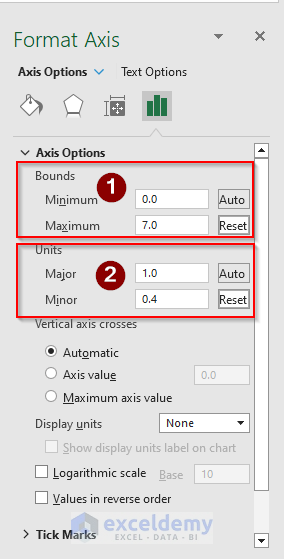
- Thirdly, if we want to change the X-axis or the horizontal axis to Logarithmic Scale, just select the option of Logarithmic Scale. Here, the Base is 10.
- As we have selected the Logarithmic Scale of Base 10, we can change the Maximum option of the Bounds box to 10 and the Major option in the Units box to 10.
- Additionally, we can also select the Values in reverse order option if we want to place the values in the chart reversely.

- Eventually, after doing all of these the X axis of our chart becomes like this where it is changed to a Logarithmic Scale.

- Finally, if the X axis is not in the right format, we can make changes by working in the Number box.

Download Practice Workbook
Conclusion
So, we can change the X-axis scale in the case of both date/text type and number type axis if we study this article properly.
Related Articles
- Automatic Ways to Scale Excel Chart Axis
- How to Scale Time on X Axis in Excel Chart
- How to Break Axis Scale in Excel
- How to Set Intervals on Excel Charts
<< Go Back to Excel Axis Scale | Excel Charts | Learn Excel
Get FREE Advanced Excel Exercises with Solutions!
