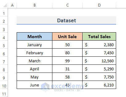
Step 1 – Create a Dataset
We are going to create a dataset of a company’s total sales and the total amount of each month’s sales.
- We will put months in column B. We will record only from January to June in our dataset.
- Input the unit sales of each month in column C.
- Put the total amount of sales in each month in column D.
Step 2 – Insert a Chart
- Select the data range which you want to visualize with a graph. In our case, we will select the whole range of data B4:D10.
- Go to the Insert tab from the ribbon.
- In the Charts category, click on the Insert Combo Chart drop-down menu.
- Choose the second combo chart which is the Clustered Column – Line on Secondary Axis.
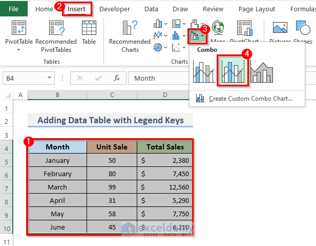
- This will display the combination of the bar and line chart of sales.
Read More: How to Create Pie Chart Legend with Values in Excel
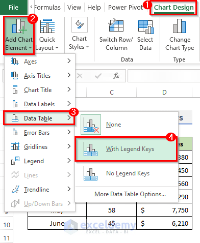
Step 3 – Add a Data Table with the Legend Keys
- If the chart is selected, the Chart Design tab will appear in the ribbon.
- Go to the Chart Design from the ribbon.
- From the Chart Layout category, click on the Add Chart Element drop-down menu.
- Click on the Data Table drop-down option.
- Select the second option which is With Legend Keys.
Note: You can also do this work from the Chart Element option, which will appear on the right side of the chart after clicking on the blank space of the chart.
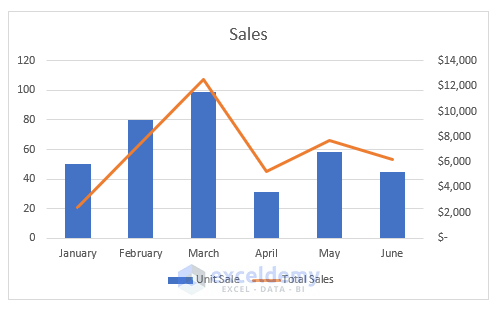
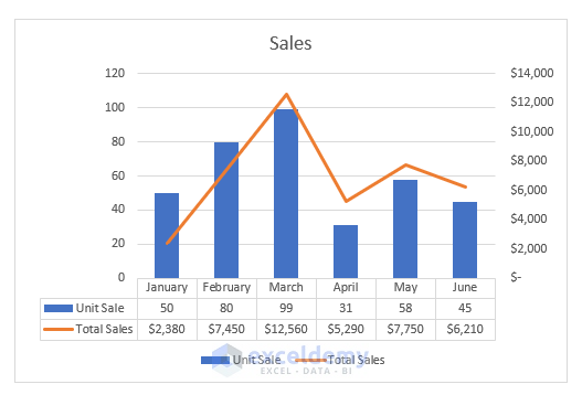
Final Output
This is the final output of the chart after adding the data table with legend keys.
How to Change the Position of the Legend in Excel
STEPS:
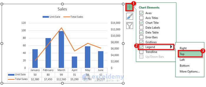
- Click on any blank space on your chart.
- The Chart Elements button will appear next to the chart’s top right corner. The button looks like a plus sign. Click on it.
- Click on the Legend drop-down option and select your required position of the legend. We selected the Top position.
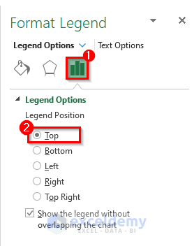
- Alternatively, you can change the position of the legend from the Format Legend window. This window will appear while selecting the chart dialog.
- Go to the Legend Option and then select the required position of the legend.
How to Remove the Legend in Excel
STEPS:
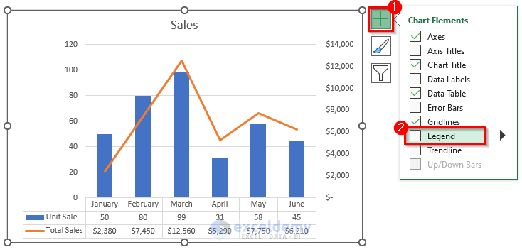
- Open the Chart Elements options.
- Uncheck the Legend option.
Read More: How to Create a Legend in Excel without a Chart
Related Articles
- How to Show Legend with Only Values in Excel Chart
- How to Show Percentage in Legend in Excel Pie Chart
- How to Change Legend Colors in Excel
- How to Reorder Legend Without Changing Chart in Excel
- What Is a Chart Legend in Excel?
<< Go Back to Excel Charts | Learn Excel
Get FREE Advanced Excel Exercises with Solutions!
