Method 1 – Using Context Menu
Steps:
- Right-click on the column that is represented by the legend you are trying to change the color. The context menu will open up.
- Select the Fill option from the menu appearing on top of the context menu as shown in the figure below.
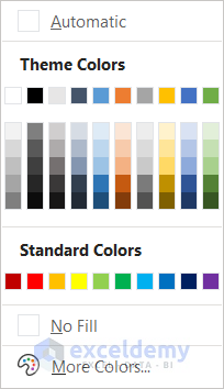
- From the drop-down, select the color you prefer for your legend. We are selecting green for the demonstration.
You will see your column’s colors, as well as the legend colors, in your Excel chart have changed to green or any other color you have selected.
Method 2 – Use of Fill Command
Steps:
- Select a column by just left-clicking once on it.
- Go to the Home tab on your ribbon and click the Fill Color drop-down icon in the Font group.

- Select the color you want from the drop-down menu. We are selecting light blue this time.
Once you have selected the color, your column color will automatically change, and so will the legend color.

Thus you can change legend colors in Excel.
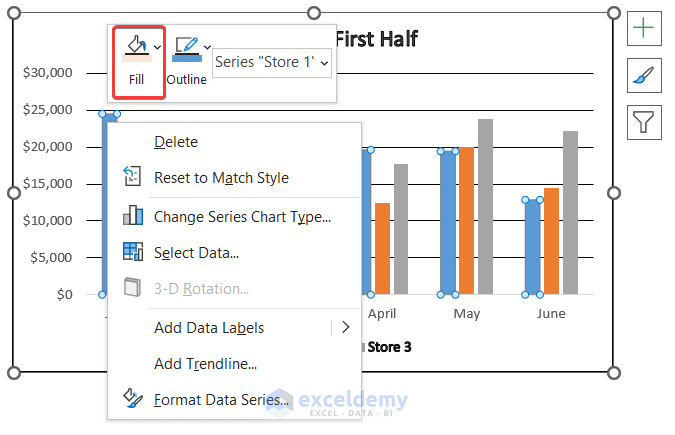
Method 3 – Applying Format Data Series Command
Steps:
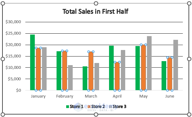
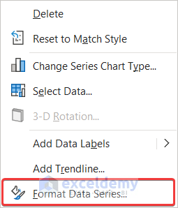
- Right-click on the column you want to change the color of.
- Select the Format Data Series command from the context menu.
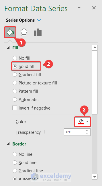
- The Format Data Series window will open up on the right side of the Excel interface. Now go to the Fill & Line tab in it.
- Under the Fill section, select Solid line.
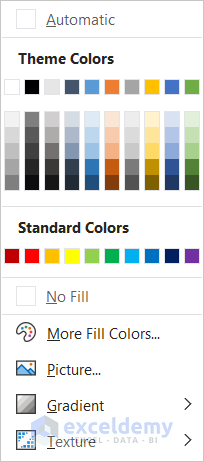
- Select the color you want your column and legend color to change to. We are using red for the demonstration.
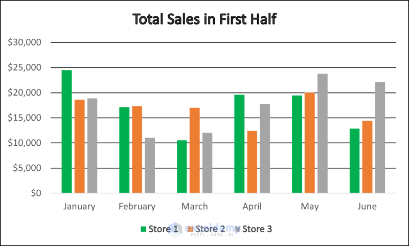
Once you have completed all of the steps, you will find that the column color and the legend of the column you selected on the first step have automatically changed.
You can change legend colors in Excel charts this way too.
Method 4 – Using Shape Fill from Format Tab
Steps:
- Select a column from the chart.
- Notice Chart Design and Format tabs appearing on the ribbon at the end of the already existing tabs. Go to the Format tab.
- Click on the Shape Fill option from the Shape Styles group.
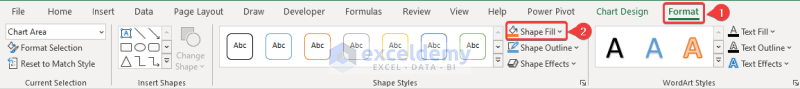
- A drop-down list of colors will appear. Now select the color you prefer (We are selecting purple for the demonstration).

The column color and legend color of the one indicating the column will change.
This is another way you can change legend colors in Excel charts.
Download Practice Workbook
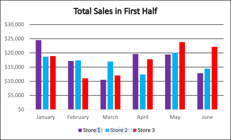
You can download the workbook with the dataset and all the charts used for the demonstration from the link below. Download and try yourself while you go through the steps in the tutorial.
Related Articles
- What Is a Chart Legend in Excel?
- How to Add a Legend in Excel
- How to Rename Legend in Excel
- How to Change Legend Title in Excel
- How to Ignore Blank Series in Legend of Excel Chart
<< Go Back To Excel Chart Elements | Excel Charts | Learn Excel
Get FREE Advanced Excel Exercises with Solutions!
