What is a Chart Legend
A Chart Legend can be defined as representing a data series on a chart. For example, when you have several columns of data, they will be represented in different colors. These colors and series names are known as chart legends. Here, product 1, product 2, and product 3, along with those different colors, will be the chart legend.

How to Create a Chart in Excel
Below, we have a dataset that includes several countries and some product sales amounts. Using this dataset, we need to create a chart. 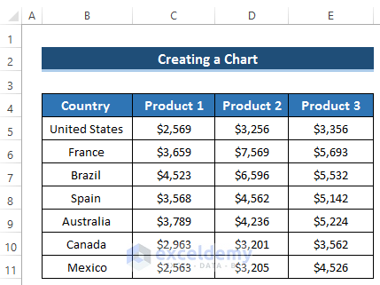
Steps
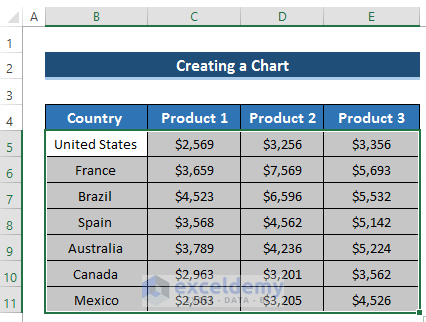
- Select the range of cells B5 to E11.
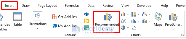
- Go to the Insert tab in the ribbon.
- From the Charts section, select Recommended Charts.
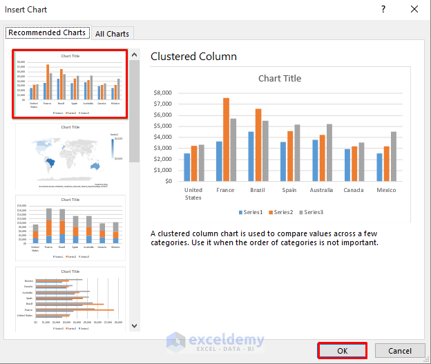
- An Insert Chart dialog box will appear.
- Select the Clustered Column chart.
- Click on OK.
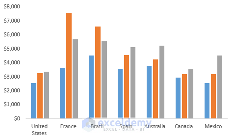
- It will create the following chart.
- If you want to modify the Chart Style, click on the Brush icon on the right side of the chart.
- Select any of your preferred chart styles.
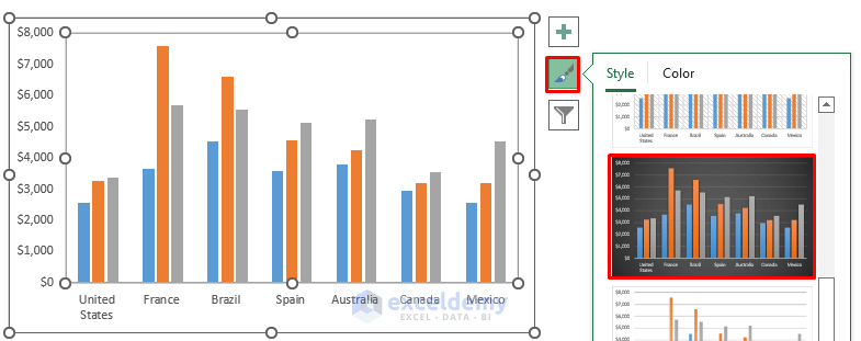
- We get the following chart.

How to Add Chart Legend in Excel
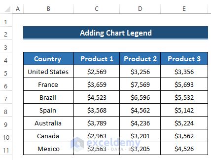
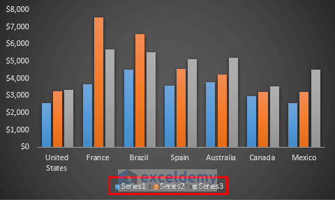
We will use the following dataset to add a chart legend to a chart.
Steps
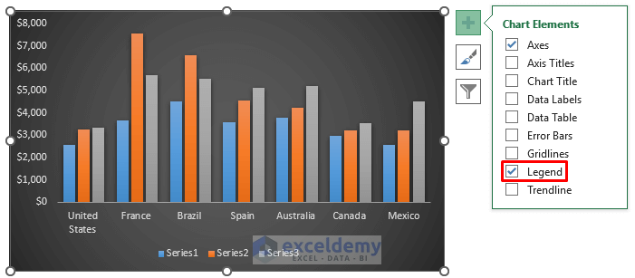
- Create the chart as we showed above.
- Our final chart will be like the following chart by using the dataset.
- To add a chart legend, click on the Plus (+) icon on the right side of the chart.
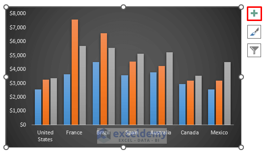
- From the options, select Legend.
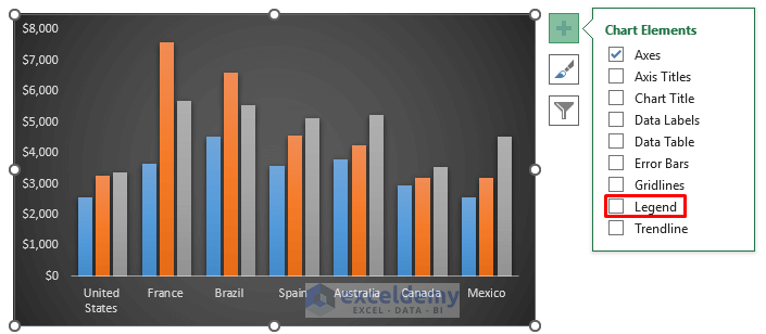
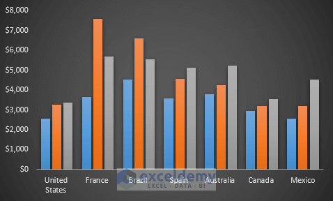
- We get the following chart with the legend at the bottom.
Read More: How to Rename Legend in Excel
How to Modify a Chart Legend in Excel
To show all the modifications, we will use the following dataset.

1. Changing Chart Legend Positions
Steps
- By default, our chart legend is at the bottom of the chart.
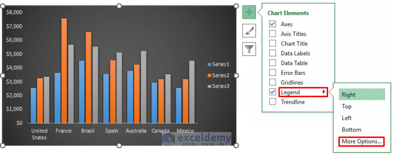
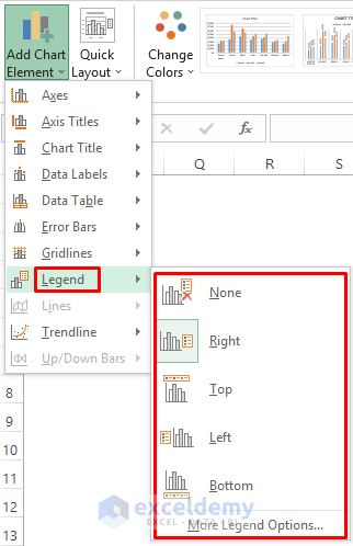
- To modify this, click on the plus (+) icon on the right side of the chart, which denotes the Chart Element.

- You will get lots of options. You need to find Legend from there.
- Click on the black arrow beside the Legend option.
- It will open up options to change legend positions.
- By default, it is at the bottom.
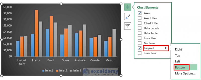
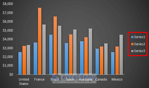
- Change the legend position from bottom to right on the chart.
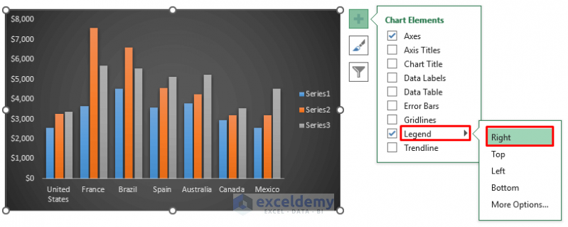
- It will give us the following result.
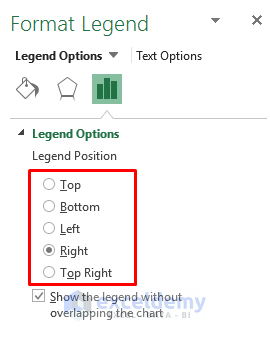
- Unlock more legend positions by clicking on More Options.
- It will open up the Format Legend dialog box.
- In the Legend Position section, there will be more positions.
- Another way is to change the chart positions. To do this, click on anywhere on the chart.
- It will enable the Chart Design option.
- From the Chart layouts group, select the Add Chart Element drop-down option.
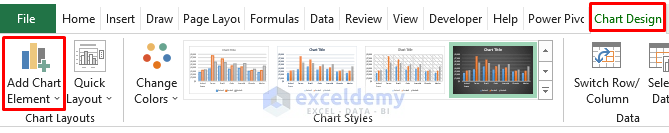
- From the Add Chart Element drop-down option, select the Legend dropdown.
- It will show all the possible positions for chart legend.
Read More: How to Reorder Legend Without Changing Chart in Excel
2. Editing Legend Names
Steps
- Right-click on the chart.
- A Context Menu will pop up.
- Select the Select Data option.
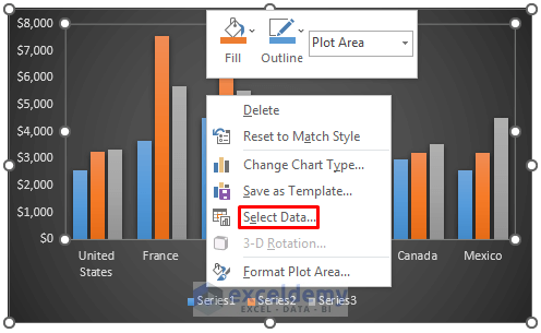
- The Select Data Source dialog box will appear.
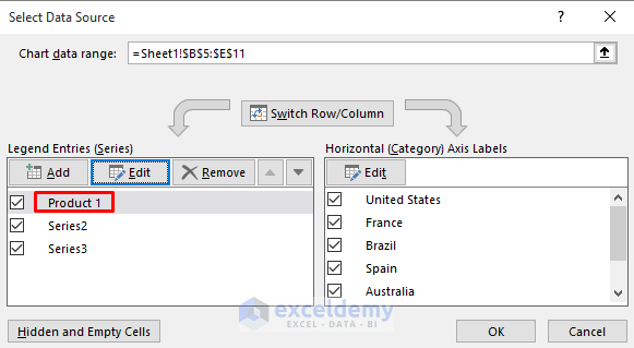
- In the Legend Entries (Series) section, select Edit.
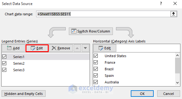
- The Edit Series dialog box will appear.
- In the Series name section, set any name.
- Click on OK.
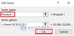
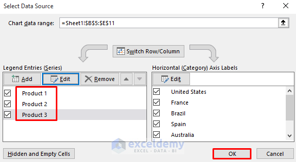
- It will change in the Legend Entries (Series) section.
- Edit the legend names for the others.
- Click on OK.
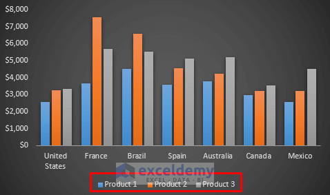
- It will change all the legend names and set the new names on the chart. See the screenshot.
Read More: How to Change Legend Title in Excel
3. Altering Font Styles of Legends
Steps
- Right-click on the chart legend.
- A Context Menu will appear.
- Select the Font option.
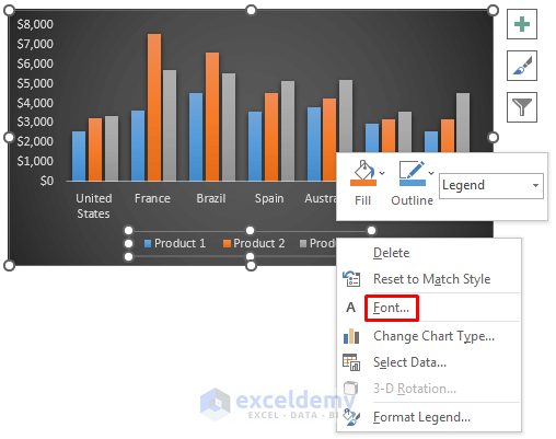
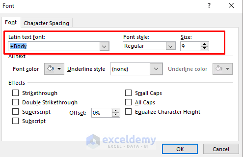
- The Font dialog box will appear.
- Set the font under Latin Text Font.
- Change the Font Style to your preference. We use a Regular style.
- From the Font Style section, change to Bold or Italic.
- Change the size.
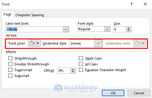
- Change the Font color and alter the Underline Style.
- Here, we set the underline style to none, but you can set a single, double, or dotted underline.
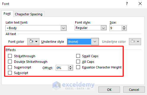
- In the Font dialog box, there is an Effects section where you can set any effects.
- Set effects like strikethrough, double strikethrough, superscript, subscript, etc.
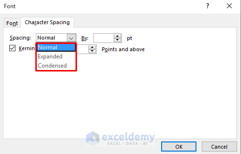
- Move to the Character Spacing section at the top.
- In the Spacing section, choose Normal if you don’t need any spacing.
- Choose Expanded spacing if you require to increase spacing.
- Choose Condensed spacing if you require to increase spacing.
4. Formatting Chart Legend
Steps
- Double-click on the chart legend text.
- It will open up the Format Legend dialog box.
- Select the Text Options from the top.
- Select the Textbox option.
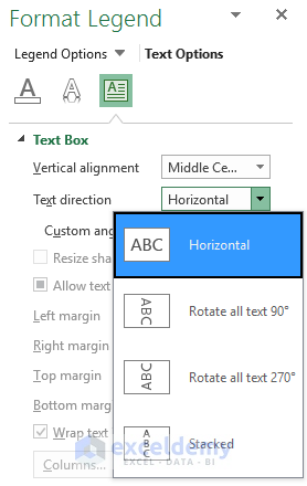
- In the Text Box section, you’ll get the vertical alignment, text direction, and custom angle.
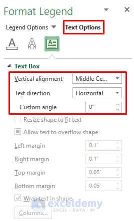
- By default, the text direction is in horizontal format.
- You can change it and set another option from the list. It will set up the chart legend text accordingly.
Read More: How to Create a Legend in Excel without a Chart
5. Customizing Chart Legend Text
Steps
- Double-click on the chart legend text.
- It will open up the Format Legend dialog box.
- Select the Text Options from the top.
- Select the Text Effects option.
- In the Text Effects option, we’ll get the Shadow, Refection, and Glow options.
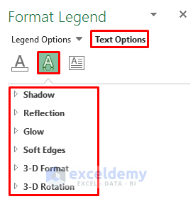
- By default, the chart legend has no shadow, reflection, or glow.
- If you want to include any of these items in your chart legend, you can do it from there.
- The Shadow option will create a show of your chart legend where you can select the color of that shadow.

- The Reflection option will create a reflection of your chart legend text.
- The Glow option will provide you with different glow colors on your chart legend.
Read More: How to Change Legend Colors in Excel
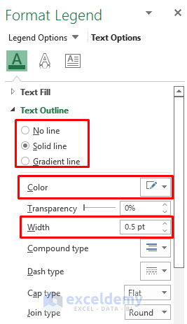
6. Altering Fill and Line of Legends
Steps
- Double-click on the chart legend text.
- It will open up the Format Legend dialog box.
- Select the Text Options from the top.
- Select the Text Fill & Outline option.
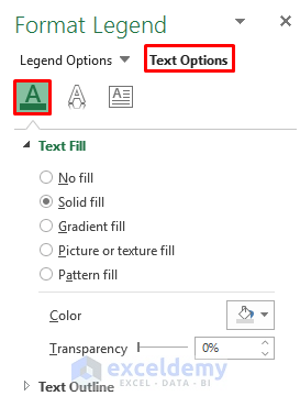
- In the Text Fill section, you can select any fill such as solid fill, gradient fill, or texture fill.
- Alter the color of that fill.
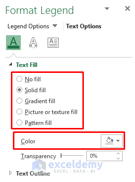
- In the Text Outline section, you can select any outline.
- Alter the Color and Width of that outline.
How to Remove Chart Legend in Excel
Steps
- Click on the plus (+) icon on the right side of the chart.

- You will get some more options.
- Uncheck the Legend option.
- We will get the following chart without any legend on it. See the screenshot.
Things to Remember
- Legend is connected to the data source
- You can place a legend at the top, bottom, right, or left by clicking the plus (+) icon on the right side of the chart.
- You can add or remove chart legend by clicking the plus (+) icon on the right side of the chart
- By clicking the filter option, you can modify the legend name.
Download the Practice Workbook
Download the practice workbook below.
Related Articles
- How to Show Legend with Only Values in Excel Chart
- How to Ignore Blank Series in Legend of Excel Chart
<< Go Back To Excel Chart Elements | Excel Charts | Learn Excel
Get FREE Advanced Excel Exercises with Solutions!
