Note:
- In Excel 2016 or newer versions, you can directly insert a statistic chart.
- In older versions, you can use Data Analysis ToolPak or different functions such as FREQUENCY or COUNTIF and COUNTIFS to perform the same task.
What Is Histogram?
A histogram is a graphical representation of the distribution of numerical data. It divides data into bins or intervals and shows the frequency or count of values within each bin. It provides a visual summary of data distribution and helps identify patterns and outliers.
Read More: Difference Between Excel Histogram and Bar Graph
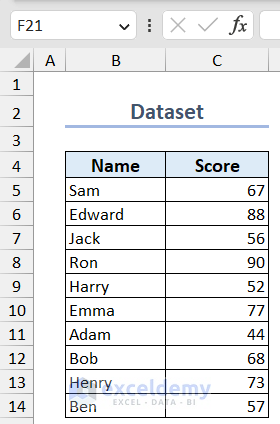
Dataset Overview
For demonstration purposes, we’ll use a dataset containing student names and scores.
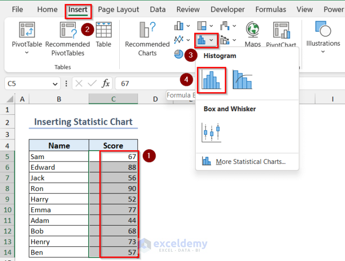
Method 1 – Create a Histogram by Inserting a Statistic Chart (Excel 2016 or newer)
To create a histogram in Excel 2016 or newer versions, you can insert a statistic chart from the Insert tab.
- Select your data.
- Go to the Insert tab >> click on Statistic Chart >> choose Histogram.
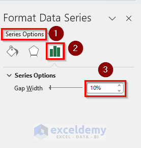
- To adjust the gap width, double-click any rectangle in the histogram and open Format Data Series options.
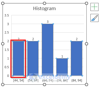
- Adjusting the gap width setting from the Series Options.
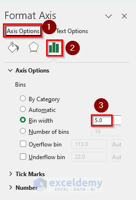
- Change the bin width by double-clicking the bin values and opening the Format Axis window.
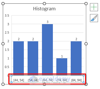
- In Axis Options, explore different bin settings:
- By Category: Use for text categories.
- Automatic: Automatically determines the number of bins or bin width.
- Bin Width: Manually set your desired bin width.
- Number of Bins: Specify the number of bins.
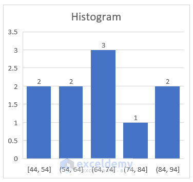
- Customize your histogram as needed.
- Your histogram has been created.
Read More: How to Create a Histogram in Excel with Bins
Method 2 – Use Data Analysis ToolPak
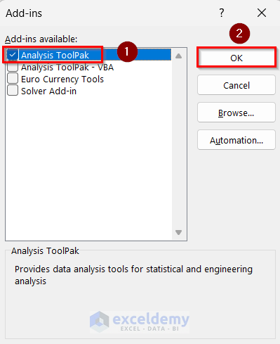
- Enable Data Analysis ToolPak (if not already enabled):
- Press ALT + F + T.
- Go to the Add-ins tab and click Go.
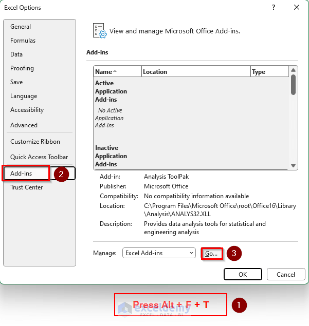
-
- Check the Analysis ToolPak checkbox and click OK.
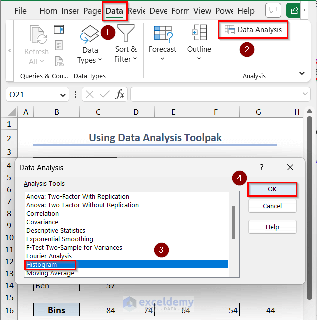
- Go to the Data tab and click Data Analysis.
- Select Histogram and click OK.
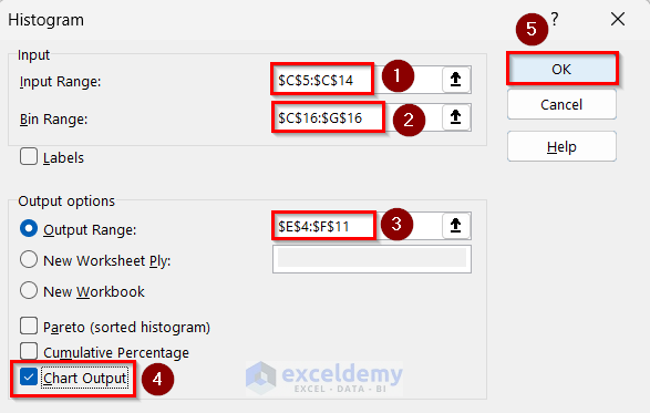
- Insert your Input Range, Bin Range and Output Range.
- Check the Chart Output checkbox and click on OK.
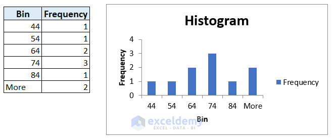
- A histogram has been created.
Read More: How to Make a Histogram in Excel Using Data Analysis
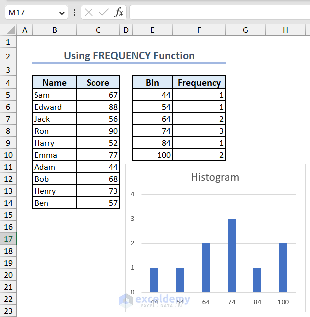
Method 3 – Apply the FREQUENCY Function
- Use the FREQUENCY function to count values in each bin:
=FREQUENCY(C5:C14,E5:E10)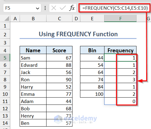
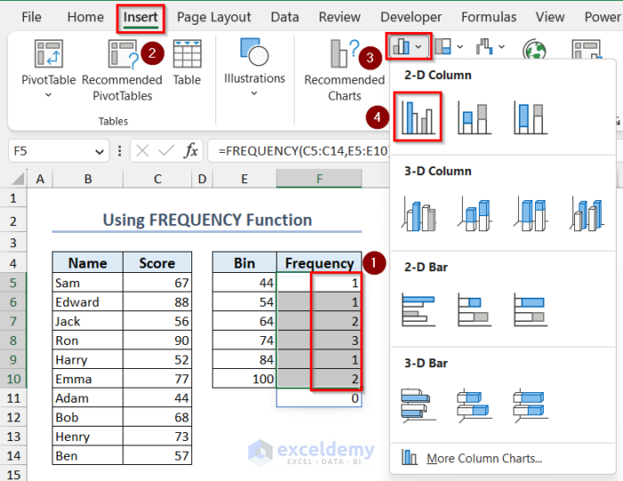
- Select the frequency column, go to the Insert tab, and choose Clustered Column Chart.
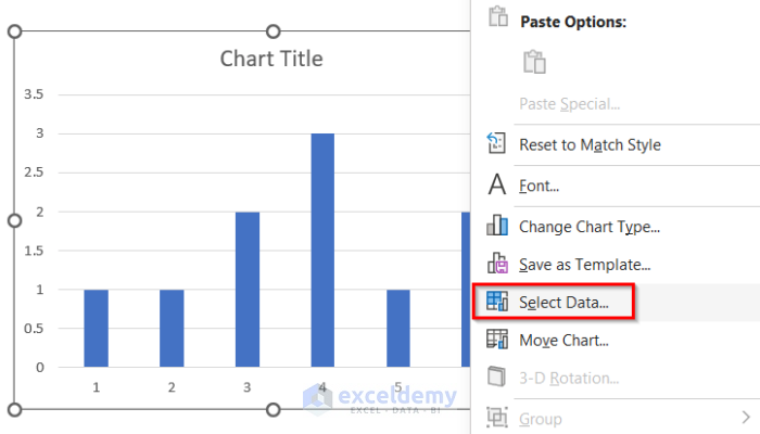
- Edit the X-axis values:
- Right-click the chart, choose Select Data.
-
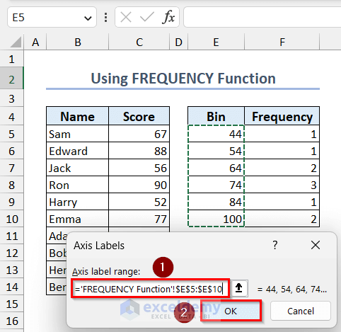
- Click Edit under Horizontal (Category) Axis Labels.
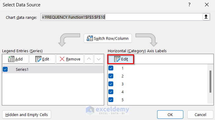
- Choose the bin column as the axis label range and click OK.
- You have your desired histogram in Excel.
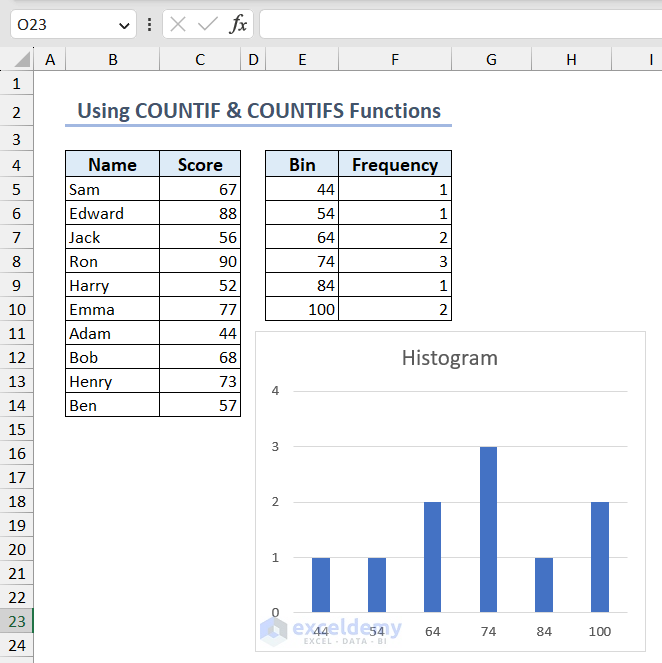
Method 4 – Using COUNTIF and COUNTIFS Functions
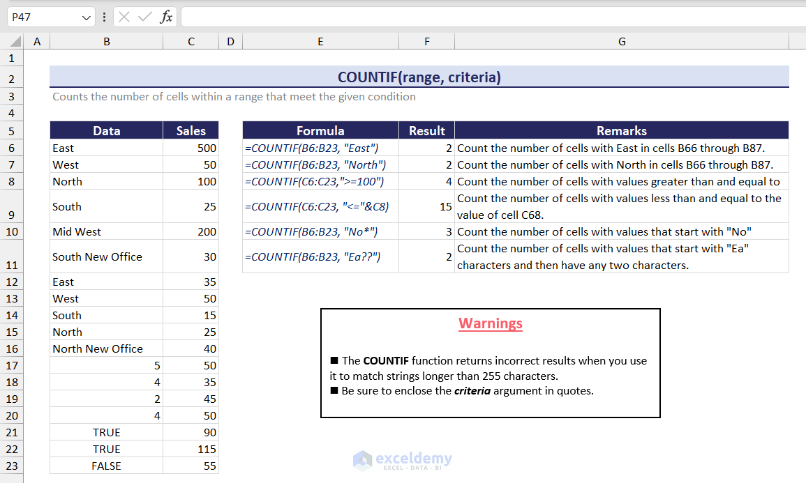
Click here to enlarge this image.
- Use the following formula to find the count value for the first bin:
=COUNTIF($C$5:$C$14,"<="&E5)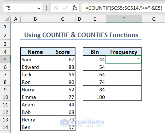
- For the rest of the bins, use this formula:
=COUNTIFS($C$5:$C$15,">"&E5,$C$5:$C$15,"<="&E6)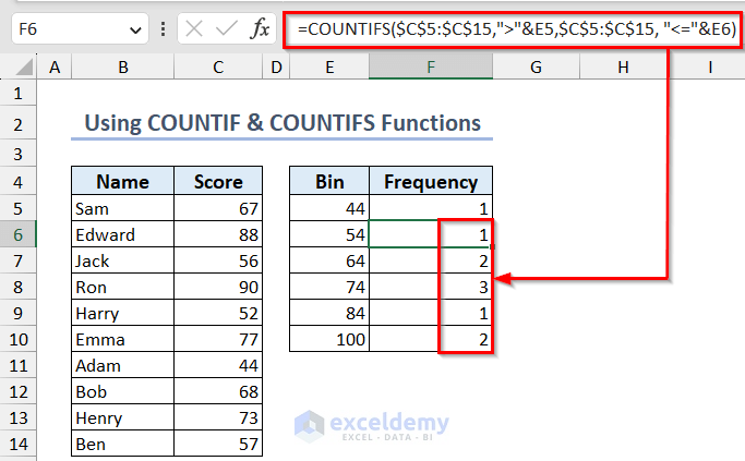
- Follow the same steps as shown in Method 3 to insert a column chart and create your histogram in Excel.
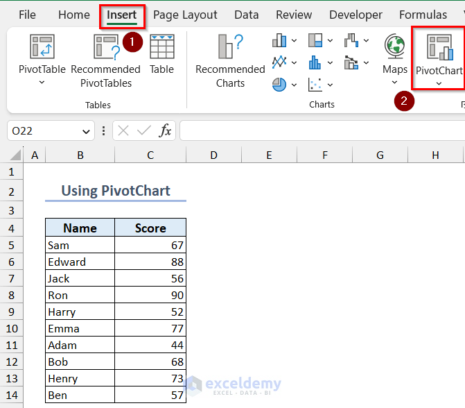
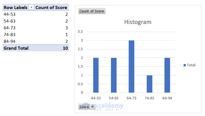
Method 5 – Create a Histogram with the PivotChart Tool
Using PivotChart:
- Go to the Insert tab and click on PivotChart.
- Insert your data range in the Table/Range text box and specify the output location in the Location textbox. Click OK.

- Drag the Score field into the Axis and Values area.
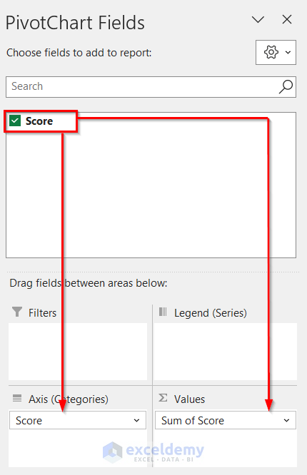
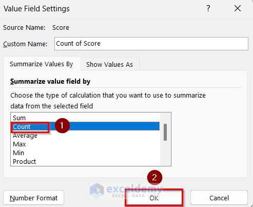
- Click on Sum of Score in the Values area and go to Value Field Settings.
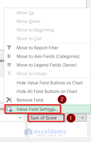
- Select Count as the Summarize value field by option and click on OK.
Create Groups:
- Right-click on any cell from the Row Labels and select Group.
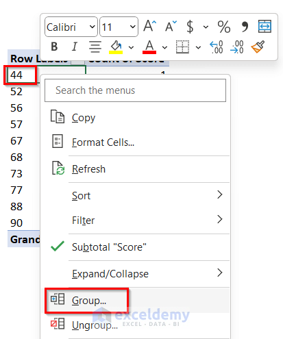
- Enter Starting, Ending at, and by values, then click OK.
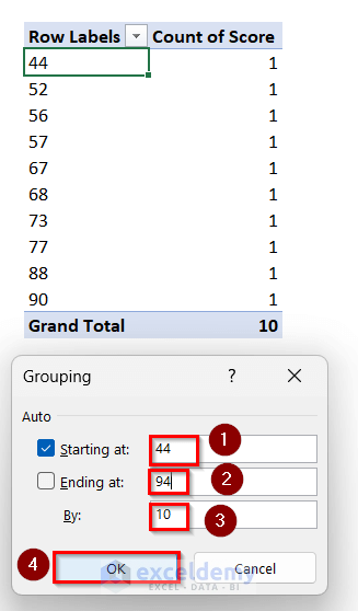
- Your histogram will be ready.
Customizing Your Histogram Chart
Here are some customizations you can apply to your histogram chart:
- Organizing by Category: Assign each category to a specific bin or interval. For example, organize customer ages into bins to visualize their distribution.
- Adding, Removing, or Changing Elements: Customize elements like axis titles, data labels, and chart titles by selecting the chart and clicking the “+” sign.
- Defining Bin Width: Specify the range or width of each bin based on your data.
- Creating Bins Automatically: Use automatic binning to determine the number of bins or manually set the number of bins.
- Creating Overflow and Underflow Bins: Identify exceptional or underperforming periods by creating overflow and underflow bins.
- Resizing Chart: Drag the chart using the handlebars in Excel.
- Formatting Axis Elements: Right-click any axis to access the Format Axis toolbox.
- Removing Space Between Bins: Adjust the Gap Width option to control spacing between bins.
Things to Remember
Remember to choose an appropriate number of bins or bin width for your data. Too few bins oversimplify information, while too many can make it hard to understand.
Frequently Asked Questions
1. How is a histogram different from a column chart?
- A histogram is a type of bar chart that represents the distribution of a continuous variable. In a histogram, the bars touch each other to show the continuity of the data. It’s commonly used to visualize how data is distributed across different intervals or bins.
- On the other hand, a column chart displays discrete categories on the horizontal axis. Each category corresponds to a separate column, allowing for easy comparison among different categories. Column charts are often used for categorical data or to compare distinct values.
2. Are there any keyboard shortcuts for creating a histogram in Excel?
- While there isn’t a specific keyboard shortcut exclusively for creating histograms, you can follow these steps efficiently:
- Select Data Range: Highlight the data range for which you want to create a histogram.
- Insert Tab: Press Alt + N to activate the Insert tab.
- Chart Type: Press SA (or navigate using arrow keys) to select the Bar chart type.
- Histogram Chart: Finally, choose the Histogram chart option.
Download Practice Workbook
You can download the practice workbook from here:
Excel Histogram: Knowledge Hub
<< Go Back to Excel Charts | Learn Excel
Get FREE Advanced Excel Exercises with Solutions!
