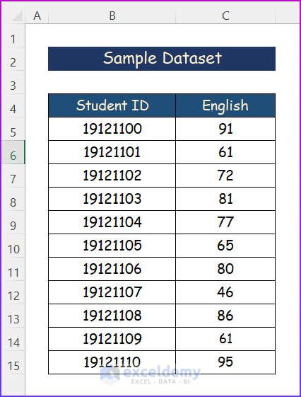
Occasionally, you might need to create a histogram for data visualization. Basically, a histogram is a column chart that displays how frequently a variable occurs within a given range. Moreover, it is a common tool for data analysis in the corporate world. In this article, I will show you five simple methods to plot histogram in Excel.
How to Plot Histogram in Excel: 5 Easy Ways
Fortunately, there are numerous approaches to making a histogram in Excel. In this part, I will show you five simple methods to plot Histogram in Excel. However, it includes Statistic Chart, Data Analysis Toolpak, FREQUENCY function, COUNTIF function and Pivot Chart. For the purpose of demonstration, I have used the following sample dataset.
1. Using Statistic Chart to Plot Histogram in Excel
If you are using Excel 2016 or a later version, you can insert a statistical chart to build a histogram in Excel. Actually, Excel comes with this feature built-in. Because the Histogram chart will take into account the entire data range and base its result on that. However, follow the steps below to complete the operation.
Steps:
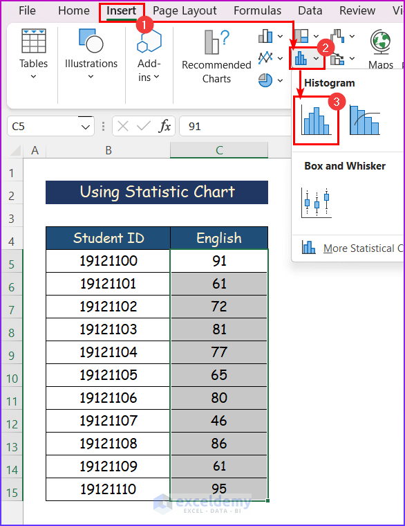
- Firstly, you have to select the data.
- Secondly, you have to go to the Insert tab.
- Thirdly, from the Charts group section, you have to select the Insert Statistic Chart and then select Histogram.
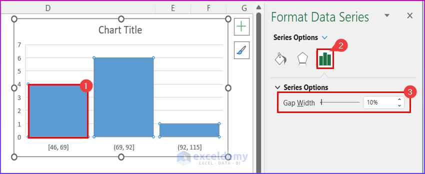
- After that, a Histogram will appear, and double-click on the rectangle. So, a new window named Format Data Series will appear beside the worksheet.
- Increase the Gap Width according to your preference from the Series Option.
- Again, double-click on the bins values, and a new window named Format Axis will appear beside the worksheet.
- Then, from the Axis Options, change the Bin width according to your choice.
- Also, you may change the Overflow bin and Underflow bin.

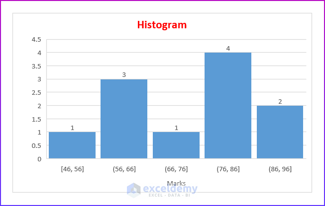
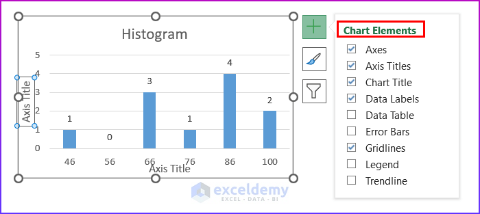
- Now, click on the Histogram. From the Chart Elements select the mentioned items.

- Lastly, you will get your desired Histogram.
2. Applying Data Analysis Toolpak for Plotting Histogram
Data Analysis Toolpak is one of the best features of Excel when we need to do advanced statistical analysis. In this section, I will show you the quick and easy steps to make a Histogram in Excel using Data Analysis ToolPak.
Steps:
- At first, press ALT + F + T or select File >> Options. Then go to the Add-ins tab and click on Go beside Manage: Excel Add-ins.
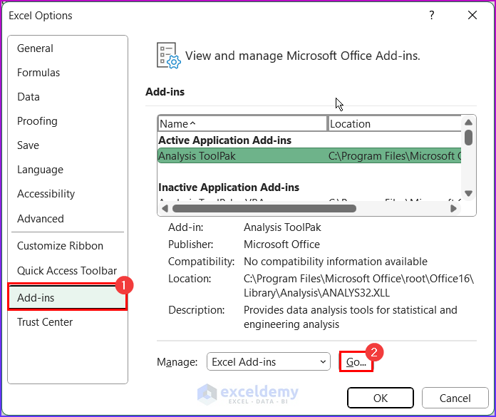
- Next, check the Analysis ToolPak checkbox and click OK. After that, you will be able to access the Data Analysis tool.

- Lastly, you will see that there is a new ribbon named Data Analysis under the Data tab, and click on the Data Analysis command.

- Now, select Histogram and then click on OK from the dialog box.

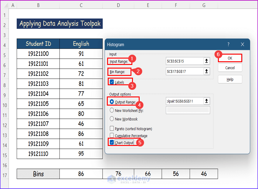
- Here, select the data range for which you want to create a Histogram in the box named Input Range. Here, I have selected C5:C15 as the Input Range which contains the marks of English.
- Then, select the Bin Range of the Histogram. In this part, I have selected cells C17:G17 as the Bin Range.
- Then, you have to assign a cell as the Output Range where the output chart and frequency table will be created. Hence, I have selected the cells F5:G11.
- After that, mark the checkbox called Chart Output.
- Now, click on OK.
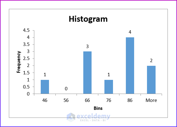
- Finally, you will see the Histogram along with a Bin and Frequency table as follows. However, the Histogram can be changed to make it look better than the Chart Elements as mentioned in the previous method.

- However, the final Histogram will be like the following picture.
3. Using FREQUENCY Function to Plot Histogram
In this part, you will find a way to create a Histogram using the FREQUENCY function. In essence, I’ll use the FREQUENCY function to get the frequencies, and then I’ll draw a simple bar graph to generate the Histogram. Hence, follow the steps below to create a Histogram in Excel with Bins using the FREQUENCY function.
Steps:
- Firstly, enter the following formula in cell F6. This will return the frequency of data according to the chosen bins.
=FREQUENCY(C5:C15,E6:E11)

Formula Breakdown
- In this formula, the FREQUENCY function will count how many times a value comes within a given interval.
- Here, C5:C15 is the data array.
- F6:F11 is the Bins array.
- Furthermore, you will get the frequency for more than the value of F11 also.
- Next, apply the AutoFill tool to apply the function for all the bins.

- Then select the whole Frequency column and go to the Insert tab.
- After that, choose 2-D Column Graph from the charts group of commands.

- Now, select the chart.
- Then, from the Chart Design tab, go to the Select Data feature.

- A dialog box will be generated. Hence, choose the Edit option.

- Here, change the series name to English and press OK.

- Similarly, you should click on the Edit option to change the Axis Labels.

- After that, select the Axis label range and click OK.

- After this, press OK on the Select Data Source box.

- Now, click on the Histogram. From the Chart Elements select the mentioned items.
- Lastly, you will get the Histogram in the image below.
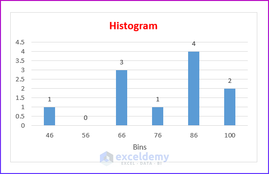
Read More: How to Make a Stacked Histogram in Excel
4. Utilizing COUNTIF and COUNTIFS Functions
Moreover, you can use the COUNTIF and COUNTIFS functions to create a Histogram. Actually, you have to find out the frequencies with the COUNTIF function and then plot a simple bar graph to create the Histogram. Hence, follow the steps below to complete the operation smoothly.
Steps:
- Firstly, enter the following formula in cell F5. This will return the frequency of data according to the chosen bins.
=COUNTIF($C$5:$C$15,"<=" &E5)
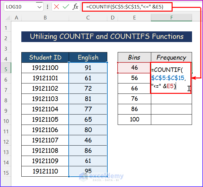
Formula Breakdown
- Here, the COUNTIF function will count those cells whose values fulfill a given condition.
- Firstly, $C$5:$C$15 is the range for the lookup array.
- Secondly, “<=” &E5 are the criteria, which means whether the cell values are less than or equal to the E5 cell value or not.
- Finally, the COUNTIF function will count those cells whose values are less than or equal to 46.
- Secondly, select another empty cell like F6 and write down the following formula in that cell. Moreover, apply the AutoFill tool to apply the function for all the bins.
=COUNTIFS($C$5:$C$15,">"&E5,$C$5:$C$15, "<="&E6)
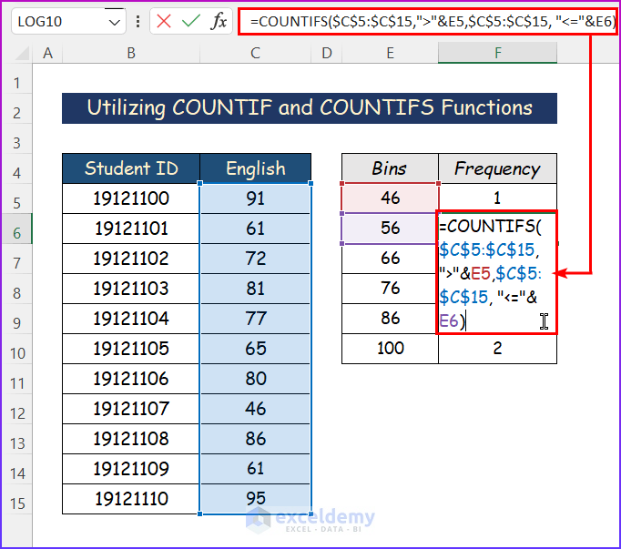
Formula Breakdown
- Here, the COUNTIFS function will count those cells whose values fulfill a set of conditions.
- Firstly, $C$5:$C$15 is the 1st range for the lookup array.
- Secondly, “>”&E5 are the 1st criteria. Which means whether the cell values are greater than the E5 cell value or not.
- Thirdly, $C$5:$C$15 is the 2nd range for another lookup array.
- Fourthly, “<=”&E6 are the 2nd criteria, which means whether the cell values are less than or equal to the E6 cell value or not.
- Finally, the COUNTIFS function will count those cells whose values are between 47 and 56.
- Now select the complete Frequency column and then go to the Insert tab.
- Similarly, choose 2-D Column Graph from the charts group of commands.

- After that, select the chart.
- Hence, go to the Select Data feature from the Chart Design tab.

- After all, choose the Edit option from the dialog box.
- In this part, change the series name to English and press OK.
- Again, you have to click on the Edit option to change the Axis Labels.
- After this, select the Axis label range and click OK.
- Finally, click OK on the Select Data Source box.
- Now, from the Chart Elements select the mentioned items after clicking on the Histogram.
- Lastly, you will get your desired Histogram in the following image.
5. Using PivotChart to Create Histogram
Alternatively, you can insert a PivotChart to modify it to a Histogram. Moreover, a pivot table is one of the quickest ways to automatically summarize data in Excel. However, follow the steps below in order to create a Histogram by using a PivotChart.
Steps:
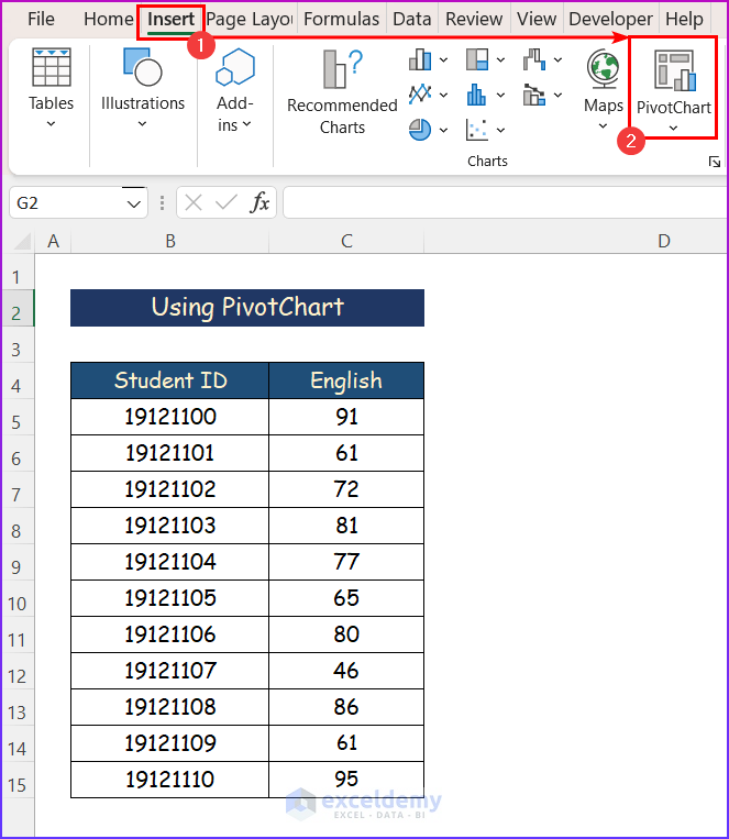
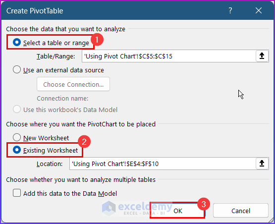
- Firstly, select the English scores (C5:C15) and go to the Insert tab.
- Now, click on PivotChart.
- Furthermore, enter the location for the PivotChart and click OK. This will insert a PivotChart along with a PivotTable.
- Next, drag the English field to the Axis and Values areas.

- After that, click on Count of English in the Values area and go to the Value Field Settings.

- In this part, change the type of calculation to Count and click OK.

- A PivotChart will be generated.

- After that, right-click on any cell from the Row Labels in the Pivot Table and select Group.

- Next, uncheck the ‘Starting at’ and ‘Ending at’ checkboxes, enter 46 and 100 in the respective text boxes beside them, then enter 10 in the text box below them to group By 10 and, then click OK.

- Finally, you will get the desired PivotChart. You can do some changes to the Histogram mentioned in the first method similarly.

Download Practice Workbook
You can download the workbook used for the demonstration from the download link below.
Conclusion
These are all the steps you can follow to plot a histogram in Excel. Hopefully, you can now easily create the needed adjustments. I sincerely hope you learned something and enjoyed this guide. Please let us know in the comments section below if you have any queries or recommendations.
Related Articles
- How to Make a Histogram in Excel with Two Sets of Data
- Difference Between Excel Histogram and Bar Graph
- What Is Bin Range in Excel Histogram?
- How to Change Bin Range in Excel Histogram
- [Fixed!] Excel Histogram Bin Range Not Working
<< Go Back to Excel Histogram | Excel Charts | Learn Excel
Get FREE Advanced Excel Exercises with Solutions!
