What Is a Histogram with Bins?
A histogram is a graphical representation of data divided into different groups to show each group’s frequency of data points. It looks like the column chart in Excel. All data points are divided into several groups or ranges called Bins. These bins are plotted along the horizontal axis. On the other hand, the frequencies of data corresponding to each bin are plotted along the vertical axis.
Assume you have the sales data of some sales reps of a certain organization. The sales quantity may vary from 0 to 500. Now, you can divide this range into groups like 0-100, 101-200, 201-300, 301-400, and so on. This way, you can quickly get an overview of the business’s performance and the number of sales reps appearing in those groups. A histogram does that successfully.

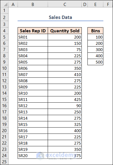
We have Sales Data for a particular organization. This dataset includes the “Sales Rep ID” and “Quantity Sold” under columns B and C. We also have the number of “Bins” available on the right side of our dataset.
Method 1 – Create a Histogram Using a Statistic Chart in Excel (for 2016 and Later Versions)
Steps:
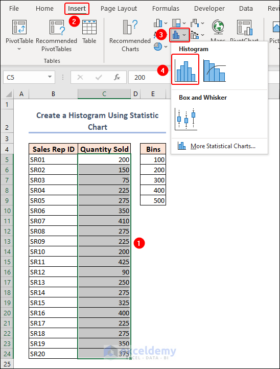
- Select the sales quantity in the C5:C24 range and then go to Insert >> Insert Statistic Chart >> Histogram.
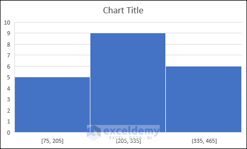
- The following histogram will be generated. Excel recognizes the statistical data range and gives us 3 sets by default.
- You need to modify the histogram to make it look as required.
- Double-click on the chart title to rename it as required.
- Click on the vertical axis and press delete if it is not required. You can also remove the chart gridlines using the chart element menu in the upper-right corner of the chart or from the chart design tab.
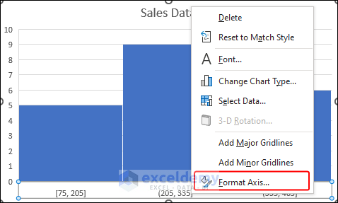
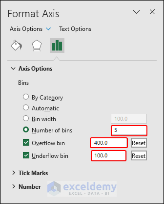
- Right-click on the horizontal axis and select Format Axis.
- Park the radio button for the Number of bins and enter 5 in the text box.
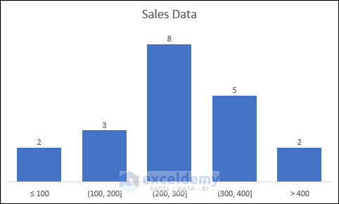
- Check the Overflow bin and Underflow bin checkboxes and enter 400 and 100 in the text boxes.
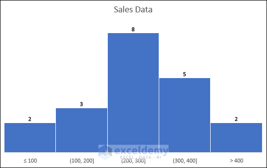
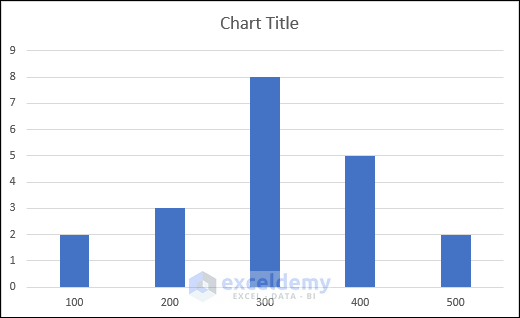
- The histogram will look as follows.
Method 2 – Create a Histogram Chart Using the FREQUENCY Function
Steps:
- Enter the following formula in cell F5. This will return the frequency of data according to the bins.
=FREQUENCY(C5:C24,E5:E9)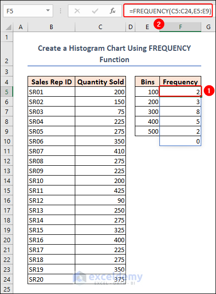
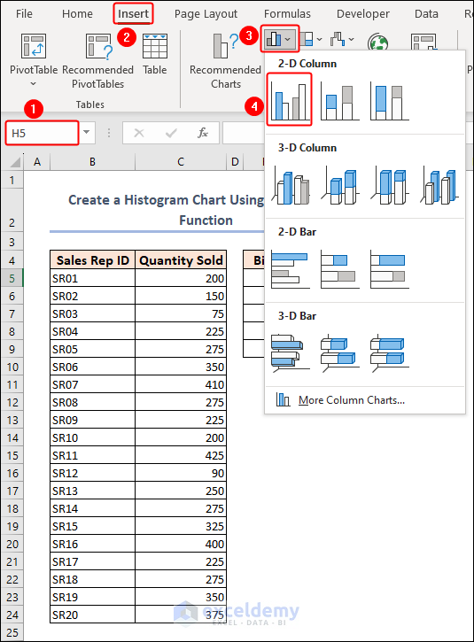
- Click on an empty cell and select Insert >> Insert Column or Bar Chart >> 2-D Clustered Column. This will insert a blank chart.
- Right-click on the blank chart and click on the Select Data option from the context menu.
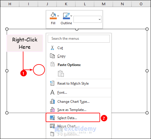
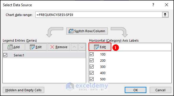
- Select the frequency range (F5:F9) and click Edit below the Horizontal (Category) Axis Labels.
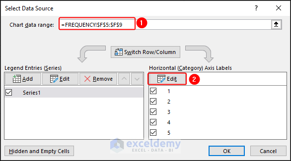
- Select the Bins range (E5:E9) and click OK.
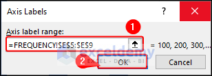
- You will see the Bins values in the Horizontal Axis Labels. Now click OK to update the column chart.
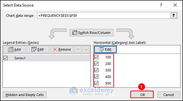
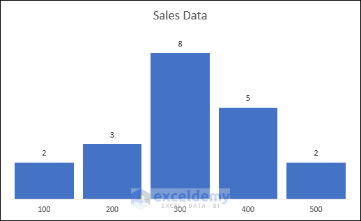
- The chart will look as follows.
- You can change the chart title, remove the vertical axis, add data labels, and remove the chart gridlines to get a similar result as earlier.
Read More: How to Make a Stacked Histogram in Excel
Method 3 – Create a Histogram Using the COUNTIFS Function
Steps:
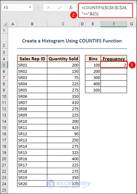
- Enter the following formula in cell F5:
=COUNTIFS($C$5:$C$24,"<="&E5)$C$5:$C$24: This is the range of cells being evaluated.
“<=”&E5: This is the criteria being used to count the number of cells. The less than or equal to operator (“<=“) is concatenated with the value in cell E5 using the “&” operator.
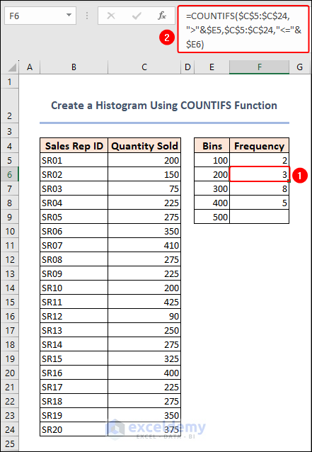
- The formula for bins, except the last one, is the following. Below is what we used in cell F6.
=COUNTIFS($C$5:$C$24,">"&$E5,$C$5:$C$24,"<="&$E6)For the remaining cells, use the Fill Handle to get results.
- Enter the following formula in cell F9:
=COUNTIFS($C$5:$C$24,">"&E8)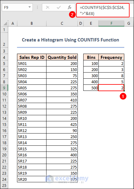
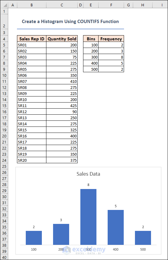
- We completed calculating the frequency for all bins. Now, plot them in a column chart just like the previous method. The result is before our eyes.
Method 4 – Create a Histogram Chart Using a PivotChart in Excel
Steps:
- Select the sales quantity (C5:C24) and go to Insert >> PivotChart as shown below.
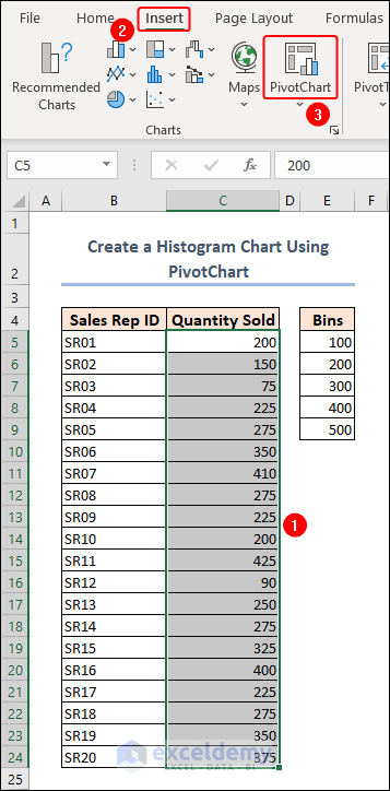
- The header row automatically selects the whole range.
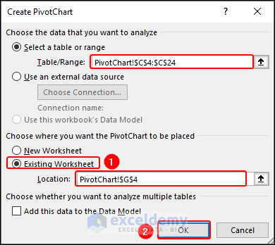
- Enter the location for the PivotChart and click OK. This will insert a PivotChart along with a PivotTable.
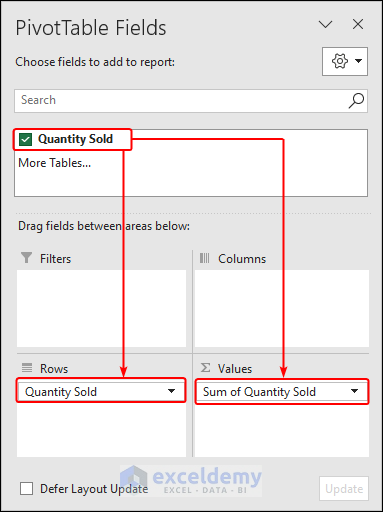
- Drag the Quantity Sold field to the Rows and Values areas.
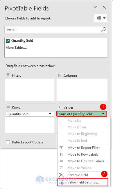
- Click on Sum of Quantity Sold in the Values area and go to the Value Field Settings.
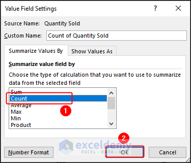
- Change the type of calculation to Count and click OK.
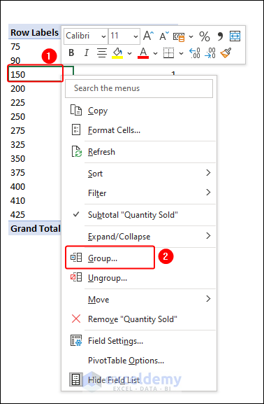
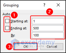
- Right-click on any cell from the Row Labels in the PivotTable and select Group.
- Uncheck the ‘Starting at’ and ‘Ending at’ checkboxes, enter 1 and 500 in the respective text boxes beside them, then enter 100 in the text box below them to group By 100 and, then click OK.
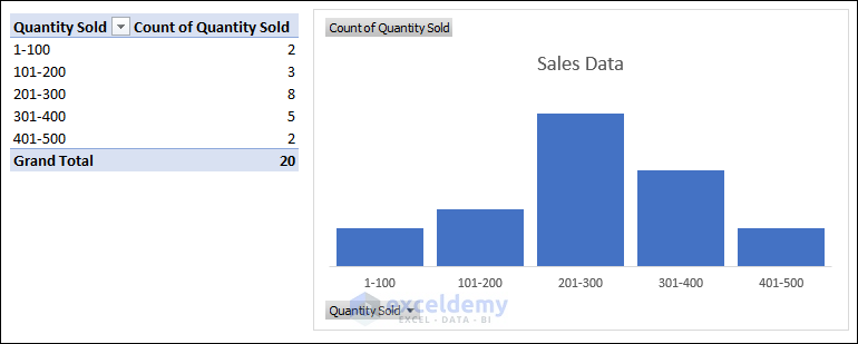
- The PivotTable and the PivotChart will look as follows.
Method 5 – Create a Histogram with a Data Analysis Tool in Excel (Available from 2013 Version)
Steps:
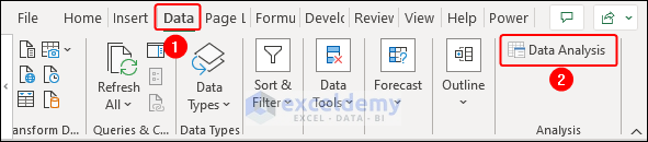
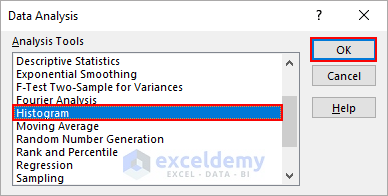
- Select Data >> Data Analysis, as shown below.
Enable Data Analysis ToolPak:
If you don’t find the Data Analysis tool in the Data tab, then you can enable it by following the steps below.
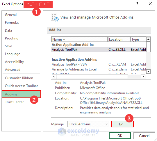
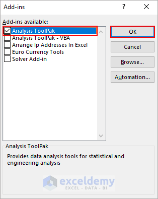
- Press ALT + F + T or select File >> Options.
- Go to the Add-ins tab and click on Go beside Manage: Excel Add-ins.
- Check the Analysis ToolPak checkbox and click OK. You can access the Data Analysis tool.
- Select Histogram and click OK.
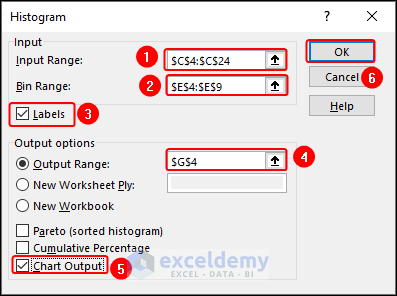
- Select the range C4:C24 as the Input Range, and the range E4:E9 as the Bin Range, check the Labels checkbox, enter the Output Range, select the Chart Output checkbox, and click OK.
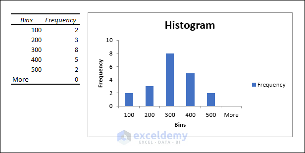
- You will see the histogram along with a Bin and Frequency table as follows. You can modify the histogram to make it more presentable as looked at earlier.
How to Customize a Histogram in Excel
You can change the chart type, color scheme, axis labels, and other formatting options to suit your needs. You can also add additional data series, adjust the bin size, and modify the chart layout. Excel provides many customization options to create a professional-looking histogram that effectively communicates your data.
How to Customize Axis Labels on Histogram Chart
Steps:
- Open the Select Data Source dialog box as we did in Method 2.
- Click on the Edit button under the Horizontal (Category) Axis Labels.
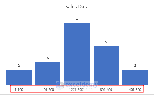
- To specify which labels should be displayed on the Axis, input them in the Axis label range box and separate them using commas. If you need to enter intervals, enclose them in double quotes and click OK, as shown in the screenshot.
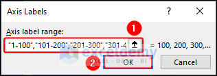
- You can see the outcome right in front of you.
How to Customize Bin Size
Steps:
- Open the Format Axis task pane as we have shown before.
- Change the Bin width to the number you want. In this case, we converted it to 50.
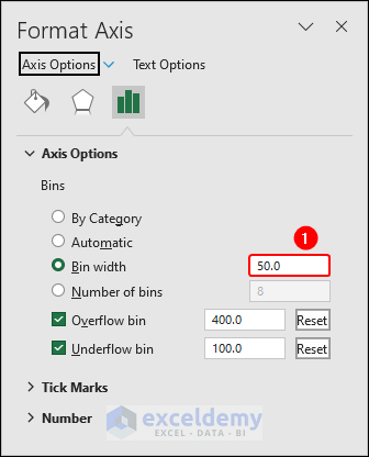
- The histogram looks like the following now.
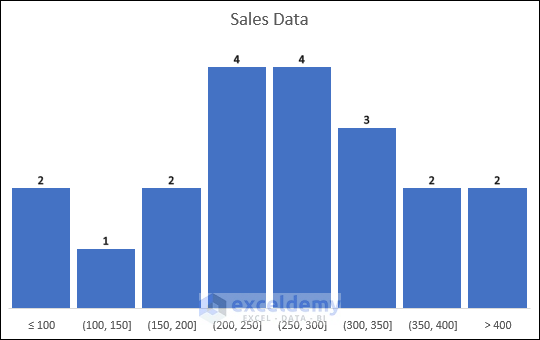
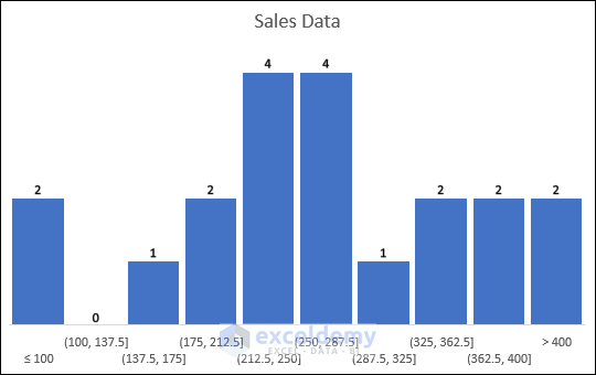
How to Adjust the Number of Bins
Steps:
- Open the Format Axis task pane and write your desired number in the Number of bins box. We wrote 10 in it.
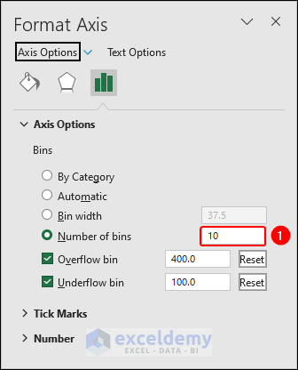
- The chart is like the one below.
How to Modify Gaps Between Bars
Steps:
- Right-click on any column in the chart and select Format Data Series from the context menu.
- Change the Gap Width on the dialog box.
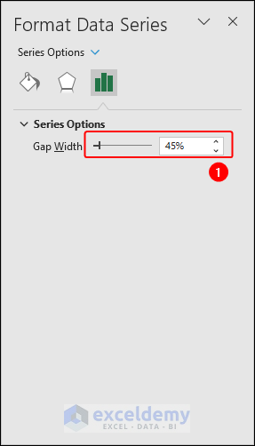
- And see the magic.
How to Make a Histogram in Excel with Two Sets of Data
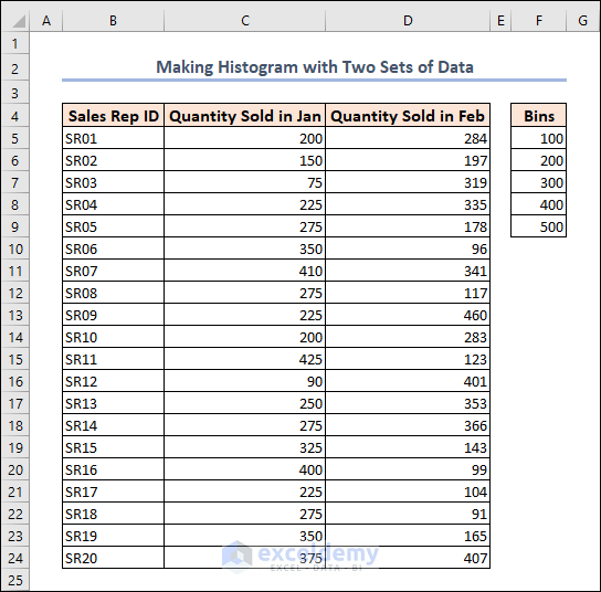
We have sales data for two months for the same sales reps of a certain organization. You have “Quantity Sold in Jan” and “Quantity Sold in Feb” under columns C and D.
Steps:
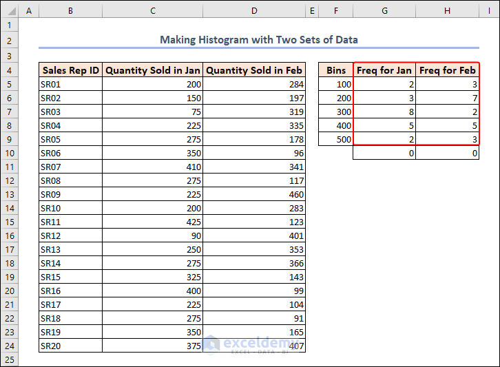
- Apply the FREQUENCY function to calculate the frequency for both Jan and Feb.
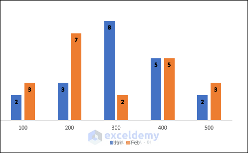
- Plot a chart as we did in Method 2 and it’ll look like the one below.
Things to Remember
- Insert Statistic Chart option is available in Excel 2016 and later versions.
- You must enable the Data Analysis ToolPak add-in to access the Data Analysis tool.
- Adjust the vertical axis scale if necessary to better display the data.
- The Number of bins you choose can affect the shape and readability of the histogram, so consider experimenting with different bin sizes to find the best fit for your data.
Download the Practice Workbook
You can download the workbook to practice.
Related Articles
- Difference Between Excel Histogram and Bar Graph
- What Is Bin Range in Excel Histogram?
- How to Create a Bin Range in Excel
- How to Change Bin Range in Excel Histogram
- [Fixed!] Excel Histogram Bin Range Not Working
<< Go Back to Excel Histogram | Excel Charts | Learn Excel
Get FREE Advanced Excel Exercises with Solutions!
