What Is Excel Histogram?
A Histogram is a graph that shows how often different values occur in a dataset. It divides the data into equal-sized groups (called bins) and counts how many data points fall into each bin. The taller the bar, the more data points are in that group. Histograms are useful for understanding the overall shape and distribution of your data.
How to Create Histogram in Excel
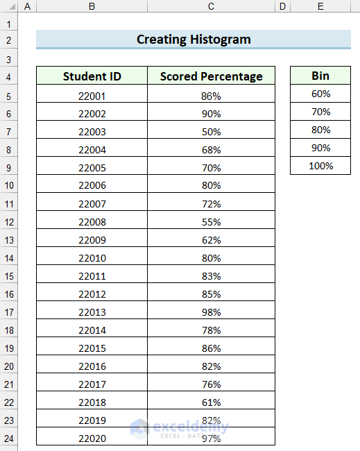
Using the following sample dataset, we will create a Histogram to represent the number of students who have Scored Percentages between specific intervals.
Steps:
Set up the Analysis ToolPak.
- Go to the File tab.
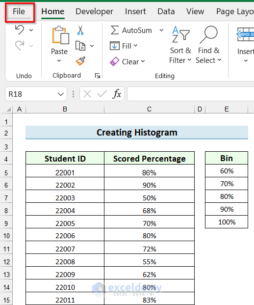
- Select Options.
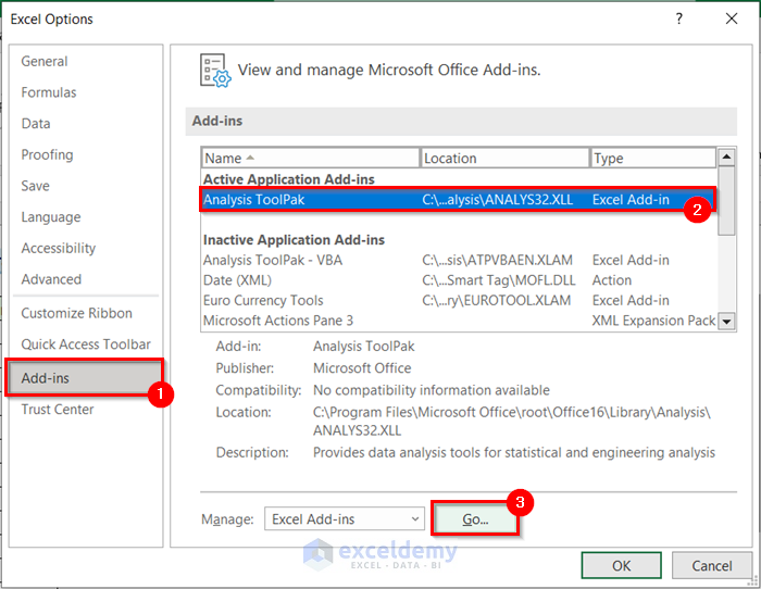
- In the Excel Options dialog box, go to the Add-ins tab.
- Select Analysis ToolPak.
- Select Go.
- In the Add-ins pop-up box, check Analysis ToolPak.
- Select OK.
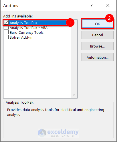
The Analysis ToolPak will be added to your Excel.
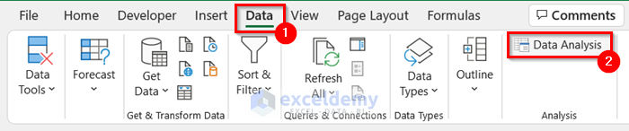
- Go to the Data tab.
- Select Data Analysis.
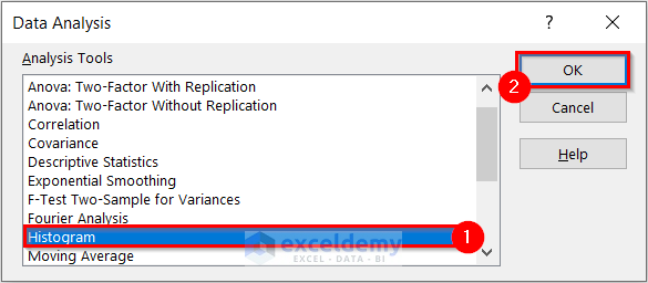
- In the Data Analysis dialog box, select Histogram.
- Select OK.
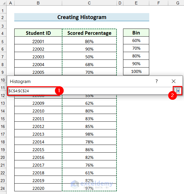
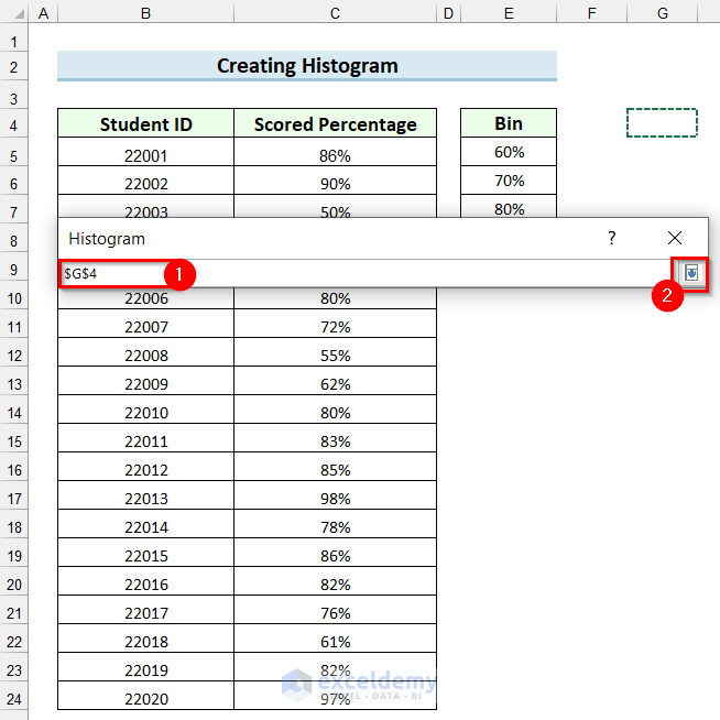
- In the Histogram dialog box, select the marked button to select the Input Range.
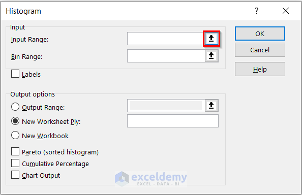
- Select the cell range.
- Click on the marked button to add the Input Range.
The Input Range will be added to your Histogram dialog box.
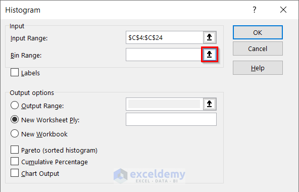
- Select the cell range.
- Click on the marked button to add the selected range to your Histogram.
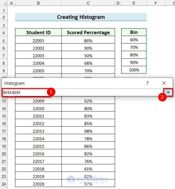
You will see the Bin Range is added to your Histogram dialog box.
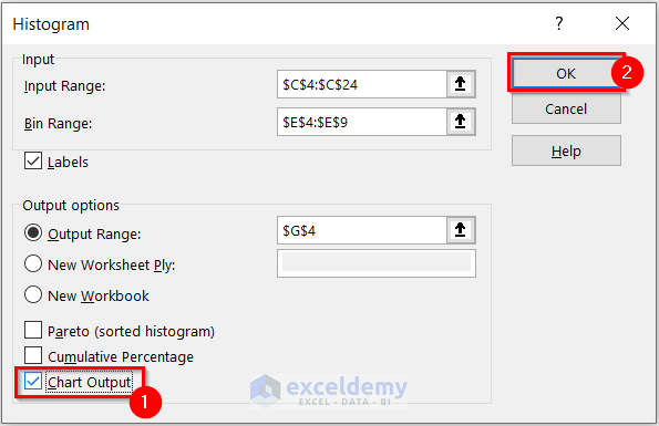
- Select Labels.
- Select Output Range.
- Click on the marked button to select the Output Range.
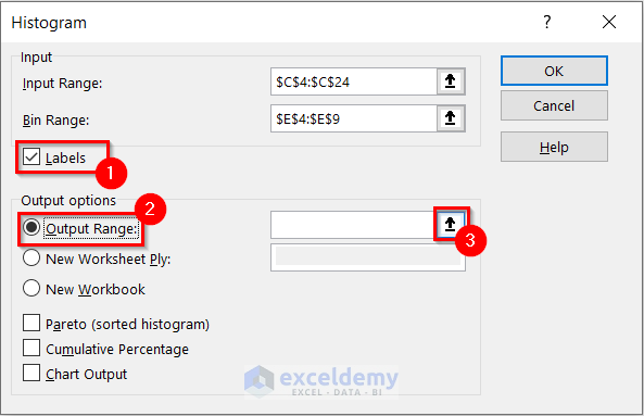
- Select the cell from where you want your Output Range to start.
- Click on the marked button to add the Output Range to your Histogram.
You will see the Output Range is added to your Histogram.
- Check the Chart Output option.
- Select OK.
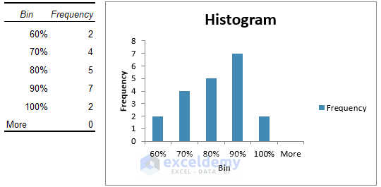
It will create a Histogram for the dataset.
To format the Histogram,
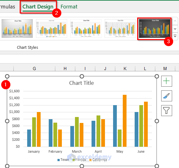
- Select the Histogram.
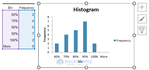
- Go to the Chart Design tab.
- Select your desired Style from the Chart Styles We have selected the marked style.
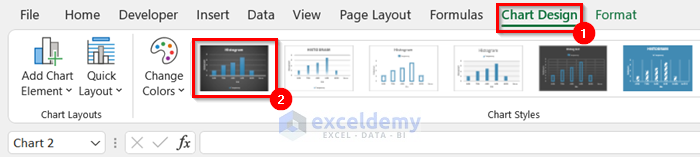
The chart will change to the selected Chart Style.
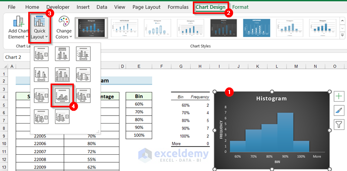
To change the Layout of the Histogram,
- Select the Histogram.
- Go to the Chart Design tab.
- Select Quick Layout.
A drop-down menu will appear.
- Select the Layout you want for your Histogram. We have selected the marked layout.
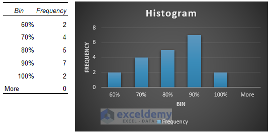
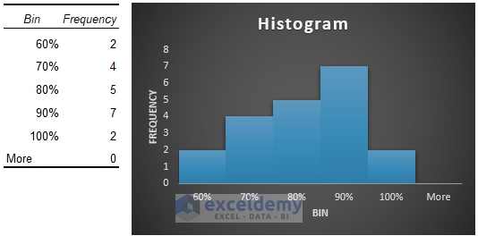
In the following image, you can see the final Histogram.
Read More: How to Create a Histogram in Excel with Bins
Pros and Cons Histogram in Excel
Pros of Excel Histogram
- You can represent a large set of data in a Histogram which will seem crowded in other forms of graphs.
- A Histogram shows the frequency of an occurring event in specific intervals.
- It helps to predict something depending on the frequency.
- You can also use it to calculate the capacity of a process.
Cons of Histogram in Excel
- In a Histogram, you will not be able to read the exact values because the data is grouped in intervals.
- You can use Histograms only for data that has continuity.
- It is hard to compare two sets of data using a Histogram.
What Is Bar Graph in Excel?
A Bar Graph is used to compare values across different categories. Most often it is used to emphasize changes over time or for comparison of items or categories.
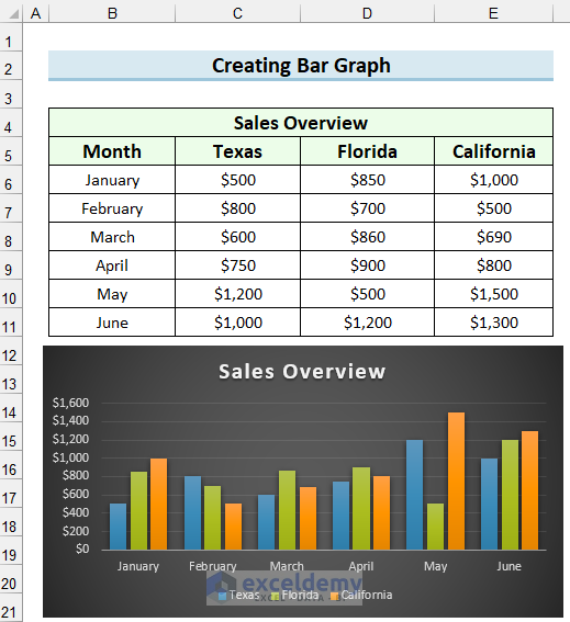
Creating a Bar Graph in Excel
We will illustrate the steps to create a Bar Graph using the following sample dataset.
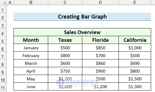
Steps:
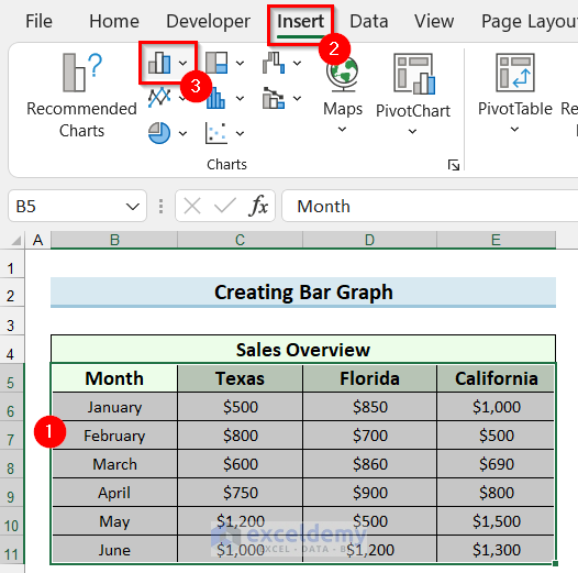
- Select the data range for the Bar Graph.
- Go to the Insert tab.
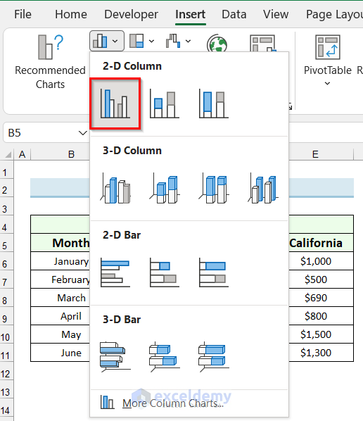
- Select Insert Column or Bar Chart.
- In the drop-down menu, select the graph type you want. We have selected the Clustered Column.
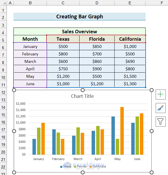
A Bar Graph will be inserted into your Excel sheet.
To format the inserted graph,
- Select the graph.
- Go to the Chart Design tab.
- Select your desired Chart Style. We have selected the marked Chart Style.
You can see that the Chart Style has been changed to the selected style.
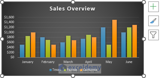
The following image is the final Bar Graph.
Pros and Cons of Bar Graph
Pros of Bar Graph in Excel
- You can use both numerical and categorical data for Bar Graphs.
- You can summarize a large set of data in a Bar Graph.
- It will help you to see close numbers.
- A Bar Graph helps you to evaluate values at a glance.
Cons of Bar Graph in Excel
- It only displays what is on the dataset.
- You will need to add an explanation with the Bar Graph.
- A Bar Graph cannot display causes, effects, or patterns.
Difference Between Excel Histogram and Bar Graph
If you want to see a specific category/item in comparison to another set of categories/items, you will need to use a Bar Graph. If you are looking at the number of times data points fall within a certain range, then use a Histogram.
The way the data is set up will also give a clue as to which options one should use, Histograms have the data points in one column and the bin ranges or intervals in the column next to the data points column. Bar Graphs will not have interval ranges in the source data.
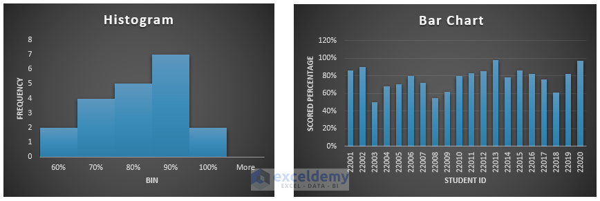
In the following sample dataset, it contains the Scored Percentage of 20 students. We will create a Histogram and a Bar Graph for this dataset to show the difference.
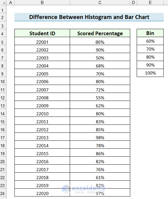
In the following image, we have created a Histogram and a Bar Graph for this dataset. The Histogram shows how many students have scored a certain Percentage and the Bar Graph shows the Percentage obtained by the students.
There are several key differences between Excel Histogram and Bar Graph. Histograms provide quantitative analysis and the data points are grouped into set intervals, while Bar Graphs are used to make comparisons across categories.
The below table shows the detailed difference between the Bar Graph and Histogram.
| Histogram | Bar Graph |
|---|---|
| 1. Graphical evaluation of data which represents data with bars to show the frequency of the numerical data. | 1. Represents data in bars for comparing different categories of data. |
| 2. The variables are non-discrete in the distribution. | 2. The variables are discrete. |
| 3. The bars have no spaces between them. | 3. The bars have spaces between them. |
| 4. Presents quantitative data. | 4. It presents numerical data. |
| 5. Elements are considered as ranges. | 5. Each and every element is taken as an individual unit. |
| 6. The width of the bars doesn’t need to be the same. | 6. The width of the bars needs to be the same. |
| 7. It’s not possible to re-arrange the data once it is created. | 7. You can re-arrange the blocks. |
Download Practice Workbook
Related Articles
- How to Make a Histogram in Excel with Two Sets of Data
- How to Make a Stacked Histogram in Excel
- How to Change Bin Range in Excel Histogram
- [Fixed!] Excel Histogram Bin Range Not Working
- How to Make a Histogram in Excel Using Data Analysis
<< Go Back to Excel Histogram | Excel Charts | Learn Excel
Get FREE Advanced Excel Exercises with Solutions!
