Method 1 – Prepare Dataset
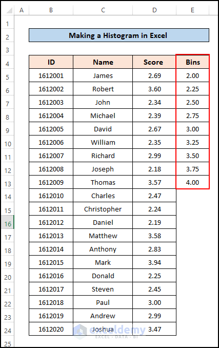
- We created a dataset with three columns. The first two are for student information, ID and Name, and the third one contains the students’ GPA scores. I will create a histogram for the GPA scores.
- We added another column to the dataset that is needed for the histogram. The range of bins which starts from 2 and ends at 4 with intervals of 0.25.
Method 2 – Enable Data Analysis ToolPak
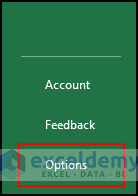
- Open an Excel Workbook and go to File tab >> Options.
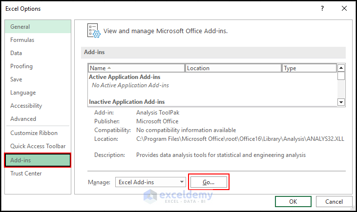
- A pop-up window named Excel Options will appear.
- Click on the Add-ins and select the “Go” button.
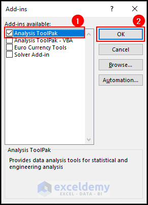
- Another new pop-up window will appear named “Add-ins”.
- Mark the box for “Analysis ToolPak” and press OK.
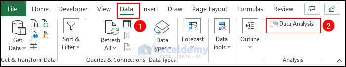
- Go to the Data tab in the top ribbon, you will see a menu named “Data Analysis” existing.
Method 3 – Go to the Histogram Feature in Data Analysis ToolPak
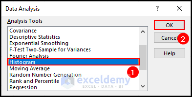
- A new pop-up window named Data Analysis will appear.
- C lick on the Histogram option in the Analysis Tools list and press OK.
Method 4 – Insert Input, Output, and Bin Range
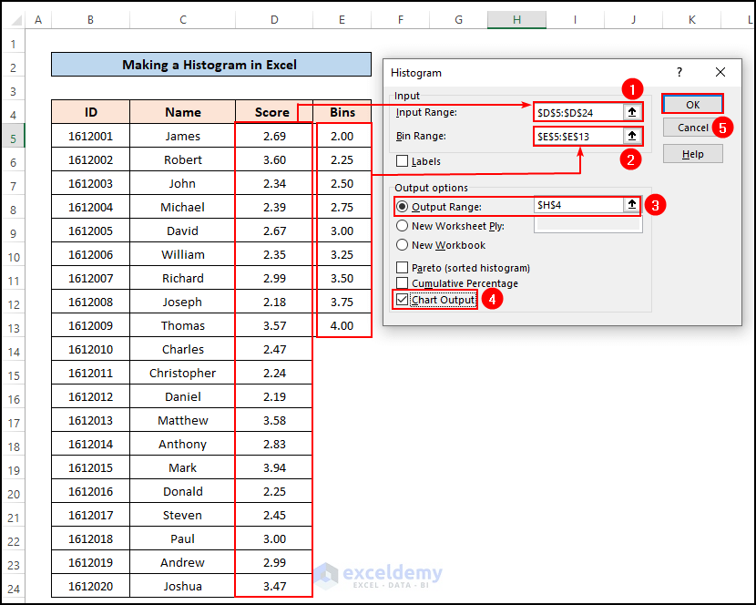
- Select the data range for which you want to create a histogram in the box named Input Range. We selected D5:D24 as the Input Range which contains the GPA scores of the students.
- Select the cell range containing the histogram’s bin values. We chose cell E5:E13 as the Bin Range.
- Assign a cell as the output range from which the output chart and frequency table will be created.
- Mark the checkbox saying “Chart Output” so, you will get the Histogram chart as output and press OK.
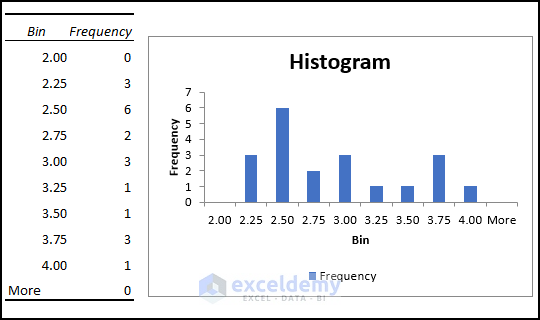
- See the frequency table according to the bin range and the histogram at the assigned position in the active worksheet.
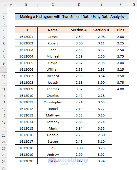
How to Make a Histogram in Excel with Two Sets of Data Using Data Analysis
- We created 2 sets of data that contain GPA scores for Section A and Section B
- The list of bins is in cell range F5:F13.
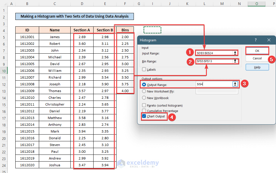
- Insert the input range as “D5:E24” and the bin range as “F5:F13”.
- Select a cell from where the output will show.
- Before, mark the checkbox of chart output and press OK.
- See that, in the histogram, there is no separation between the two sets of data, and Excel has merged the two datasets as shown in the histogram.
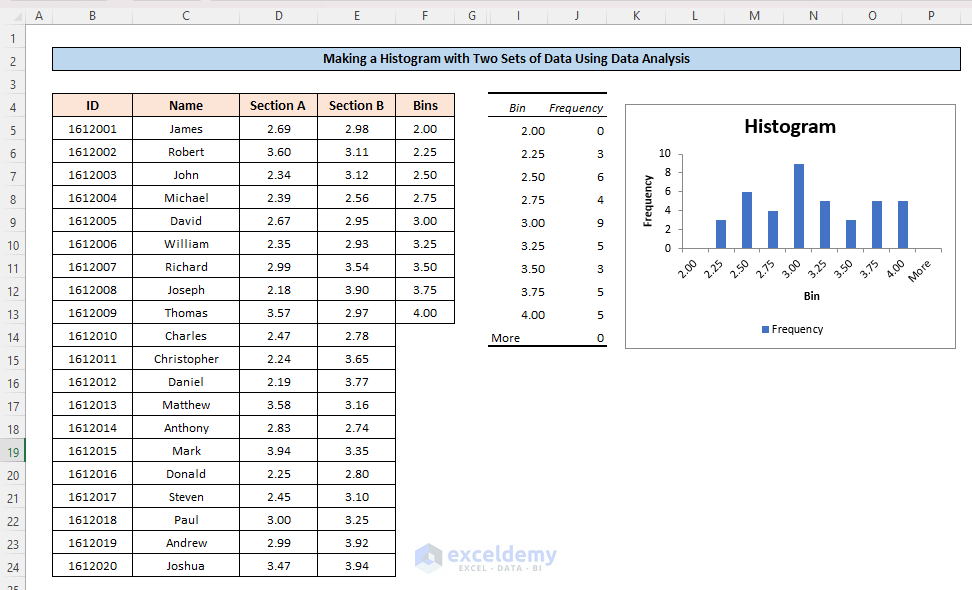
Create a histogram chart showing 2 sets of data individually then, you have to calculate the frequency of the dataset using the FREQUENCY function and then plot a histogram chart.
Download Practice Workbook
You can download the practice workbook from here:
Related Articles
- Difference Between Excel Histogram and Bar Graph
- How to Change Bin Range in Excel Histogram
- [Fixed!] Excel Histogram Bin Range Not Working
<< Go Back to Excel Histogram | Excel Charts | Learn Excel
Get FREE Advanced Excel Exercises with Solutions!
