In Excel, we often need to create Histograms to present a summary of our data. Bin Range is one of the essential components to define when making a histogram. The entire value range is simply divided into several intervals using a Bin Range. But when Excel’s Bin Range option goes haywire, it can be quite annoying. In this article, we will explore 3 possible solutions to fix this issue of Bin Range not working in Excel Histogram.
Excel Histogram Bin Range Not Working: 3 Solutions
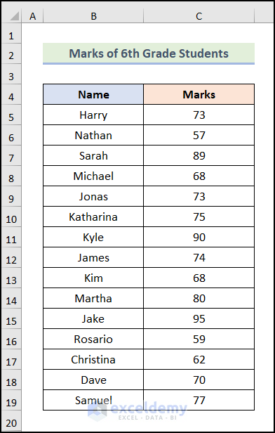
Let’s say we have Marks of 6th Grade Students of a school. In each solution, firstly, we will see a case where Bin Range is not working and later on we will learn the detailed steps to fix it.
Not to mention that we have used the Microsoft 365 version for this article, you can use any other version according to your convenience.
Solution 01: Using Format Axis Option from Default Histogram Chart
In the first solution, we will use the default Histogram chart option provided by Excel. Let’s follow the steps mentioned below.
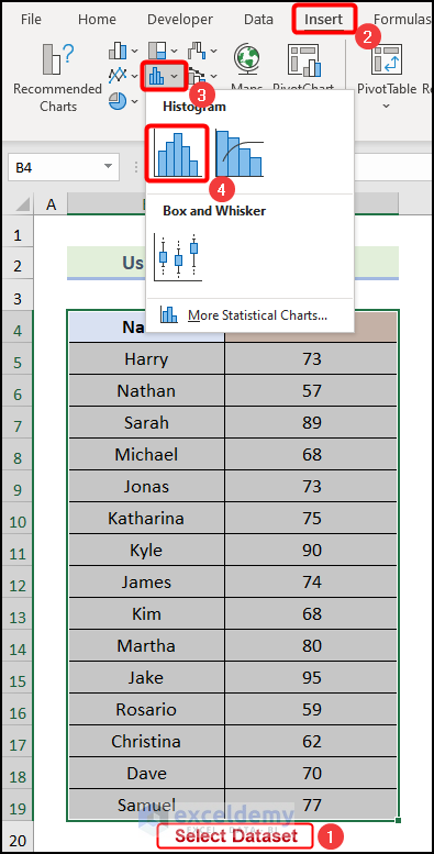
Steps 01: Insert Histogram Chart
- Firstly, select the entire dataset and go to the Insert tab from Ribbon.
- Following that, click on the Insert Statistic Chart option.
- Then, choose the Histogram option from the drop-down.
As a result, the following Histogram chart will be added to your worksheet.
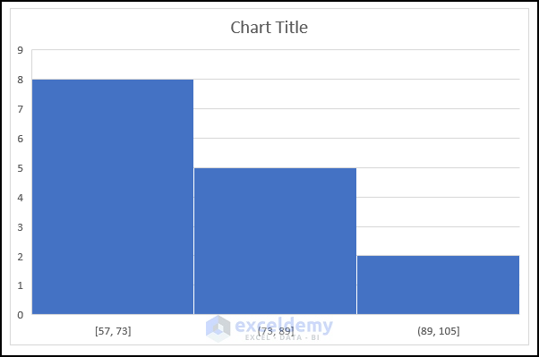
You can see that this Histogram doesn’t look well and that the Bin Ranges aren’t formatted correctly. Therefore, the Bin Ranges must be fixed. Let’s follow the methods below to resolve this problem.
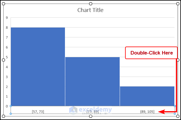
Step 02: Edit Horizontal Axis of Histogram Chart
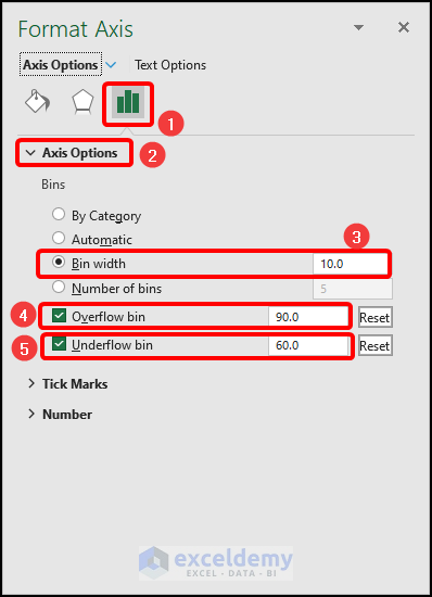
- Firstly, double-click on the Horizontal Axis of the Histogram chart as marked in the following image.
Subsequently, the Format Axis dialogue box will open on your worksheet.
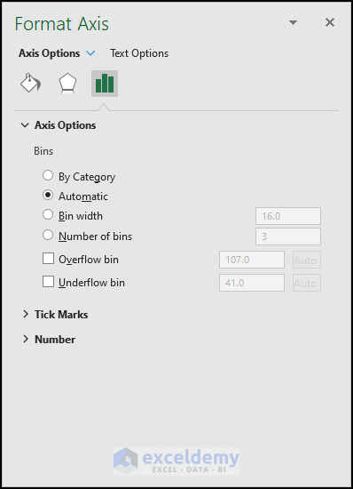
- Now, in the Format Axis dialogue box, go to the Axis Options tab.
- Following that, click on the field of Bin width and enter 10 in it.
- Then, check the field of the Overflow bin and enter 90 here.
- Next, check the field of the Underflow bin and enter 60 here.
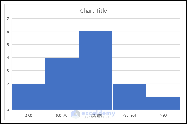
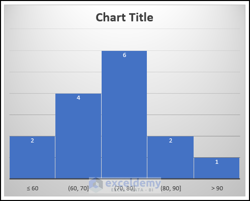
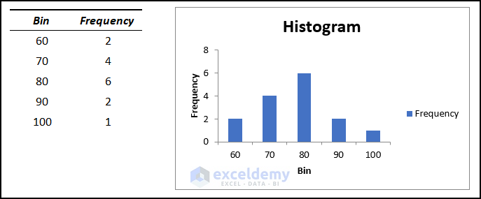
Consequently, your Histogram chart will be looking like the following image, which looks a lot better than the previous one.
Step 03: Format the Histogram Chart
- Firstly, click on the Chart Styles option as marked in the image below.
- Then, choose your preferred style from the drop-down.
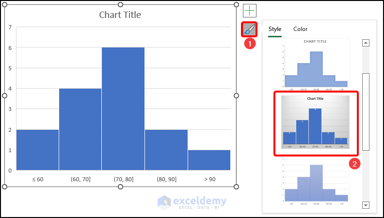
As a result, you will have your preferred Chart Style applied to your Histogram chart.
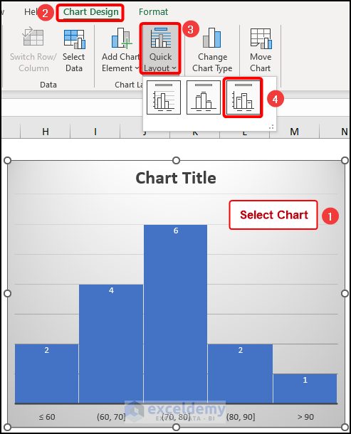
- Then, select your chart to activate the Chart Design tab in Ribbon.
- After that, go to the Chart Design tab.
- Subsequently, choose the Quick Layout option.
- Next, select the 3rd option from the drop-down as shown in the following image.
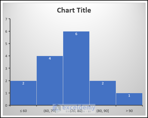
Consequently, you will have the following out like in the image below.
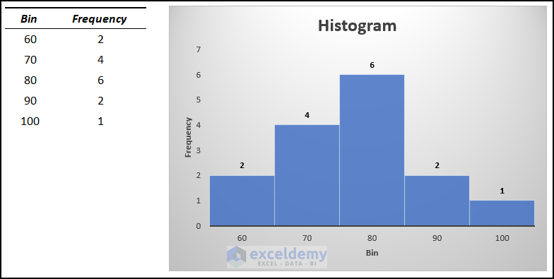
- Now, edit the Chart Title of the Histogram chart. Here, we have used Histogram as our Chart Title.
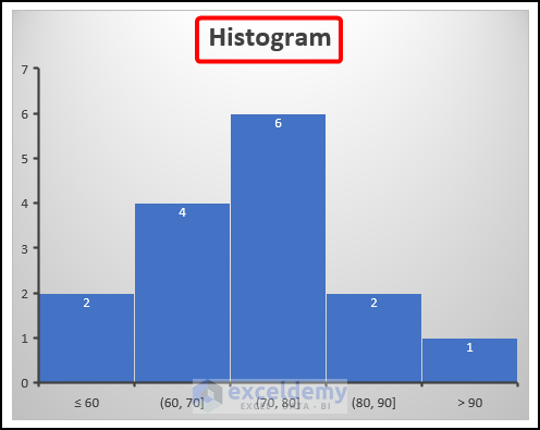
- Following that, click on the Chart Elements option.
- Then, check the field of Axis Titles as marked in the following picture.
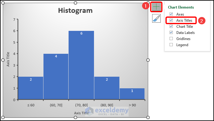
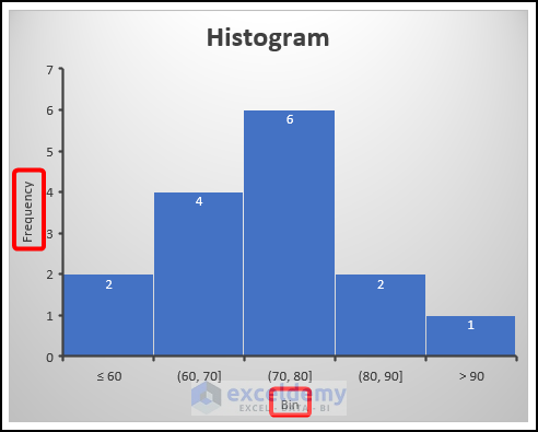
- After that, edit the Axis Titles. In this case, we used Frequency as our Vertical Axis Title and Bin as our Horizontal Axis Title.
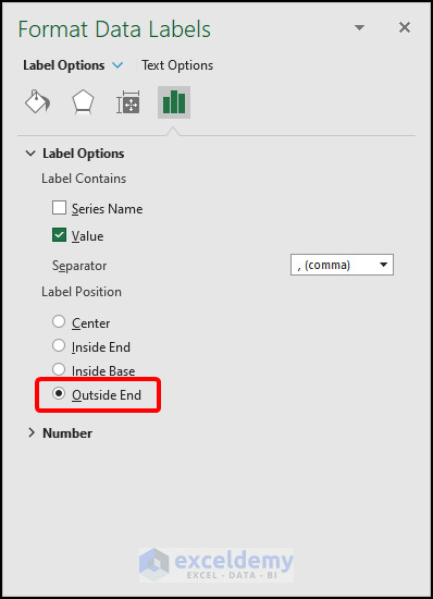
- Now, right-click on any of the Data Labels on the chart.
- Then, choose the Format Data Labels option.
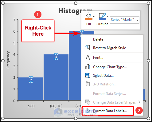
As a result, the Format Data Labels dialogue box will open on your worksheet as shown in the following image.
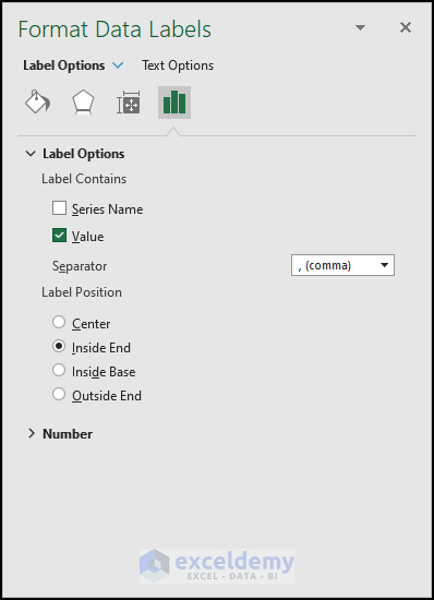
- Now, in the Format Data Labels dialogue box, choose the Outside End option.
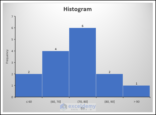
Consequently, you will have the following final output, as demonstrated in the following image.
Read More: How to Create a Histogram in Excel with Bins
Solution 02: Utilizing Pivot Chart Feature
In this section of the article, we will use the Pivot Chart feature of Excel to solve the same issue. Let’s follow the following procedure.
Steps:
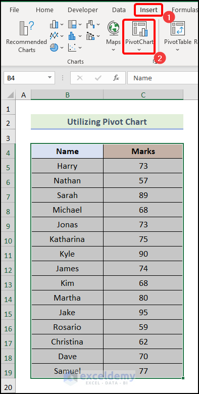
- Firstly, select your data and go to the Insert tab from the Ribbon.
- After that, choose the Pivot Chart option from the Charts group.
As a result, the Create PivotChart dialogue box will open on your worksheet.
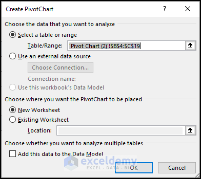
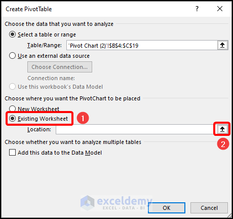
- Now, in the Create PivotChart dialogue box, choose the Existing Worksheet option.
- Following that, click on the marked icon in the image below to choose the Location.
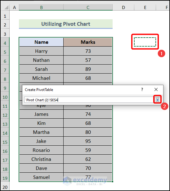
- Now, specify the location in the existing worksheet by selecting a cell. In this case, we chose cell E4.
- Then, click on the marked portion in the following picture.
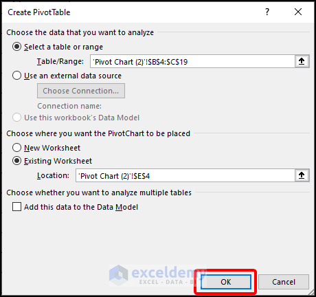
- As a result, you will be redirected to the Create PivotChart dialogue box and click on OK there.
Following that, the PivotChart Fields dialogue box will be visible.
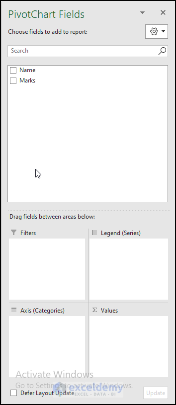
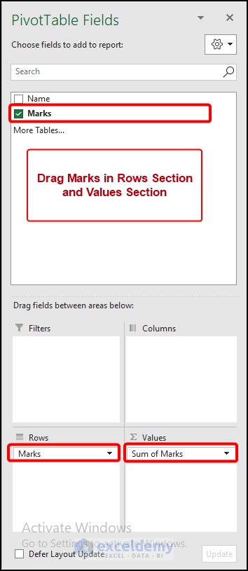
- After that, in the PivotTable Fields dialogue box, drag the Marks in the Rows section.
- Then, again drag the Marks in the Values section.
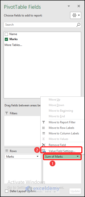
- Then, click on the Sum of Marks section as marked in the following image.
- Next, click on the Value Field Settings option.
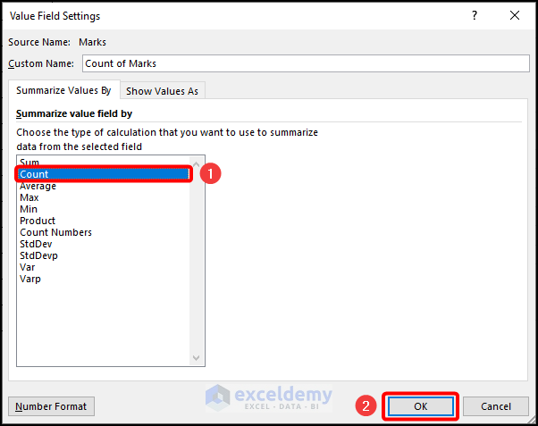
- After that, in the Value Field Settings dialogue box, choose the Count option.
- Then, click on OK.
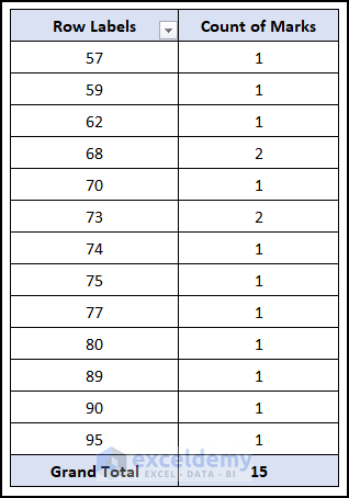
Subsequently, you will be able to see the following Pivot Table on your worksheet.
- Now right click on any cell of the Row Labels column.
- Then, choose the Group option.
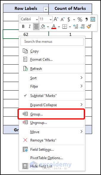
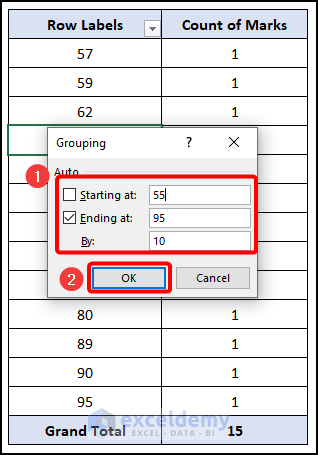
- Subsequently, in the Grouping dialogue box, enter the following values in the marked fields.
- Starting at → 55
- Ending at → 95
- By → 10
- Finally, click on OK.
Consequently, your dataset will be grouped and you will have the following Pivot Chart.
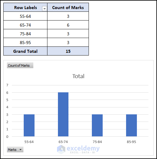
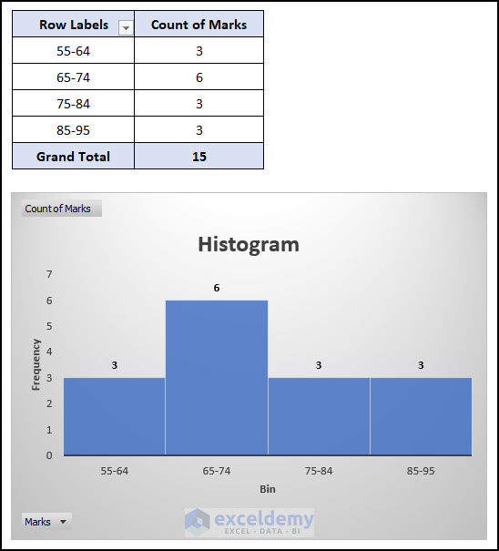
- At this stage, follow the steps mentioned in Step 03 of the 1st method to apply formatting to the chart and your chart will be looking like the image demonstrated below.
Solution 03: Editing Bin Range Selection in Analysis ToolPak Add-in
Now, we will learn another effective way to fix the issue of Bin Range not working in Excel. Here, we will use the Analysis ToolPak Add-in of Excel. Firstly, let’s see what kind of problem we face when the Bin Range is not working in Excel.
Steps:
In Excel, Analysis ToolPak Add-in is not available by default. We need to manually enable the Add-in in Excel.
- Firstly, you have to enable the Data Analysis ToolPak Add in.
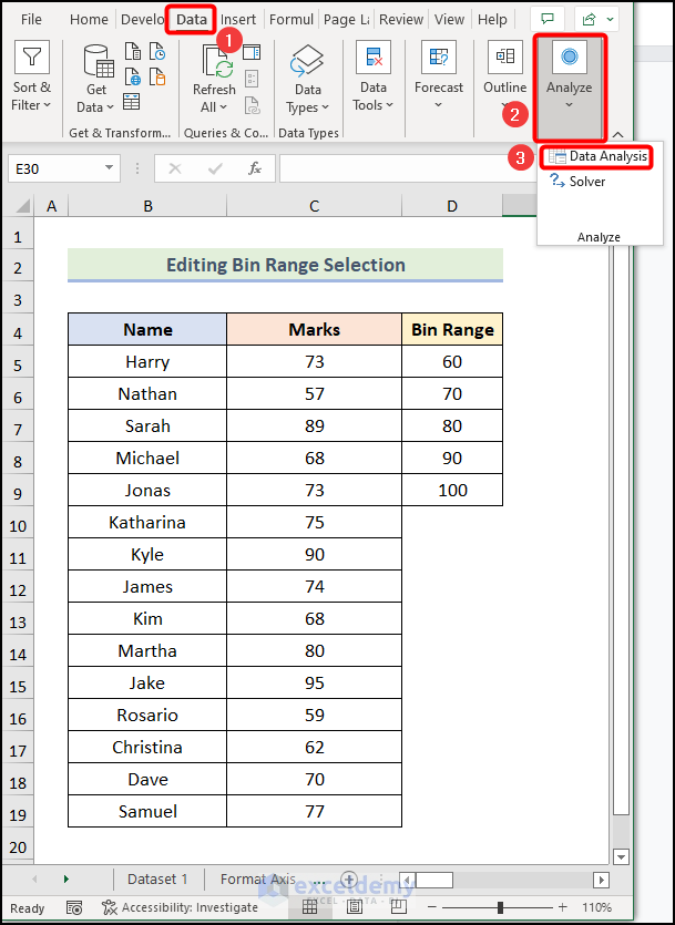
- After you have enabled the Add-in, go to the Data tab from Ribbon.
- Following that, click on the Analyze option.
- Then, choose the Data Analysis option from the drop-down.
As a result, the Data Analysis dialogue box will be visible on your worksheet.
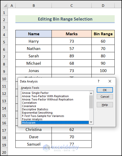
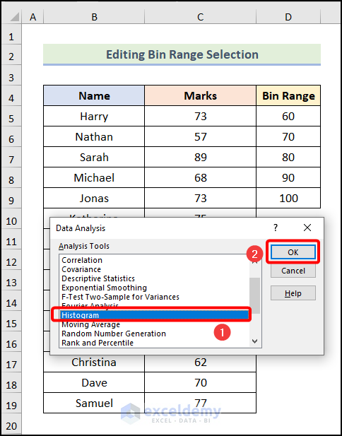
- Now, in the Data Analysis dialogue box, choose the Histogram option.
- Then, click on OK.
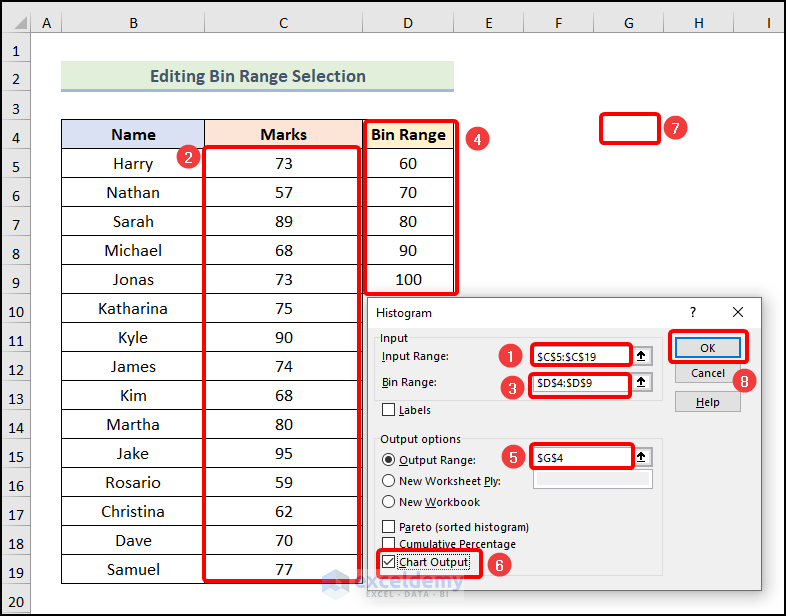
- After that, in the Histogram dialogue box, click on the Input Range field.
- Then, choose the range of inputs as marked in the following image.
- Now, click on the Bin Range field.
- Following that, select the range of cells in the column Bin Range as marked in the image below.
- After that, click on the Output Range field and select cell G4. You can choose any other cell according to your preference.
- Subsequently, check the field of Chart Output.
- Finally, click on OK.
As a result, you will have the following error, as shown in the following picture.
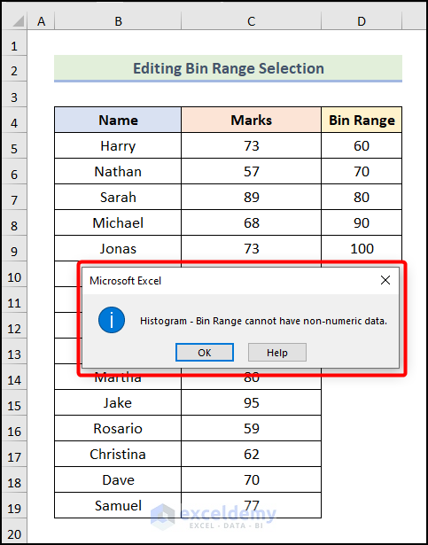
Now, to solve this issue, let’s use the steps mentioned below.
- Firstly, click OK in the dialogue box.
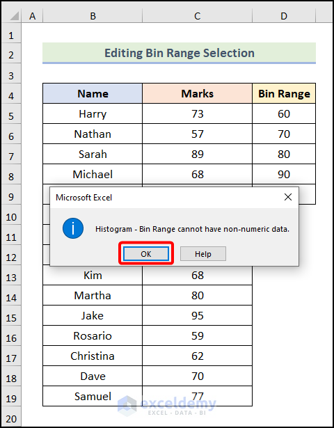
You can solve this issue in 2 ways. We will see both ways here.
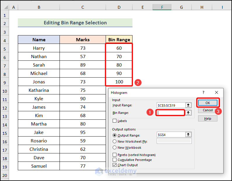
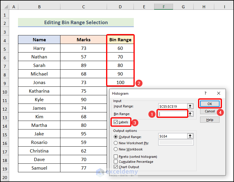
- One way to solve this issue is to check the field of Labels after selecting the range of cells in the Bin Range column.
- Then, click on OK.
- The 2nd way to solve this problem is by selecting the range of cells without the column header in the Bin Range field.
- After that, click on OK.
Consequently, you will have the desired Histogram chart as demonstrated in the image below.
- Now, use the steps used in Step 03 of the 1st method to format the Histogram chart and you will get the following final output on your worksheet.
Read More: How to Make a Histogram in Excel Using Data Analysis
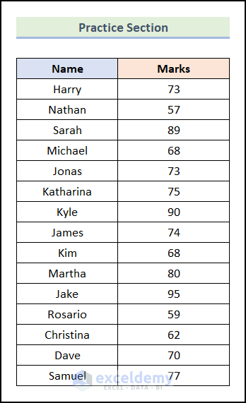
Practice Section
In the Excel Workbook, we have provided a Practice Section on the right side of the worksheet. Please practice it by yourself.
Download Practice Workbook
Conclusion
That’s all about today’s session. I strongly believe that this article was able to guide you to fix the issue of the Histogram Bin Range Not Working in Excel. Please feel free to leave a comment if you have any queries or recommendations for improving the article’s quality.
Related Articles
- How to Make a Histogram in Excel with Two Sets of Data
- How to Make a Stacked Histogram in Excel
- Difference Between Excel Histogram and Bar Graph
- How to Create a Bin Range in Excel
- How to Change Bin Range in Excel Histogram
<< Go Back to Excel Histogram | Excel Charts | Learn Excel
Get FREE Advanced Excel Exercises with Solutions!
