Method 1 – Use of Data Analysis
Steps:
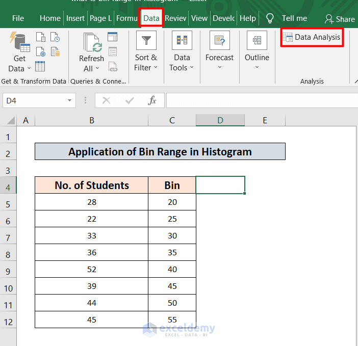
- Go to the Data tab in your Toolbar.
- Select the Data Analysis option from the Analysis group.
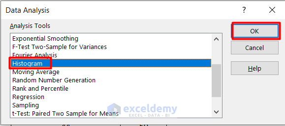
- A new window will pop up. Select the Histogram option.
- Click OK.
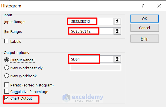
- Input $B$5:$B$12 in the Input Range by selecting the dataset.
- Input $C$5:$C$12 in Bin Range by selecting the dataset.
- Select a cell $D$4 for the output range also.
- Click on the Chart Output to Check the option.
- You will find the output just like the picture given below.
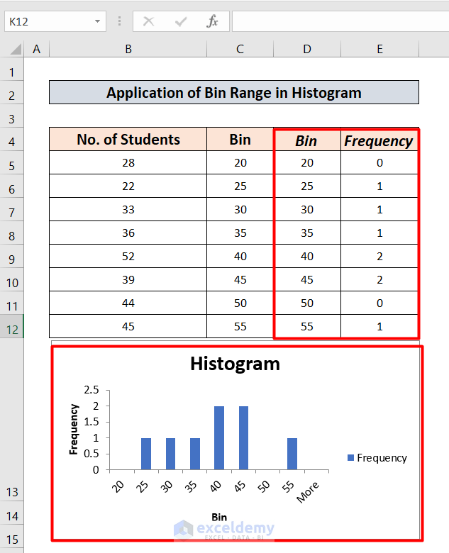
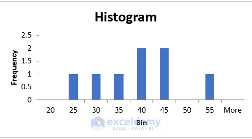
- You will find the histogram just like the picture given below.
- To change the histogram column type, right-click on the Columns.
- From the opened menu, select the Format Data Series.
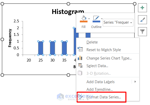
- After selecting this option, click on the icon indicated.
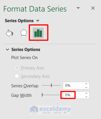
- Select gap width 0%.
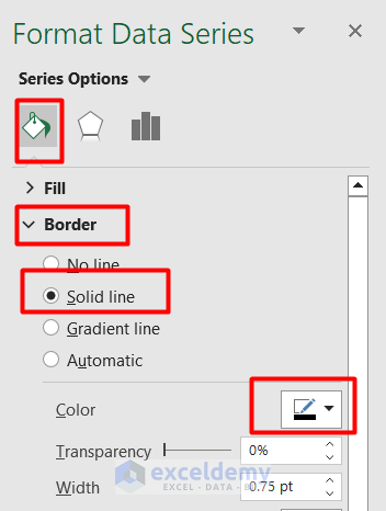
- Select the first icon.
- Click on the Border menu.
- Select Solid Line and then select a Black color.
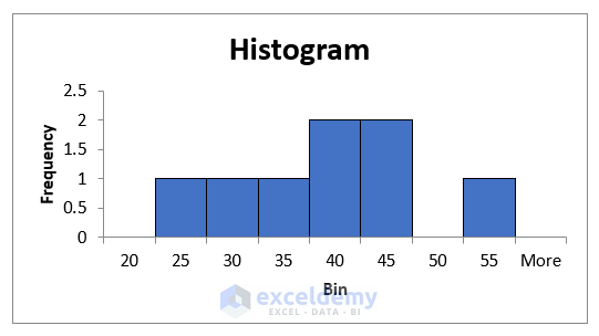
- You will find the histogram like the one below.
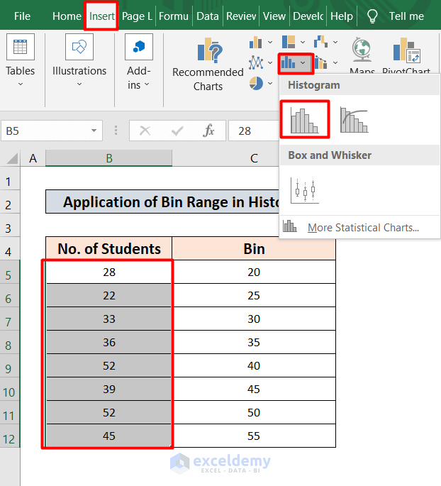
Method 2 – Use of Recommended Chart Option
Steps:
- Select data ranging from B5 to B12.
- Select the Insert tab from your Toolbar.
- Select the Histogram option.
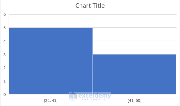
- Select the first option to insert or plot a Histogram.
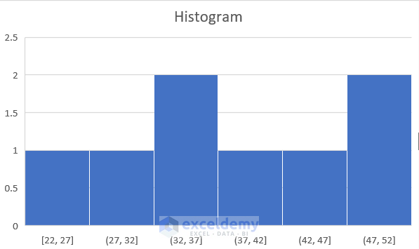
- You will find the histogram chart like the picture given below.
- Right-click on the x-axis to edit.
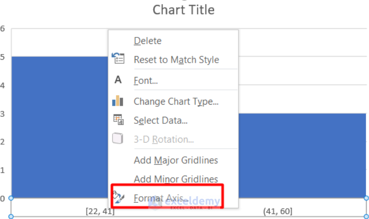
- From the Format Axis option, increase the number of bins to 6.
- Change the overflow and underflow bin to 60 & 0.0.
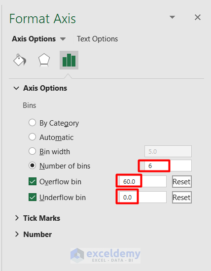
- You will find the histogram just like the one given below.
Impacts of Bin Range on Histogram
- In the first example, we divided the result into 9 parts. As a result, 9 columns have equal width. If we make the width inequal, this will affect the visual representation.
- The same description applies to the second example. At first, there were only two columns as the Bin Range was higher. In the final result, I lowered the Bin range by dividing the whole data into six equal distributions.
Things to Remember
- If you don’t have the data analysis button in your data tab, you must enable analysis Toolpak addins.
Download Practice Workbook
Please download the practice workbook to practice yourself.
Related Articles
- How to Make a Histogram in Excel with Two Sets of Data
- How to Make a Stacked Histogram in Excel
- Difference Between Excel Histogram and Bar Graph
- How to Change Bin Range in Excel Histogram
- [Fixed!] Excel Histogram Bin Range Not Working
- How to Make a Histogram in Excel Using Data Analysis
<< Go Back to Excel Histogram | Excel Charts | Learn Excel
Get FREE Advanced Excel Exercises with Solutions!
