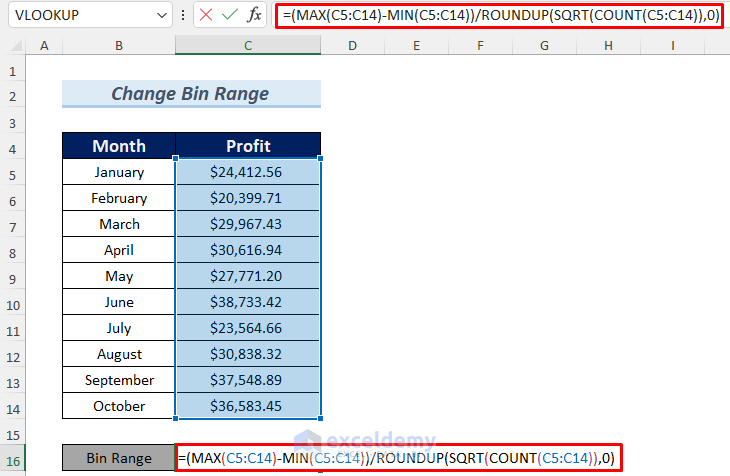
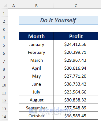
The dataset contains profit data for the first ten months of the year. We will use this dataset to create a histogram and organize the graph by applying a proper bin range.

Step 1 – Calculating the Bin Range for the Dataset
The formula to determine the bin range is given below:
(Maximum Value – Minimum Value)/(Rounded Value of the Square Root of the Number of Data)
- Select a cell to store the bin range and copy the following formula in that cell:
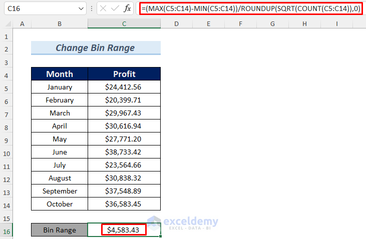
=(MAX(C5:C14)-MIN(C5:C14))/ROUNDUP(SQRT(COUNT(C5:C14)),0)
The formula uses the MAX, MIN, ROUNDUP, SQRT, and COUNT functions to calculate the bin range value.
Formula Breakdown
- COUNT(C5:C14) —-> returns the number of data of the dataset.
- Output: 10.
- SQRT(COUNT(C5:C14)) —-> turns into
- SQRT(10) —-> returns the square root of 10.
- Output: 16227766
- ROUNDUP(SQRT(COUNT(C5:C14)),0) —-> then becomes
- ROUNDUP(3.16227766) —-> returns
- Output: 4
- MIN(C5:C14) —-> returns the minimum value of the dataset.
- Output:71
- MAX(C5:C14) —-> gives the maximum value of the dataset.
- Output: 42
- (MAX(C5:C14)-MIN(C5:C14))/ROUNDUP(SQRT(COUNT(C5:C14)),0) —-> turns into
- (38733.42-20399.71)/4 —-> which results into
- Output: $4583.43
- Hit Enter and you will get the bin range.
Read More: How to Create a Histogram in Excel with Bins
Step 2 – Creating a Histogram with an Excel Dataset
- Select the range B4:C14.
- Go to Insert and select Histogram (from the Charts group).
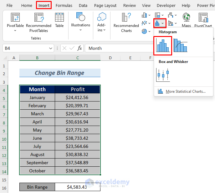
- You will see the histogram appear on your Excel sheet.
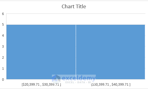
The histogram is divided into only two bars which means it only shows the frequency for two intervals. To get frequencies for more intervals, we need to apply the bin range.
Step 3 – Changing the Bin Range in the Histogram
- Click on the Plus icon of the histogram chart.
- Select Axes and choose More Axis Options.
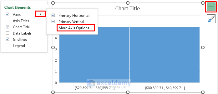
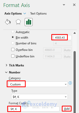
- Change the Bin width to 4583.43. This will divide the histogram into 4 intervals.
- You can change the number format. We chose a Custom Category which will convert the number to thousands format (1k = one thousand).
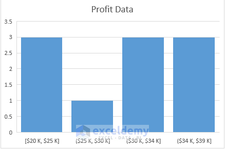
- The histogram changes to adopt the new bin range.
Practice Section
Here’s the dataset of this article so that you can practice making a histogram.
Related Articles
- How to Make a Histogram in Excel with Two Sets of Data
- How to Make a Stacked Histogram in Excel
- Difference Between Excel Histogram and Bar Graph
- [Fixed!] Excel Histogram Bin Range Not Working
- How to Make a Histogram in Excel Using Data Analysis
<< Go Back to Excel Histogram | Excel Charts | Learn Excel
Get FREE Advanced Excel Exercises with Solutions!
