What Is a Histogram in Excel?
A histogram shows the frequency of data in different intervals within the data range. It is a graph with a series of rectangular bars. The number and height of the bars are proportional to the number of different ranges called bins and to the frequency of data within those bins.
For example, if you want to create a histogram from the result scores of the students in a class, you can assess the performance of the class at a glance. You will know how many students failed, how many of them got good grades, etc. from the histogram.
How to Add a Vertical Line to a Histogram in Excel: Step-by-Step Procedures
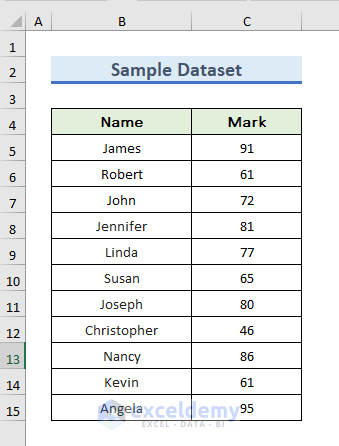
STEP 1 – Prepare the Dataset
- We have a simple dataset with student names and their marks.
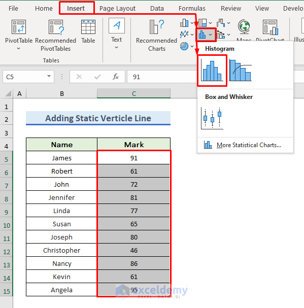
STEP 2 – Insert the Histogram Chart
- Select the C5:C15 range to select the marks.
- Go to the Insert tab.
- From the Charts group section, select the Insert Statistic Chart and then select Histogram.
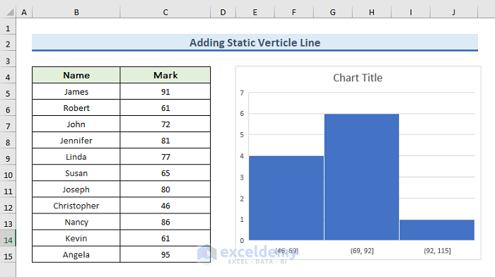
- The histogram will appear.
- Modify the horizontal axis to beautify the histogram.
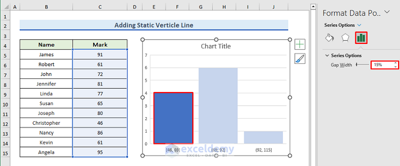
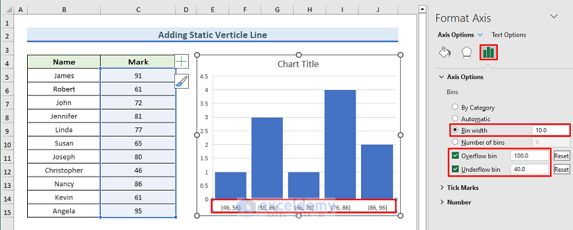
STEP 3 – Format the Axes
- Double-click on any rectangle of the histogram.
- A new window named Format Data Point will appear on the right side of the Excel sheet.
- Increase the gap width according to your preference. We have made the gap width as 15%.
- Double-click on the horizontal axis or bins values. Bins indicate the range of the rectangle of the histogram.
- From the Axis Options, change the Bin width according to your choice.
- The Bin width represents the width of the rectangle. We have made the width 10.
- You may also change the Overflow bin and Underflow bin.
- The Overflow bin represents the maximum limit of the bin and the Underflow bin indicates the minimum limit of the bin.
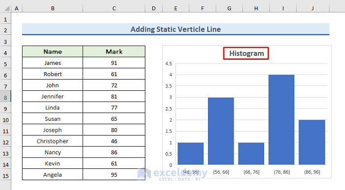
STEP 4 – Insert the Title
- Double-click on the Chart Title.
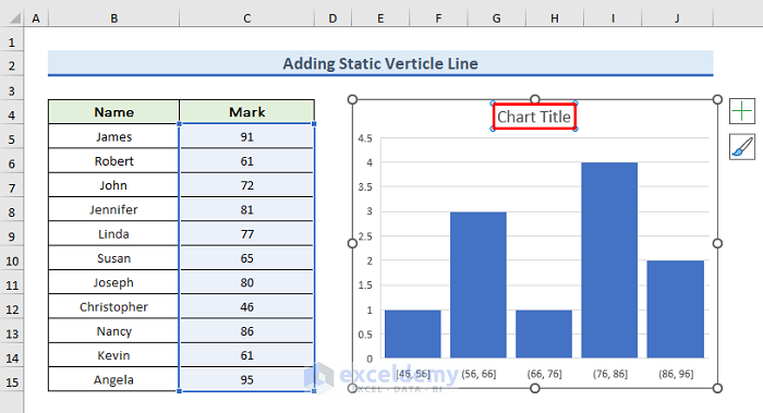
- Type the new title. We have provided the title Histogram.
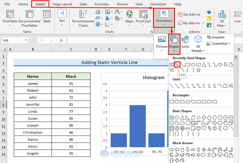
STEP 5 – Add a Vertical Line to the Histogram
- Cick on the Insert tab.
- Select Illustrations, go to Shapes, and select Line to insert the vertical line.
- Your mouse cursor will be changed.
- Hover over where you want to insert the line. We’ll add the line between two rectangles of the histogram.
- Hold down your Shift key on the keyboard.
- Click where you want your line to begin and drag to draw.
- Release the Shift and the mouse button.

STEP 6 – Modify the Vertical Line
- Double-click on the vertical line.
- This will take you to the Shape Format tab.
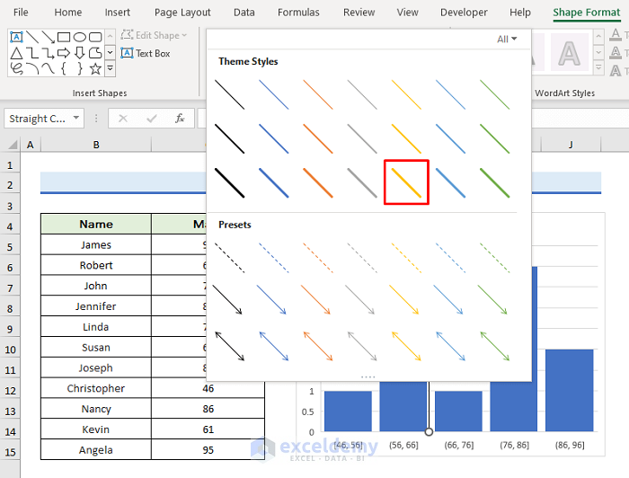
- Click on the arrow icon in Shape Styles to shape the line.
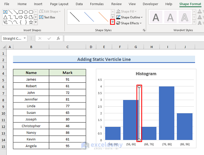
- A wizard will pop out. We have selected a yellow wide-line option. You can select as per your preference.
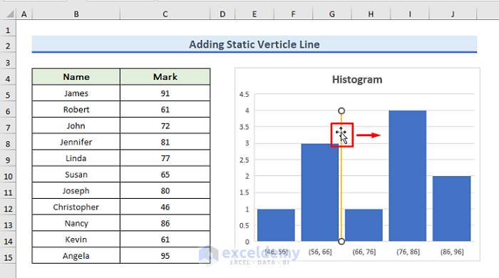
- You can also move your vertical line in your histogram. To do so, click on the line and drag it left or right.
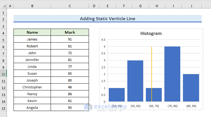
Final Output
- We have placed our line in the range of 66 to 76.
Things To Remember
- For other types of charts, it is easy to add vertical lines. You can insert vertical lines by using Excel Shapes, applying Combo Charts, and creating a Chart Trendline.
- For histograms, you can only insert vertical lines using Excel Shapes.
- For other charts, you can also insert dynamic vertical lines, but this is not possible to histogram.
Download the Practice Workbook
Related Articles
- How to Create a Histogram with Bell Curve in Excel
- How to Create Probability Histogram in Excel
- Stock Return Frequency Distributions and Histograms in Excel
- How to Create Histogram in Excel Using VBA
<< Go Back to Excel Histogram | Excel Charts | Learn Excel
Get FREE Advanced Excel Exercises with Solutions!
