Microsoft Excel is one of the most useful software you can get. Using Excel’s features and tools, it is possible to do an infinite number of things with a dataset. We need to use Excel Charts to regularly show the Histogram with inequivalent periods of frequency density. Since this information does not follow a normal distribution, we must construct Histograms with unequal intervals. This article will examine two easy ways to graph histograms with unequal class periods in Excel. Therefore, review these two suitable ways to plot Histogram with unequal class intervals in Excel.
Why Do We Use Histograms?
A Histogram is a visual representation of data that uses a series of concentric rectangles to depict the frequency with which different data items occur within a range of values. One common type of graph is the histogram, which provides a concise summary of continuous variables, either continuous or discrete.
- After creating the histogram, you can lower the average and high variance to meet existing or new needs.
- A change in continuous data can show success in treating the problem’s fundamental causes by examining graphs before and after implementing countermeasures.
- The histogram can demonstrate how far the item, service, or diagnostic testing don’t fulfill customer needs if the detail and explanations are accessible.
How to Plot Histogram with Unequal Class Intervals in Excel: 2 Suitable Ways
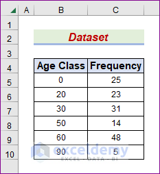
To illustrate this concept, let’s explore a representative dataset. The following dataset has columns labeled Age Class and Frequency. We will create a histogram graphic by utilizing the data from the dataset. In the first technique shown in this article, you will learn how to use the Charts Feature to depict a histogram chart with non-equivalent class periods. In contrast, another person creates a graph in Excel using Visual Basic for Applications that illustrates a histogram.
I have been writing up this post with the help of Microsoft Excel 365. It is entirely up to you to choose the best variant that caters to your requirements. Whatever course of action you decide to take, we will support it.
1. Utilize Charts Feature to Plot Histogram with Unequal Class Intervals in Excel
The Chart Feature in Microsoft Excel allows users to create visual representations of data efficiently. A diagram is a graphical display of information, and often, the information is represented via figures like bars or lines. We will calculate necessary data throughout this context and plot a histogram with inequivalent intervals using the Excel Charts feature. Please read these directions carefully and follow them to the letter to complete the task.
STEPS:
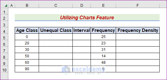
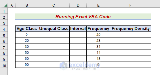
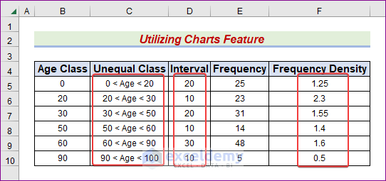
- First, create two columns titled Unequal Class and Interval between the Age and Frequency columns.
- Second, build another column named Frequency Density throughout the F column.
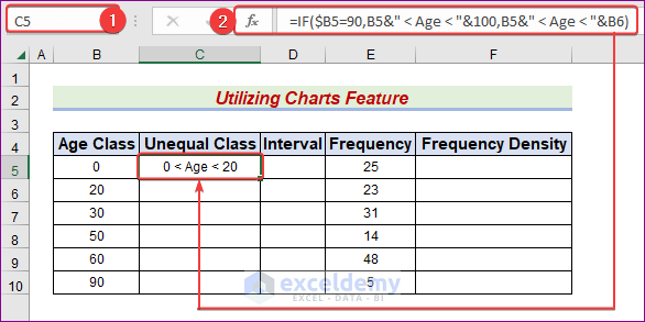
- Third, select the C5 cell.
- After that, input the following formula in the Formula bar.
=IF($B5=90,B5&" < Age < "&100,B5&" < Age < "&B6)
- Later, hit Enter or Tab to see the outcome in C5.
- At this point, we have to use the same formula in other cells.
- To achieve this, utilize the AutoFill Handle icon and drag it to cell C10 to see the result.

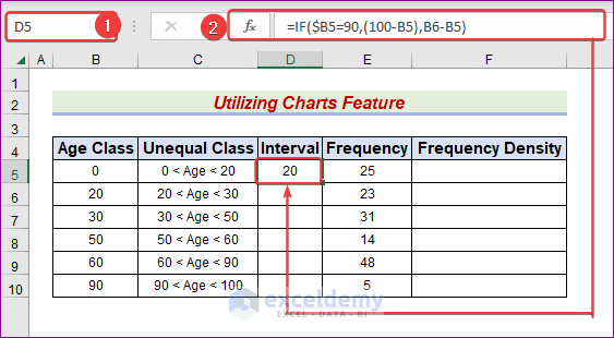
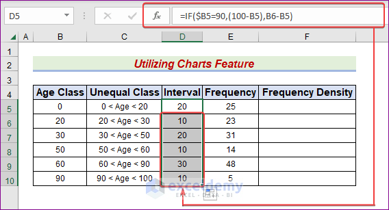
- Likewise, choose cell D5.
- Then, in the Formula bar, type the following formula.
=IF($B5=90,(100-B5),B6-B5)
- The result will be shown in D5 when you hit Enter or Tab.
- We have to use the same formula in other cells at this point.
- To do this, use the AutoFill Handle icon and drag it to cell D10 to see the result.
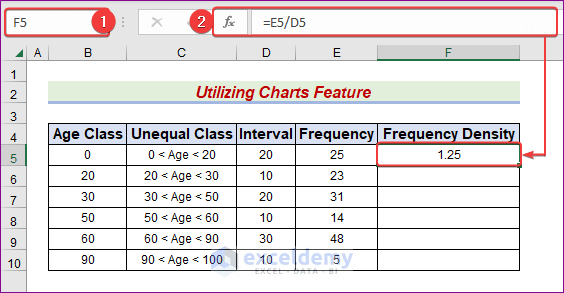
- Choose the F5 cell for now.
- Then, in the Formula bar, type the following formula.
=E5/D5
- Hit Enter or Tab later to see the result in the F5 cell.
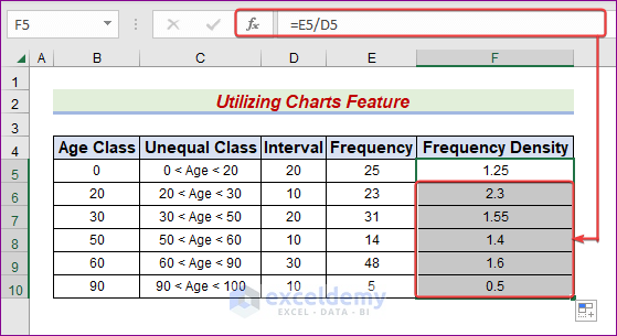
- We have to use the same formula in other cells at this point.
- To do this, use the AutoFill Handle symbol and drag it to cell F10 to view the consequence.
- Presently, select the C5:C10 range.
- Afterward, hold the Ctrl key down and mark the F5:F10 range using the Mouse.

- Latterly, navigate to the Insert tab and click on the Recommended Charts.
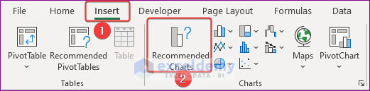
- Subsequently, the Insert Chart window will pop up.
- Choose the Clustered Column chart from the Recommended Charts tab and then hit OK.
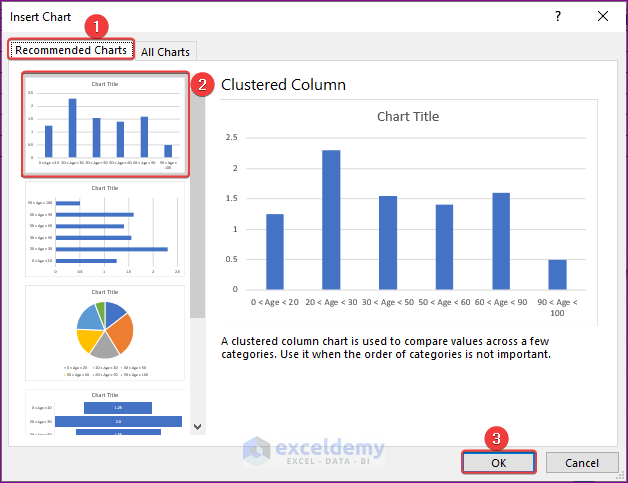
- Consequently, a chart area will appear and write the chart title.
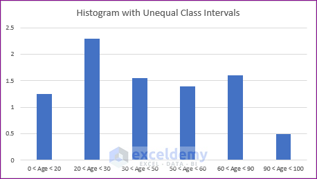
- As a result, we will get the desired output like the below one.

2. Run Excel VBA Code to Graph Histogram with Unequivalent Class Intervals
The abbreviation VBA refers to the Visual Basic for Applications programming language, and VBA is an application developed by Microsoft. Using VBA code, we can use functions incompatible with Excel, and Excel’s VBA provides an innovative alternative method for displaying histogram charts for unequal periods. This tutorial will show you how to use VBA code to create a histogram with unequal class intervals. Please turn in the assignment by following these instructions to the letter.
STEPS:
- Start by creating two columns with the headings Unequal Class and Interval between the Age and Frequency.
- Then extend the F column with a new column called Frequency Density.
- Third, go to the Developer tab and click on Visual Basic.
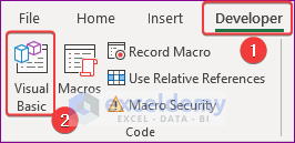
- Eventually, click on,
Insert → Module

- Now, write the following code in the Module box.
Sub HistogramWithUnequalClassInterval()
    Range("C5").Select
    ActiveCell.FormulaR1C1 = _
        "=IF(RC2=90,RC[-1]&"" < Age < ""&100,RC[-1]&"" < Age < ""&R[1]C[-1])"
    Range("C5").Select
    Selection.AutoFill Destination:=Range("C5:C10"), Type:=xlFillDefault
    Range("D5").Select
    ActiveCell.FormulaR1C1 = "=IF(RC2=90,(100-RC[-2]),R[1]C[-2]-RC[-2])"
    Range("D5").Select
    Selection.AutoFill Destination:=Range("D5:D10"), Type:=xlFillDefault
    Range("F5").Select
    ActiveCell.FormulaR1C1 = "=RC[-1]/RC[-2]"
    Range("F5").Select
    Selection.AutoFill Destination:=Range("F5:F10"), Type:=xlFillDefault
    Range("C5:C10,F5:F10").Select
    Range("F5").Activate
    ActiveSheet.Shapes.AddChart2(201, xlColumnClustered).Select
    ActiveChart.SetSourceData Source:=Range( _
        "'Excel VBA'!$C$5:$C$10,'Excel VBA'!$F$5:$F$10")
    ActiveChart.ChartTitle.Text = "Histogram with Unequal Class Intervals"
End Sub- Later, press F5 or click on the Run button.

- Consequently, the C, D, and F columns will fill with the necessary values to plot the histogram.
- As a result, it will produce the desired chart utilizing the intended values like the below one.
Download Practice Workbook
Please click the link below to download a copy of the sample workbook we used in the presentation.
Conclusion
If you follow what we instructed, you will soon be able to create a Histogram with unequal class intervals in Excel. Keep using these, and if you think of any other ideas or methods that are more effective, please let me know. Remember to jot down any questions, comments, or recommendations you have in the space provided.
Related Articles
- How to Create a Histogram with Bell Curve in Excel
- How to Plot Cumulative Histogram in Excel
- How to Create Probability Histogram in Excel
- How to Add Vertical Line to Histogram in Excel
- Stock Return Frequency Distributions and Histograms in Excel
<< Go Back to Excel Histogram | Excel Charts | Learn Excel
Get FREE Advanced Excel Exercises with Solutions!
