Creating Histogram Using Stock Returns Data
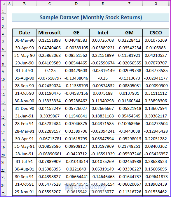
The following sample dataset will be used for illustration.
Stock Return Frequency Distributions and Histograms in Excel: Step-by-Step Procedures
Step 1 – Calculating Frequency Distributions
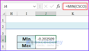
We will use the FREQUENCY function to calculate the frequency distributions of the Cisco stock return data in Excel. We will also use the MIN and MAX functions to find the minimum and maximum values of that data. Using these values, we will create bins or intervals to group the data. We have used the named range “CSCO” for the cell range G5:G134.
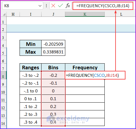
- Enter the following formula in cell J4 to find the minimum value of the dataset.
=MIN(CSCO)
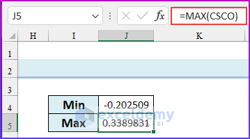
- Enter the following formula in cell J5 to find the maximum value of the dataset.
=MAX(CSCO)
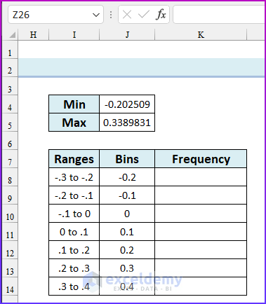
- From these values, we can create bins to calculate the frequency distribution. A standard histogram should have a number of ranges between 8 to 15 (our advice is: to take a total of 10 ranges).
- Create bins similar to the following image.
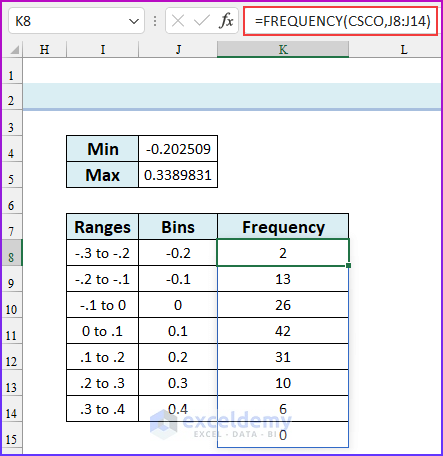
- Enter the following formula in cell K8.
=FREQUENCY(CSCO,J8:J14)
- Press ENTER. Remember, this is an array formula and we are using the Microsoft 365 version of Excel. If you are using an older version, pre-select the cell range K8:K15, enter the formula and press CTRL+SHIFT+ENTER. We have created the frequency distribution in Excel.
Step 2 – Creating Histograms in Excel
We will make a histogram using our Cisco data. We will use the same bins to create a histogram in this step. You need to enable the Data Analysis Toolpak in Excel. The frequency distribution will be automatically created using the data analysis feature. Follow the instructions below to make a Histogram in Excel using Data Analysis.
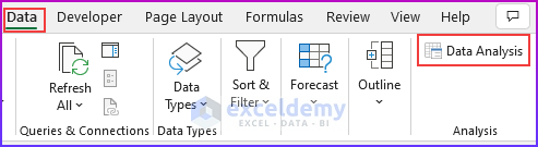
- Open the Data Analysis dialog box (Data tab → Analysis group of commands → Data Analysis).
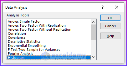
- From the Data Analysis dialog box, choose the Histogram A Histogram dialog box will pop up.
- In the Input range, insert cell range $G$4:$G$134, in the bin range, insert cell range $J$7:$J$15.
- Select the checkbox Labels. As our selected input and bin ranges have labels (CSCO & Bins).
- As Output range, we have selected cell reference: $I$17. We have selected the Chart Output checkbox as we want to see the Histogram on the chart.
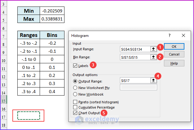
- Click OK. You will get a Histogram table and chart as shown in the image below.
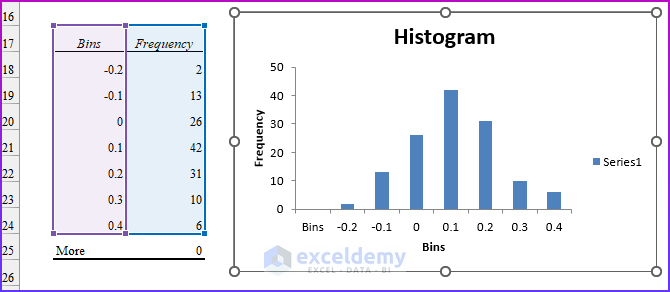
- This is our frequency distribution table with the chart output. From the frequency table and from the chart, it is clear that Cisco returns are most likely between 0 and 10 percent per month and the height of the bars drops off as the graph moves away from the tallest bar.
Stock Returns Comparison Using Histograms
We will construct a histogram for GM by using the same bin ranges as for Cisco, then place one histogram above the other.
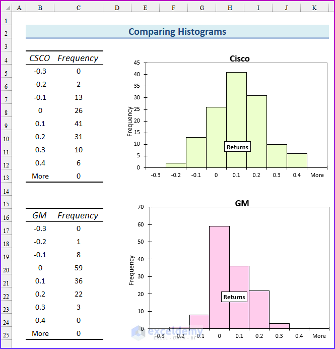
We have constructed the histograms of Cisco and GM using the same bin ranges, -.3 to -.2, -.2 to -.1, and so on. By comparing these two histograms, we can draw two important conclusions:
- Cisco performed better than GM. Because the highest bar for Cisco is one bar to the right of the highest bar for GM. Also, the Cisco bars extend farther to the right than the GM bars. GM returns are up to 30% while the Cisco returns are up to 40%.
- Cisco had more variability or spread about the mean, than GM. Note that GM’s peak bar contains 59 months, whereas Cisco’s peak bar contains only 41 months. This shows that for Cisco, more of the returns are outside the bin that represents the most likely Cisco return. Cisco returns are more spread out than GM returns.
What Are Some Common Shapes of Histograms?
The common shapes of histograms are as follows:
- Symmetric
- Skewed Right (Positively Skewed)
- Skewed Left (Negatively Skewed)
- Multiple Peaks
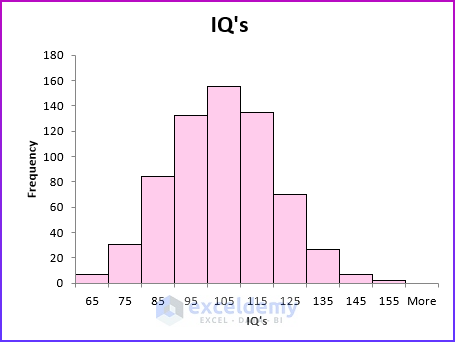
Symmetric Distribution
A histogram is symmetric if it has a single peak and looks approximately the same to the left of the peak as to the right of the peak. Test scores (such as IQ tests) are often symmetric.
Skewed Right – Positively Skewed
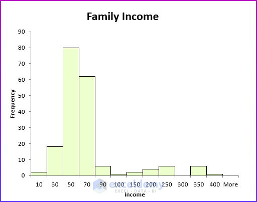
A histogram is a skewed right (positively skewed) if it has a single peak and the values of the data set extend much farther to the right of the peak than to the left of the peak. Many economic data sets (such as family or individual income) exhibit a positive skew. This figure shows an example of a positively skewed histogram created from a sample of family incomes.
Skewed Left – Negatively Skewed
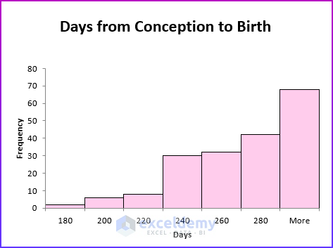
A histogram is skewed left (negatively skewed) if it has a single peak and the values of the data set extend much farther to the left of the peak than to the right of the peak. Days from conception to birth are negatively skewed. In the figure below, the height of each bar represents the number of women whose time from conception to birth fell in the given bin range.
Multiple Peaks
When a histogram exhibits multiple peaks, it usually means that data from two or more populations are being plotted together. For example, suppose the diameter of elevator rails produced by two machines yields the histogram shown in the following figure.
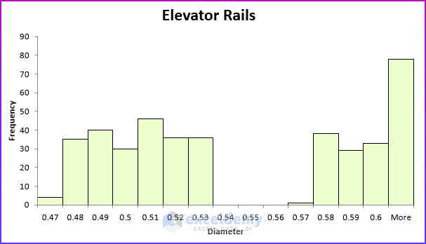
In this histogram, the data is clustered into two groups. The left group of elevator rails is produced by one machine and the right group of elevator rails is produced by other machines.
If your required diameter for an elevator rail is “.55” inches, you can conclude that one machine is producing elevator rails that are too narrow, whereas the other machine is producing elevator rails that are too wide. And neither machine produced the required “.55” inch diameter elevator rails. This example shows why histograms are a powerful tool in quality control.
Download Practice Workbook
Related Articles
- How to Create a Histogram with Bell Curve in Excel
- How to Create Probability Histogram in Excel
- How to Add Vertical Line to Histogram in Excel
- How to Create Histogram in Excel Using VBA
<< Go Back to Excel Histogram | Excel Charts | Learn Excel
Get FREE Advanced Excel Exercises with Solutions!
