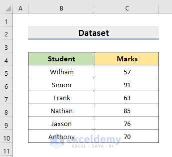
The following dataset contains Student names and their obtained Marks in a subject. We’ll organize the marks in specified intervals, or bins, which will be shown in a histogram.
Method 1 – Apply the Built-in Histogram Chart in Excel
STEPS:
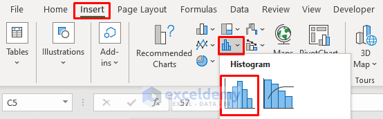
- Select the marks column i.e. the range C5:C10.
- Go to Insert and select Histogram.
- Choose the first option.
- You’ll get a histogram chart.
- Right-click on the X-axis.
- Choose Format Axis from the Context Menu.
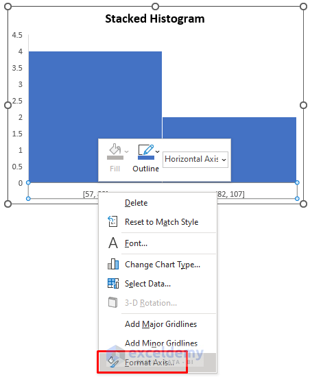
- The Format Axis pane will appear.
- Input 10 in the Bin width under the Axis Options section.
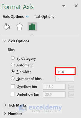
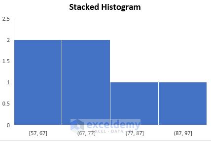
- You’ll get your desired stacked histogram.
- See the figure below which is our final output.
Read More: How to Create a Histogram in Excel with Bins
Method 2 – Make a Stacked Histogram Through Data Analysis
STEPS:
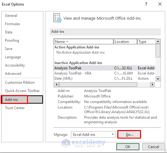
- Select File and choose Options.
- The Excel Options dialog box will pop out.
- Go to the Add-ins tab.
- Choose Excel Add-ins from the Manage drop-down.
- Click Go.
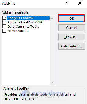
- Check the box for Analysis ToolPak.
- Click OK.
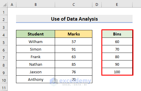
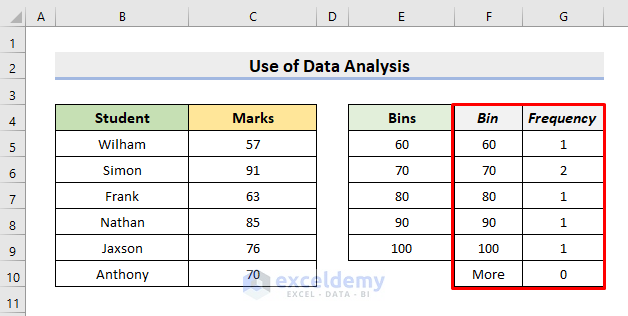
- Create a Bins range or column according to the dataset. We listed bins from 60 to 100.
- Select Data and choose Data Analysis.
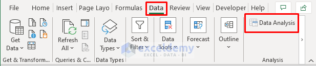
- Choose Histogram.
- Press OK.
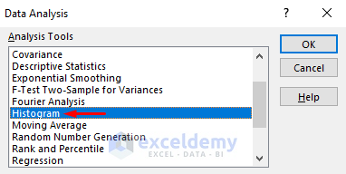
- The Histogram dialog box will emerge.
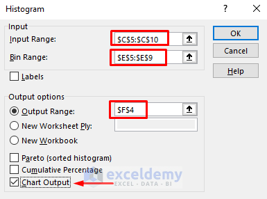
- Select the Marks column as the Input Range.
- Choose the Bins Range.
- Select the F4 cell as the Output Range.
- Check the box for Chart Output.
- Press OK.
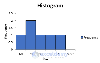
- This will spill Bin and Frequency as shown below.
- You’ll also get the Histogram chart.
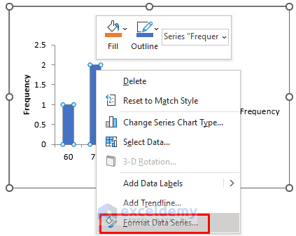
- To transform it to a stacked histogram, right-click on the columns.
- Choose Format Data Series.
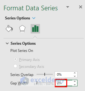
- Make the Gap Width 0%.
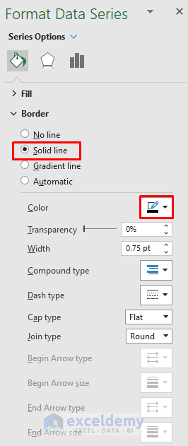
- Choose a Solid line as Border and Black as Color.
- We’ll get our stacked histogram.
Method 3 – Use the Excel FREQUENCY Function to Insert a Stacked Histogram
STEPS:
- Insert the bin column in E, from 60 to 100.
- Click on cell F5.
- Insert the formula:
=FREQUENCY(C5:C10,E5:E9)- Press Enter.
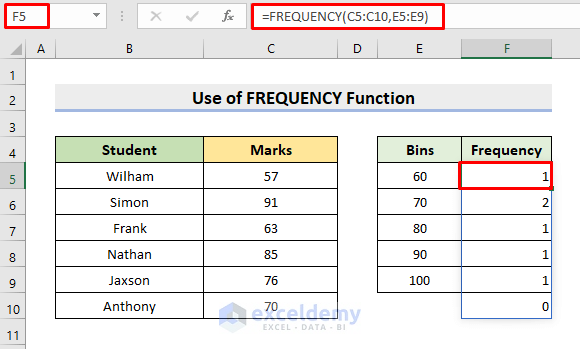
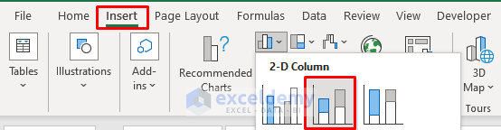
- Select the Bins range and the Frequency range.
- Click Insert and choose a 2-D Column chart.
- Right-click on the columns and choose Select Data.
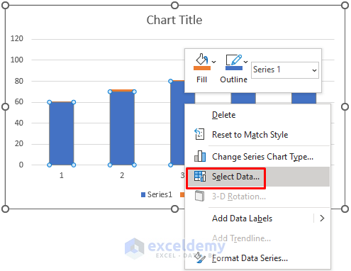
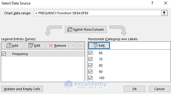
- Select the Frequency range in the Legend Entries.
- Make the Bins range as the Horizontal Axis Labels.
- Press OK.
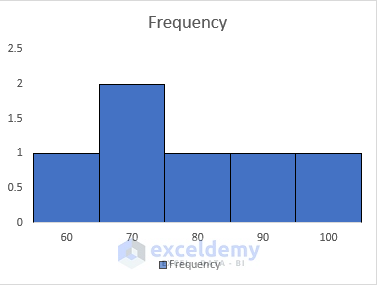
- The stacked histogram is ready to be displayed.
Download the Practice Workbook
Related Articles
- How to Make a Histogram in Excel with Two Sets of Data
- Difference Between Excel Histogram and Bar Graph
- How to Create a Histogram in Excel with Bins
- How to Change Bin Range in Excel Histogram
- [Fixed!] Excel Histogram Bin Range Not Working
<< Go Back to Excel Histogram | Excel Charts | Learn Excel
Get FREE Advanced Excel Exercises with Solutions!
