Enable Data Analysis Toolpak in Excel
Steps:
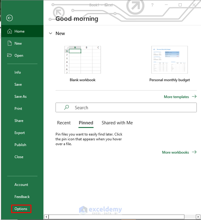
- In File, go to Options.
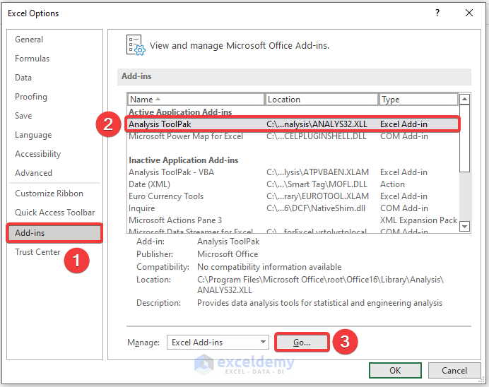
- Select Add-ins.
- In Manage, select Excel Add-ins.
- Click Go.
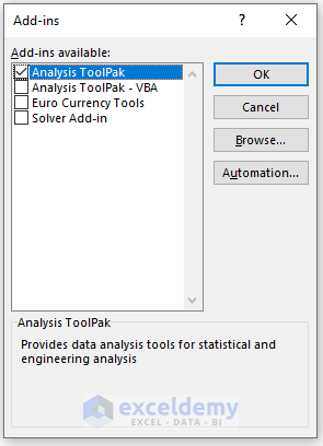
- In the new window, check Analysis ToolPak.
- Click OK.
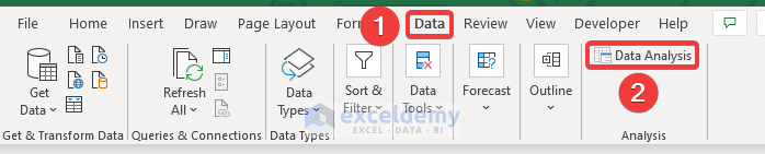
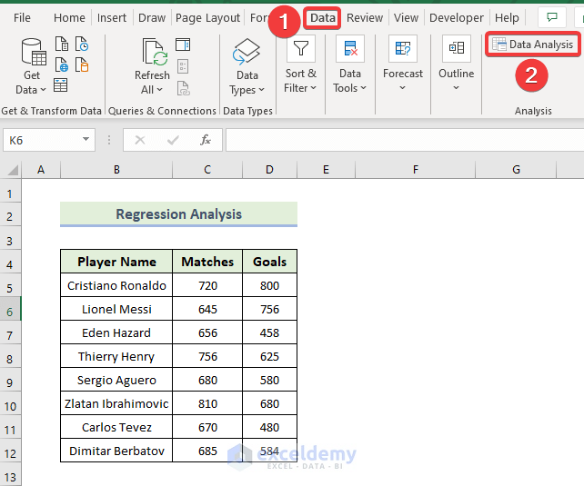
- In the Data tab, select Analyze and choose Data Analysis.
Feature 1 – Anova Analysis
ANOVA is a statistical method used to analyze variance observed within a dataset by dividing it into two sections: 1) Systematic factors and 2) Random factors.
Anova can determine which factors have a significant effect on a given set of data and supports additional analysis on methodological factors and on regression analysis.
The Formula is:
F=MSE / MST
Here:
F = Anova coefficient
MST = Mean sum of squares due to treatment
MSE = Mean sum of squares due to error
Anova is of two types: single factor and two factors, according to variance analysis.
- In two factors, there are multiple dependent variables and in one factor, there will be one dependent variable.
- Single-factor Anova calculates the effect of a single factor on a single variable.
- Single-factor Anova identifies the differences that are statistically significant between the average means of numerous variables.
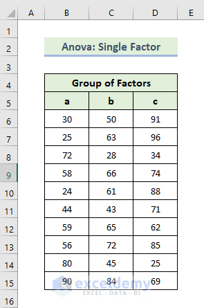
1.1 Single-Factor Anova Analysis
The sample dataset showcases a group of factors.
Steps:
- Go to the Data tab.
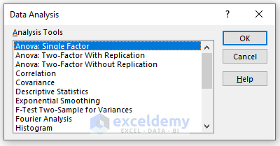
- Select Data Analysis.

- In the Data Analysis window, select Anova: Single Factor.
- Click OK.
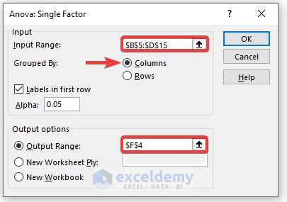
- In the Anova: Single Factor window, enter data in Input Range.
- Check Labels in First Row.
- In the Output Range box, enter the data range. You can also see the output in a new worksheet by selecting New Worksheet Ply or in a new workbook by selecting New Workbook.
- Check Labels in the first row (if you select the input data range with the label).
- Click OK.
This is the output.
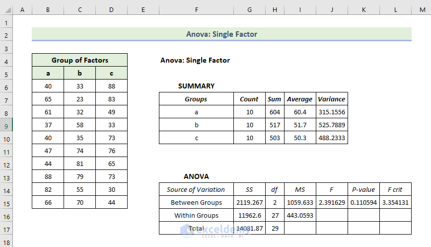
Interpretation:
- In the Summary table, you will find each group’s average and variances. The average level is 60.4 for Group A but the variance is 315.15 which is lower than other groups: elements in that group are less valuable.
- Anova results are not very significant as you are calculating only the variances.
- P-values interpret the relation between the columns: the values are greater than 0.05, which is not statistically significant.
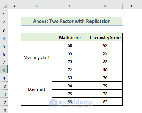
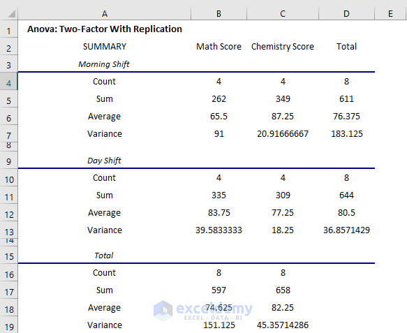
1.2 Anova: Two Factor with Replication
The dataset showcases data on different exam scores on two shifts in that school.
To analyze data and find a relation between the shifts and students’ marks.
Steps:
- Go to the Data tab.
- Select Data Analysis.
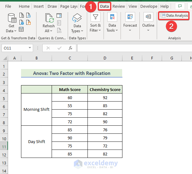
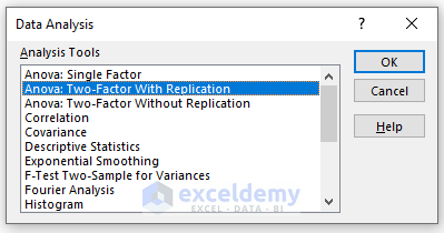
- In the Data Analysis window, select Anova: Two-Factor With Replication.
- Click OK.
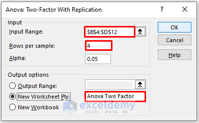
- In the new window, enter data in Input Range.
- Enter 4 in Rows per sample as you have 4 rows per shift.
- In the Output Range box, enter the data range. You can also see the output in a new worksheet by selecting New Worksheet Ply (here) or in a new workbook by selecting New Workbook.
- Click OK.
- A new worksheet was created.
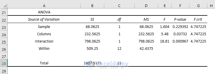
The two-way Anova result is displayed.
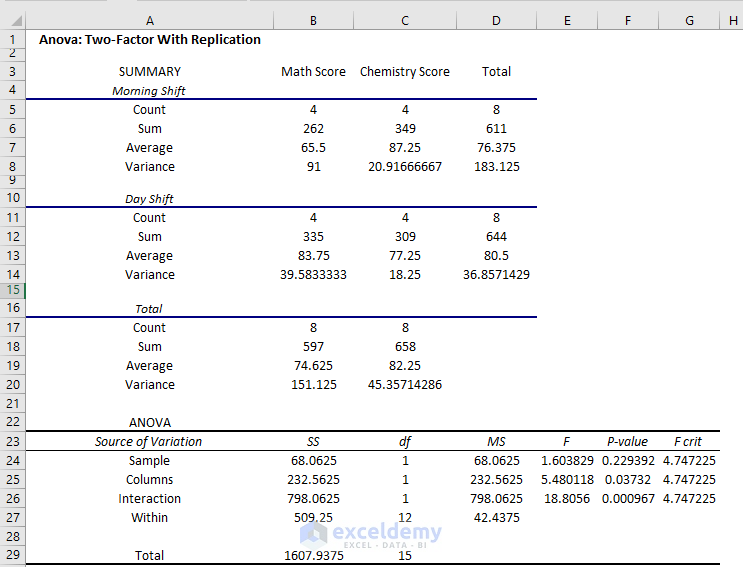
Interpretation:
- The average score on the Morning shift in Math score is 65.5 but on the Day shift is 83.75
- In the Chemistry exam, the average score on the Morning shift is 87.25, but on the Day shift is 77.25.
- Variance is very high at 91 on the morning shift in the Math exam.
- You will get a complete overview in the summary.
You can summarize the interactions and individual effects.
- The P-value of Columns is 0.037 which is statistically significant: there is an effect of shifts on the performance of the students in the exam. But the value is close to the alpha value of 0.05 (the effect is less significant).
- The P-value of interactions is 0.000967 which is much less than the alpha value. It is very significant statistically: the effect of the shift on both exams is very high.
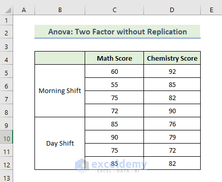
1.3 Anova: Two Factor without Replication
You have data on different exam scores on two shifts in that school.
To find a relation between shifts and students’ marks:
Steps:
- Go to the Data tab.
- Select Data Analysis.
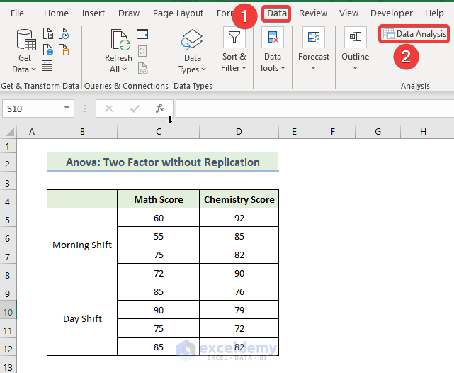
- In the Data Analysis window, select “Anova: Two-Factor Without Replication”.
- Click OK.

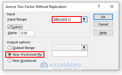
- In the new window, enter data in Input Range.
- In the Output Range box, enter the data range. You can also see the output in a new worksheet by selecting New Worksheet Ply (here) or in a new workbook by selecting New Workbook.
- Check Labels.
- Click OK.
- A new worksheet was created.
- The two-way Anova result is displayed.
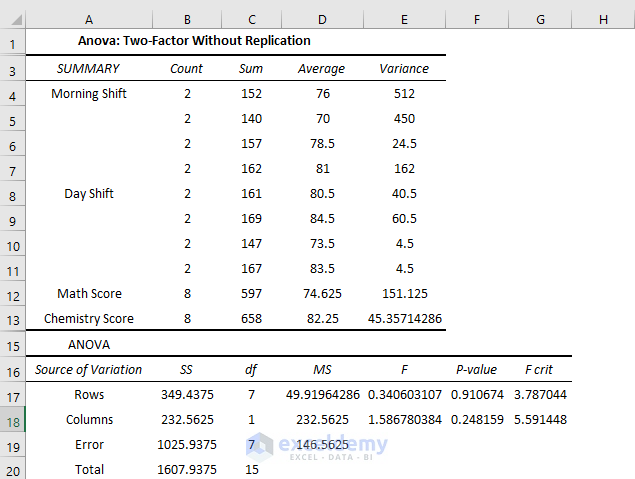
Interpretation:
- The average score on the Morning shift in Math score is 65.5 but on the Day shift is 83.75
- In the Chemistry exam, the average score on the Morning shift is 87 but on the Day shift is 77.25.
- The P-value of Columns is 0.24, which is statistically significant: there is an effect of shifts on the performance of the students. The value is close to the alpha value of 0.05, so the effect is less significant.
Read More: How to Use Analyze Data in Excel
Feature 2 – Correlation Analysis
In statistics, correlation or correlation coefficient is the parameter to show coherence between two variables in response to the continuous fluctuating quantity of another. Its value ranges from -1 to +1. It has three states of defining variable relations:
- -1 indicates a negative correlation, which means the variables change in the opposite direction.
- +1 indicates a positive correlation, which means the variables change in the same direction.
- 0 indicates no correlation, which means no apparent movements in any direction of a variable upon changing other variables’ values.
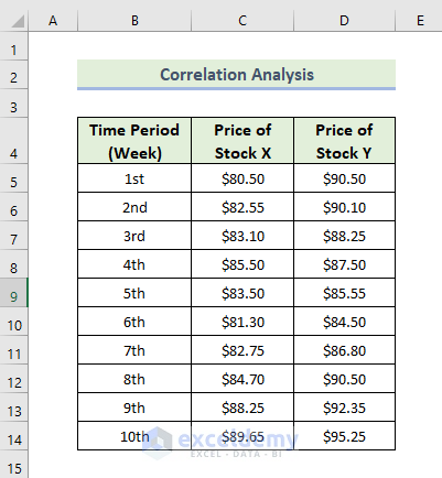
The dataset showcases two stock prices in different periods of time.
Steps:
- Go to the Data tab.
- Select Data Analysis.
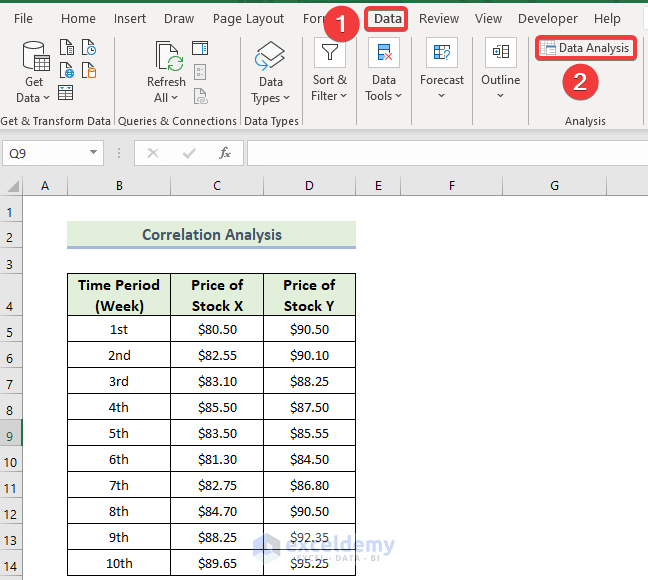
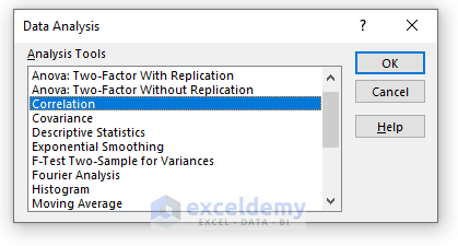
- In the Data Analysis window, select Correlation.
- Click OK.
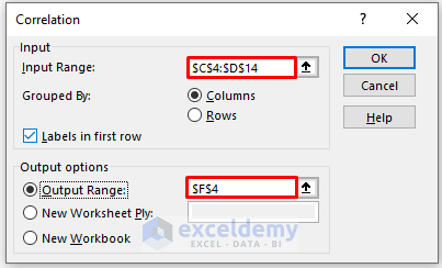
- In the new window, enter data in Input Range.
- Check Columns in Grouped By.
- In the Output Range box, enter the data range. You can also see the output in a new worksheet by selecting New Worksheet Ply or in a new workbook by selecting New Workbook.
- Check Labels in the first row.
- Click OK.
This is the correlation result.
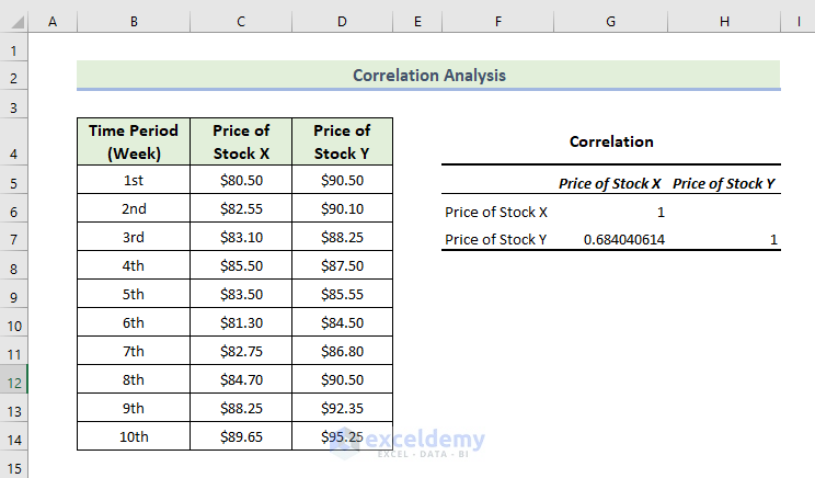
There is a positive correlation, which means the variables change in the same direction.
Read More: How to Install Data Analysis in Excel
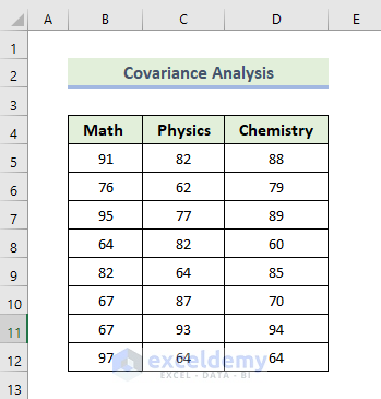
Feature 3 – Covariance Analysis
The covariance of two variables is a measure of how one of them influences the other. It’s a necessary evaluation of the deviation between two variables (they do not have to be dependent on each other).
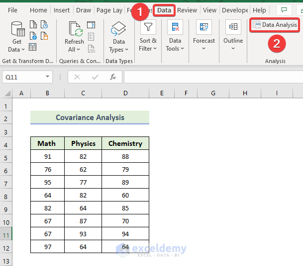
Steps:
- Go to the Data tab.
- Select Data Analysis.
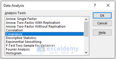
- In the Data Analysis window, select Covariance.
- Press Enter.
- Click OK.
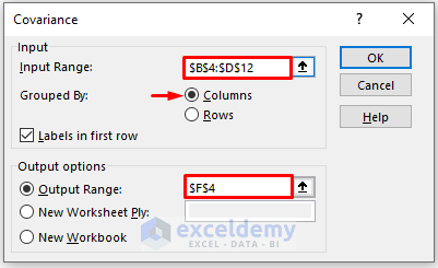
- In the new window, enter data in Input Range.
- Check Columns in Grouped By.
- In the Output Range box, enter the data range. You can also see the output in a new worksheet by selecting New Worksheet Ply or in a new workbook by selecting New Workbook.
- Check Labels in the first row.
- Click OK.
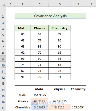
- This is the covariance result.
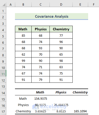
Interpretation:
The highlighted section in the following image indicates the variance for each subject.
- The variance of Math is 154.9375 and the variance of Physics is 76.484375. The variance of Chemistry is 154.9375.
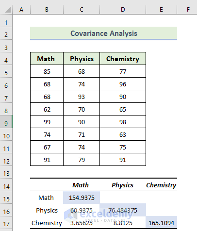
The highlighted section in the following image indicates the values of variance between the subjects: Math and Physics, Maths and Chemistry, and Physics and History have a variance value of respectively 60.9375, 3.65625, and 8.8125. When the covariance is positive, it indicates that the variables are proportionate: when one increases, the other tends to rise.
Read More: How to Make Histogram Using Analysis ToolPak
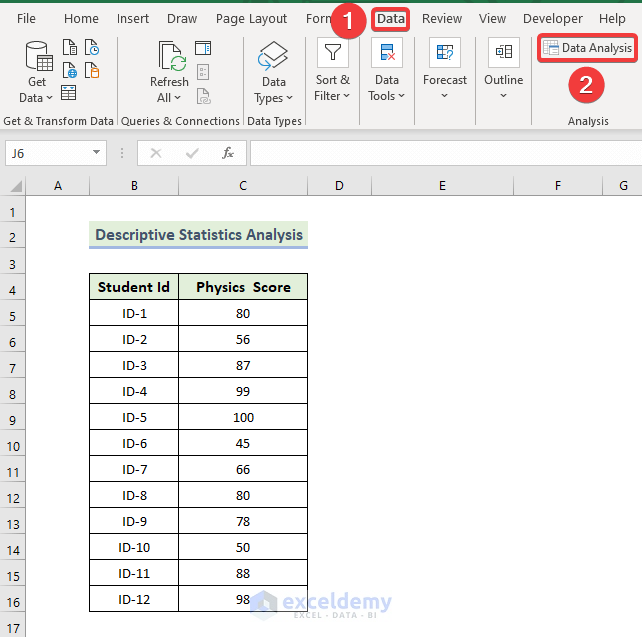
Feature 4 – Descriptive Statistics Analysis
Steps:
- Go to the Data tab.
- Select Data Analysis.
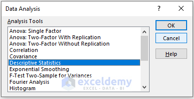
- In the Data Analysis window, select Descriptive Statistics.
- Click OK.
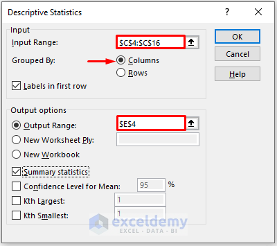
- In the new window, enter data in Input Range.
- Check Columns in Grouped By.
- In the Output Range box, enter the data range. You can also see the output in a new worksheet by selecting New Worksheet Ply or in a new workbook by selecting New Workbook.
- Check Summary statistics.
- Click OK.
The covariance result will be displayed.
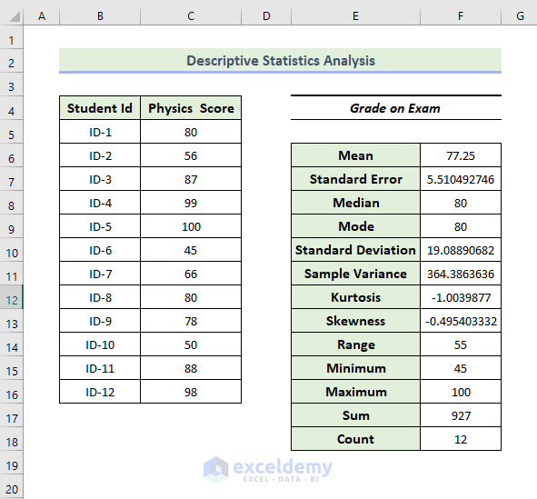
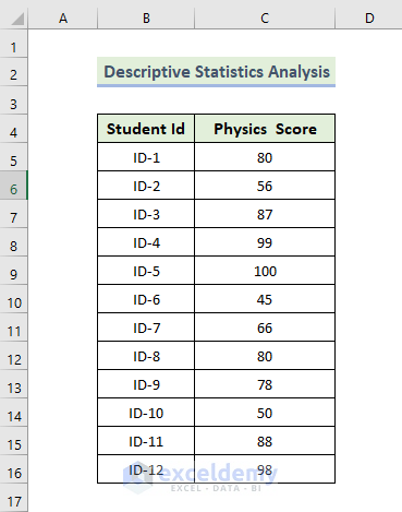
- The result gives the characteristics of two variables, mean, median, standard deviation, and maximum and minimum value of the dataset, which are respectively 77.25, 80, 19.088, 45, and 100.
Feature 5 – Exponential Smoothing Analysis
The dataset contains items sold in different weeks by a manufacturing company. To get an exponential smoothing analysis:
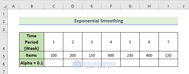
Steps:
- Go to the Data tab.
- Select Data Analysis.
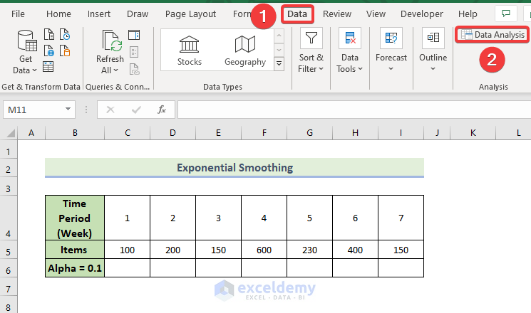
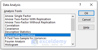
- In the Data Analysis window, select Exponential Smoothing.
- Click OK.
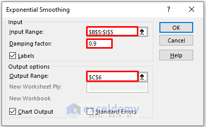
- In the new window, enter data in Input Range.
- Enter 0.9 in Damping factor. Here, 1-alpha.
- In the Output Range box, enter the data range. You can also see the output in a new worksheet by selecting New Worksheet Ply or in a new workbook by selecting New Workbook.
- Check Labels.
- Check Chart Output.
- Click OK.
The exponential smoothing result and the chart for 0.1 alpha are displayed.
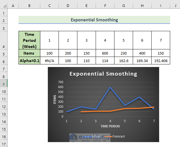
Excel can not provide data for the first value in this method. If you use a large damping factor, you will get more smooth peaks and valleys.
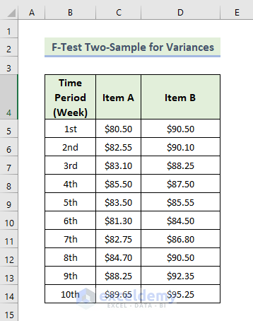
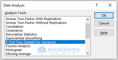
Feature 6 – F-Test Two-Sample for Variances Analysis
Steps:
- Go to the Data tab.
- Select Data Analysis.
- In the Data Analysis window, select F-Test Two-Sample for Variances.
- Click OK.
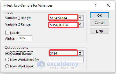
- In the new window, enter data in Input Range.
- In the Output Range box, enter the data range. You can also see the output in a new worksheet by selecting New Worksheet Ply or in a new workbook by selecting New Workbook.
- Check Labels.
- Click OK.
The F-test for two sample variances is displayed.
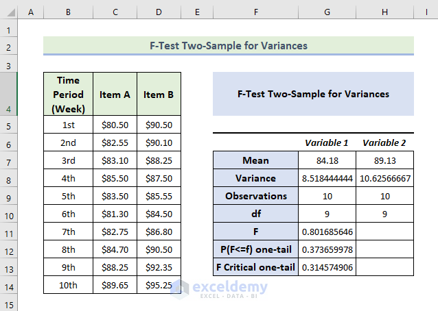
Interpretataion:
- The mean value of variable 2 is greater than variable 1.
- If F is greater than F Critical one-tail, it doesn’t follow the null hypothesis. In the above data, the value of F is .8016 and the value of F Critical one-tail is 0.3145 which indicates F is greater than F critical one-tail: the variances between the two variables don’t match.
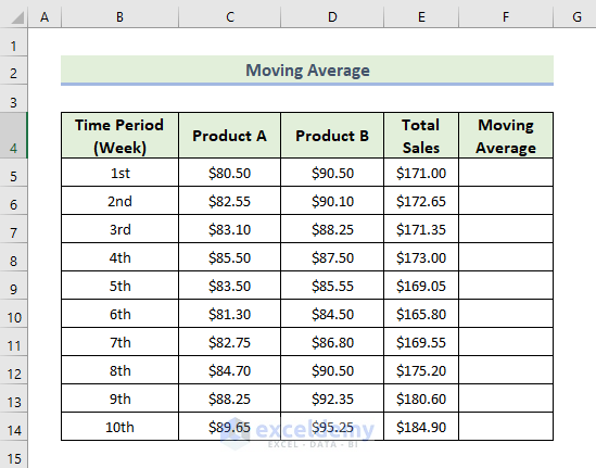
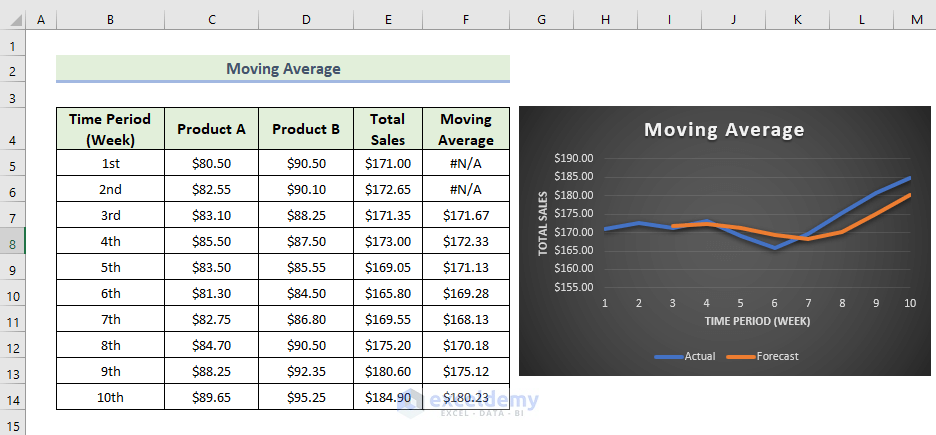
Feature 7 – Moving Average Analysis
The moving average means the period of time of the average is the same, but it keeps moving when new data is added. A moving average smooths irregularities (peaks and valleys) from data to easily recognize trends. The larger the interval period is, the more smoothing occurs, as more data points are included in each calculated average.
The dataset contains items sold in different weeks by a manufacturing company. To do a moving average analysis:
Steps:
- Go to the Data tab.
- Select Data Analysis.
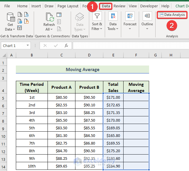
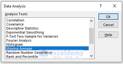
- In the Data Analysis window, select Moving Average.
- Click OK.
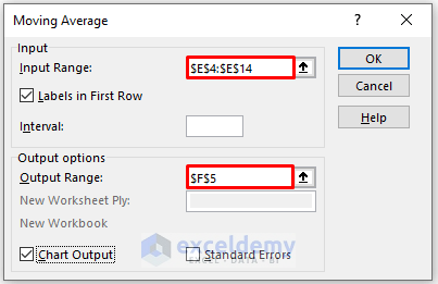
In the Moving Average box:
- Enter data in Input Range.
- Enter the number of intervals in Interval.
- In the Output Range box, enter the data range. You can also see the output in a new worksheet by selecting New Worksheet Ply or in a new workbook by selecting New Workbook.
- To see the trendline with a chart, check Chart Output.
- Check Labels in the first row.
- Click OK.
The moving average and the Excel trendline will be displayed, showing both the original data and the moving average value with smooth fluctuations.
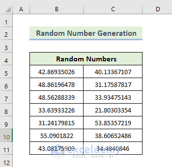
Feature 8 – Random Number Generation
Steps:
- Go to the Data tab.
- Select Data Analysis.

- In the Data Analysis, select Descriptive Statistics.
- Click OK.
In the Random Number Generation box:
- Enter the Number of Variables (the number of columns of random numbers that you want in your worksheet. Here, 2).
- Enter the Number of Random Numbers (the number of rows that you want in your worksheet. Here, 7).
- Select Uniform in Distribution.
- In parameters, indicate the boundaries of your distribution. Here 40 to 60.
- In the Output Range box, enter the data range. You can also see the output in a new worksheet by selecting New Worksheet Ply or in a new workbook by selecting New Workbook.
- Click OK.
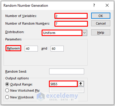
- Random numbers will be generated.
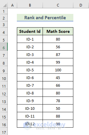
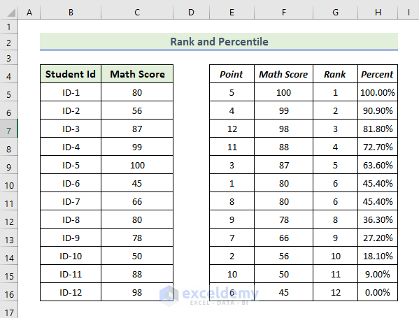
Feature 9 – Rank and Percentile Analysis
The dataset showcases students’ ID and their Math exam scores. To calculate the rank and percentile of each student’s math exam score:
Steps:
- Go to the Data tab.
- Select Data Analysis.
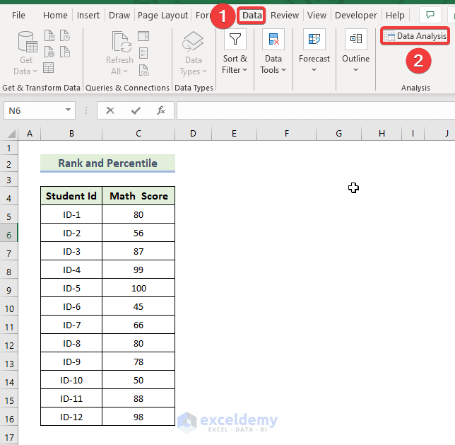
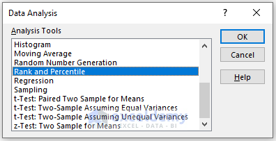
- In the Data Analysis window, select Rank and Percentile.
- Click OK.
In the Rank and Percentile box:
- Enter data in Input Range.
- Check Columns in Grouped By section.
- In the Output Range box, enter the data range. You can also see the output in a new worksheet by selecting New Worksheet Ply or in a new workbook by selecting New Workbook.
- Check Labels in the first row.
- Click OK.

The rank and percentile for each student’s exam score will be displayed.
Read More: [Fixed!] Data Analysis Not Showing in Excel
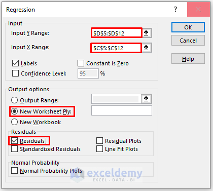
Feature 10 – Regression Analysis
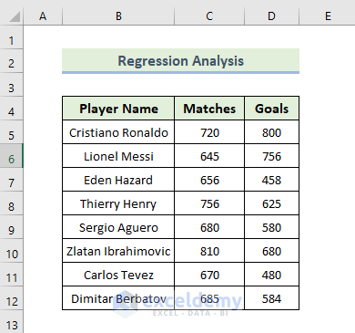
The dataset contains the player name, the number of matches played, and the number of goals each player scored.
Steps:
- Go to the Data tab.
- Select Data Analysis.
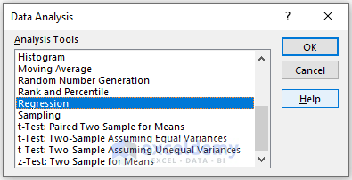
- In the Data Analysis window, select Regression.
- Click OK.
In the Regression box,
- Enter data in Input Range: the data ranges in Input X Range and Input Y Range.
- In the Output Range box, enter the data range. You can also see the output in a new worksheet by selecting New Worksheet Ply or in a new workbook by selecting New Workbook.
- Check Labels.
- Check Residuals.
- Click OK.
The result of the regression analysis is displayed.
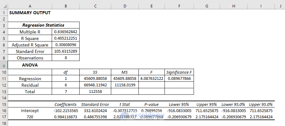
Interpretation:
Regression Statistics:
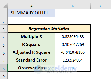
Regression statistics is an array of various parameters that describe how well the measured linear regression is.
- Multiple R is a correlation coefficient parameter that indicates the correlation between variables. Its value ranges from -1 to +1. The bigger the value, the stronger the correlative relationships are.
- R Square symbolizes the coefficient of determination. It indicates the scale by how well the data model fits the regression analysis.
- The adjusted R square is used in multiple variables in regression analysis.
- Standard Error is another parameter that shows a healthy fit of any regression analysis. The smaller the standard error the more accurate the linear regression equation. It shows the average distance of data points from the linear equation.
Anova:
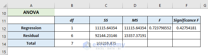
It analyses the variance of the data model.
- Here, df represents the degree of freedom.
- SS( sum of squares) symbolizes the good-to-fit parameter.
- MS means the Mean Square.
- F refers to the Null Hypothesis. It tests the overall significance of the regression model
- Significance of F means the P-value of F.
Co-efficient Outcome:
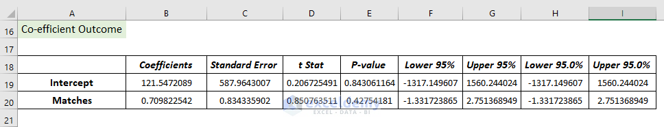
It helps to determine Y values.
Residual Output:
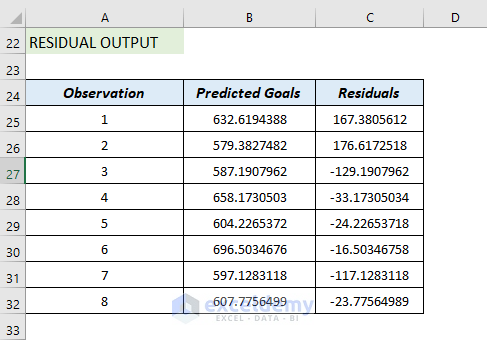
It compares the estimated value with the calculated value.
Feature 11 – t-Test Analysis
There are three types of T-Test:
- Paired two samples for means
- Two samples assuming equal variances
- Two- samples using unequal variances
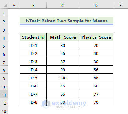
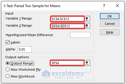
11.1 t-Test: Paired Two Sample for Means
The dataset contains Students’ IDs and each student’s Math and Physics scores.
Steps:
- Go to the Data tab.
- Select Data Analysis.
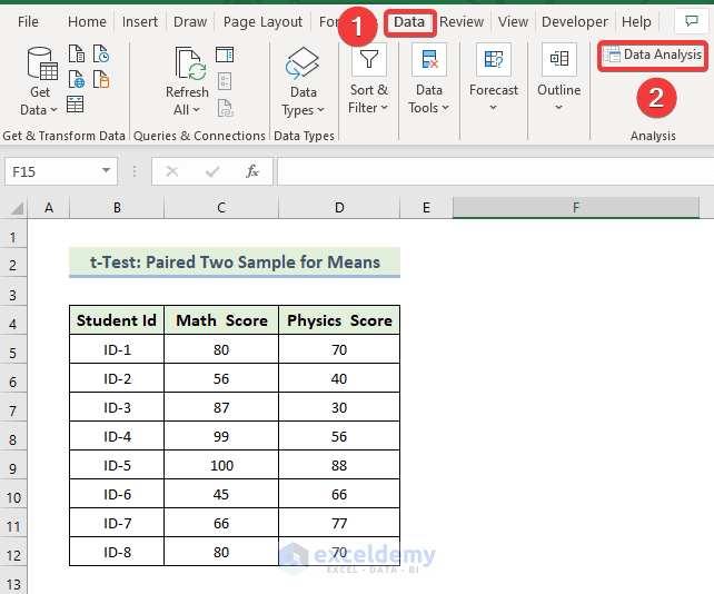
- In the Data Analysis window, select t-Test: Paired Two Samples for Means.
- Click OK.

In the t-Test: Paired Two Sample for Means box:
- Enter data in Input: the data ranges in Variable 1 Range and Variable 2 Range.
- In the Output Range box, enter the data range. You can also see the output in a new worksheet by selecting New Worksheet Ply or in a new workbook by selecting New Workbook.
- Check Labels.
- Click OK.
The result of the t-Test: Paired Two Sample for Means will be displayed.
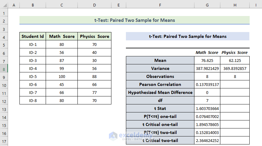
Interpretation:
- The Mean Value of the Math Score is greater than the mean value of the Physics Score.
- The variance of the Math Score is also greater than the variance of the Physics Score.
- If t Stat is greater than t Critical two-tail, you can’t eliminate null hypothesis. In the above calculation, t Stat and t Critical two-tail value are respectively 1.603 and 2.36464. That means 1.603< 2.36464: it doesn’t match the null hypothesis. The variances between the two variables don’t match.
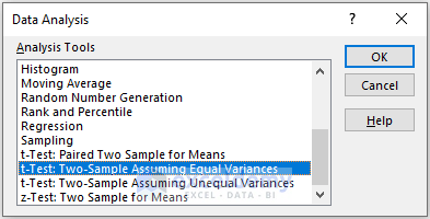
11.2 t-Test Two-Sample Assuming Equal Variances
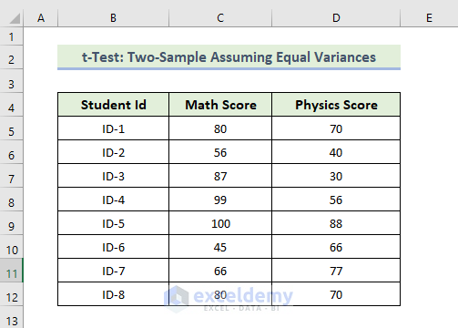
Steps:
- Go to the Data tab.
- Select Data Analysis.
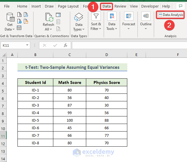
- In the Data Analysis window, select t-Test: Two-Sample Equal Variances.
- Click OK.
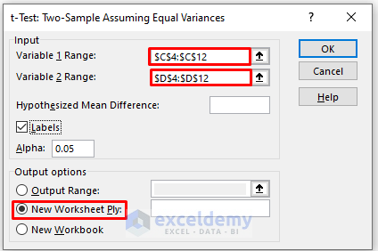
In the t-Test: Paired Two Sample Equal Variances box,
- Enter data in Input: the data ranges in Variable 1 Range and Variable 2 Range.
- In the Output Range box, enter the data range. You can also see the output in a new worksheet by selecting New Worksheet Ply or in a new workbook by selecting New Workbook.
- Check Labels.
- Click OK.
The t-Test: Two-Sample Equal Variances will be displayed.
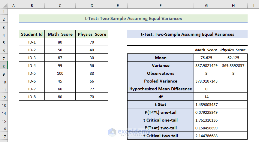
Interpretation:
- The Mean Value of the Math Score is greater than the mean value of the Physics Score.
- The variance of the Math Score is also greater than the variance of the Physics Score.
- If t Stat is greater than t Critical two-tail, you can’t eliminate the null hypothesis. In the above calculation, t Stat is and t Critical two-tail values are respectively 1.48 and 2.144. 1.48< 2.144: it doesn’t match the null hypothesis. The variances between the two variables don’t match.
11.3 t-Test: Two-Sample Assuming Unequal Variances
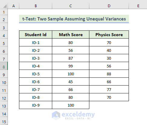
Steps:
- Go to the Data tab.
- Select Data Analysis.
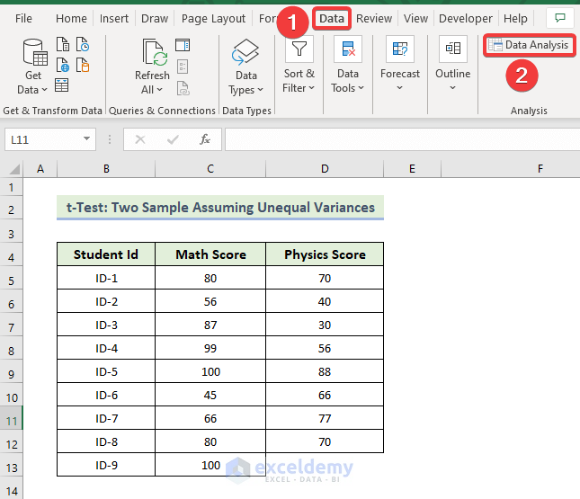
- In the Data Analysis window, select t-Test: Two-Sample Unequal Variances.
- Click OK.

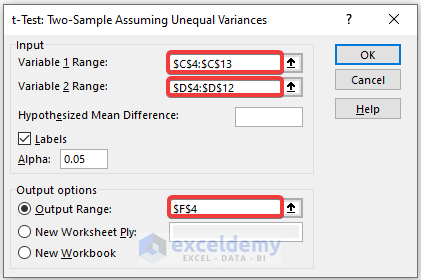
In the t-Test: Paired Two Sample Unequal Variances box,
- Enter data in Input: the data ranges in Variable 1 Range and Variable 2 Range.
- In the Output Range box, enter the data range. You can also see the output in a new worksheet by selecting New Worksheet Ply or in a new workbook by selecting New Workbook.
- Check Labels.
- Click OK.
The t-Test: Two-Sample Unequal Variances will be displayed.
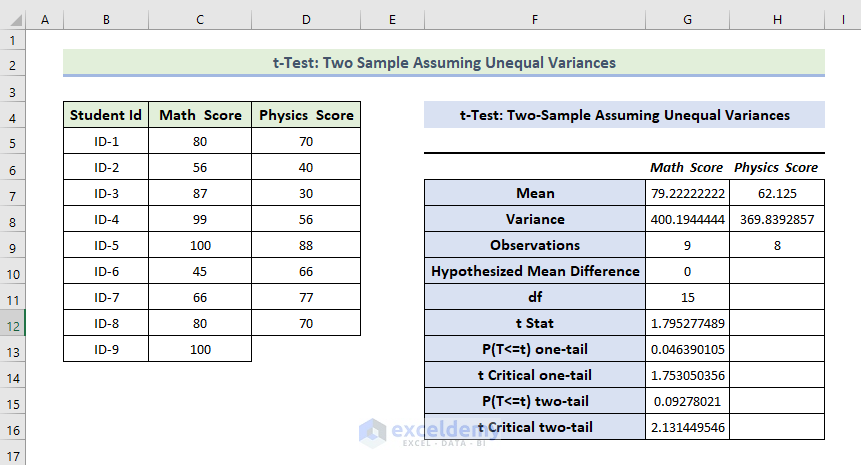
Interpretation:
- The Mean Value of the Math Score is greater than the mean value of the Physics Score.
- The variance of the Math Score is also greater than the variance of the Physics Score.
- If t Stat is greater than t Critical two-tail, you can’t eliminate null hypothesis. In the above calculation, t Stat and t Critical two-tail values are respectively 79 and 2.131. 1.79< 2.131: it doesn’t match the null hypothesis. The variances between the two variables don’t match.
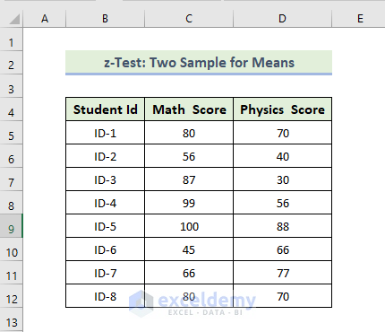
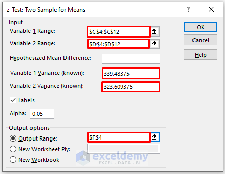
Feature 12 – z-Test: Two Sample for Means
Steps:
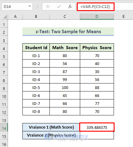
- To calculate the variance of the Math score, use the following formula in D14:
=VAR.P(C5:C12)
- Press Enter.
- You will see the variance of Match Score.
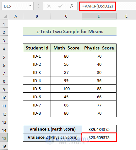
- To calculate the variance of the Physics score, use the following formula in D15:
=VAR.P(D5:D12)
- Press Enter.
You will see the variance of Physics Score.
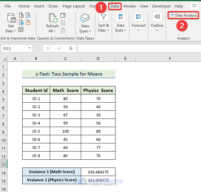
- Go to the Data tab.
- Select Data Analysis.
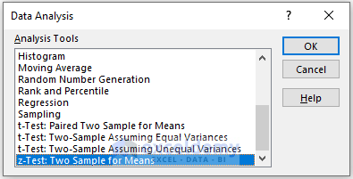
- In the Data Analysis window, select z-Test: Two-Sample Means.
- Click OK.
In the z-Test: Two-Sample Means box:
- Enter data in Input: the data ranges in Variable 1 Range and Variable 2 Range.
- In the Output Range box, enter the data range. You can also see the output in a new worksheet by selecting New Worksheet Ply or in a new workbook by selecting New Workbook.
- Enter the value variance of Math and Physics Score in Variable 1 Variance (known) and Variable 2 Variance (known)
- Check Labels.
- Click OK.
The z-Test: Two-Sample Means will be displayed.
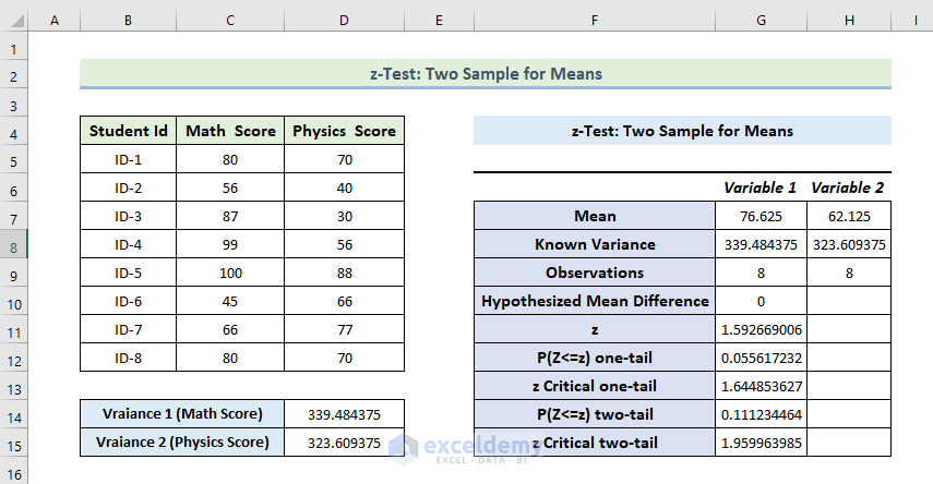
Interpretation:
- The Mean Value of the Math Score is greater than the mean value of the Physics Score.
- The variance of the Math Score is also greater than the variance of the Physics Score.
- If Z is less than Z critical two-tail, you can’t eliminate the null hypothesis. In the above calculation, z and z Critical two-tail values are 52 and 1.95. 1.52 < 1.95: matches the null hypothesis. The variances between the two variables match.
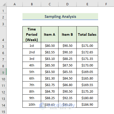
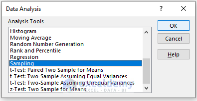
Feature 13. Sampling Analysis
To do a sampling analysis:
Steps:
- Go to the Data tab.
- Select Data Analysis.
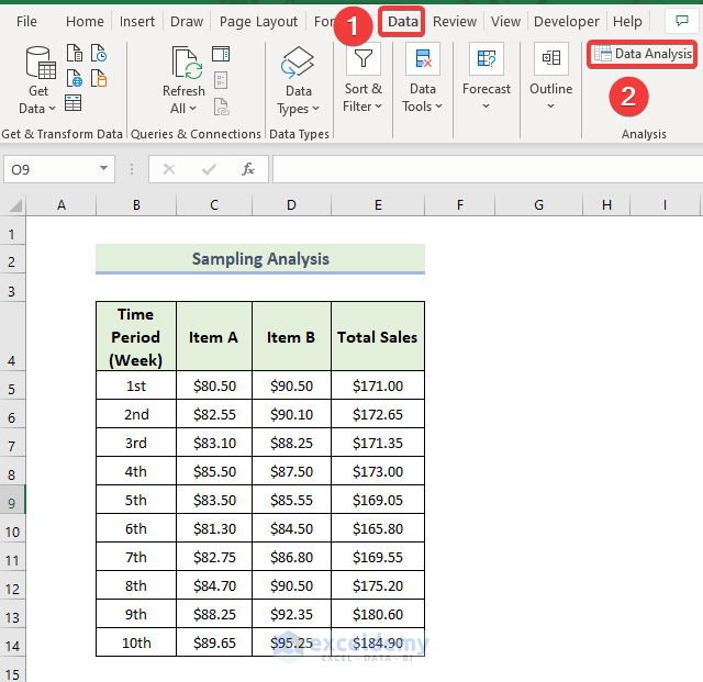
- In the Data Analysis window, select Sampling.
- Click OK.
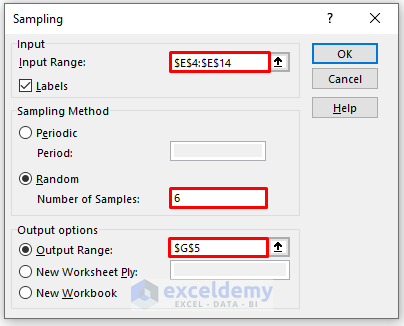
In the Sampling box,
- Enter data in the Input Range.
- In the Output Range box, enter the data range. You can also see the output in a new worksheet by selecting New Worksheet Ply or in a new workbook by selecting New Workbook.
- Enter data in Number of Samples.
- Check Labels.
- Click OK.
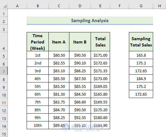
The Sampling analysis will be displayed: six samples were taken from the Total Sales column.
Download Practice Workbook
Download the practice workbook to exercise.
Related Articles
<< Go Back to Data Analysis with Excel | Learn Excel
Get FREE Advanced Excel Exercises with Solutions!

I am a social science researcher, was struggling to find out the suitable analytical tool for excel. You explained the way in such easy way that provide the awesome intuition for the statistical analysis. great work.
Hello Maeenuddin Khan,
Glad to hear your appreciation. Thank you so much for your kind words! It’s great that the explanation helped you with finding a suitable analytical tool in Excel for your research. It’s always rewarding to know that the content makes a positive impact. If you have any further questions or need more guidance, feel free to reach out anytime. Keep up the great work with your research!
Regards
ExcelDemy