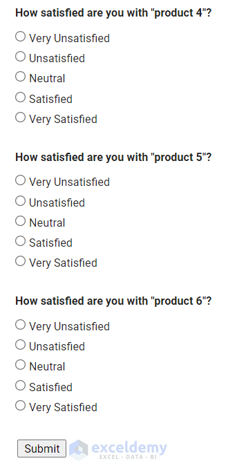
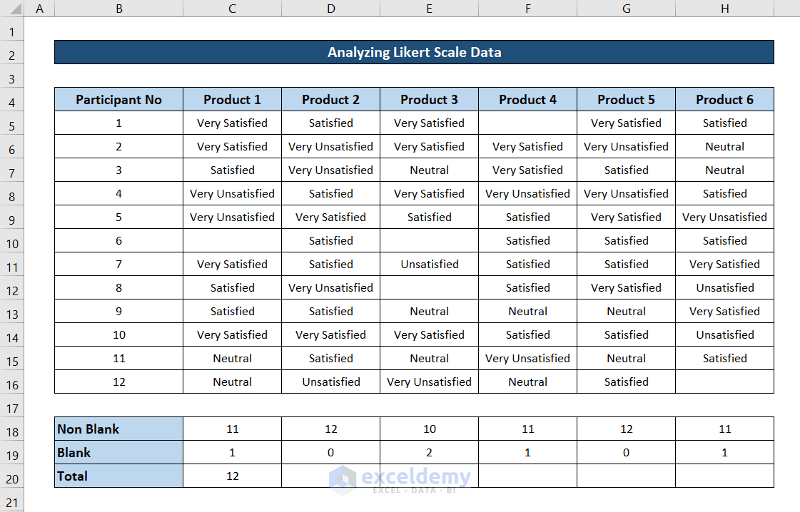
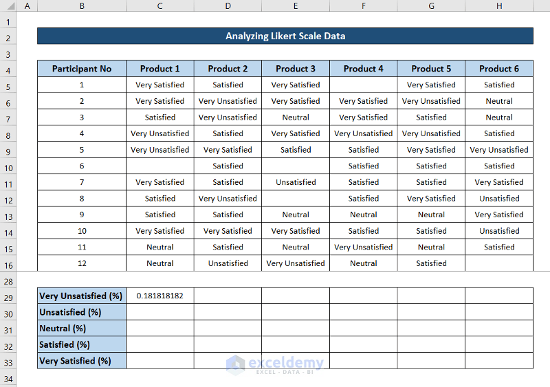
Step 1 – Create a Survey Form and Make the Dataset
- We need to collect data from participants or customers. You can collect data manually or use online survey tools. We have created the following survey with Google Forms.

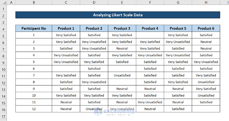
- Gather all the answers and organize them.
- Fill the responses in Excel to make a workable dataset.
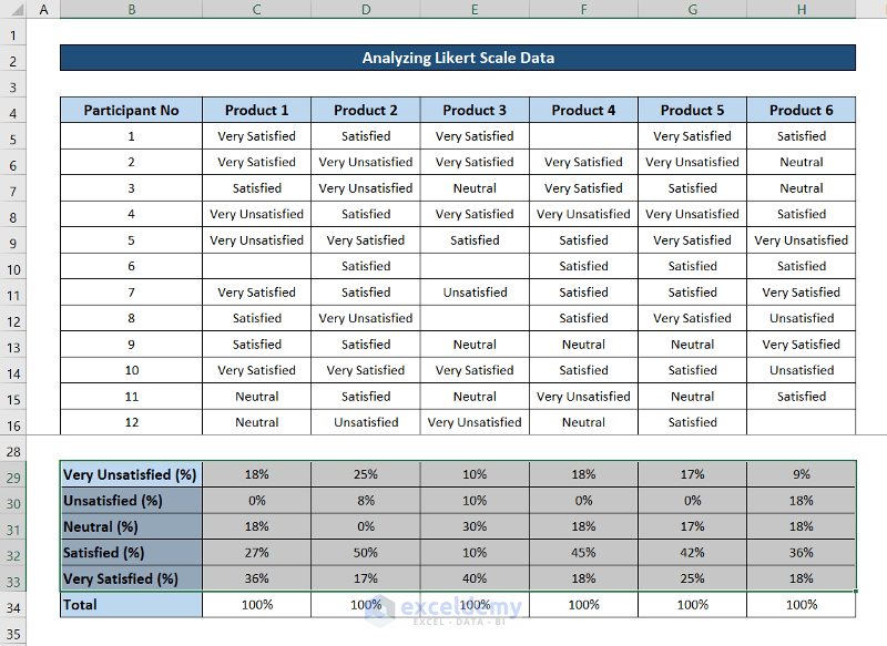
- A sample dataset of 12 people participating in the survey will look like this.
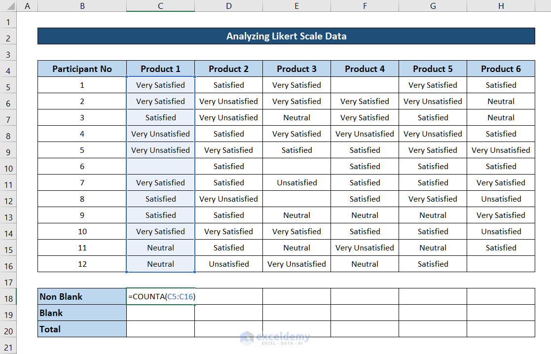
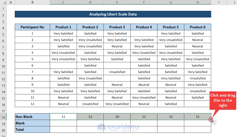
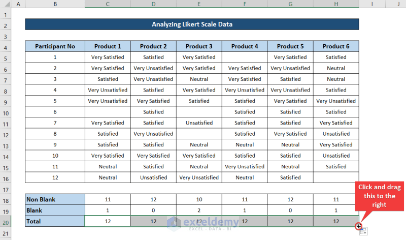
Step 2 – Count Blank and Non-Blank Responses
- We made a smaller table on the bottom to calculate basic statistical results.
- Select cell C18 and use the following formula.
=COUNTA(C5:C16)
- Press Enter.
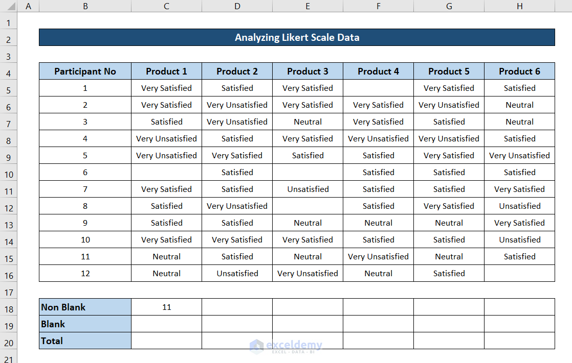
- Click and drag the fill handle icon to the right to fill up the formula for the rest of the cells.
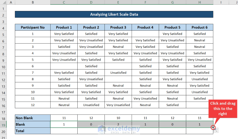
- Select cell C19 and insert this formula.
=COUNTBLANK(C5:C16)
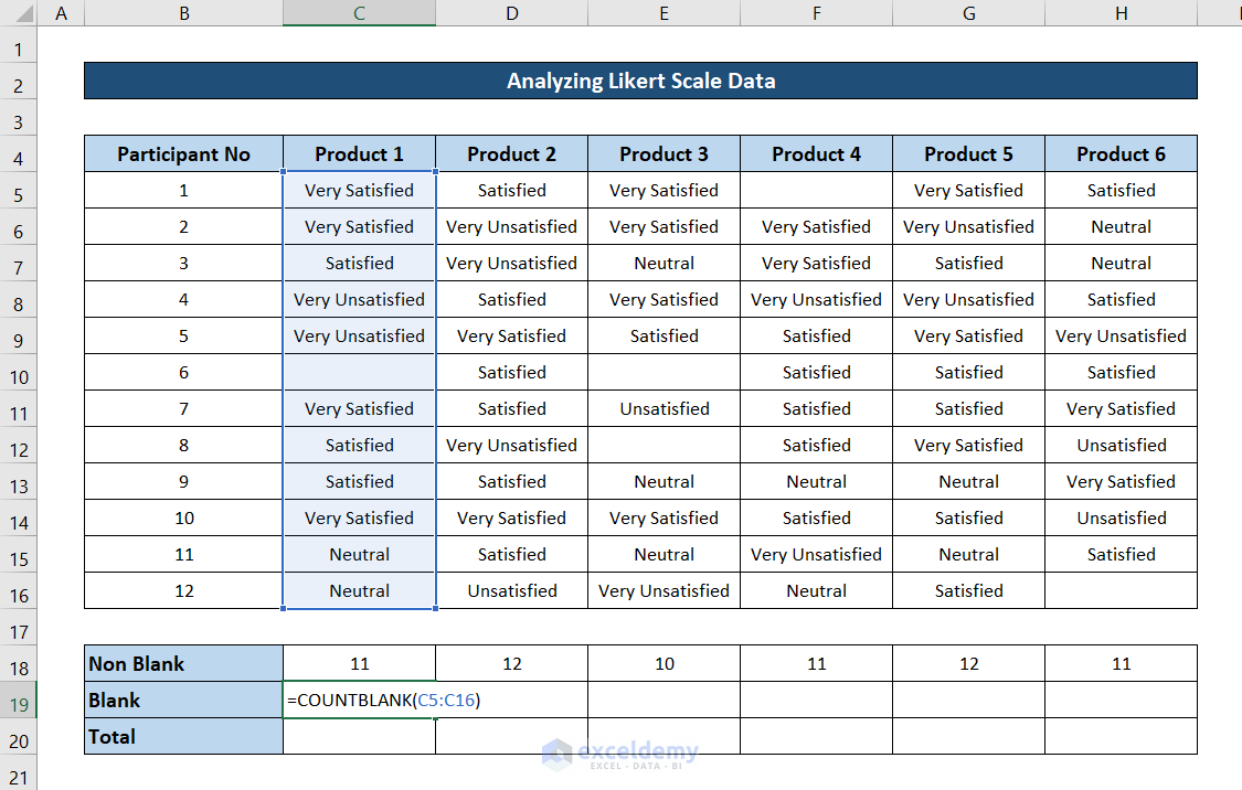
- Press Enter.

- Click and drag the fill handle icon to the end of the row to fill out the rest of the cells with this formula.
- Select the cell C20 and use the following formula in the cell.
=SUM(C18:C19)
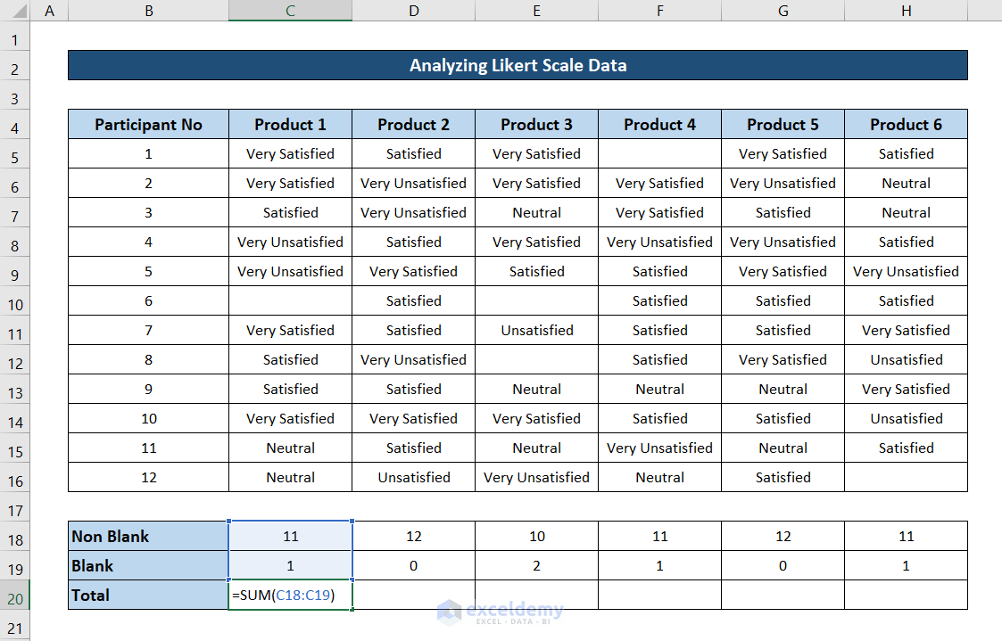
- Hit Enter.
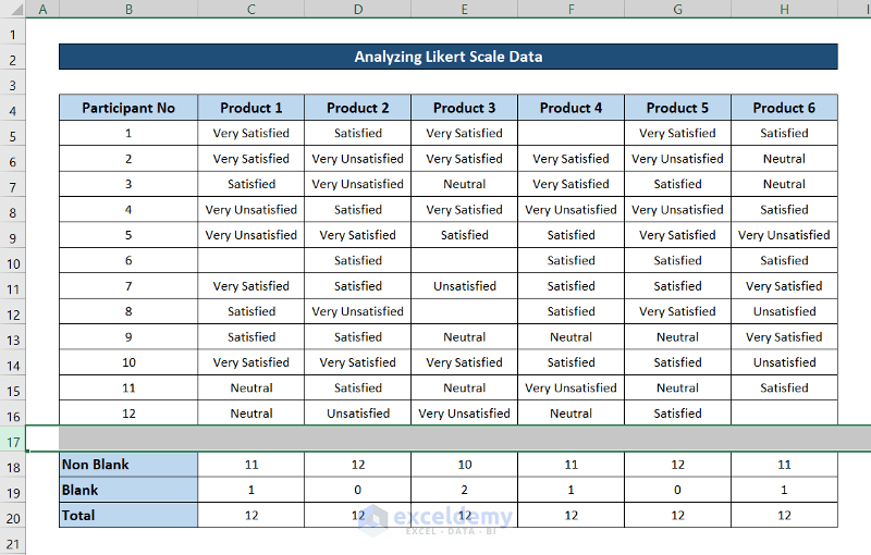
- Now select the cell again. Then click and drag the fill handle icon to the end of the row to replicate the formula for each cell.
Read More: How to Analyze Raw Data in Excel
Step 3 – Count All Feedback from the Dataset
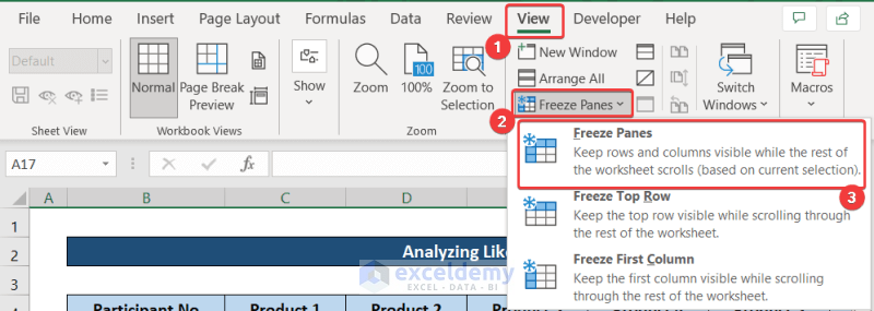
- Select the row after where the dataset ended.
- Go to the View tab and select Freeze Panes from the Windows group.
- Choose Freeze Panes from the drop-down menu.
- We’ve inserted the possible answers in B22:B26.
- Scroll down to the bottom of the sheet, select cell C22, and insert the following formula.
=COUNTIF(C$5:C$16,$B22)
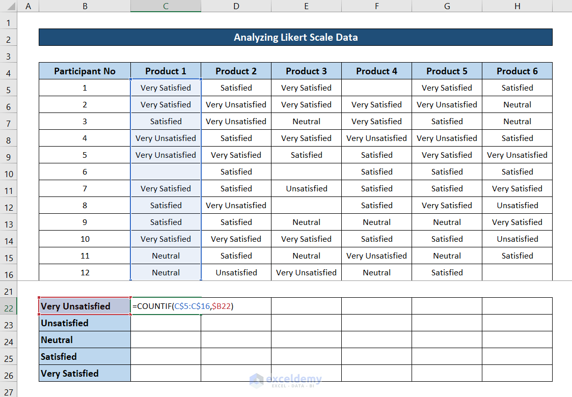
- Hit Enter and you will have the total number of people who are “Very Unsatisfied” with the first product.
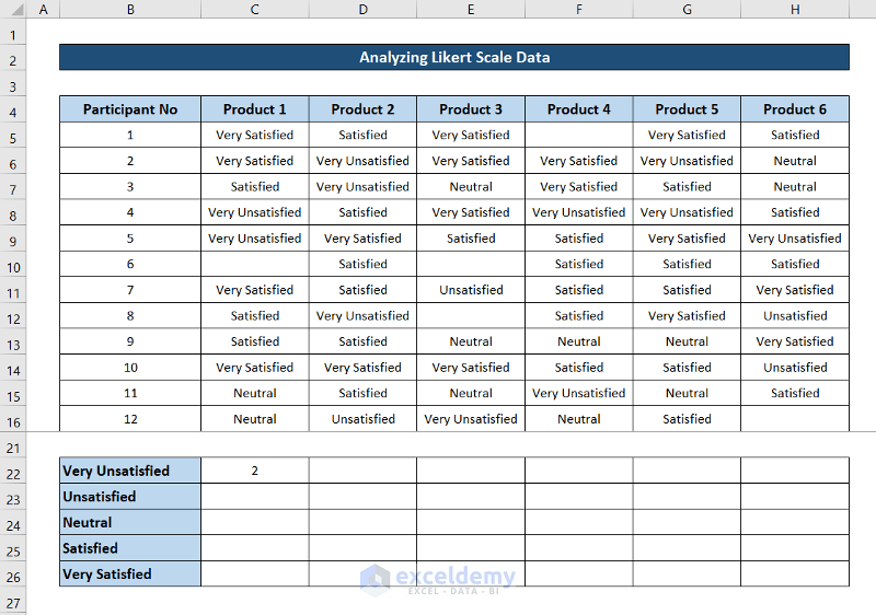
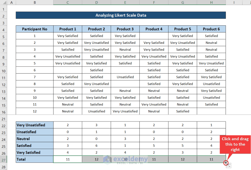
- Click and drag the fill handle icon to the end of the column to fill out the rest of the cells with this formula.
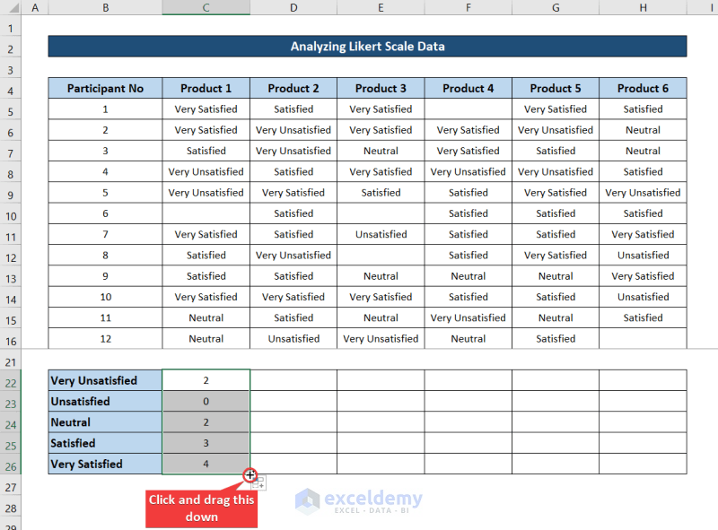
- While the range is selected, click and drag the fill handle icon to the right to fill out the rest of the cells with the formula for their respective cells.
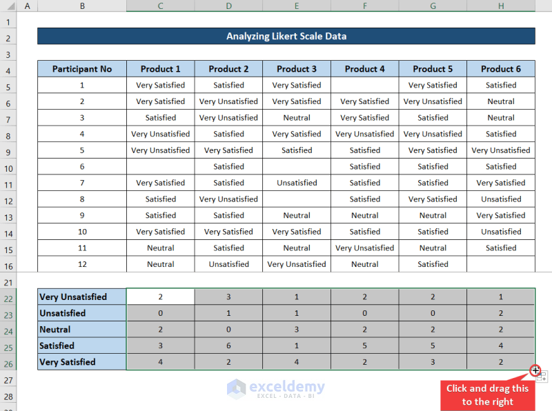
- Select cell C27 and insert the following formula.
=SUM(C22:C26)
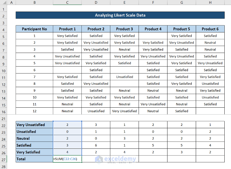
- You should get the same result as the previous Total Sum in row 20.
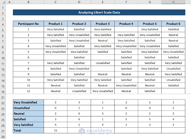
- Click and drag the fill handle icon to the end of the row to replicate the formula for the rest of the cells.
Read More: How to Analyze Large Data Sets in Excel
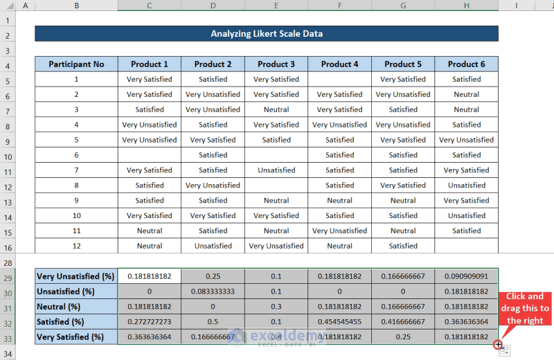
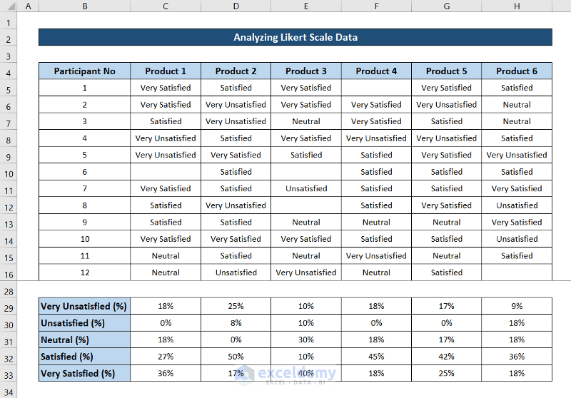
Step 4 – Calculate the Percentage of Each Feedback
- Select the cell C29 and insert the following formula.
=C22/C$27
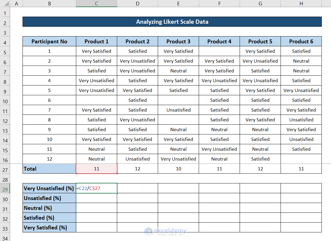
- Hit Enter.
- Click and drag the fill handle icon to the end of the column to fill the rest of the cells with this formula.
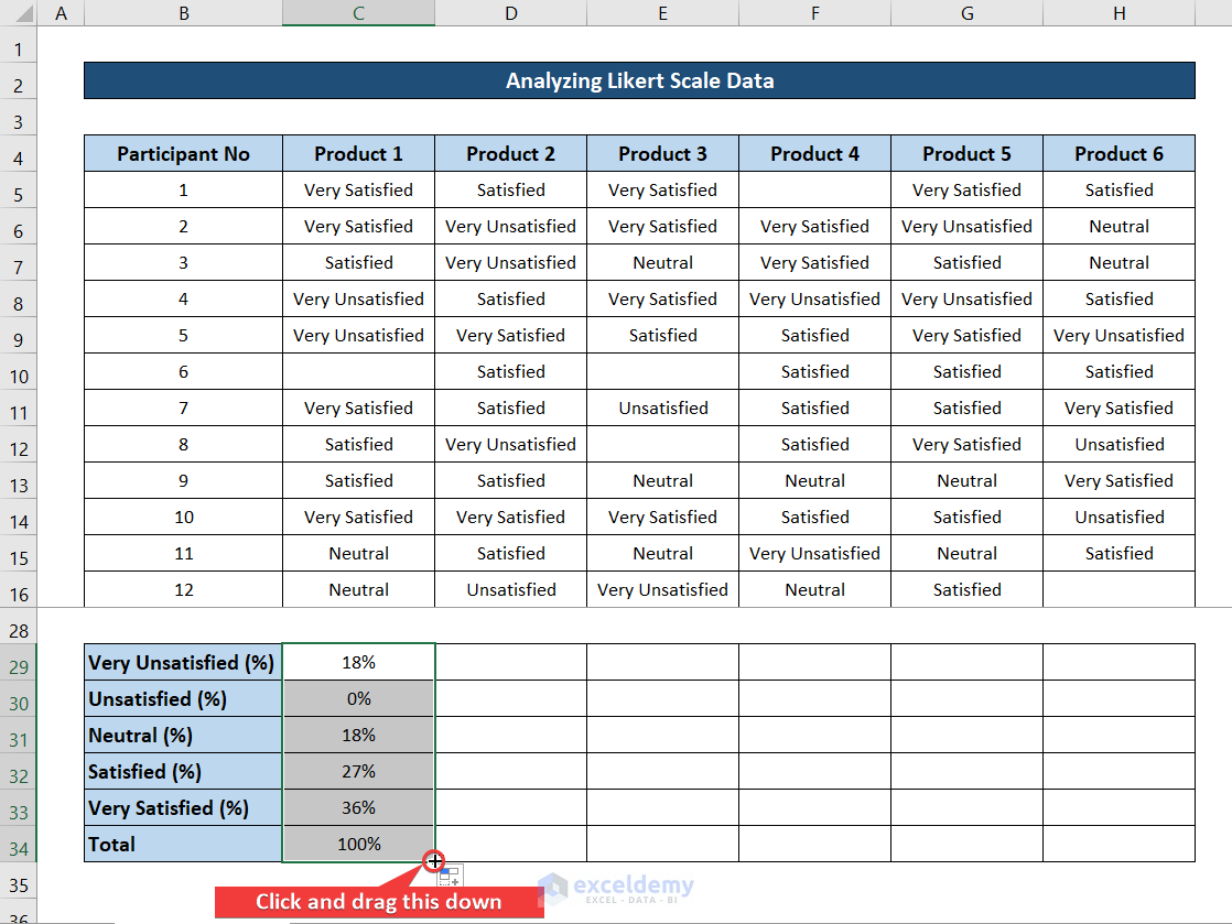
- While the range is selected, click and drag the fill handle icon to the right to replicate the formula for the rest of the cells.
- Select the range C29:H33 and go to the Home tab on your ribbon.
- Select % from the Number group.
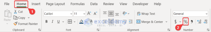
- You will get all of the ratios in a percentage format.
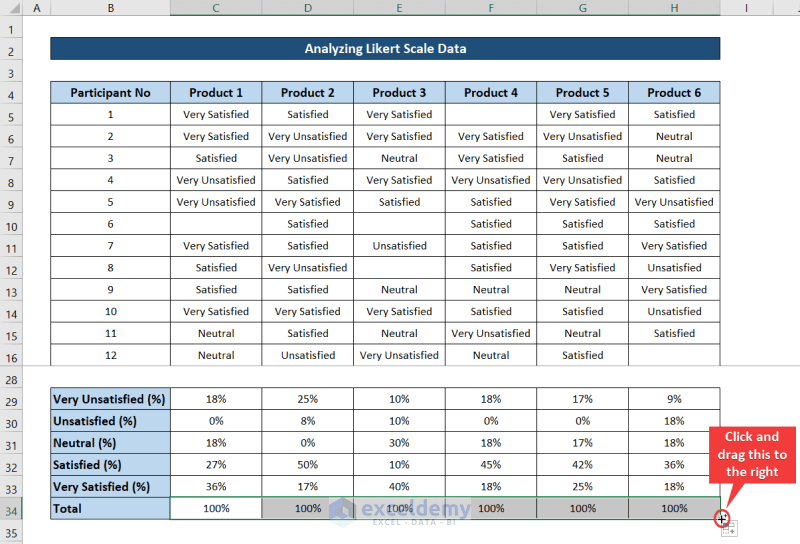
- Select cell C34 and insert the following formula.
=SUM(C29:C33)
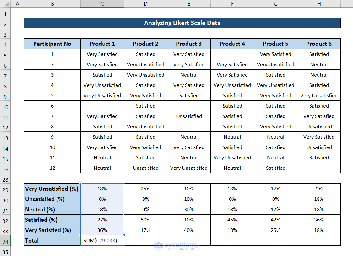
- You should get 100% as value.
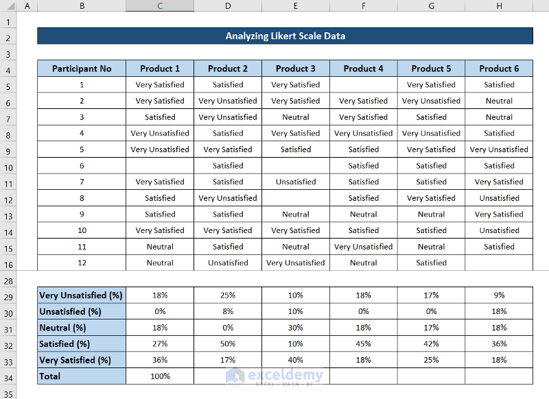
- Click and drag the fill handle icon to the end of the row to fill out the rest of the cells with the formula.
Step 5 – Make a Report on the Likert Scale Analysis
- Select the range B4:H4 and copy it to the clipboard.
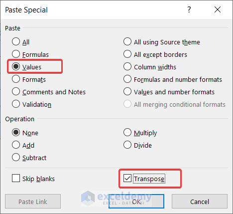
- Go to a new spreadsheet and right-click on the cell you want to start the report (we have selected cell B4 here), then click on Paste Special from the context menu.

- In the Paste Special box, check Transpose and click OK.
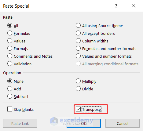
- Here’s the start of the table.
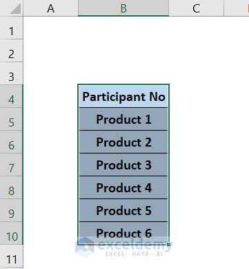
- Rename the value in cell B4 to align with the report.
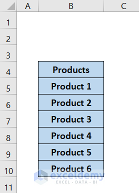
- Go back to the Likert scale sheet, select the range B29:H33, then copy it.
- Move to the report sheet, select cell B5, and right-click on it.
- Select Paste Special from the context menu.
- Check the Values and Transpose options in the Paste Special box.
- Click OK and you will get something like this.
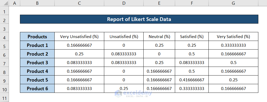
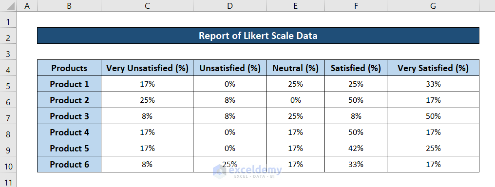
- Format the cells as percentages.
- You will get a report that looks like this.
Read More: How to Analyze Text Data in Excel
Step 6 – Generate the Final Report with Charts
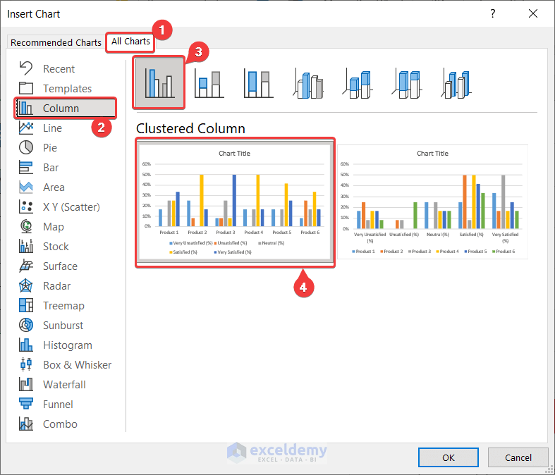
- Select the range B4:G10.
- Go to the Insert tab on your ribbon and select Recommended Charts from the Charts group.

- In the Insert Chart box, select the All Charts tab and select the type of chart you want from the left side of the box and then the specific graph from the right of the box.
- Click on OK.
- A graph will pop up on the spreadsheet.
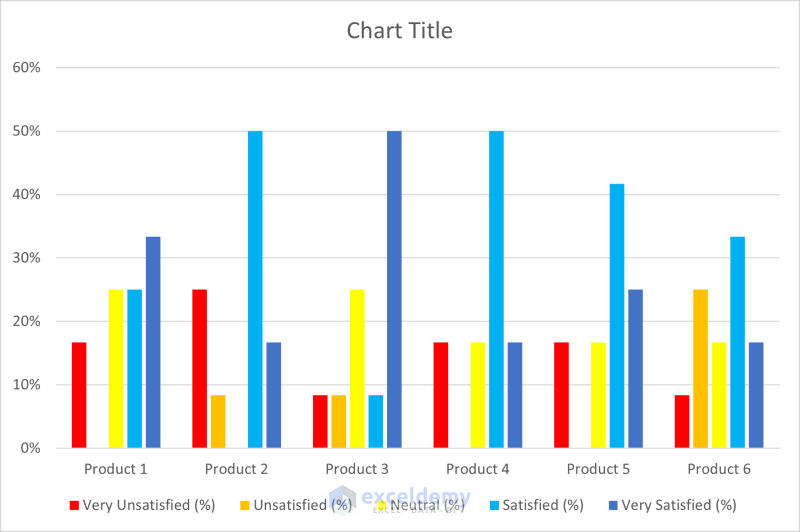
- After some modifications, the chart will look something like this.
Read More: How to Analyze Time Series Data in Excel
Download the Practice Workbook
Related Articles
- How to Analyze Sales Data in Excel
- How to Analyze qPCR Data in Excel
- How to Analyze Quantitative Data in Excel
- How to Analyze Qualitative Data in Excel
- How to Analyse Qualitative Data from a Questionnaire in Excel
- How to Convert Qualitative Data to Quantitative Data in Excel
<< Go Back to Data Analysis with Excel | Learn Excel
Get FREE Advanced Excel Exercises with Solutions!

This guide is AMAZING. As a masters student analysing data like this for the first time, this guide has been a saviour. Thank-you!!
Hello P MUMU,
We are glad to know that this article helped you to solve your problem. For more like this, make sure to check our other articles from ExcelDemy.
Thank you so much for this. The tutorial is very specific and organize. i was able to understand clearly, thank you so much.
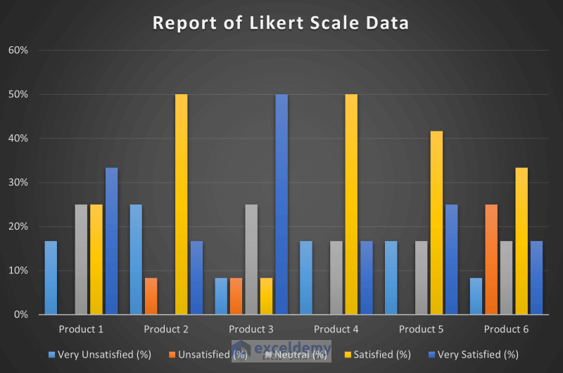
This is a very handy step-through. However, how do you make the stacked bar charts of Likert scales (much easier to comprehend than the bar graph you have).
Hello Claire,
Follow these steps to make the stacked bar charts of Likert scales.
Insert >> Charts >> 100% Stacked Column
Thank you.
Thanks for your time. I was so helpful.
Dear Kh Paydar,
You are most welcome.
Regards
ExcelDemy
I am a beginner; it is very helpful.
Thanks fhasim015! Glad to know that.
Very helpful. Organized in a clear way. Thank you so much
Dear Navini,
You are most welcome.
Regards
ExcelDemy
Thanks for the work. It saved me, save going to SPSS and other long statistical softwares.
(1) Likert scale range is 1 to 5 for question answer… I failed to find their effect on the final results… are they multiplied or added & when &
where.
(2) Is it possible to add non-parametric tests to the nice Excel sheet
Hello Hassan Ibrahim Mohammed,
Hope you are doing well. I will suggest you to go through the article again. You can download the dataset to try the calculations.
1: Likert Scale Range and Its Effect on Final Results
Here, each Likert scale response (ranging from 1 to 5) is assigned a numerical value. These values are added up for each respondent to get a total score. For example, if a respondent’s answers to five questions are 4, 3, 5, 2, and 1, the total score is 15. This summed score helps in analyzing the overall sentiment or opinion of the respondents. Higher scores indicate more positive responses, while lower scores indicate more negative responses.
2: Adding Non-Parametric Tests to Excel
To add non-parametric tests like the Mann-Whitney U test or the Kruskal-Wallis test to your Excel sheet, you can use the dataset from the article. But Excel does not have built-in non-parametric test functions, you need to manually calculate them using formulas and the Data Analysis ToolPak (If not available in Ribbon, get it from Excel options). For example, you can rank your Likert scale data using the RANK function and then apply the necessary formulas to perform the tests. It may require detailed setup and understanding of the test procedures, but it can be done effectively in Excel.
Regards
ExcelDemy