Looking for ways to analyze raw data in Excel? Then, this is the right place for you. Here, you will find 9 different ways to analyze raw data in Excel.
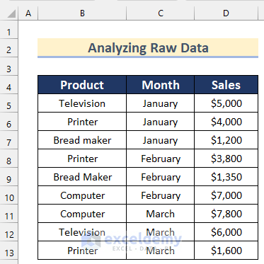
Here, we have a dataset containing the names of some Product, Month, and Sales values of a company. Now, we will show you how you can analyze this raw data set in Excel in 9 suitable ways.
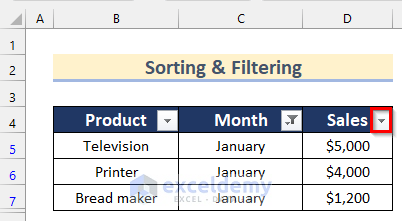
1. Using Sort & Filter Feature to Analyze Raw Data in Excel
In the first method, you will find a way to sort & filter raw data to analyze in Excel. Follow the steps given below to do it on your own.
Steps:
- Firstly, select the field you want to filter. Here, we will select Cell C4.
- Then, go to the Data tab >> click on Sort & Filter >> select Filter.
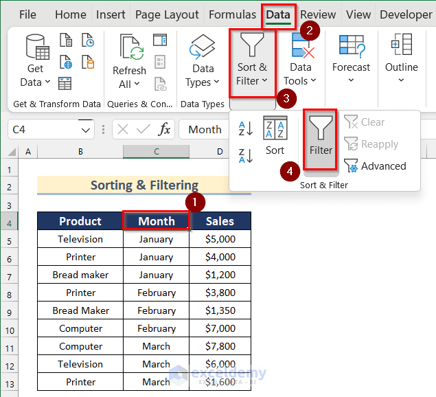
- Next, click on the button shown below.
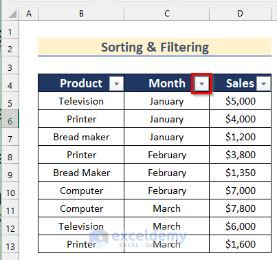
- After that, turn off Select All option and turn on January.
- Then, click on OK.

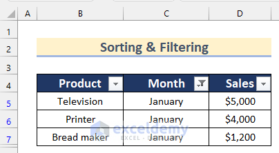
- Now, you will get the filtered data having only the Sales value of January.
- Additionally, to sort the Sales values, click on the button shown below.
- After that, click on Sort Smallest to Largest.

- Thus, you can sort and filter raw data to analyze in excel.

Read More: How to Analyze Large Data Sets in Excel
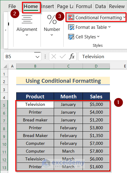
2. Analyzing Raw Data Using Conditional Formatting
Next, we will show you how you can analyze raw data using Conditional Formatting in Excel. Go through the steps given below to do it on your own.
Steps:
- Firstly, select Cell range B5:D13.
- Then, go to the Home tab >> click on Conditional Formatting.
- Next, click on Top/Bottom Rules >> select Bottom 10 Items.

- Now, the Bottom 10 Items box will open.
- After that, insert 2 in the box and select Light Red Fill with Dark Red Text as Format.
- Then, click on OK.
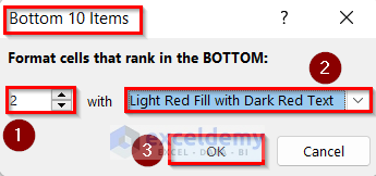
- Finally, you will be able to analyze the bottom 2 Sales values from your dataset.

- Similarly, you can use this feature for different other analyses of your raw data.
Read More: How to Analyze Text Data in Excel
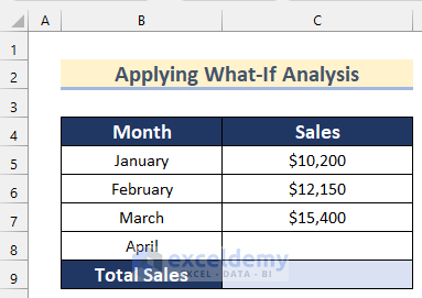
3. Applying What-If Analysis to Inspect Data in Excel
Now, suppose you have a dataset containing the Sales values for 3 months and you have a Target Sales value for 4 months. You can calculate the Sales value of the remaining month to reach your target using the What-If Analysis feature in Excel.
Here are the steps.
Steps:
- Firstly, to calculate the current Total Sales, select Cell C9 and insert the following formula.
=SUM(C5:C8)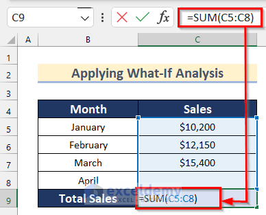
- After that, press Enter.

Here, in the SUM function, we added the values of the Cell range C5:C8 to calculate the Total Sales for 4 months.
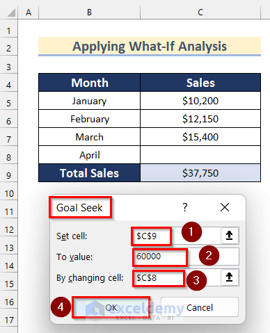
- Then, go to the Data tab >> click on Forecast >> click on What-If Analysis >> select Goal Seek.

- Now, the Goal Seek box will open.
- Afterward, insert Cell C9 as Set Cell, 60000 as To value and Cell C8 as By changing cell.
- Next, click on OK.
- Finally, click on OK.
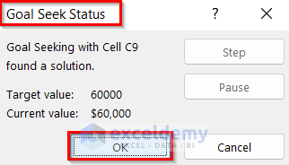
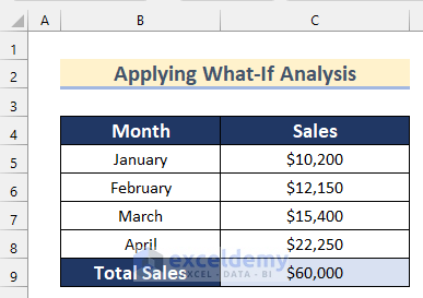
- Thus, you will get the value of Sales for the remaining month to reach your Target Sales.
Read More: How to Analyze Time Series Data in Excel
4. Scanning Raw Data with Analyze Data Feature
You can also scan raw data with the Analyze Data feature. Follow the steps given below to know how to do that.
Steps:
- To start with, select Cell range B4:D13.
- Then, go to the Home tab >> click on Analyze Data.
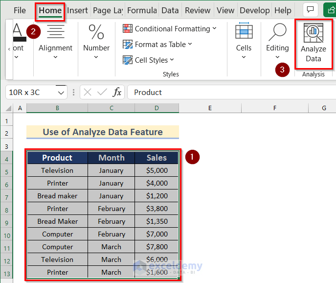
- After that, the Analyze Data toolbar will open.
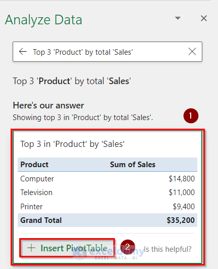
- Here, you will see different kinds of PivotTable and PivotChart already created using the dataset. You can insert any of them according to your needs.
- Now, we will insert the Sales by Product and Month PivotTable.
- To do that, click on Insert PivotTable.

- Thus, you can insert different PivotTable or PivotChart using the Analyze Data feature in Excel.

- Additionally, you can analyze your raw data by using the Suggested options.
- To do that, click on the Ask a Question about your data box.
- Then, you will see different Suggested options there.
- Next, click any of them according to your needs.
- Here, we will click on the Top 3 ‘Product’ by total ‘Sales’ option.

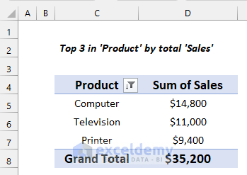
- After that, you will see that a sample PivotTable has appeared.
- Further, click on Insert PivotTable.
- Finally, the PivotTable will be added to a different worksheet.
Read More: How to Analyze Sales Data in Excel
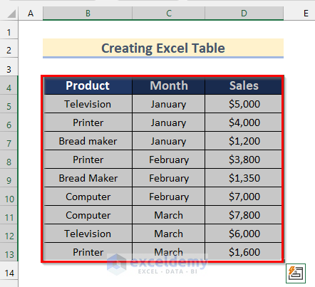
5. Researching Raw Data by Creating an Excel Table
In the fifth method, we will show you how you can research raw data by creating tables in Excel. Follow the steps given below to do it on your own dataset.
Steps:
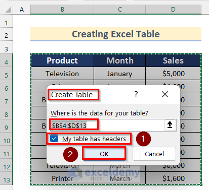
- In the beginning, select Cell range B4:D13.
- Then, press the keyboard shortcut Ctrl + T.
- Now, the Create Table box will appear.
- Next, you will see that the Cell range has already been selected.
- After that, turn on My table has header option.
- Then, click on OK.
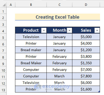
- Afterward, you will see that the raw dataset has been converted into a table.
- Here, you can analyze your data using this table.
Suppose you want to filter the Sales values greater than $3800 and sort them from smallest to largest. You can do this by using this table.
- Firstly, click on the button shown below beside the Sales field.
- Then, click on Number Filter >> select Greater Than.

- Now, the Custom Autofilter box will open.
- After that, select is greater than from the drop-down option and insert $3800 in the box.
- Then, click on OK.

- Thus, you will be able to filter the data using the table.

- Next, to sort the Sales values, click on the button shown below.
- Then, click on Sort Smallest to Largest.

- Finally, the Sales values will be sorted using the table.

6. Using Power Query Editor for Analyzing Data in Excel
Now, we will show you how to analyze raw data using the Power Query Editor in Excel. Go through the steps given below to do it on your own.
Steps:
- Firstly, select Cell range B4:D13.
- Secondly, go to the Data tab >> click on From Table/Range.
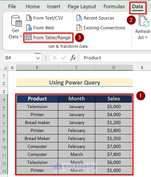
- Now, the Create Table box will appear.
- After that, you will see that the Cell range has already been selected.
- Next, turn on My table has header option.
- Then, click on OK.

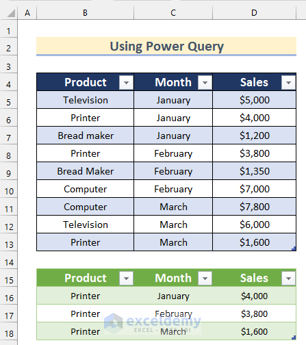
- Consequently, the table will open in the Power Query Editor.
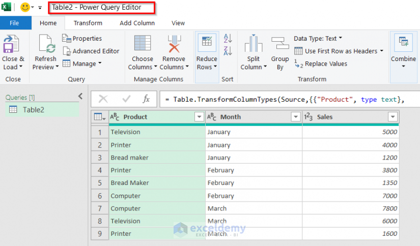
- Then, to filter the Products, click on the button shown below.

- Afterward, turn off the Select All option and turn on the Printer option.
- Next, click on OK.

- After that, click on Close & Load >> select Close & Load To.
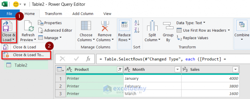
- Now, the Import Data box will open.
- Then, select Existing worksheet.
- Next, insert Cell C15 to put the data in that cell.
- Finally, click on OK.

- Here, a PivotTable will be added in the Existing worksheet using Power Query Editor.
Read More: How to Analyze Quantitative Data in Excel
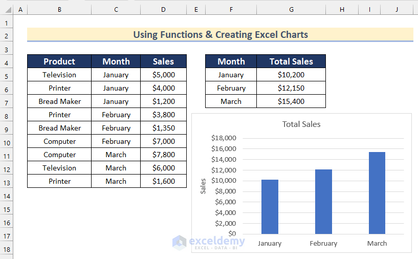
7. Surveying Raw Data Using Functions & Creating Excel Charts
You can also survey raw data using different functions and then create different kinds of Excel Charts. Here, we will show you how you can analyze our given dataset using the SUMIF function and then create a Bar Chart.
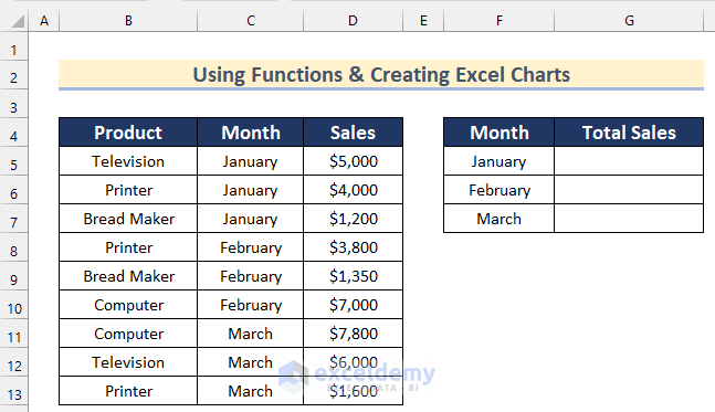
Steps:
- To start with, select Cell G5 and Insert the following formula.
=SUMIF($C$5:$C$13,F5,$D$5:$D$13)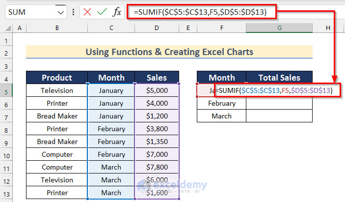
- Then, press Enter.
- After that, drag down the Fill Handle tool to AutoFill the formula for the rest of the cells.
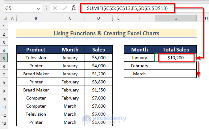
Here, in the SUMIF function, we inserted Cell range C5:C13 as range, Cell F5 as criteria and Cell range D5:D13 as sum_range.
- Now, you will get the Total Sales values for the 3 months.

- Next, to create a Bar Chart using these values, select Cell range F4:G7.
- Then, go to the Insert tab >> click on Insert Column or Bar Chart.
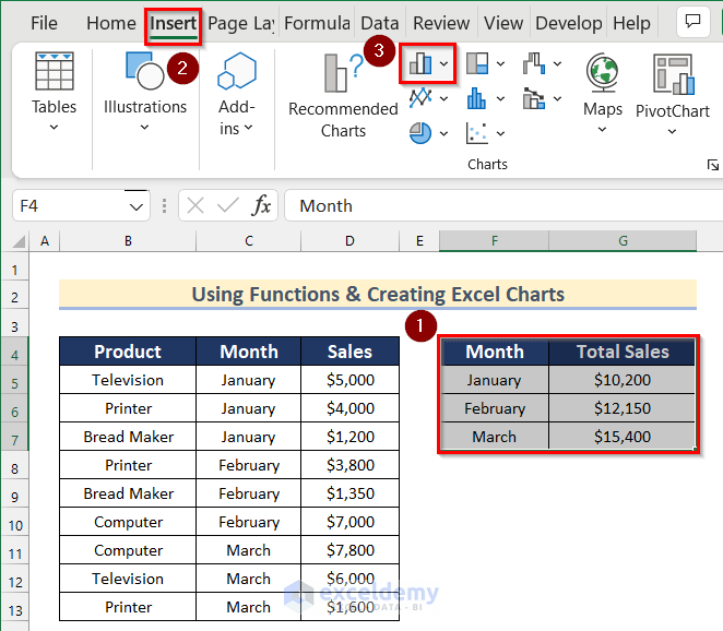
- After that, select the 2-D Clustered Column chart.

- Thus, you can analyze your raw data using functions and creating charts in Excel.
8. Applying Data Analysis Feature to Analyze Data in Excel
Next, we will show you how to apply the Data Analysis Feature to analyze raw data in Excel. This feature is added in the Excel add-in program. Follow the steps given below to use it on your own.
Steps:
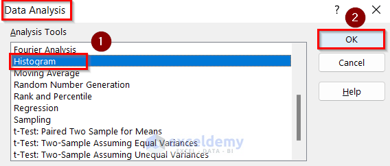
- Firstly, go to the Data tab >> select Data Analysis.

- Now, the Data Analysis box will open.
- Then, choose any Analysis Tool according to your preference. Here, we will select Histogram.
- After that, click on OK.
- Next, the Histogram box will appear.
- Afterward, insert Cell range D5:D13 as Input Range.
- Then, turn on the Output Range option and insert Cell range F4:I13 in the box.
- Now, turn on the Chart Output option.
- Finally, click on OK.
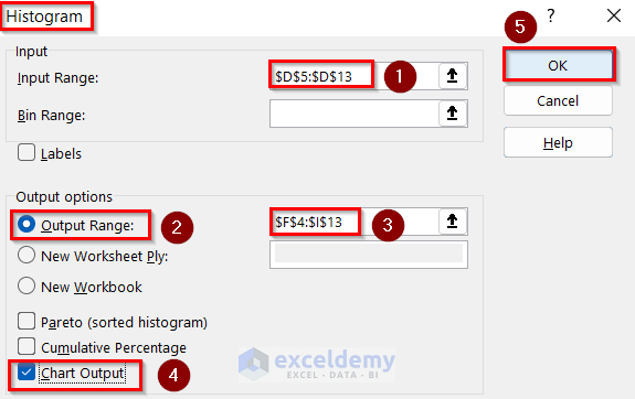
- At last, you will have the Histogram of your dataset using the Data Analysis feature.

Read More: How to Analyze Likert Scale Data in Excel
9. Analyzing Raw Data with Excel Data Validation Feature
In the final method, we will show you how to analyze raw data with Excel Data Validation Feature. To do that on your own, follow the steps given below.
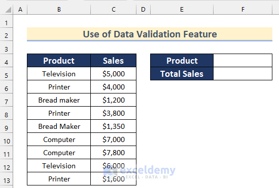
Steps:
- Firstly, insert the name of the Products in Cell range H4:H7.
- Then, select this Cell range and type Product in the Name box.
- Next, press Enter.

- After that, select Cell F4.
- Now, go to the Data tab >> click on Data Tools >> click on Data Validation >> select Data Validation.

- Next, the Data Validation box will open.
- Then, select List as Allow form the drop-down and insert Product named range as Source.
- Finally, click on OK.

- Afterward, click on the drop-down button shown below.
- Then, select any Product of your choice. Here, we will select Television.

- After that, select Cell F5 and insert the following formula.
=SUMIF(B5:B13,F4,C5:C13)
- Next, press Enter.

Here, in the SUMIF function, we inserted Cell range B5:B13 as range, Cell F4 as criteria and Cell range C5:C13 as sum_range.
- That’s it!! These are the ways to analyze your raw data easily in Excel.
Practice Section
In the article, you will find an Excel workbook like the image given below to practice on your own.
Download Practice Workbook
You can download the workbook to practice yourself.
Conclusion
So, in this article, we have shown you ways to analyze raw data in Excel. I hope you found this article interesting and helpful. If something seems difficult to understand, please leave a comment. Please let us know if there are any more alternatives that we may have missed.
Related Articles
- How to Analyze qPCR Data in Excel
- How to Analyze Time-Scaled Data in Excel
- How to Analyze Qualitative Data in Excel
- How to Analyse Qualitative Data from a Questionnaire in Excel
- How to Convert Qualitative Data to Quantitative Data in Excel
<< Go Back to Data Analysis with Excel | Learn Excel
Get FREE Advanced Excel Exercises with Solutions!
