In this article, we will demonstrate how to make a histogram using the Analysis Toolpak.
What is a Histogram in Excel?
A histogram is a visual depiction that arranges a number of data points into user-specified intervals, and is structurally identical to a bar chart. But whereas a bar chart compares two variables (X and Y), a histogram only analyzes one variable. The histogram groups several data points into logical ranges or bins in order to reduce a data series into a widely comprehensible graphic.
Create a Histogram Using the Analysis ToolPak (Complete Guideline)
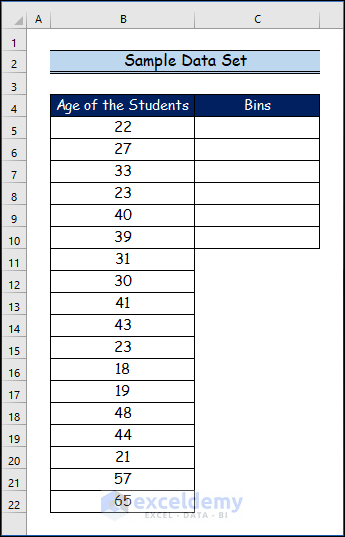
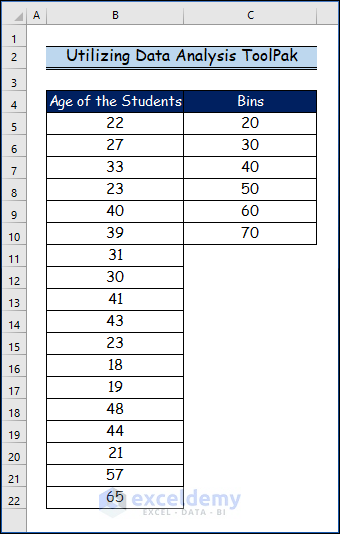
Suppose we have the following sample dataset. Let’s create a histogram from the data.
Step 1 – Setting Up Analysis ToolPak
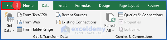
First, we’ll set up the Analysis ToolPak in Excel.
- Go to the File tab.
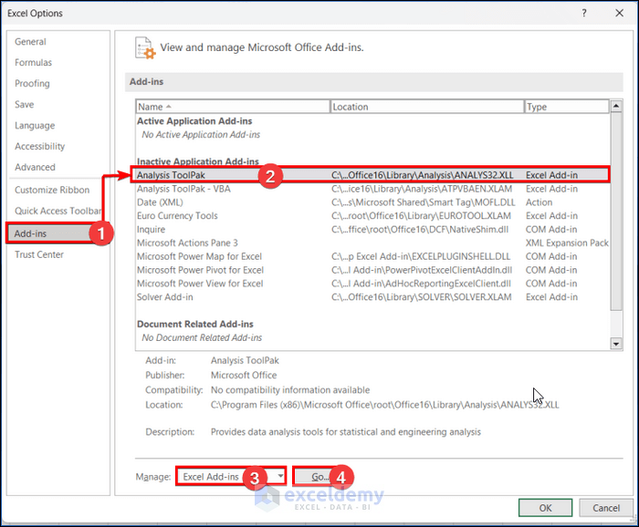
- Select the Add-ins tab from the Excel Options dialog box.
- Choose the Analysis ToolPak from the Inactive Application Add-ins.
- Select Excel Add-ins from the Manage drop-down menu.
- Click on the Go… option.
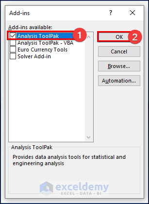
The Add-ins dialog box will appear.
- Choose the Analysis ToolPak from the Add-ins available.
- Click OK.
The Data Analysis command is now available in the Data tab’s Analysis set of commands.
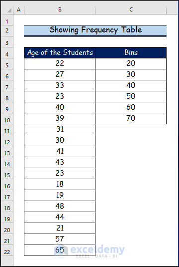
Step 2 – Showing the Frequency Table
The list has a total of 18 values ranging between 18 and 65, so we’ll use a bin size of 20 to create the bins. The first bin will therefore range from 0 to 20.
- Enter the top value of this bin, namely 20, into cell C5.
Data Analysis TookPak requires only the upper value of the bin when making a histogram chart.
- Put the number 30 in cell C6 (because the next bin has a value greater than 20 and less than or equal to 30).
- Place the 6 upper values in the bins by selecting all the bins for the 18 values in the dataset.
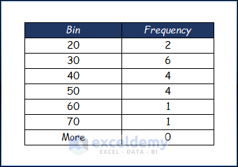
Here is our data table showing the frequency of the data table:
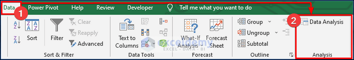
- Go to the Data tab.
- Click on Data Analysis from the Analysis group.
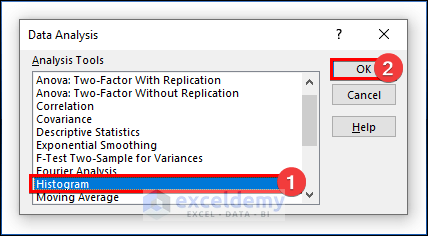
The Data Analysis dialog box will appear.
- Select the Histogram tools.
- Click OK.
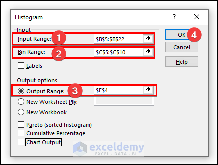
- Select the Input Range from the above data table.
- Enter the Bin Range from the above data table.
- Choose any cell for the Output Range, for example cell E4.
- Click OK.
We have the frequency table.
Step 3 – Using the Analysis ToolPak to Make a Histogram
The following features will need to be specified to create a Histogram:
Input Range
The dataset’s range will be the input range.
Bin Range
These basically specify what is put into each bar. Care should be taken when choosing these bins. Select the range of bins to input, making sure that the range is in increasing order.
Labels
Only check this box if the data ranges are chosen along with the data set header and bin data.
Print Options
Printing the histogram is regulated by these options. By naming a new worksheet, selecting a range in the present worksheet, or choosing a new workbook, the output can be printed.
Print Output Options
What data is shown depends on these choices.
Here is the data table used to make the histogram:
- Go to the Data tab.
- Click on Data Analysis from the Analysis group.
A Data Analysis dialog box will open.
- Choose the Histogram tool.
- Click OK.
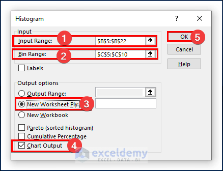
- Pick an Input Range from the data table above.
- Enter the Bin Range from the data table above.
- Choose the New Worksheet Ply to see the histogram in another worksheet.
- Choose the Chart Output option.
- Click OK.
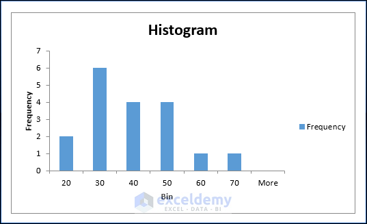
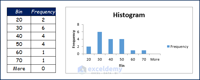
The final histogram bar chart with the frequency table is as in the below image.
We receive two values between 0 and 20, six values between 20 and 30, four values between 30 and 40, and so on. It is obvious from the figure that there is no pattern to the data.
Read More: How to Use Data Analysis Toolpak in Excel
Download Practice Workbook
Related Articles
- How to Install Data Analysis in Excel
- How to Enter Data for Analysis in Excel
- How to Perform Case Study Using Excel Data Analysis
- How to Use Analyze Data in Excel
- How to Analyze Data in Excel Using Pivot Tables
- [Fixed!] Data Analysis Not Showing in Excel
<< Go Back to Data Analysis with Excel | Learn Excel
Get FREE Advanced Excel Exercises with Solutions!
