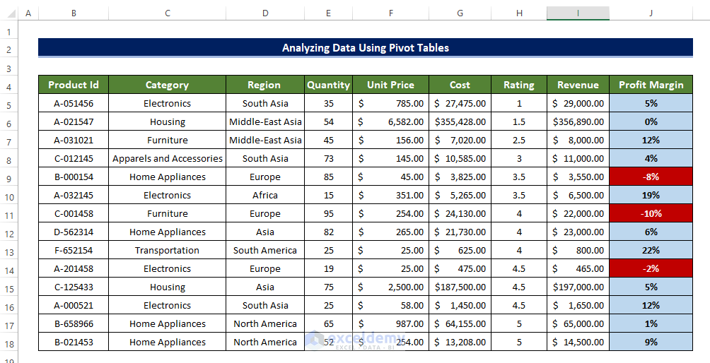
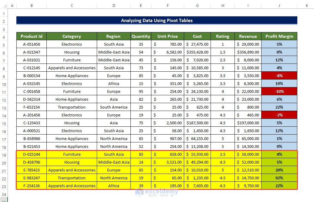
We’ll use the sample dataset below to show how to analyze data in Excel using a Pivot Table.
Example 1 – Selecting Various Fields to Analyze Data in Pivot Table
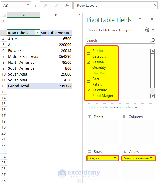
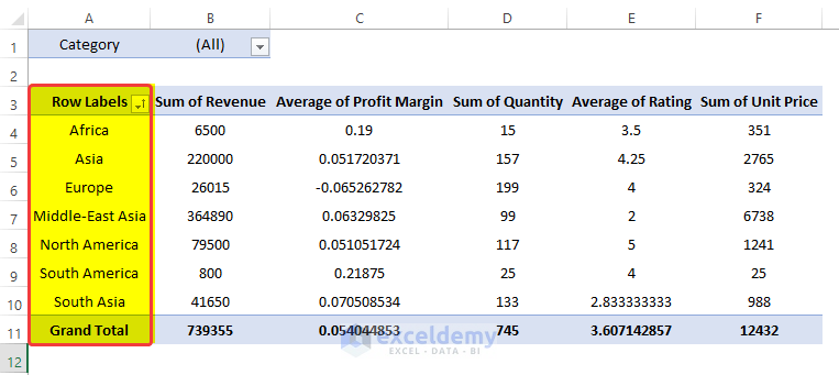
We have dragged the Region to the row fields and dragged the Revenue to the Value field.
A Pivot Table will be created according to these fields in the Pivot areas.
Steps
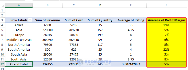
- We trimmed down the initial table to a minimal shape, where we can see the Revenue total earned in each Region. This helps us to access how each Region performs.
- We can add more value fields in the area to evaluate the performance in different sectors.
- For example, we can drag Cost and Quantity in the field to expand our existing table.
- From the table, we can see the total cost of production in each Region and the total Quantity of products produced in each Region.
- This table enables us to analyze data more effectively.
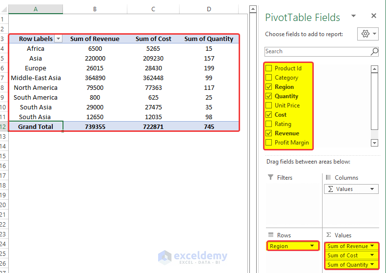
- For all the values fields, the fields are shown as the Sum of the fields. But users can change the field operation.
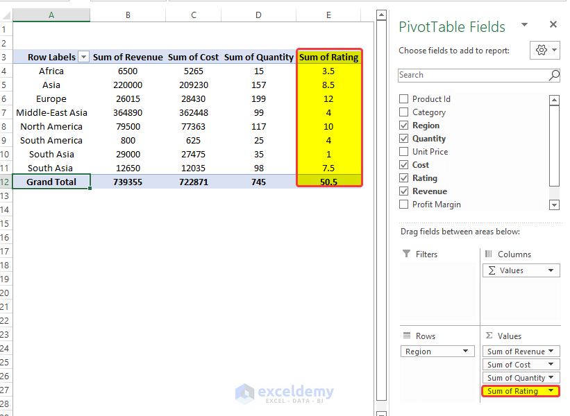
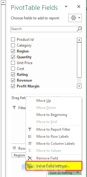
- We can add the Rating field in the area. The value in the Pivot Table will be shown as the Sum of the Ratings in each Region. But we need the average Ratings of each Region.
- To change field evaluation settings, we will click on the field in the area and right-click on the mouse.
- From the menu, select Value Field Settings.
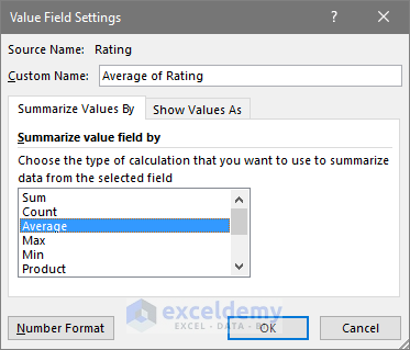
- A new dialog box named Value Field Settings will open.
- Select Average from the Summarize value field by.
- Click OK.
- The Ratings are now presented in average value instead of SUM total in the range of cells E4:E11.
- With this data, we can analyze which Region’s product received better customer reviews compared to the others.
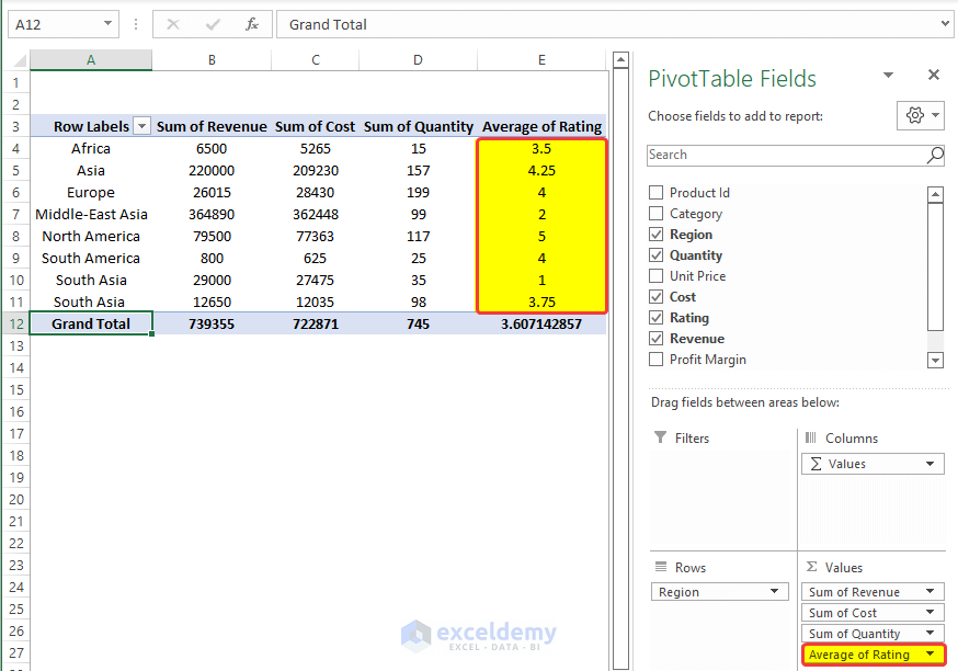
- From the table above, the Asia Regions performed well compared to other Regions.
- We will add the Profit Margin field in the area. As the default value settings are set to Sum, change it to Average, to see the Average of the Profit Margins of each Region.
- Doing this will add the profit margin of each Region in the range of cells F4:F12
- But the Profit Margins are in fractions, we need to convert them to percentages.
- To do this, we will select the range of cells F4:F12 and click on the Percentage icon in the Number group.
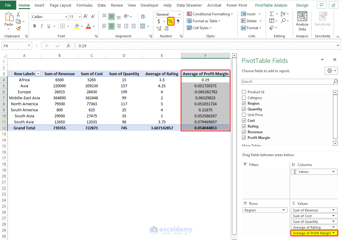
- We can see the average Profit Margins in the percentages format of each Region in the range of cells F4:F11.
- With this summary table, we can analyze that the Africa Region is performing well in terms of Profit Margin.
Read More: How to Install Data Analysis in Excel
Example 2 – Nesting Multiple Fields
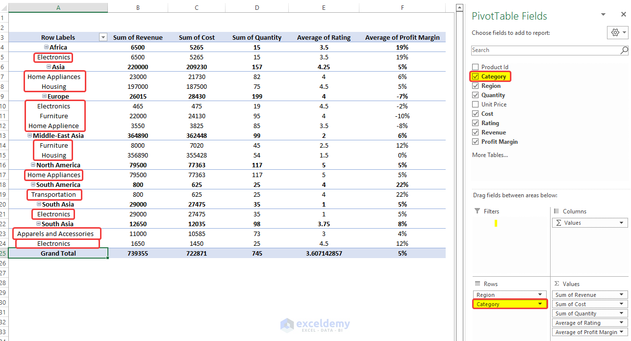
We can group several fields altogether to create a nest of criteria in the Pivot Table. In the nested or grouped field, the first field will present the data first. Under the first field, all the second-tier fields will be present as shown in the image below.
Steps
- Drag the Category field just below the Region field in the Row areas.
- The Category is going to be nested below each Region field.
- Using the table, we can differentiate not only the Regions from each other but also the inside field of each Region.
- Drag the Region to the second position. Doing it places the Category in the first position in the nesting.
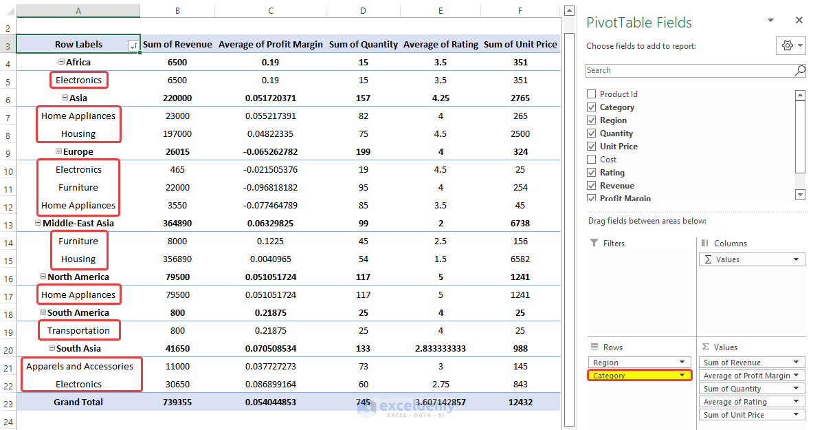
Example 3 – Filtering Data in Pivot Table
After creating the Pivot Table we can add a filter to the selection to add more flexibility to our analysis.
Steps
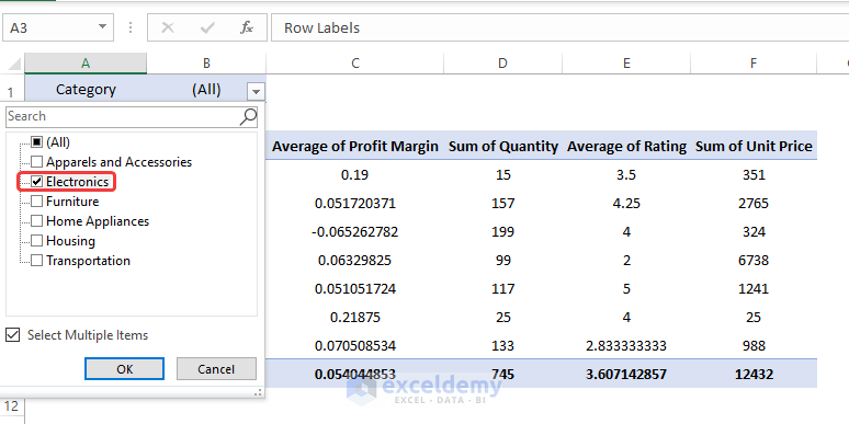
- Drag the Category field in the Filters area.
- Click on the Filter And tick mark the Select Multiple Items.
- Select the Electronics and click OK.
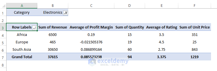
- The table filters out all the entries other than the Electronics, updating the table automatically.
- The updated table is shown below. Here only the Africa, Europe, and South Asia Regions have the products under the Electronics Category. Hence only these Regions are shown here.
Read More: How to Use Data Analysis Toolpak in Excel
Example 4 – Sorting Data in Pivot Table
Steps
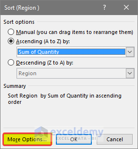
- To sort out the Pivot Table, click on the sort icon on top of the Row levels a drop-down menu will open. From that drop-down menu, click on the More Sort Options.
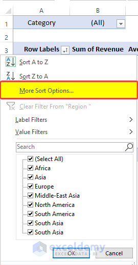
- A new dialog box will open, select the field name on which you will perform the sort. In this case, we choose Region.
- By default, the sort option is set to Ascending (A to Z) by:
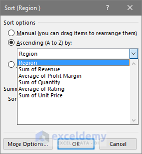
- The Regions will be organized alphabetically.
- We can also Sort any field by any criteria.
- For example, you can sort the Pivot Table by the total Quantity of products in each Region produced.
- Select the sort icon, and in the Sort dialog box, select the Sum of Quantity in the drop-down menu.
- Click on the More Options at the right bottom of the dialog box.
- In the next dialog box, click on the Grand total in the Sort By This will Sort the table Quantity from smallest to largest. Click OK.
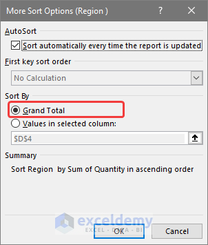
- Click OK.
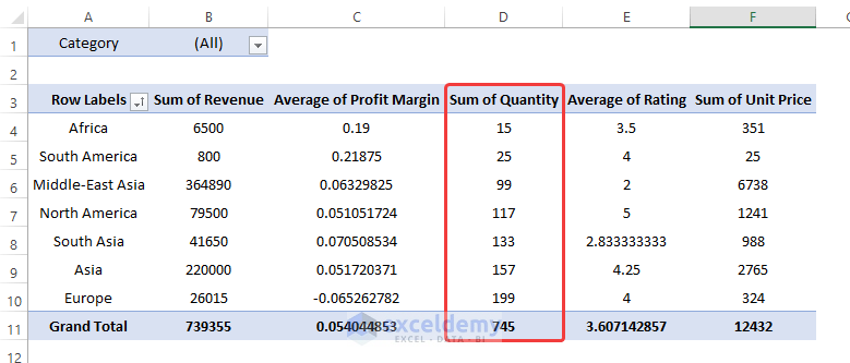
- The Pivot Table is now sorted according to the smallest Quantity of a product to the largest Quantity of the product.
- We not only have the number of Products arranged by each Region but they also can be Sorted so that we can evaluate which Region has produced more products.
Read More: How to Perform Case Study Using Excel Data Analysis
Example 5 – Use of Slicer in Pivot Table
A Slicer is a convenient tool to filter out necessary information.
Steps
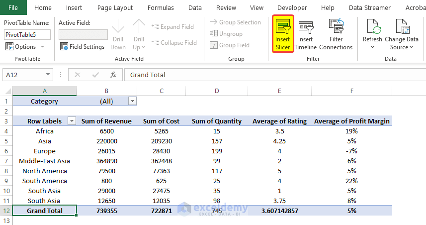
- To add slicer in the Pivot Table, click on the Insert Slicer command from the PivotTable Analyze tab.
- Anew dialog box named Insert Slicers will open.
- Select the slicers that you are going to add by tick marking the checkboxes. In this case, we checked the Category, Region, and Rating boxes.
- Click OK.
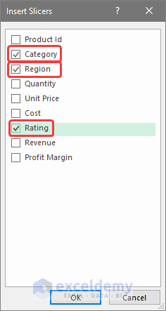
- There will be 3 different slicers in the worksheet. Each one for every field and the entries in these fields.
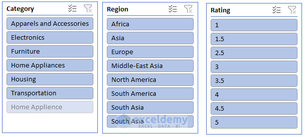
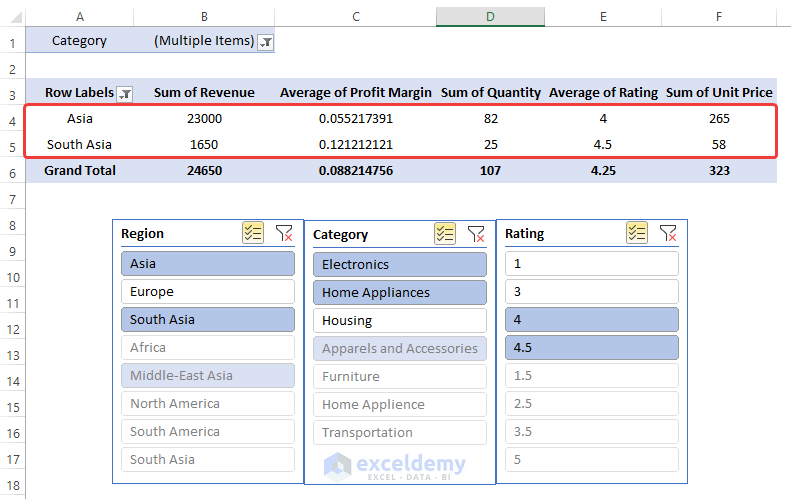
- Click on Asia and South Asia in the first slicer. This will eliminate other entries which have Regions other than Asia and South Asia.
- Select the Electronics and the Home Appliances.
- This will select only products only in that two Category.
- Choose Ratings 4 and 5.
- the table is going to update regularly as we click on Slicer.
- We have different products and their different performance parameter only from the Asia and the South Asia Region The list is further filtered by the only two Category of products. We proceed to choose only 4 and 4.5 Ratings.
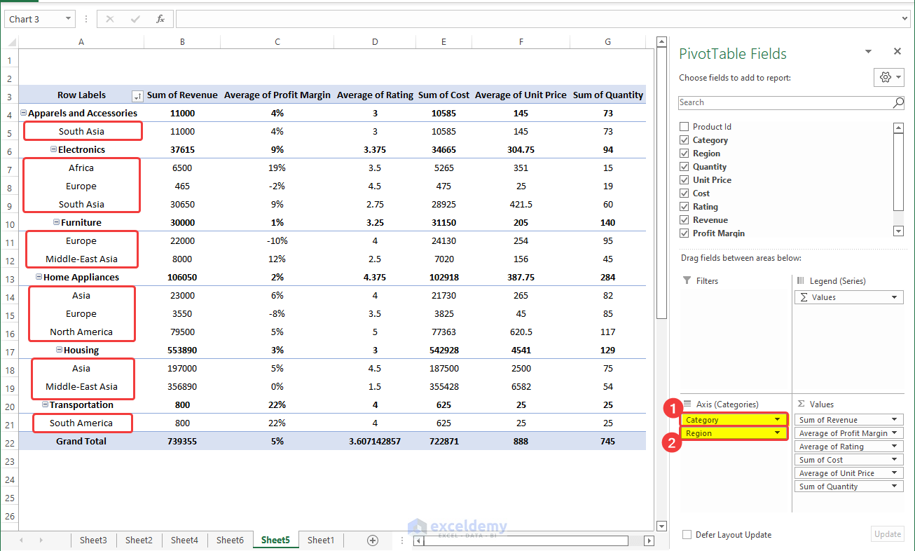
Example 6 – Analyzing Data with PivotChart
Steps
- We need to visualize how the Profit Margin earned by each Region is related to the revenue generated by them. Are they in proportion to each other, or do they act inversely?
- Go to the Insert tab and click on the From the drop-down menu, click on the PivotChart.
- A new dialog box named Insert Chart will open, where you can choose your favorite types of charts.
- We will choose the Combo option, as we need to show two separate values on the vertical axis.
- For the Sum of Revenue, choose the chart type as Clustered Column from the dropdown menu.
- For the Average of Profit Margin, choose the Line chart type. And also set this chart as the secondary axis by ticking the box right side of the dropdown menu.
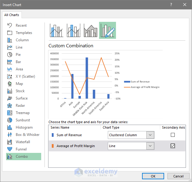
- Click OK and the new chart is now present with the two axes, the left side is for the Sum of Revenue and the right side is for the Profit Margin.
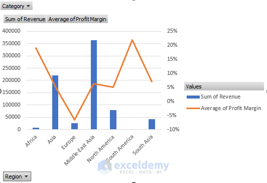
The Profit Margin and the Sum of the Revenue are not proportional here. Higher revenue doesn’t mean that the Profit Margin would be higher accordingly.
- The charts have filters by default in it. For example, you can see the Category filter already set in the top left corner of the chart. Click on it and see that all the products Category are now selected.
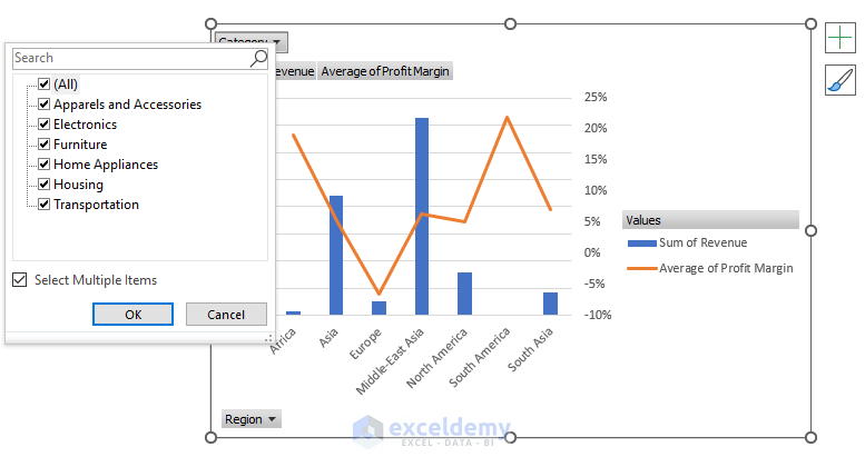
- If you want to select some Categories and ignore the rest of them, select your desired one and click For example, we will choose Furniture and Home Appliances and click OK.
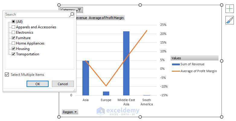
- The chart now shows only the Furniture and the Home Appliances And only 4 Regions actually have that Category product.

This is how we can analyze and visualize the Pivot Tables in Excel and narrow down the data using the filter option in the chart.
Read More: How to Use Analyze Data in Excel
Example 7 – Updating Data in Existing Pivot Table
Updating the data is considered to be routine work in any kind of data analysis project. Suppose we got some new raw sales data, as shown in the highlighted part of the table below. Now creating a new Pivot Table from the scratch can be a tedious thing to do. To resolve this, we will update the data source internally by keeping the original Pivot Table structure intact.
Steps
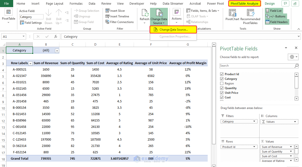
- From the Pivot Table Analysis tab, click on the Change Data Source command.
- From the drop-down menu, click on the Change Data Source.
- In the Move PivotTable range box, select the full range of the updated table.
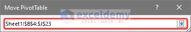
- The full range is now added to the existing PivotTable and is also updated.
Read More: How to Enter Data for Analysis in Excel
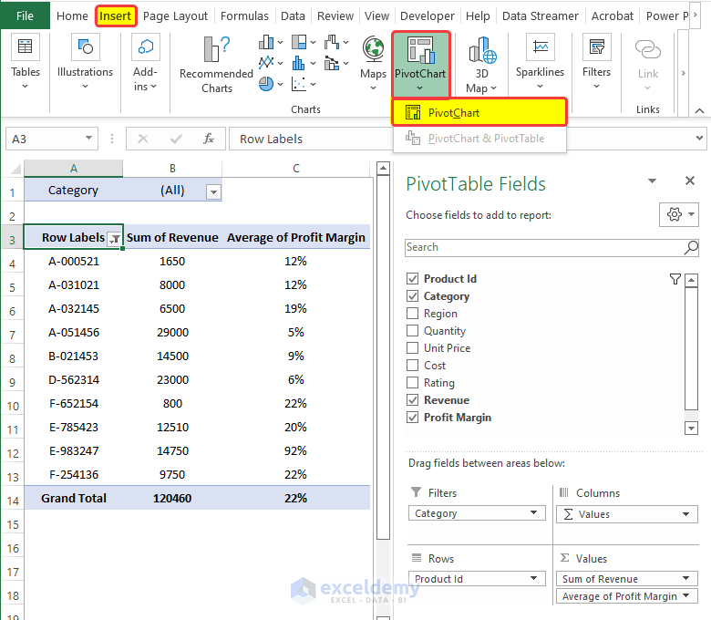
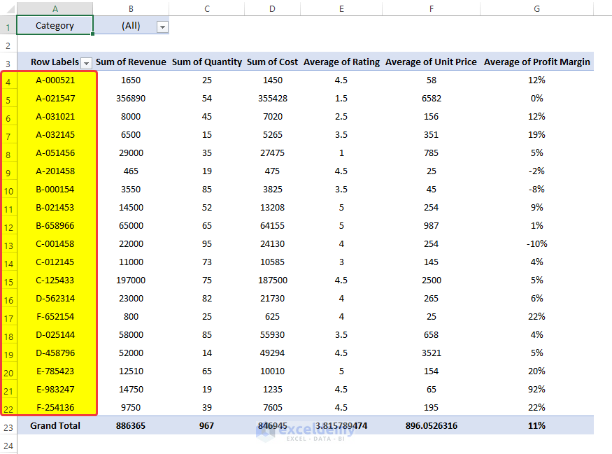
Example 8 – Getting Top 10 Values from Pivot Table
Steps
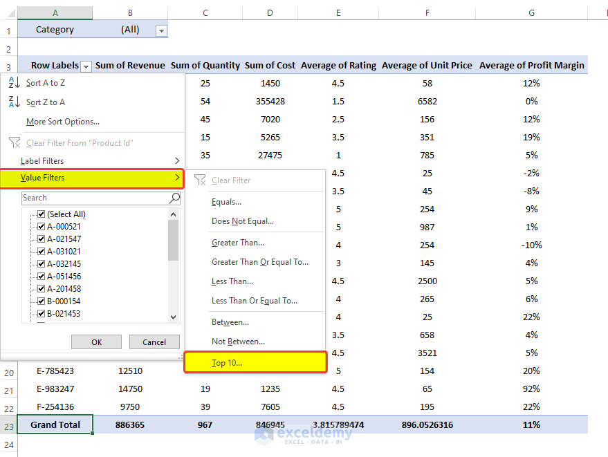
- Click on the dropdown icon on top of the Row Levels.
- From the drop-down menu, click on the Value Filters > Top 10.
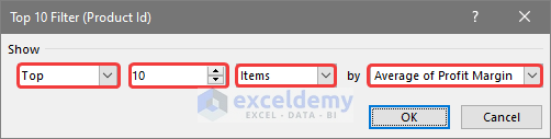
- A new dialog box Top 10 Filter (Product Id) opens.
- In the first dropdown box, select whether you want the top 10 value or the bottom 10 We chose Top.
- Select whether you want to select the top 10 or We chose 10.
- Choose Items from the next dropdown box.
- Choose based on which column are you going to filter the top 10 We select Average of Profit Margin.
- Click OK.
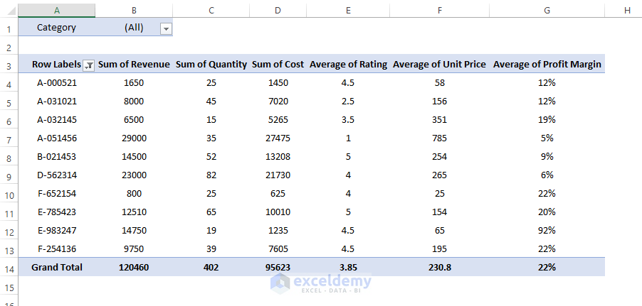
The Top 10 values according to the Average of the Profit Margin will be shown.
Example 9 – Grouping Data in Pivot Table
Steps
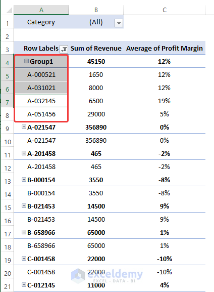
- Select multiple values by pressing Ctrl, and right-click on the mouse.
- From the context menu, select Group.
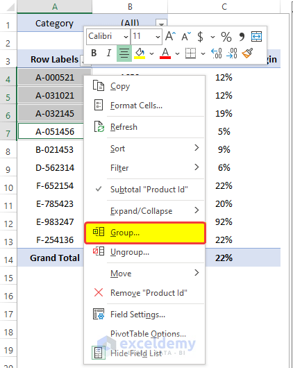
- The Product ID is now grouped.
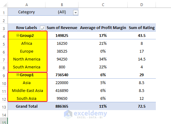
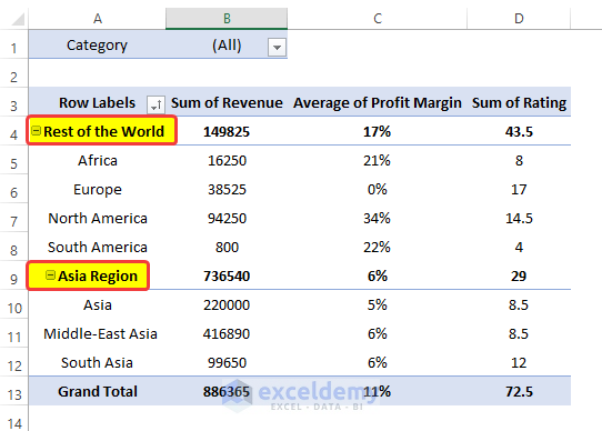
- We can also group data by Region. For example, we can group the whole Asia Region under one group. And then group others as the rest of the world group.
- Create the group as shown above.
- Select the cell and press F2.
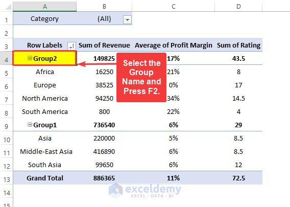
- Enter the group name “Rest of the World”.
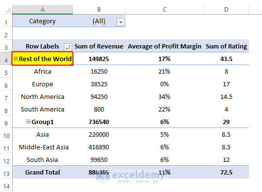
- Repeat the same process for Group 2.
- Here we will enter Asia Region, as the name of the group.
Download Practice Workbook
Related Articles
<< Go Back to Data Analysis with Excel | Learn Excel
Get FREE Advanced Excel Exercises with Solutions!
