In every business, it’s quite urgent to analyze the data to evaluate the condition of a business. It will help to determine the risks and take proper steps to reduce loss. In excel we can do that easily using some methods. Today in this article, we’ll show 2 easy methods to enter data in Excel for analysis with sharp methods and vivid illustrations.
2 Ways to Enter Data for Analysis in Excel
Let’s get introduced to the dataset that we’ll use to explore the methods. It represents some yearly sales and profits in different regions.

1. Using Pivot Table to Enter Data for Analysis
A tabular format of data always helps to manage data easily and analysis properly. Excel Pivot Table feature offers many useful ways to enter data in Excel for analysis. We’ll analyze the profit according to individual regions. Let’s go forward to explore it.
Steps:
- First, click on any data from the dataset.
- Then click as follows: Insert > PivotTable.
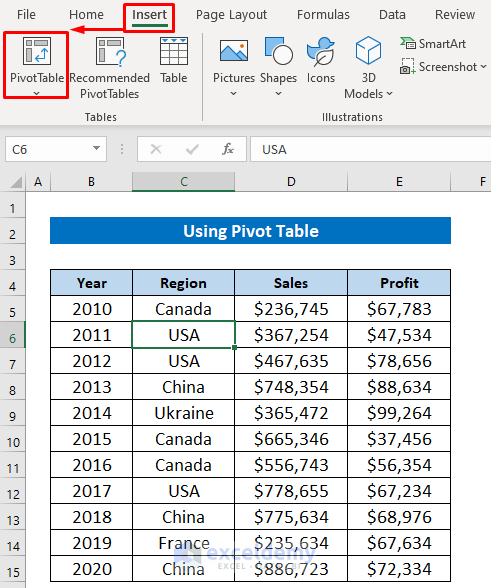
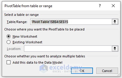
- After getting this dialog box, just choose the worksheet option, and it will choose the data range automatically. we chose New Worksheet.
- Next, press OK.
The PivotTable Fields area will appear on the right side of your worksheet.
- To analyze the profit according to individual regions, drag the Region header in the Rows field and the Profit header in the Value

Now look, the pivot table is showing the sum of profit for each region. So, now we can easily analyze which region is giving us the highest profit and which is giving us less profit.

Read More: How to Install Data Analysis in Excel
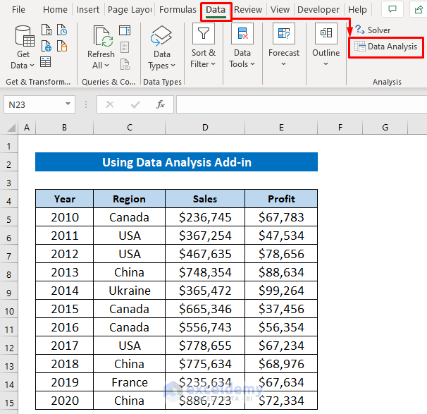
2. Using Data Analysis Add-in to Enter Data for Analysis
Besides Excel’s default features and commands, Excel also allows using official Add-ins and third-party Add-ins to enter data into Excel for analysis. Analysis ToolPak is that kind of official Add-in. Now we’ll learn how to organize data in Excel for analysis using the Add-in. Before using the Add-in, we’ll show you how we prepare Data Analysis Add-in in Excel. If you know and already activated then skip these steps.
Steps:
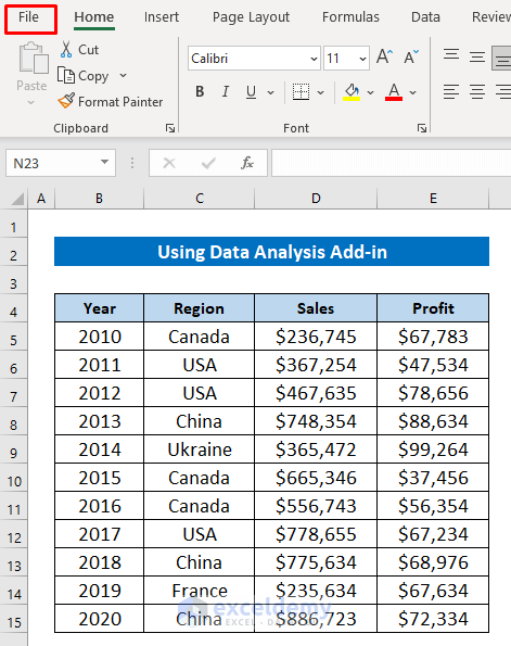
- Click on the File tab beside the Home ribbon.
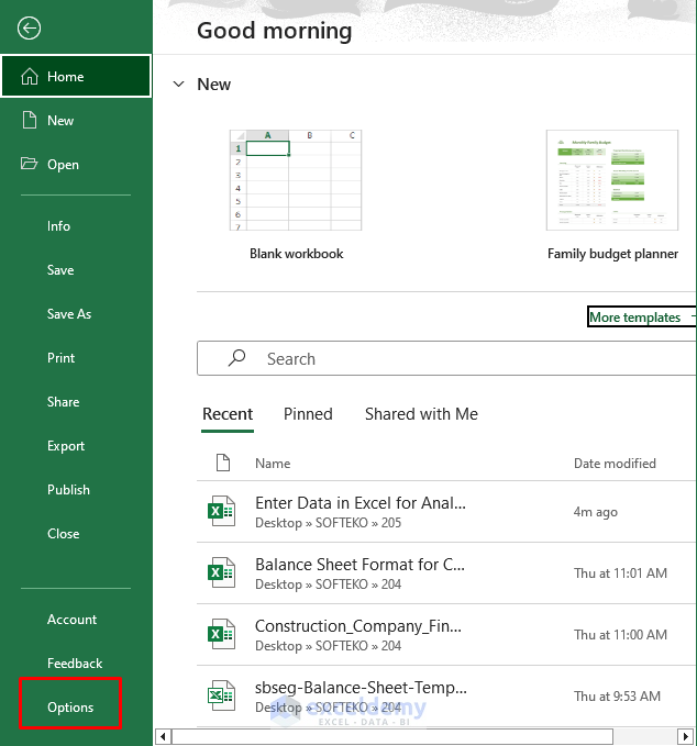
- Later, select Options from the appeared menu.
- Next click: Add-ins > Excel Add-ins > Go.

- After appearing in the Add-ins dialog box, mark Analysis ToolPak and press OK.

Read More: How to Analyze Data in Excel Using Pivot Tables
Descriptive Statistics
Firstly, we’ll learn how to use the Data Analysis ToolPak in Excel for Descriptive Statistics to get the summary of statistics.
Steps:
- Click on the Data ribbon and select the Data Analysis command from the Analysis section.
Soon after, the Data Analysis dialog box will appear.
- Select Descriptive Statistics from the tool list and press OK.

- Here, we’ll make summary statistics report from the Profit column. So, select the range from the Profit column for the Input Range.
- Then you will get different output range options, we chose New Worksheet Ply.
- Finally, mark any statistical option from the lower section and press OK. We marked Summary Statistics.

After a while, you will get the report in a new sheet like the image below. It will contain some useful statistical factors like Mean, Median, Sum, Count, etc.

Read More: How to Perform Case Study Using Excel Data Analysis
Histogram
A histogram chart helps to show the distribution of values in a particular range. Here, we’ll learn how to use the Data Analysis Add-in in Excel for Histogram.
Steps:
- Follow the first step from the previous section to open the Data Analysis dialog box.
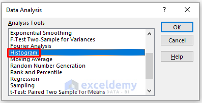
- Again select the input range from the Profit column and mark the Output option.
- Finally, mark any chart option and press OK. We marked Chart Output.

Here’s the histogram output in a new sheet with a chart. It’s showing the frequency of values.

Regression
We can also perform a regression analysis in Excel using the Data Analysis ToolPak.
Steps:
- Follow the first step from the first section of this method to open the Data Analysis dialog box.
- Then select the Regression tool from the list and press OK.
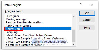
- Here, we selected the Profit column for Input Y Range and Sales for Input X Range. Because we want to predict sales based on the profits.
- Lastly, select the output option and press OK. here also we set New Worksheet Ply.

A few moments later, you will get the regression summary output like the image below.

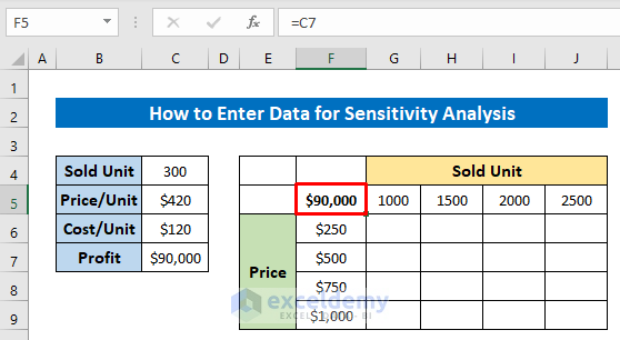
How to Enter Data for Sensitivity Analysis
Based on a given data sensitivity analysis extracts the other predicted data. To learn how to use data tables in Excel for sensitivity analysis, we modified the dataset that is showing a product’s sold unit, price per unit, and cost per unit. We’ll apply Sensitivity Analysis to get the other data for achieving the corresponding profit.
Steps:
- First, use the following formula in Cell C7 to calculate the profit-
=(C5-C6)*C4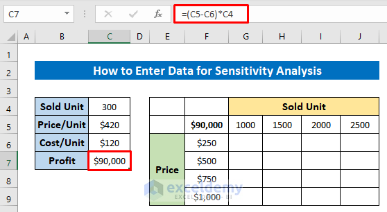
- Next, insert the other data in a new table like the image below for those you want profits.
- And insert the calculated profit in the joining cell of the new data.
- Next, select the new data range and click as follows: Data > Forecast > What-If Analysis > Data Table.

- In the Row input cell box, select Cell C4, and in the Column input cell box, select Cell C5.
- Then press OK.

See, the table is now giving us the profits according to the new data of the table.

Download Practice Workbook
You can download the free Excel workbook from here and practice independently.
Conclusion
That’s all for the article. We hope the procedures described above will be good enough to enter data in Excel for analysis. Feel free to ask any questions in the comment section and give us your valuable feedback.
Related Articles
<< Go Back to Data Analysis with Excel | Learn Excel
Get FREE Advanced Excel Exercises with Solutions!
