Method 1 – With Default Analyze Data Option
Steps:
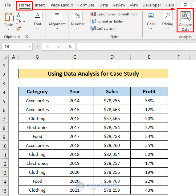
- Click on any data from the dataset.
- Click as follows: Home > Analyze Data.
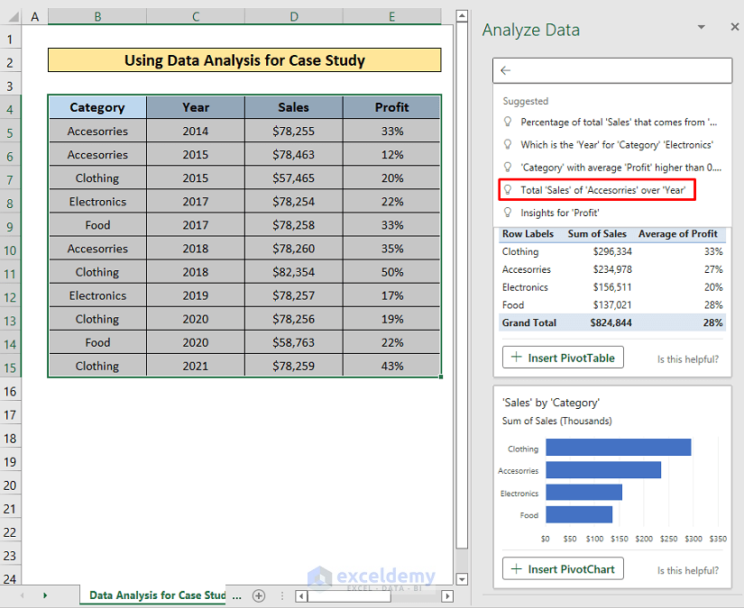
You will get an Analyze Data field on the right side of your Excel window where you will see different kinds of cases like- Pivot Tables and Pivot Charts.
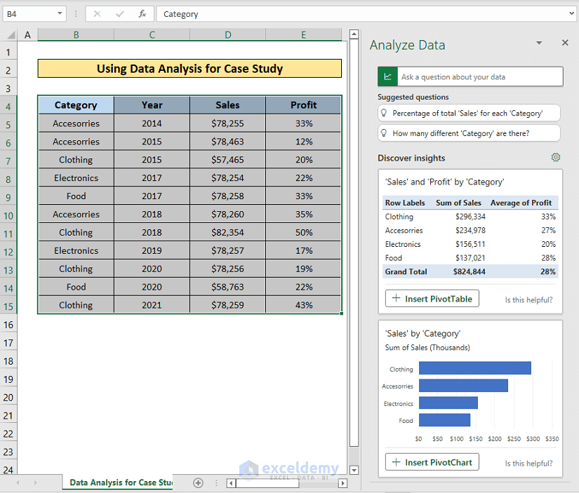
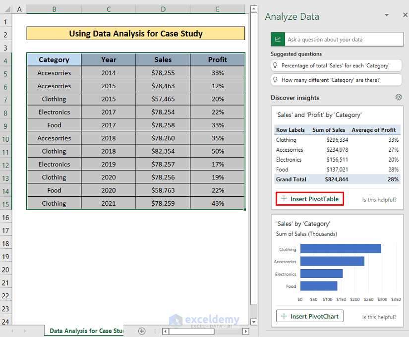
- Click on Insert Pivot Table.
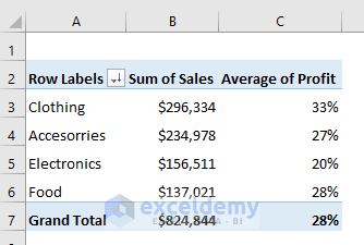
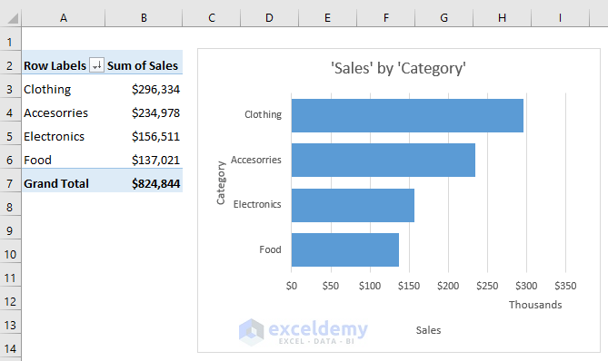
The Pivot Table will be inserted in a new sheet.
- Click on Insert Pivot Chart from the Sales by Category section and you will get the Pivot Chart in a new sheet.
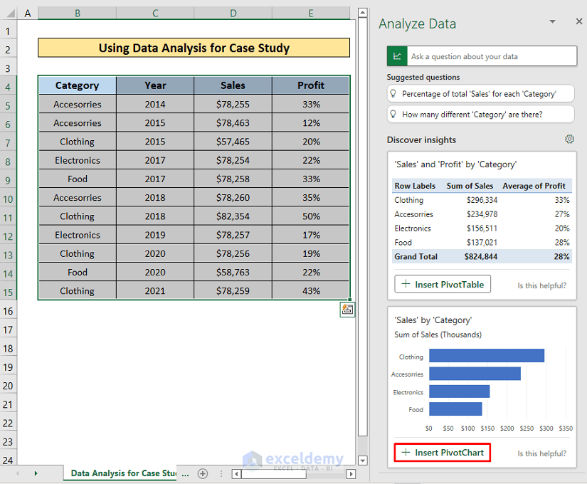
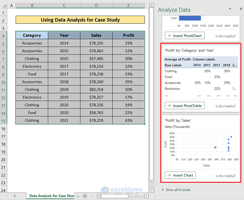
- Scroll down and Excel will show more possible Pivot Tables and Charts.
Read More: How to Analyze Data in Excel Using Pivot Tables
Method 2 – Analyze by Inserting Queries
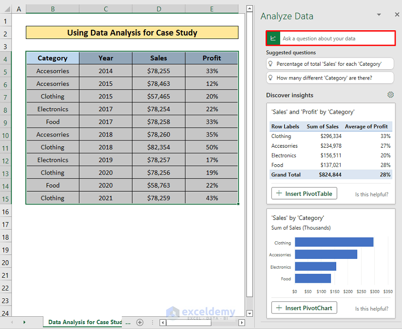
We will learn how to analyze data by inserting queries in the ‘Ask a question about your data’ box.
Steps:
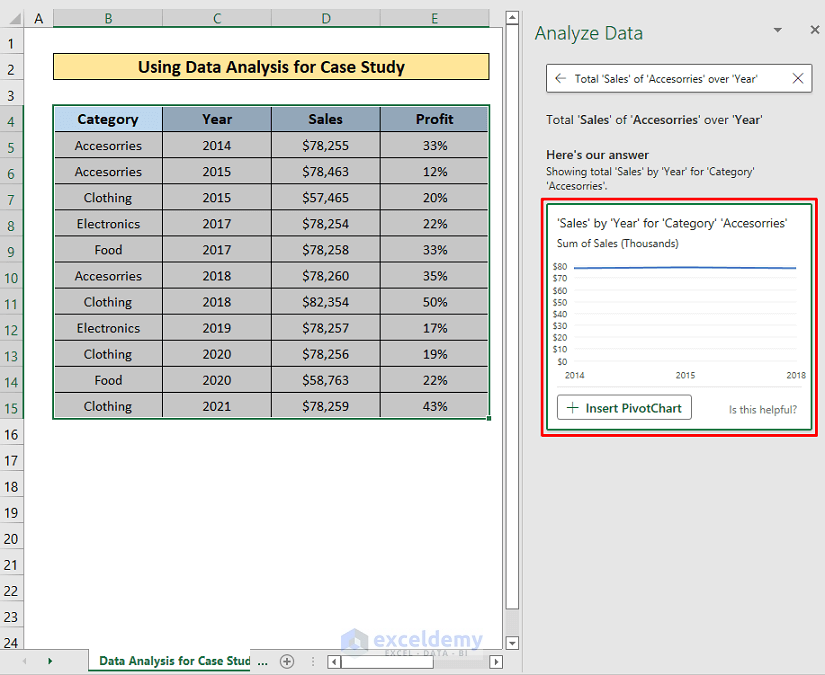
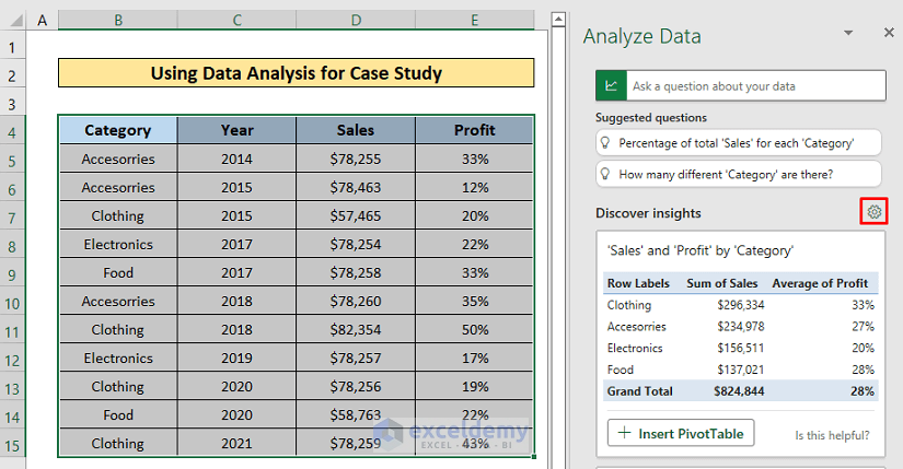
- When you click on the question box, it will show some default questions. Click one of them and it will show the answer according to the question. We clicked Total ‘Sales’ of ‘Accessories’ over ‘Year’.
It shows the answer as shown below.
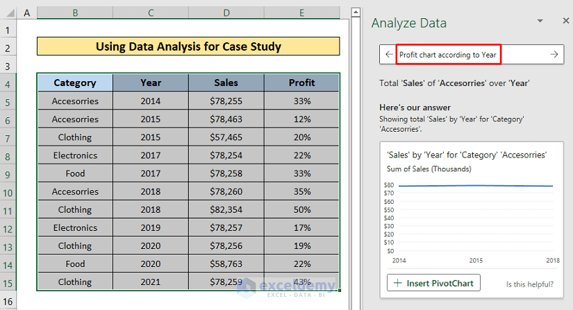
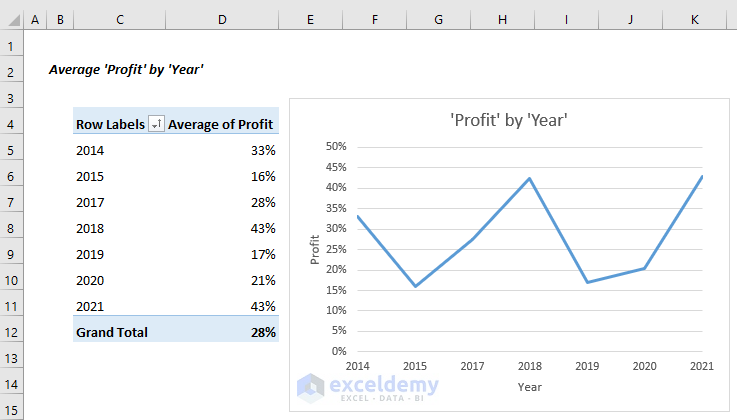
- You can ask your own question. We asked- Profit chart according to Year.
- Press ENTER.
- It shows the chart of profit by year. Click on Insert PivotChart.
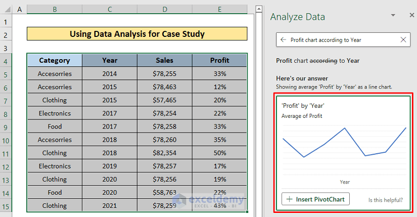
A new sheet will open up with the PivotChart.
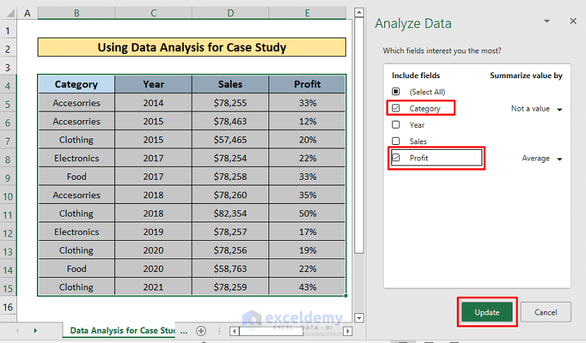
- There is a Setting icon in the Discover insights part, click it and a dialog box will open up to select the customized fields of interest.
- Check your desired fields from here. We checked Category and Profit.
- Click Update.
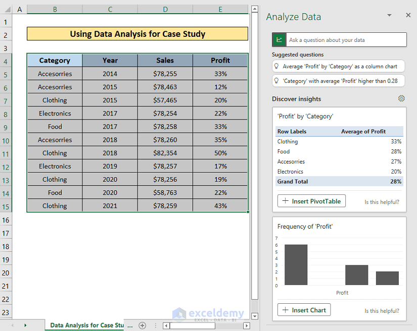
It will show only the answers about Category and Profit.
Things to Remember
- The Analyze Data tool is only available in the latest Excel 365. In earlier Excel versions, it is named Data Analysis ToolPak and available as Add-ins by default.
Download Practice Workbook
Related Articles
- How to Use Data Analysis Toolpak in Excel
- How to Enter Data for Analysis in Excel
- How to Make Histogram Using Analysis ToolPak
- [Fixed!] Data Analysis Not Showing in Excel
<< Go Back to Data Analysis with Excel | Learn Excel
Get FREE Advanced Excel Exercises with Solutions!
