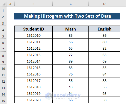
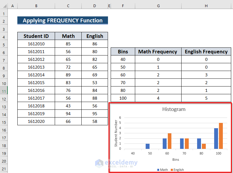
The sample dataset contains 3 columns: Student ID, Math, and English. You want to calculate how many students get marks between different intervals.
Method 1 – Use the FREQUENCY Function to Create a Histogram with Two Sets of Data
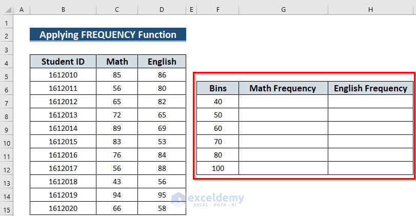
Step 1: Calculating Frequencies in Excel
- Choose your Bins: the intervals you want the Histogram to use. Here, how many students get marks below 40, also between 41 to 50, 51 to 60, 61 to 70, 71 to 80, and more than 81.
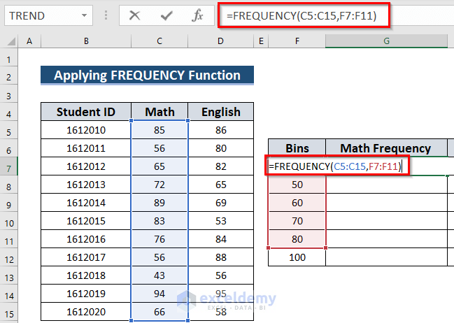
- Select G7 and enter the following formula.
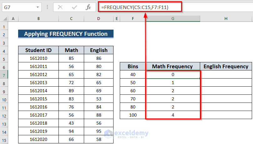
=FREQUENCY(C5:C15,F7:F11)The FREQUENCY function will count how many times a value comes within a given interval. Here, C5:C15 is the data array and F7:F11 is the Bins array. You will get the frequency for more than the value of F11.
- Press ENTER to see the frequencies.
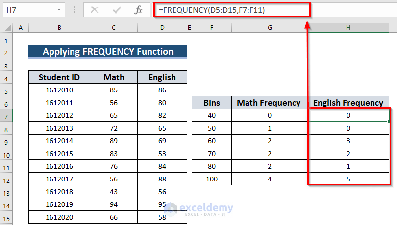
- Select H7 and enter the following formula.
=FREQUENCY(D5:D15,F7:F11)The FREQUENCY function will count how many times a value comes within a given interval. Here, D5:D15 is the data array and F7:F11 is the Bins array. You will get the frequency for more than the value of F11.
- Press ENTER to see the frequencies for English.
Step 2: Inserting a Chart to Create the Histogram
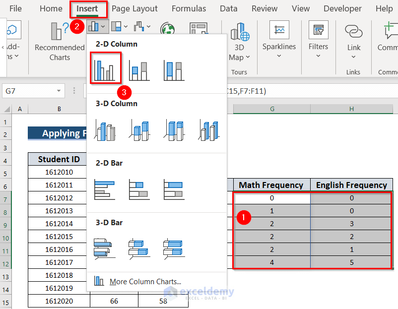
- Select the data. Here, I G7:H12.
- Go to the Insert tab.
- In Charts, select Insert Column or Bar Chart.
- Choose 2-D Column >> Clustered Column (here).
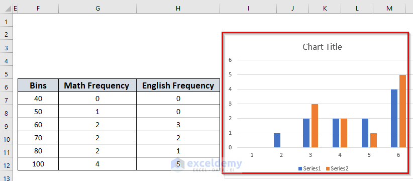
This is the output.
- Select the chart.
- In the Chart Design tab >> go to Select Data. (if you don’t select the chart, the Chart Design tab will not be visible)
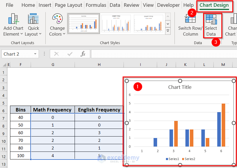
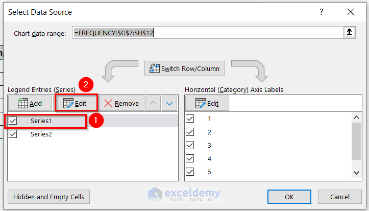
In the Select Data Source dialog box:
- Select Series1.
- Choose Edit.
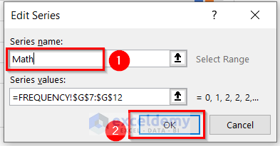
In the dialog box Edit Series:
- Enter the Series name in that dialog box. Here, Math.
- Click OK to see the Histogram.
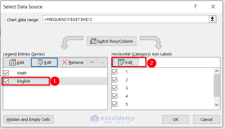
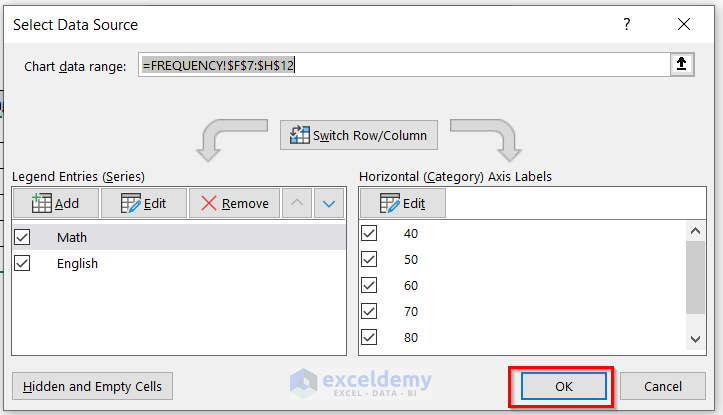
In Select Data Source:
- Change the name of Series2 into English.
- Click Edit to change the Axis Labels.
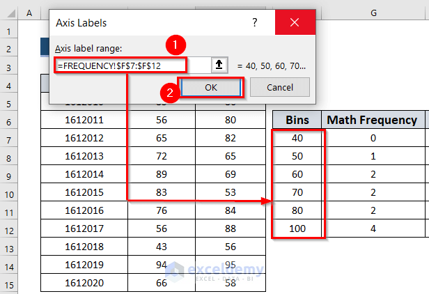
In the Axis Labels dialog box:
- Select the Axis label range. Here, F7:F12 in the FREQUENCY worksheet.
- Click OK.
- Click OK in Select Data Source.
You can add Axis Titles in Chart Elements. Change the Chart Title.
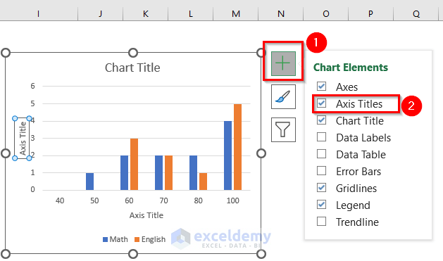
The Histogram with two sets of data will be displayed.
Read More: How to Create a Histogram in Excel with Bins
Method 2 – Using the Data Analysis ToolPak to Make a Histogram with Two Sets of Data
If the Data Analysis ToolPak is invisible, follow Step 1. Otherwise, move to Step 2.
Step 1: Inserting the Data Analysis ToolPak in Excel
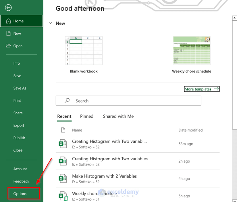
- Go to the File tab.
- Choose Options.
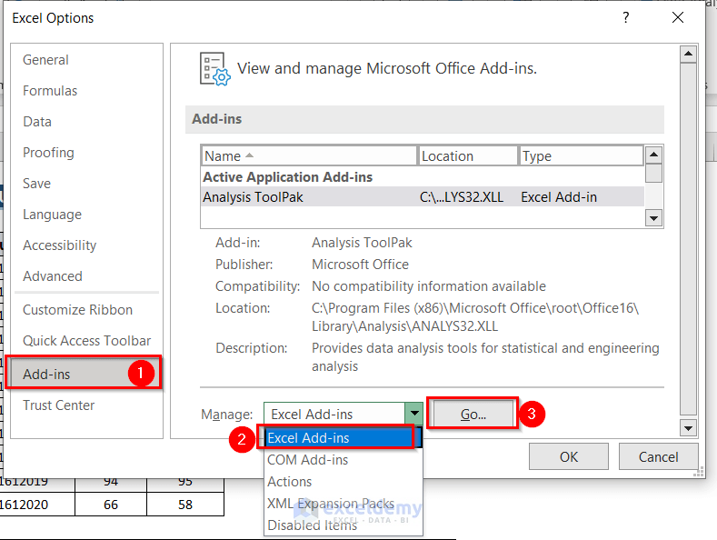
In the Excel Options dialog box:
- Select Add-ins.
- In Manage:, choose Excel Add-ins.
- Click Go.
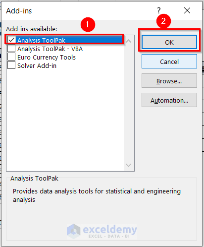
In the Add-ins dialog box:
- Click Analysis ToolPak.
- Click OK.
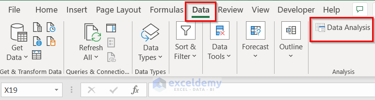
Data Analysis is displayed on the ribbon.
Step 2: Use the Data Analysis Tool in Excel
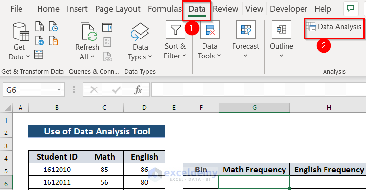
- In the Data tab >> go to Data Analysis.
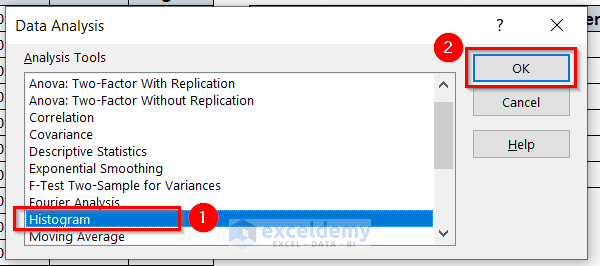
In the Data Analysis dialog box:
- Select Histogram and click OK.
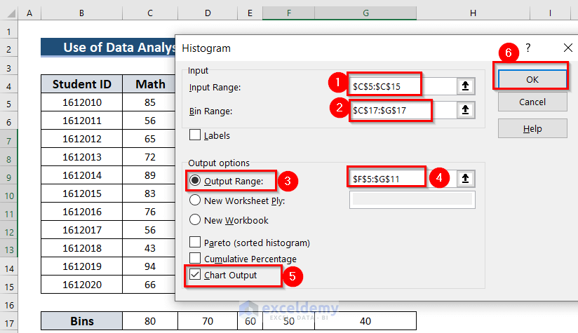
The Histogram window will open.
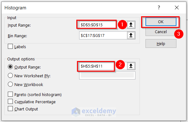
- Select the data range to create the Histogram in Input Range. Here, C5:C15.
- Select the Bin Range of the Histogram. Here, C17:G17.
- Assign a cell as the Output Range. Here, F5:G11.
- Check Chart Output.
- Click OK.
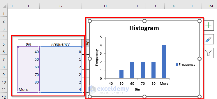
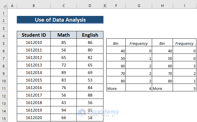
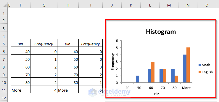
You will see the frequency table according to the bin range and the Histogram.
You can create a Histogram with 1 set of data with the Data Analysis tool.
- In the Data tab >> go to Data Analysis >> In Data Analysis select Histogram and click OK.
In the Histogram window:
- In Input Range, select the data range for the Histogram . Here, D5:D15.
- Select the Output Range. Here, H5:H11.
- Click OK.
You will see another Bin and Frequency table for English.
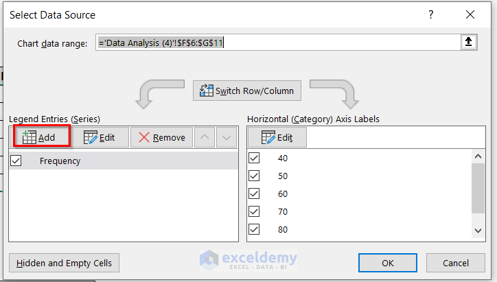
- Select the chart.
- In the Chart Design tab >> go to Select Data.
In the Select Data Source dialog box:
- Choose Add.
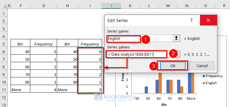
In the Edit Series dialog box:
- Enter the Series name. Here, English.
- Enter the Series values. Here, I6:I11.
- Click OK to see the Histogram.
In the Select Data Source dialog box:
- Select Frequency.
- Choose Edit.
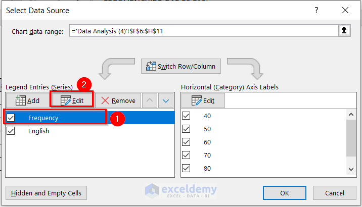
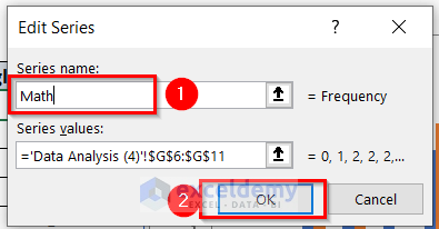
In the Edit Series dialog box:
- Enter the Series name. Here, Math.
- Click OK to see the Histogram.
- Click OK in Select Data Source.
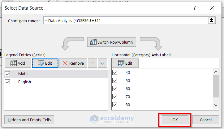
The Histogram with two sets of data will be displayed.
Method 3 – Using the COUNTIF Function to create a Histogram with Two Sets of Data
Step 1: Finding Frequencies in Excel
- Choose your Bins: the intervals you want the Histogram to use. Here, how many students get marks below 40, also between 41 to 50, 51 to 60, 61 to 70, 71 to 80, and more than 81.
- Select an empty cell, G7 (here), and enter the following formula.
=COUNTIF($C$5:$C$15,"<" &F7)- Press ENTER.
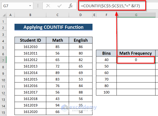
Formula Breakdown
The COUNTIF function will count cells whose values fulfill a given condition.
- $C$5:$C$15 is the range for the lookup array.
- “<” &F7 is the criteria: cell values less than the F7 cell value.
- The COUNTIF function will count cells whose values are less than 40.
- Select another empty cell, G8 (here), and enter the following formula.
=COUNTIFS($C$5:$C$15,">"&F7,$C$5:$C$15, "<="&F8)- Press ENTER.
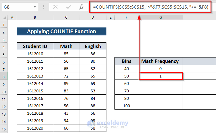
Formula Breakdown
The COUNTIFS function will count cells whose values fulfill a set of conditions.
- $C$5:$C$15 is the 1st range for the lookup array.
- “>”&F7 is the 1st criterion: cell values greater than the F7 cell value.
- $C$5:$C$15 is the 2nd range for another lookup array.
- “<=”&F8 is the 2nd criterion, cell values less than or equal to the F8 cell value.
- The COUNTIFS function will count cells whose values are between 41 and 50.
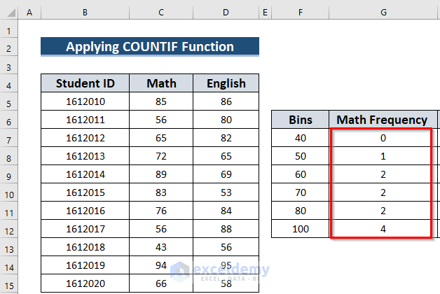
Use the same formula with relative cell references:
- Select G8. The Fill Handle will be displayed at the bottom-right corner of G8.
- Drag the Fill Handle to G12.

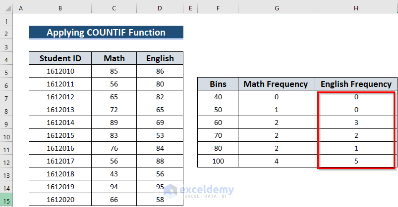
You will see all the frequencies for Math.
- Select an empty cell, H7 (here), and enter the following formula to see the frequencies for English.
=COUNTIF($D$5:$D$15,"<" &F7)- Press ENTER.
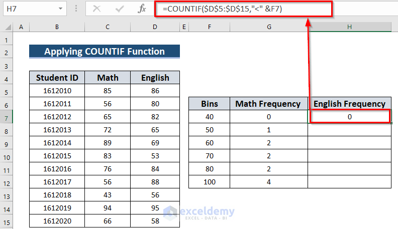
Formula Breakdown
The COUNTIF function will count cells whose values fulfill a given condition.
- $D$5:$D$15 is the range for the lookup array.
- “<” &F7 is the criterion, cell values are less than the F7 cell value.
- The COUNTIF function will count cells whose values are less than 40.
- Select an empty cell, H8 (here), and enter the following formula.
=COUNTIFS($D$5:$D$15,">"&F7,$D$5:$D$15, "<="&F8)- Press ENTER.
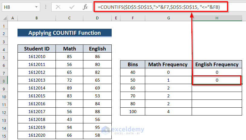
Formula Breakdown
The COUNTIFS function will count cells whose values fulfill a set of conditions.
- $D$5:$D$15 is the 1st range for the lookup array.
- “>”&F7 is the 1st criterion, cell values are greater than the F7 cell value
- $D$5:$D$15 is the 2nd range for another lookup array.
- “<=”&F8 is the 2nd criterion, cell values are less than or equal to the F8 cell value.
- The COUNTIFS function will count cells whose values are between 41 and 50.
- Use the same formula with relative cell references:
- Select H8. Drag the Fill Handle to H12.
You will see the frequencies for English.
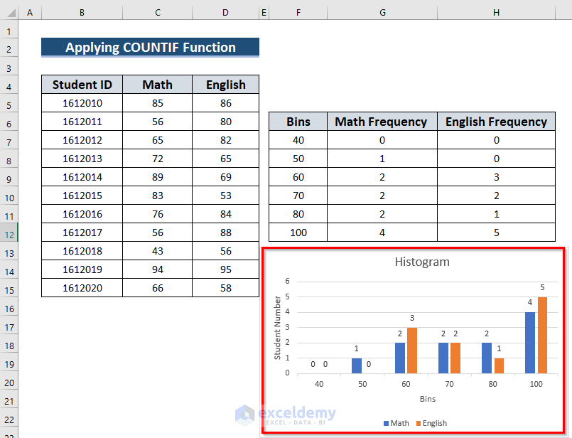
Step 2: Inserting Chart to Create Histogram
Follow Step 2 in Method 1 to create the following Histogram with two sets of data.
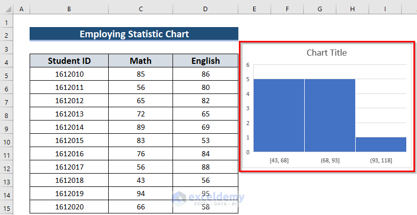
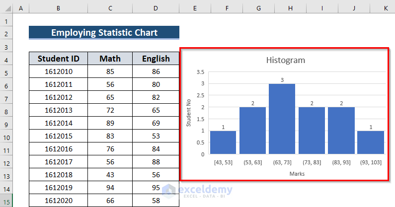
Method 4 – Using a Statistical Chart to Create a Histogram
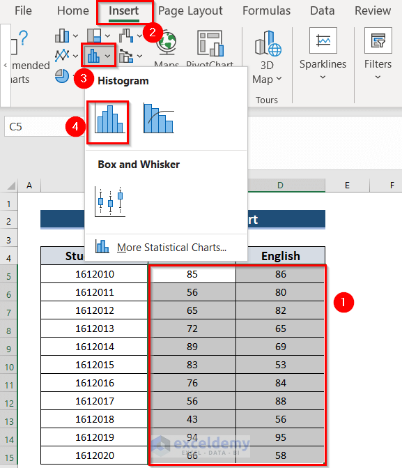
- Select the data. Here, C5:D15.
- Go to the Insert tab.
- In Charts, select Insert Statistic Chart.
- Select Histogram.
This will be the result.
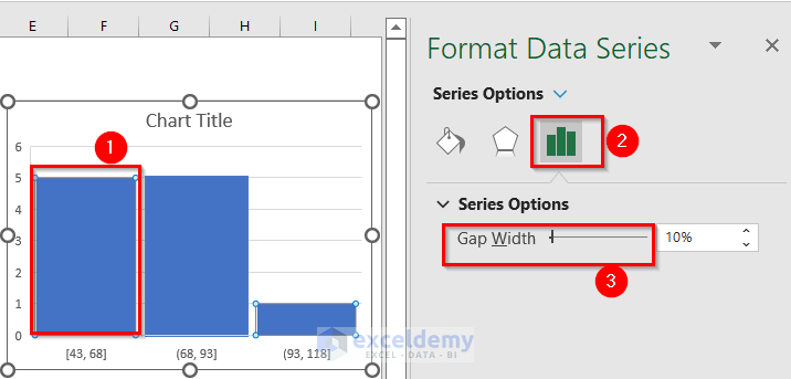
- Double-click the rectangle to open the Format Data Series window.
- In Series Options >> increase the Gap Width.
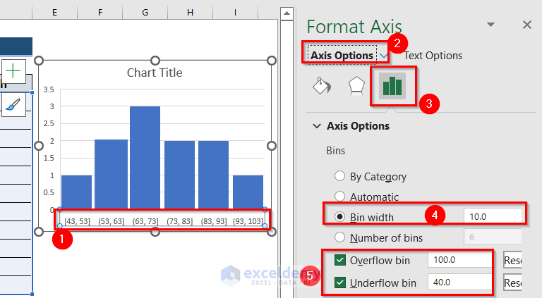
- Double-click the bins values to open the Format Axis window.
- In Axis Options >> change the Bin width.
- Change the Overflow bin and Underflow bin.
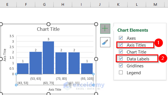
- In Chart Elements, add Axis Titles and Data Labels.
- Change the Chart Title.
Your Histogram is will be displayed
Read More: How to Make a Stacked Histogram in Excel
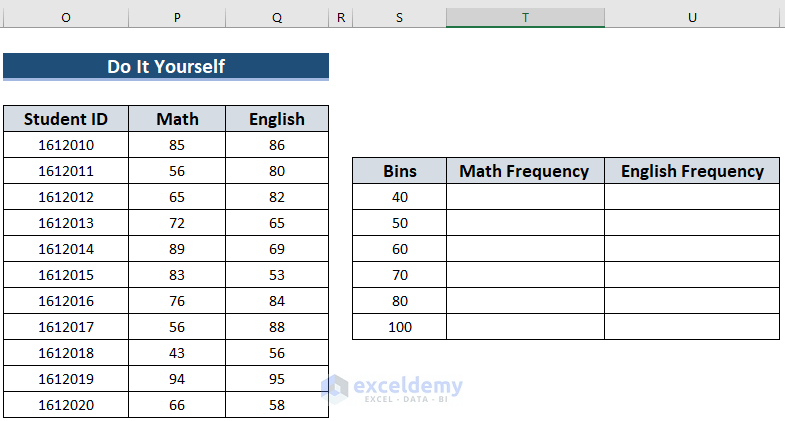
Practice Section
Practice here.
Download Practice Workbook
Download the practice workbook here.
Related Articles
- Difference Between Excel Histogram and Bar Graph
- How to Create a Bin Range in Excel
- How to Change Bin Range in Excel Histogram
- [Fixed!] Excel Histogram Bin Range Not Working
<< Go Back to Excel Histogram | Excel Charts | Learn Excel
Get FREE Advanced Excel Exercises with Solutions!
