While working in Microsoft Excel sometimes we need to calculate probability and then plot a histogram graph to make it more lucrative. But you might find it difficult without proper guidelines and functions. Today in this article, I am sharing with you how to create a probability histogram in Excel. Stay tuned!
How to Create Probability Histogram in Excel: 3 Simple Steps
In the following, I have shared 3 simple and quick steps to create a probability histogram in Excel. Follow the instructions below.
Step 1: Making an Informative Dataset
As we all know a dice have 6 faces. To check the probability of all faces we will take random numbers from 1 to 6. Here we also took 0 or null to represent a wrong position of the dice.
- Open a workbook and fill with random numbers.

- Next, just beside the random number column we will create a new column named “Probability” where we will determine the probability for those random numbers.

Step 2: Using BINOM.DIST Function to Determine Probability
Without moving here and there, we will calculate the probability using the BINOM.DIST function in Excel. The BINOM.DIST function is a statistical function that returns the binomial distribution probability.
- Choose a cell (C5) and insert the below formula down-
=BINOM.DIST(B5,6,1/6,FALSE)Where,
- We have taken our chosen numbers from cell (B5).
- As we are giving 6 trials, for this we have used 6.
- For taking 6 trials the probability stands as 1/6.
- Next, we choose FALSE as it’s a probability mass function.
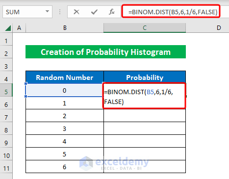
- Simply, press ENTER to get the output.
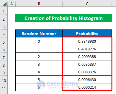
- Hence, drag the “Fill Handle” down to fill the rest of the cells.
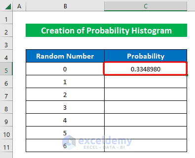
- Finally, we have successfully calculated probability in Excel.
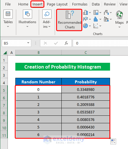
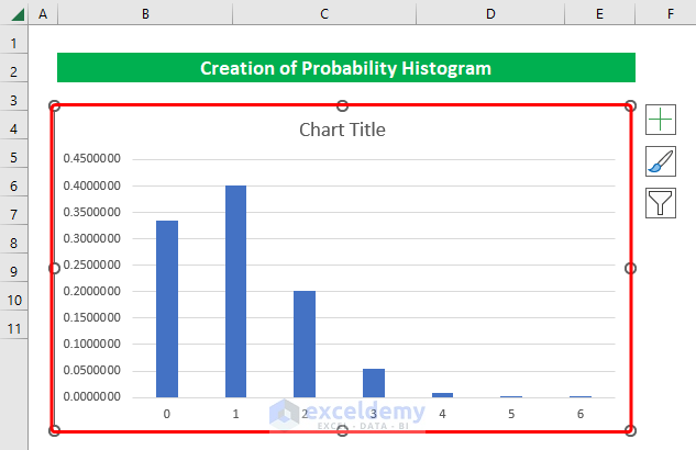
Step 3: Plotting a Histogram Graph
In this part, we will plot a histogram graph using the data from the table. Let’s fall into it right now.
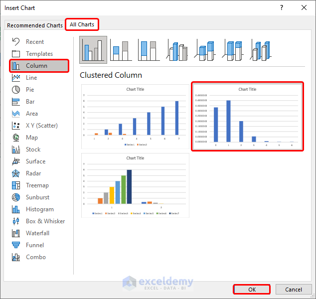
- Select cells (B5:C11) and click “Recommended Charts” from the “Insert” option.
- From the newly appeared window, choose a “Column Chart” and press OK.
- In conclusion, we have plotted the graph in our worksheet.
- Thereafter, you can also change the chart design to make it more lucrative. For that, choosing the chart go to the “Quick Layout” option from the “Chart Design” feature.
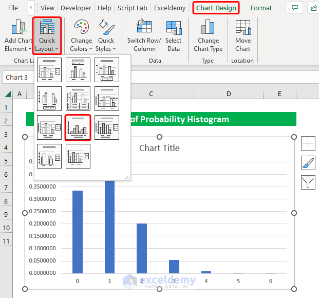
- Accordingly, change the title by double-clicking and then typing “Probability Histogram”.

- Similarly, provide your desired “Axis Titles”.

- In conclusion, we have created the probability histogram within a short time. Simple isn’t it?

Read More: How to Plot Cumulative Histogram in Excel
How to Create Binomial Distribution Histogram in Excel
The binomial distribution is a statistical calculation to determine the probability under a given set of parameters. The assumptions are taken in such a way that there will be only one outcome. You can draw a binomial distribution histogram in Excel using some simple tricks.
Suppose we have a dataset of a coin’s “Probability of Success” according to its “Number of Flips”. Now we will calculate the probability with multiple terms to understand the binomial distribution.

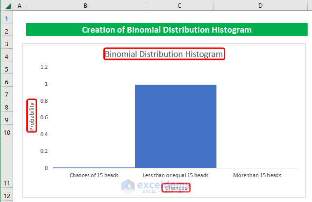
In order to understand, we have taken 3 scenarios which are- “Chances of 15 heads”, “Less than or equal 15 heads”, “More than 15 heads”. Let’s calculate the binomial probability using the BINOM.DIST function.
Step 1:
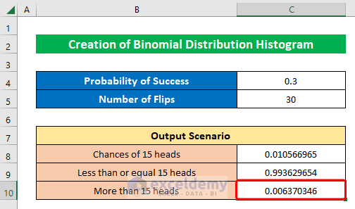
- First, choose a cell (C8) and write the below formula down-
=BINOM.DIST(15,C5,C4,FALSE)Where,
- We have taken 15 as we are calculating the chances of 15 heads.
- Total number of Trials is 30 which is in cell (C5).
- We have a probability of 3.
- As it is a probability mass function thus we selected FALSE.
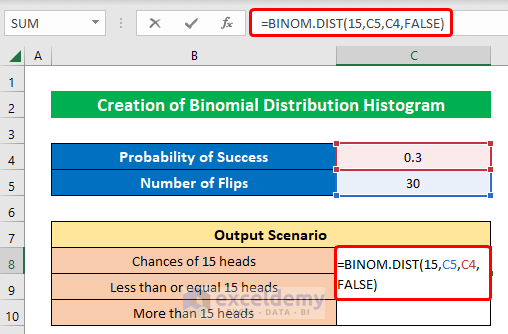
- Gently, hit ENTER to get the probability.

- Similarly, in cell (C9) put the below formula down-
=BINOM.DIST(15,C5,C4,TRUE)Where,
- For Cumulative we used TRUE as the term is a cumulative distribution function.
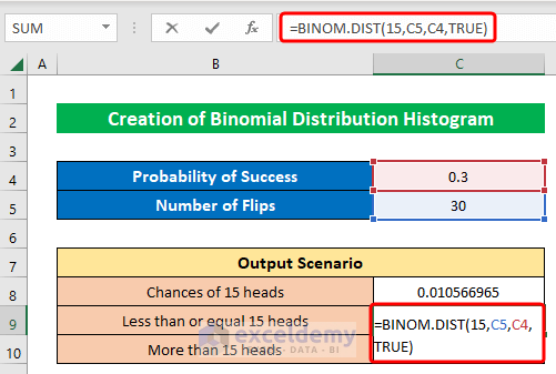
- Simply, click ENTER.

- In the same fashion, choose cell (C11) and write the below formula-
=1-BINOM.DIST(15,C5,C4,TRUE)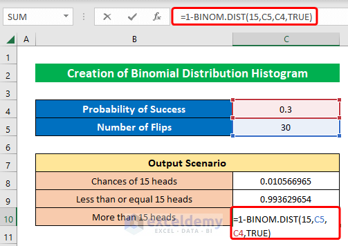
- Similarly, press the ENTER key to get the result.
Step 2:
- Now, choosing cells (B8:C10) select a “2-D Column” from the “Insert” option.

- Thus a chart will be created in the worksheet.
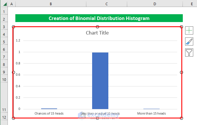
- You can visit the “Quick Layout” option from the “Chart Design” feature to change the layout of the plotted chart.

- Just write down the ‘Chart Title” and “Axis Title” and your binomial distribution histogram will be ready.
Download Practice Workbook
Download this practice workbook to exercise while you are reading this article.
Conclusion
In this article, I have tried to cover almost all the steps to create a probability histogram in Excel. Take a tour of the practice workbook and download the file to practice by yourself. I hope you find it helpful. Please inform us in the comment section about your experience. Stay tuned and keep learning.
Related Articles
- How to Create a Histogram with Bell Curve in Excel
- How to Plot Histogram with Unequal Class Intervals in Excel
- How to Add Vertical Line to Histogram in Excel
- Stock Return Frequency Distributions and Histograms in Excel
- How to Create Histogram in Excel Using VBA
<< Go Back to Excel Histogram | Excel Charts | Learn Excel
Get FREE Advanced Excel Exercises with Solutions!
