Excel Charts

How to Create a Bell Curve in Excel (2 Easy Methods)

We often need to plot a Bell Curve in the field of Statistics. Using Excel, that task will be so much easier. In this article, we will show you 2 ...

How to Make a Yes No Flowchart in Excel (2 Useful Methods)

While using Excel for educational or business purposes, drawing flowchart is a too common task. There are smart ways in Excel to do it, especially ...

How to Make an Interactive Flowchart in Excel (With Easy Steps)

We use Excel for many different reasons. Educational institutions, companies, business sectors, etc. store information and records in MS Excel. They ...

How to Create a Swimlane Flowchart in Excel (With Easy Steps)

This tutorial will show how to create a swimlane flowchart in Excel. Swimlane flowchart is very helpful to get insights into a particular business. ...

How to Plot Cities on a Map in Excel (2 Easy Methods)

In many cases, we need to analyze and work with data related to cities. Plotting those data is a must in most cases. If you want to learn how to plot ...

How to Make Route Map in Excel (2 Simple Ways)

Sometimes we need to create a route map of our visiting place to cover them as early as possible. There are several types of applications to get it. ...

How to Map Data in Excel (2 Easy Methods)

Excel has some extremely useful tools for visualizing data. The data map is one of them. Additionally, it is widely used for visualizing different ...

How to Create a Cross Functional Flowchart in Excel (3 Easy Ways)

In this article, we will learn to create a cross functional flowchart in Excel. A cross functional flowchart shows the number of steps and ...

How to Plot Addresses on Google Map from Excel (2 Suitable Examples)

Google Maps is one handy app nowadays that helps navigate or locate unknown areas easier and more accessible. You can have your locations updated on ...

How to Edit Legend in Excel (2 Simple Methods)

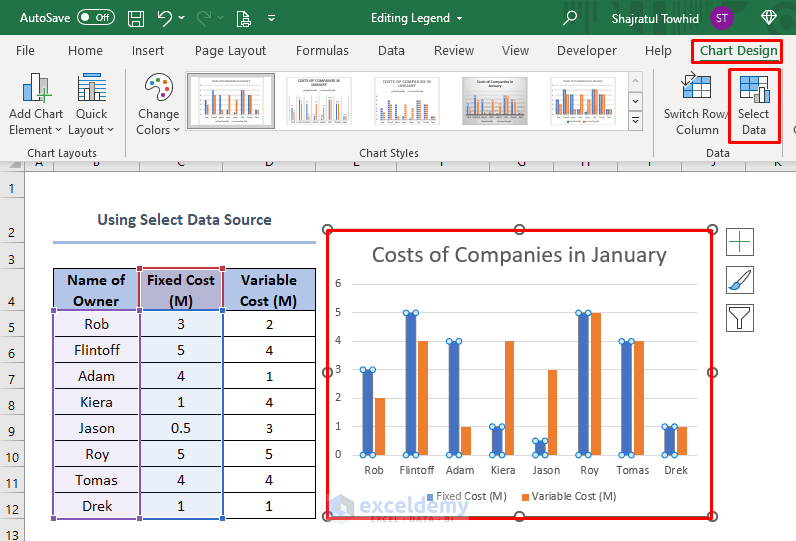
While using charts in Excel we often need to edit the legend. Legends are basically representation of data. We mainly use legends when data has the ...

How to Create a Workflow in Excel (3 Simple Methods)

This article illustrates how to create a workflow in Excel. Workflow can be defined as the sequence of operations for any particular process. It is ...

How to Create a Google Map with Excel Data (With Easy Steps)

Google Maps serves as a search engine to locate any place that people are looking for, as well as a map to lead them to that place. Sometimes we have ...

How to Add Notes in Excel Chart (2 Easy Methods)

While working with Microsoft Excel, sometimes we need to add some extra notes to a chart. We can easily add notes in Excel charts. Adding notes to a ...

How to Edit a Line Graph in Excel (Including All Criteria)

Making a line graph to visualize the data in Excel is very common in our daily life. After making a line graph, you may have to edit the line graph ...

How to Edit Pie Chart in Excel (All Possible Modifications)

For better representation and visualization of data, a Pie chart is a very handy tool. We need to create and edit these charts very frequently. In ...

Advanced Excel Exercises with Solutions PDF


ExcelDemy
Logo