What Are Error Bars in Excel?
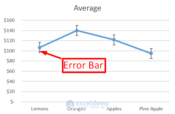
Error bars in charts can help you see the ranges of errors and standard deviations.
In two-dimensional area, column, bar, XY (scatter), line, and bubble charts, error bars can be used. Error bars for the x and y values can be displayed in scatter and bubble charts.
How to Add Error Bars in Excel:
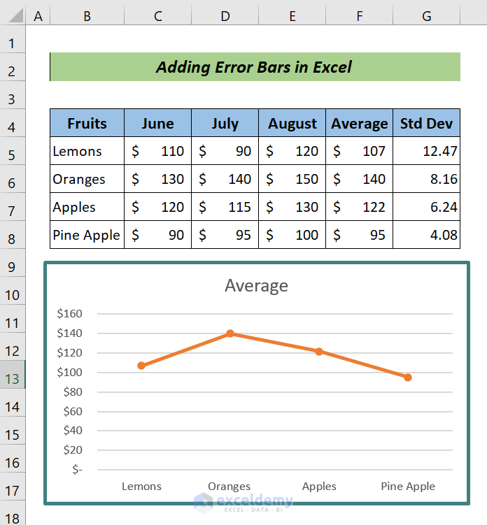
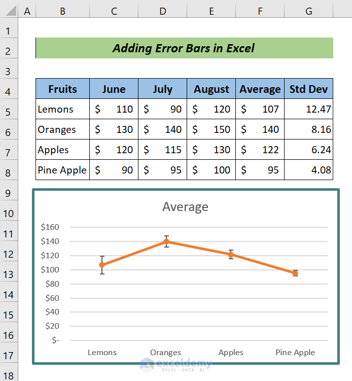
This is the sample dataset.
Steps:
- Select the chart in which you want to add error bars.
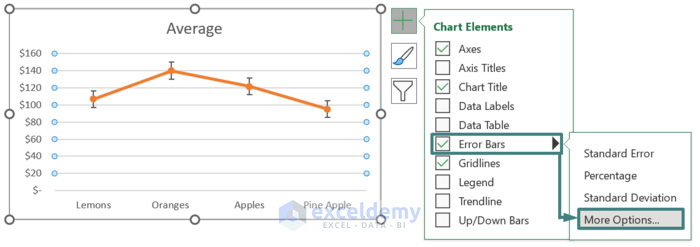
- Click the Plus sign (+).
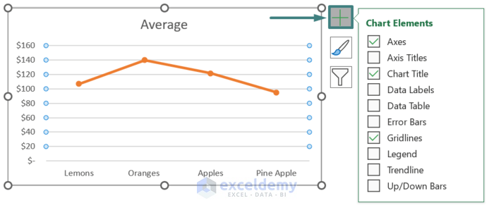
- In Chart Elements, check Error Bars.
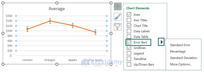
- Click the arrow next to it. A list of items that can be added to the chart will be displayed.
Note:
Include error bars for:
- Standard Error: shows the standard error of the average for all values: the gap between the sample average and the population average of the data series.
- Standard Deviation: displays the amount of scattering of the data: how far is it from the mean. The default standard deviation is 1 for all data points.
- Percentage Error: adds percentage error bars to your chart. The percentage error is 5% by default.
Step 1- Adding Individual Error Bars Through the Excel Chart Elements
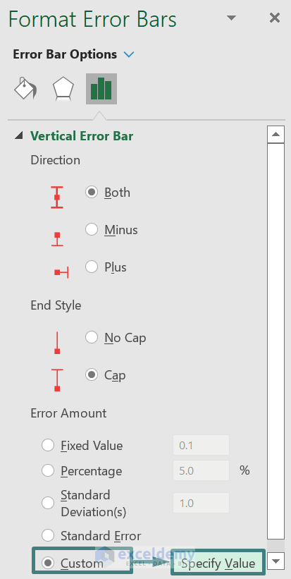
- Click the plus sign (+) next to the chart >> Error Bars >> More options. A Format Error Bars window will open.
Step 2: Customizing Error Amount
- Select Custom and click Specific Value. A Custom Error Bars dialog box will be displayed.
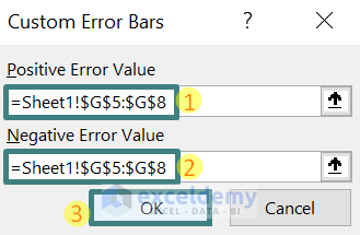
Step 3 – Setting Positive and Negative Error Values in Excel
- Delete the content of the Positive Error Value box. Keep the cursor in the box (or click Collapse Dialog), and select G5:G8.
- Apply the same procedure for the Negative Error Value box.
- Click OK.
This is the result.
Note:
Delete previous content in the Positive and Negative Error Value boxes. The new range will be added to the previous array as shown below and an error message will be displayed.
={1}+Sheet1!$G$5:$G$8
Download Practice Workbook
Download the practice workbook.
Related Articles
- How to Add Error Bars in Excel
- How to Add Custom Error Bars in Excel
- How to Add Horizontal Error Bars in Excel
- How to Add Standard Deviation Error Bars in Excel
- How to Graph Uncertainty in Excel
<< Go Back To Excel Chart Elements | Excel Charts | Learn Excel
Get FREE Advanced Excel Exercises with Solutions!
