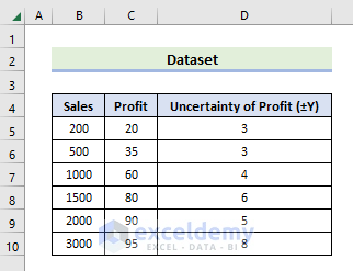
The following dataset has columns labeled Sales, Profit, and Uncertainty of Profit. We will create a chart now that compares the number of sales to the amount of profit. The graph will represent the degree of uncertainty associated with the Profit column.
Method 1 – Utilize the Error Bar Option to Plot Uncertainty in Excel
Steps:
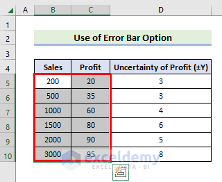
- Choose the working sheet as the Active Sheet.
- Select the B5:C10 range.
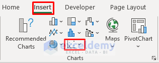
- Navigate to the Insert tab.
- From the Charts group, click the Bubble Chart icon.
- Select the Scatter icon from the Scatter section.
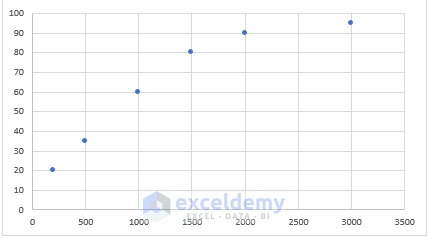
- A graph window will open that plots the values of our selected cells.
- The Scatter Chart plots the left column along the X-Axis and the right column on the Y-Axis.
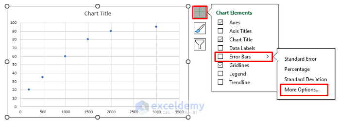
- Click anywhere in the Chart, then click on the plus icon on the top-right. The Chart Elements bar will open.
- Choose the Error Bars option.
- Pick More Options.
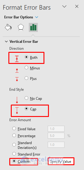
- The Format Error Bars pane will appear.
- From the Vertical Error Bar section, check Both and Cap as the Direction and the End Style, respectively.
- Check Custom from the Error Amount, then go to Specify Value.
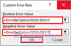
- The window for the Custom Error Bars will open.
- Select the sheet name followed by an Exclamation mark and the range in the Positive Error Value box.
- Input the same range in the Negative Error Value box.
- Hit OK.
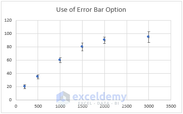
- Here’s the result.
Read More: How to Add Error Bars in Excel
Method 2 – Display Uncertainty in a Chart Through Excel VBA
Steps:
- Choose the intended sheet as an active sheet.
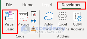
- Navigate to the Developer tab and click on Visual Basic.
- Click the Insert option and select Module.
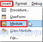
- An empty Module Box will appear.
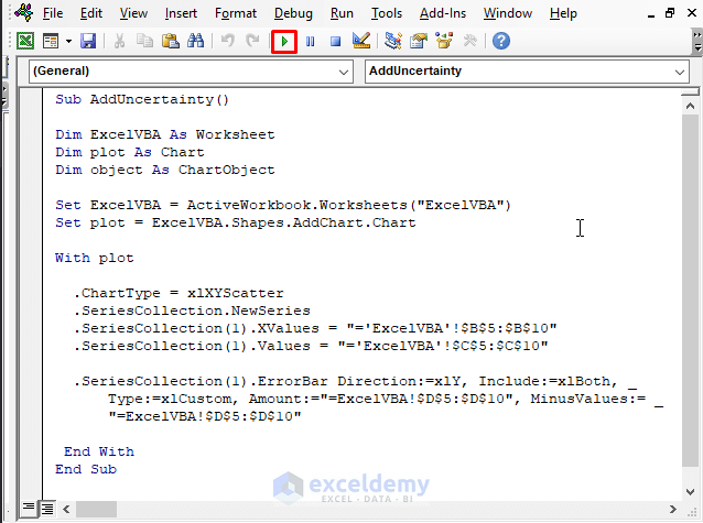
- Insert the following code in the Module Box.
Sub AddUncertainty()
Dim ExcelVBA As Worksheet
Dim plot As Chart
Dim object As ChartObject
Set ExcelVBA = ActiveWorkbook.Worksheets("ExcelVBA")
Set plot = ExcelVBA.Shapes.AddChart.Chart
With plot
  .ChartType = xlXYScatter
  .SeriesCollection.NewSeries
  .SeriesCollection(1).XValues = "='ExcelVBA'!$B$5:$B$10"
  .SeriesCollection(1).Values = "='ExcelVBA'!$C$5:$C$10"
  .SeriesCollection(1).ErrorBar Direction:=xlY, Include:=xlBoth, _
      Type:=xlCustom, Amount:="=ExcelVBA!$D$5:$D$10", MinusValues:= _
      "=ExcelVBA!$D$5:$D$10"
 End With
End Sub- Modify the worksheet name and the range as needed.
- Press F5 or click the Run button.
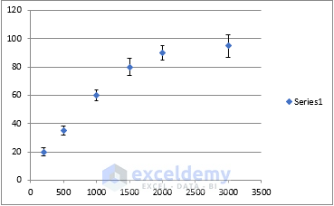
- Here’s the result.
Read More: How to Add Custom Error Bars in Excel
Download the Practice Workbook
Related Articles
- How to Add Individual Error Bars in Excel
- How to Add Horizontal Error Bars in Excel
- How to Add Standard Deviation Error Bars in Excel
<< Go Back To Excel Chart Elements | Excel Charts | Learn Excel
Get FREE Advanced Excel Exercises with Solutions!
