This article illustrates how to make a line graph in Excel with multiple variables. A line graph connects different data points to show the trend and ...
The sample dataset below contains a list of products including their selling prices with the cost prices of a company. For the two different series ...
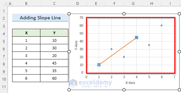
In a Scatter Plot where the data shows little correlation, adding an average line creates a useful yardstick. Suppose we have inserted a Scatter Plot ...