Method 1 – Utilizing Excel Shapes
Steps:
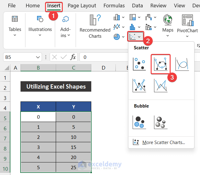
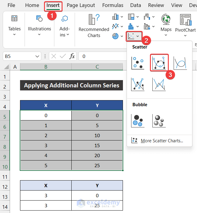
- Select the range of cells B5:C10.
- In the Insert tab, click on the drop-down arrow of the Insert Scatter (X, Y) or Bubble Chart option from the Charts group.
- Choose the Scatter with Smooth Lines and Markers from the Scatter section.
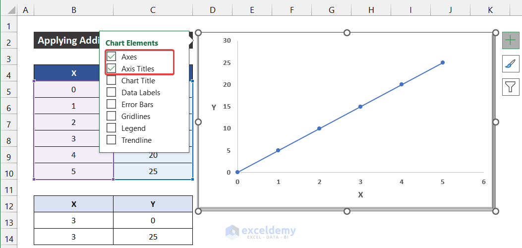
- The chart will appear in front of you.
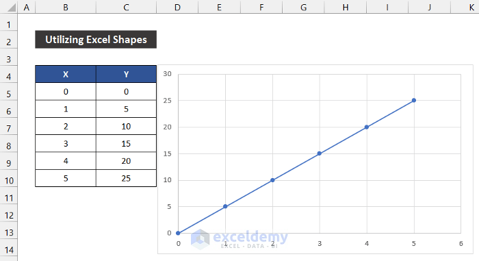
- Modify the chart according to your desire from the Chart Design and Format ribbons and keep the required elements from the Chart Elements icon. In our chart, we kept the default style.
- Add only the Axes and Axis Title elements in our graph.
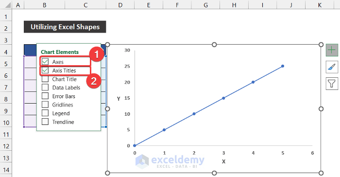
- Our graph insertion is finished.
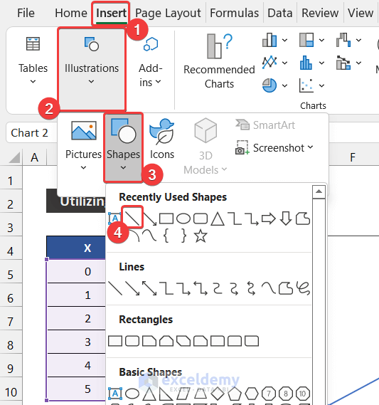
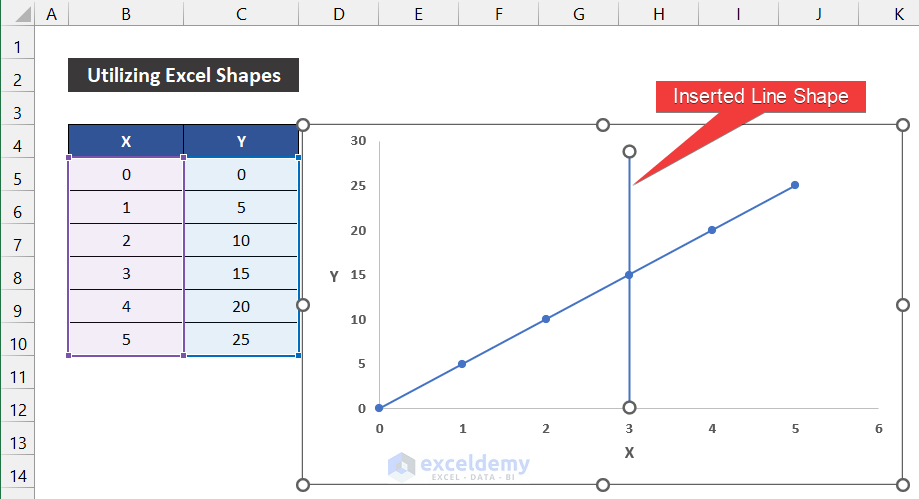
- In the Insert tab, click on the drop-down arrow of the Illustration > Shapes option.
- Choose the Line shape.
- You will see that your mouse cursor will be changed.
- Click close to the point where you want to insert the line. In our case, we add the line at the position of value 3.
- Wild press the Shift button on your keyboard to keep the line straight.
- The line will appear on your graph.
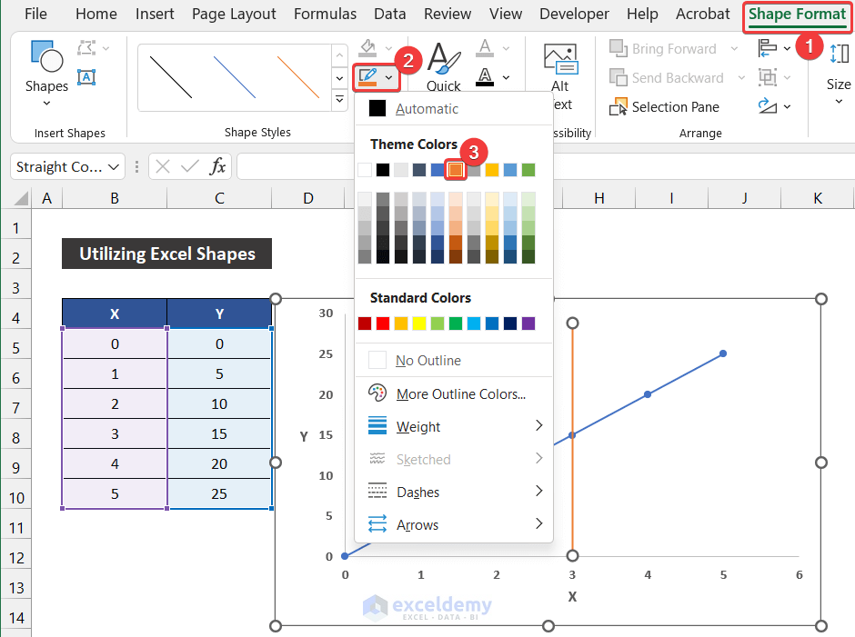
- In the Shape Format tab, click on the drop-down arrow of the Shape Outline option from the Shape Style group.
- Choose any color according to your desire. We chose Orange: Accent 2 color to make them easily distinguishable.
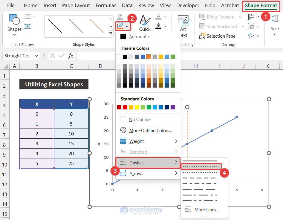
- Click on the drop-down arrow of the Shape Outline option and select the Dashes option.
- Choose the Round Dot option to convert the line solid from the dotted form.
- You will get the vertical dotted line in your graph.
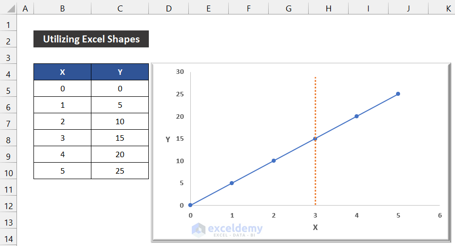
Say that our method worked perfectly, and we are able to add a vertical dotted line in an Excel graph.
Method 2 – Applying Additional Column Series
Steps:
- Select the range of cells B5:C10.
- In the Insert tab, click on the drop-down arrow of the Insert Scatter (X, Y) or Bubble Chart option from the Charts group.
- Choose the Scatter with Smooth Lines and Markers from the Scatter section.
- The chart will appear on your device.
- Modify the chart according to your desire from the Chart Design and Format ribbons and keep the required elements from the Chart Elements icon. In our chart, we kept the default style.
- Add only the Axes and Axis Title elements in our graph.
- Our graph insertion is finished.
- Go to the Chart Design tab and click on the Select Data option from the Data group.
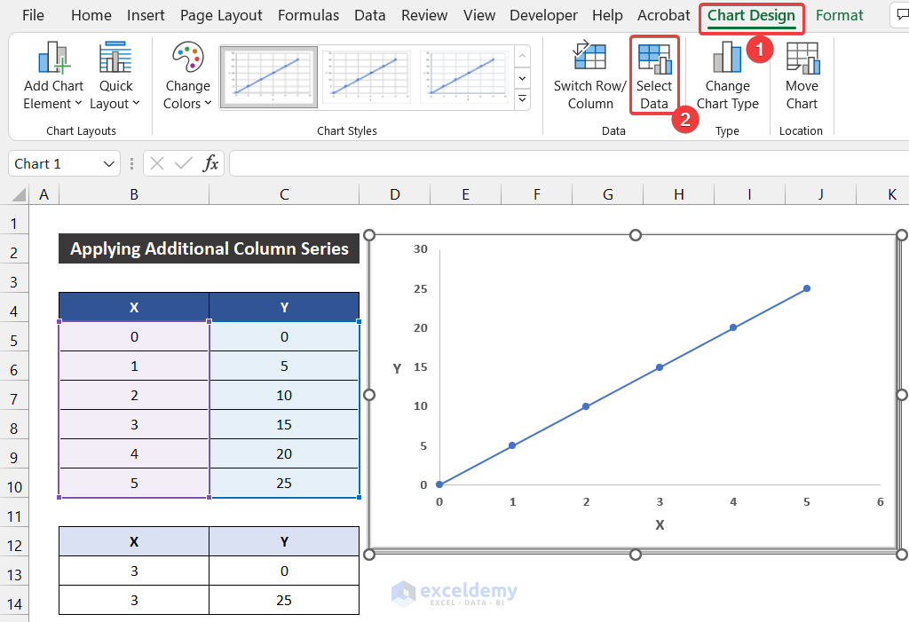
- A small dialog box titled Select Data Source will appear.
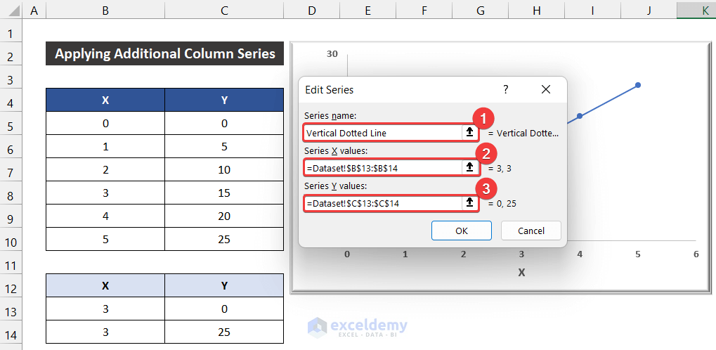
- Click on the Add option to add a series where we add the vertical dotted line.
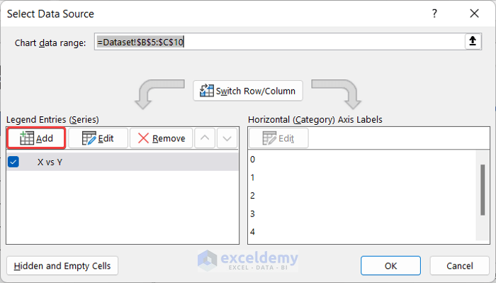
- A small dialog box entitled Edit Series will appear.
- Write a suitable name for this series. We wrote Vertical Dotted Line for our series.
- Set the Series X Values as ‘Dataset!$B$14:$B$15’ and Series Y Values as ‘Dataset!$C$14:$C$15′.
- Click OK.
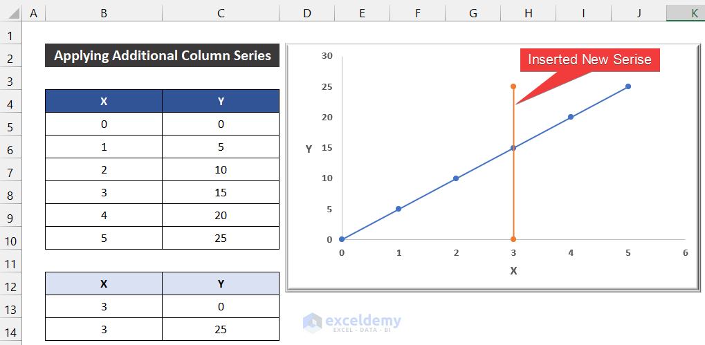
- Click OK to close the Select Data Source dialog box.
- You will see the second series on our existing chart.
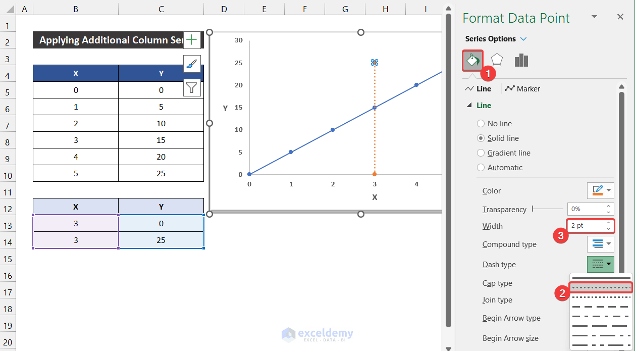
- Double-click on the line.
- As a result, a side window entitled Format Data Point will appear.
- In the Fill & Line tab and change the Dash Type from Solid to Round Dot.
- Modify the Width and Color according to your desire to ensure the line is easily distinguishable.
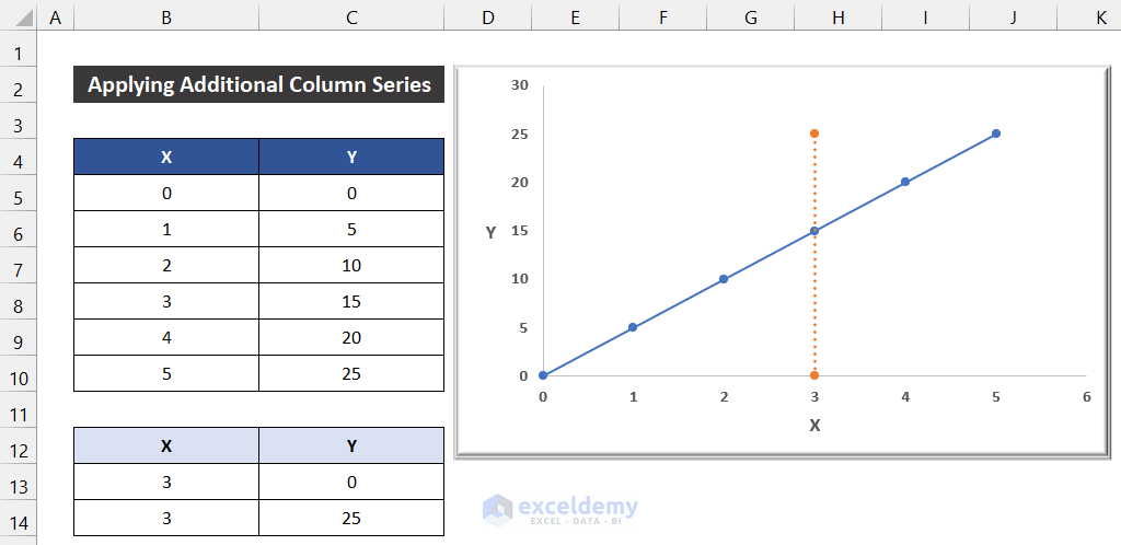
- You will get the vertical dotted line in your graph at your desired location.
Say that our method worked successfully, and we are able to add a vertical dotted line in an Excel graph.
Method 3 – Modifying Error Bar
Steps:
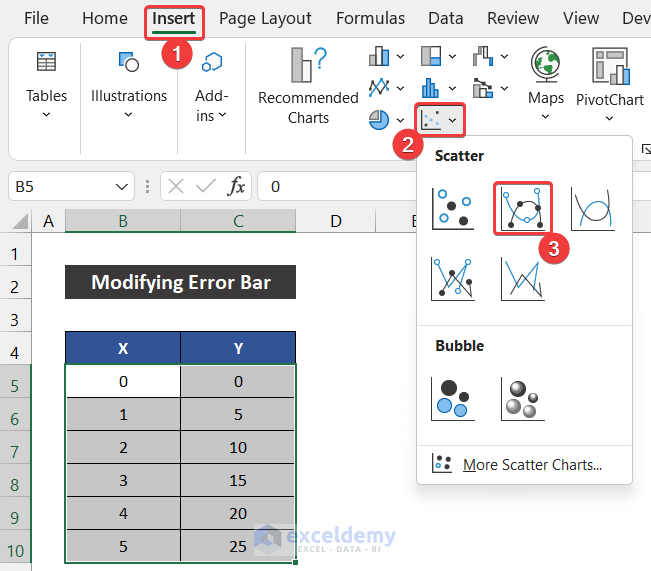
- Select the range of cells B5:C10.
- In the Insert tab, click on the drop-down arrow of the Insert Scatter (X, Y) or Bubble Chart option from the Charts group.
- Choose the Scatter with Smooth Lines and Markers from the Scatter section.
- Get the chart in your Excel worksheet.
- Modify the chart according to your desire from the Chart Design and Format ribbons and keep the required elements from the Chart Elements icon. We kept the default style.
- Add only the Axes and Axis Title elements in our graph for the convenience of our users.
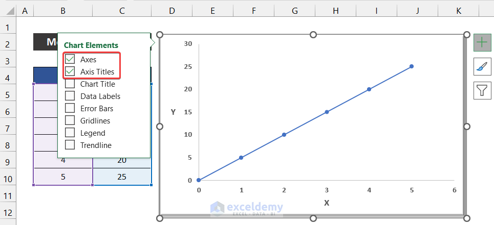
- Our graph insertion task is completed.
- Go to the Chart Design tab and click on the Select Data option from the Data group.
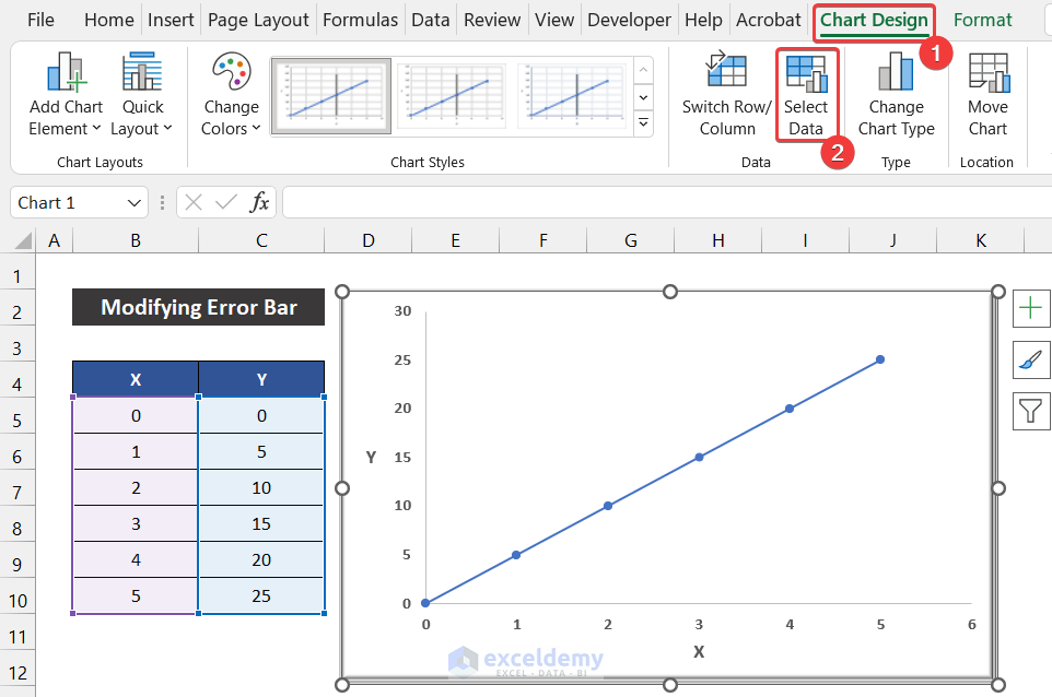
- A small dialog box called Select Data Source will appear.
- Click on the Add option to add a series where we add the vertical dotted line.
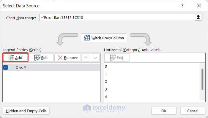
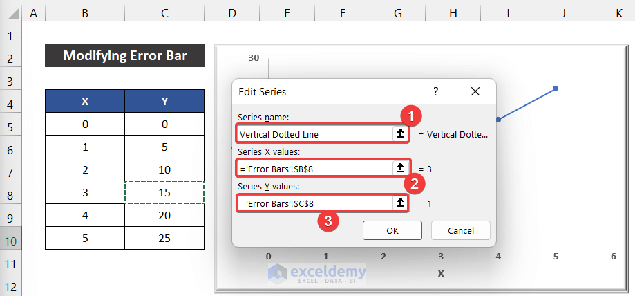
- Another small dialog box entitled Edit Series will appear.
- Write a suitable name for this series. We wrote Vertical Dotted Line for our series.
- Set the Series X Values as ”Error Bars’!$B$8′ and Series Y Values as ‘‘Error Bars’!$C$8′.
- Click OK.
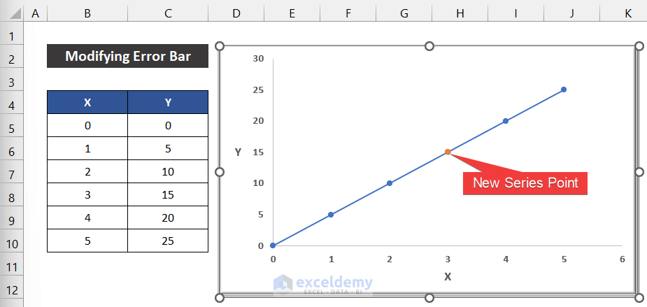
- Click OK to close the Select Data Source dialog box.
- You will see a dot of a different color on the existing line.
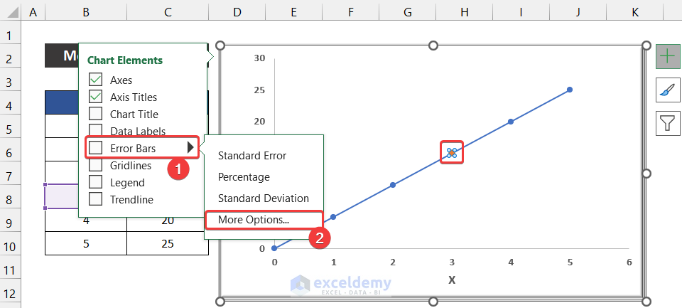
- Select that dot spot and click on the Chart Element icon.
- Choose the Error Bars > More Options option.
- A side window called Format Error Bars will appear.
- If the window shows the option for the Horizontal Error Bar, press Detele to delete the horizontal error bar and click the vertical bar.
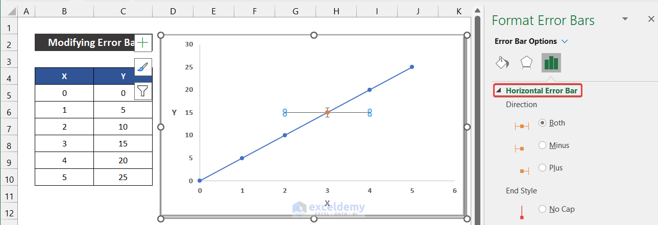
- Click the horizontal bar and press Delete.
- Get the option to modify the Vertical Error Bar.
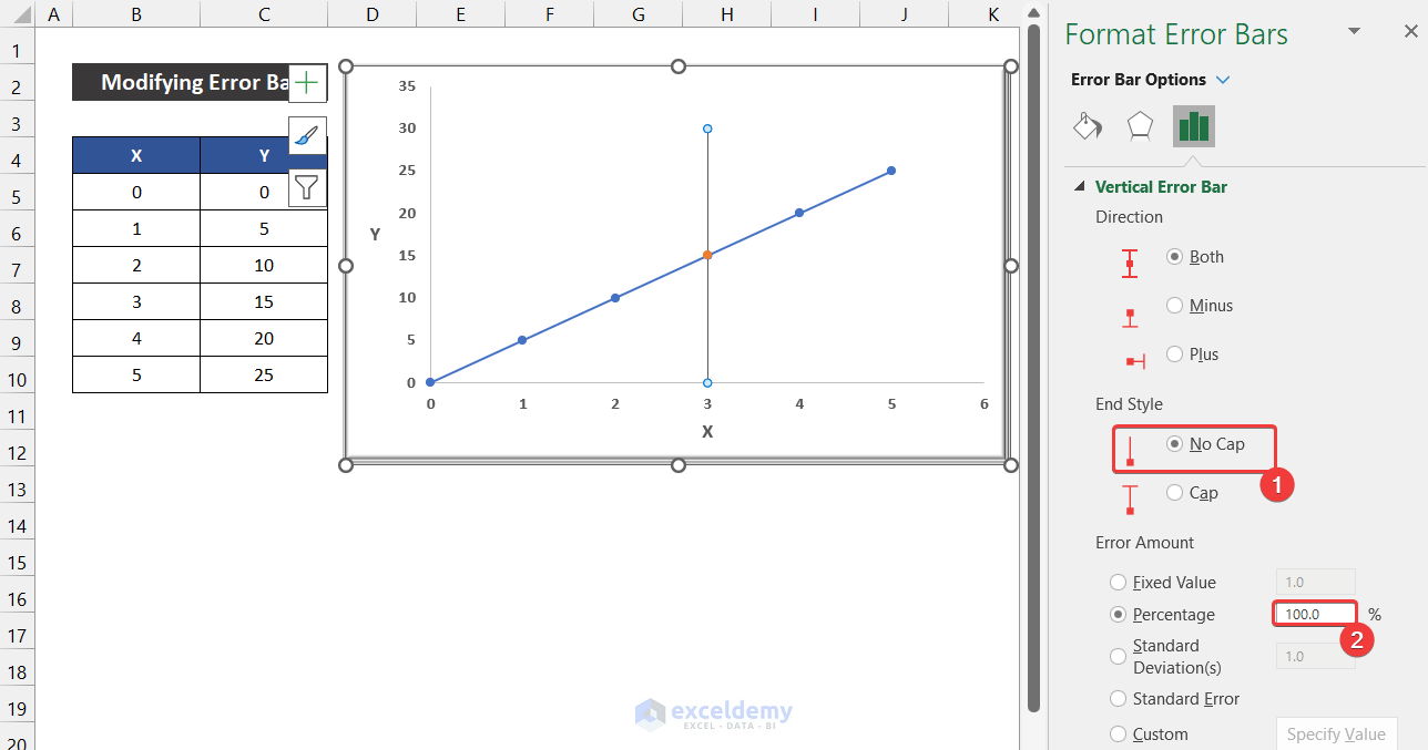
- In the End Style section, choose the No Cap option.
- In the Error Amount section, change the option from Fixed Value to Percentage.
- Set the option value 5% to 100%.
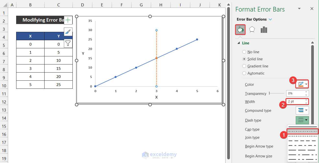
- Go to the Fill & Line tab and change the Dash Type from Solid to Round Dot.
- Modify the Width and Color according to your desire to ensure the line is easily distinguishable.
- Get the vertical dotted line in your graph.
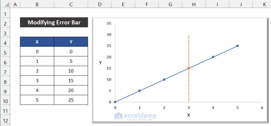
Say that our method worked precisely, and we are able to add a vertical dotted line in an Excel graph.
Download Practice Workbook
Download this practice workbook for practice while you are reading this article.
Related Articles
- How to Center a Chart in Excel
- How to Left Align a Chart in Excel
- How to Add Asterisk in Excel Graph
- How to Remove Chart Border in Excel
<< Go Back to Formatting Chart in Excel | Excel Charts | Learn Excel
Get FREE Advanced Excel Exercises with Solutions!
