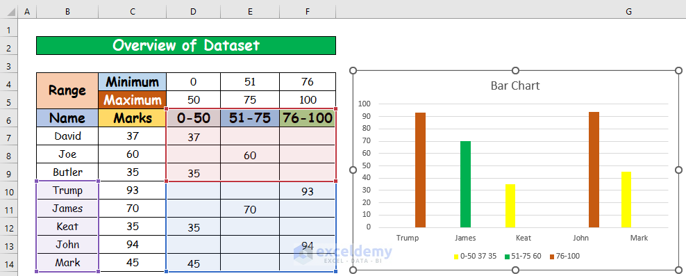
This is an overview of the sample dataset.
Method 1 – Using the Vary Colors by Point Option in Excel
Steps:
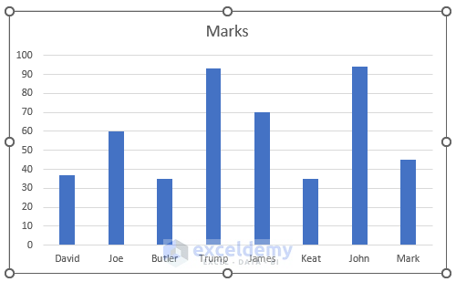
- Select the range in the Column chart. Here, B6:C14.
- In the Insert tab, go to:
Insert → Charts → 2D Column Chart
A column chart will be created.
- Select any of the columns in the chart and right-click.
- Select Format Data Series.
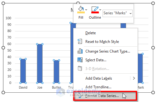
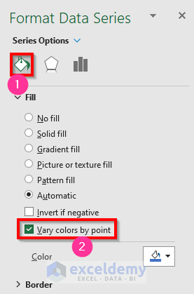
- In Format Data Series, choose your Series Overlap and Gap Width and select the Fill Shape icon.
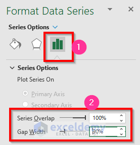
- Check Vary colors by point.
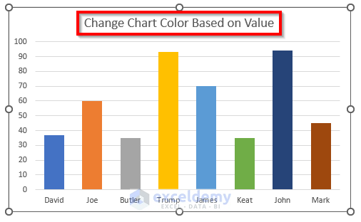
The chart color changed based on cell value.
Read More: [Solved:] Vary Colors by Point Is Not Available in Excel
Method 2: Applying the IF and AND Functions to Change the Chart Color Based on a Value
Step 1:
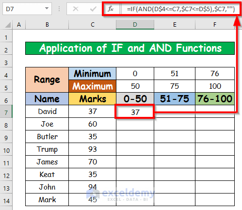
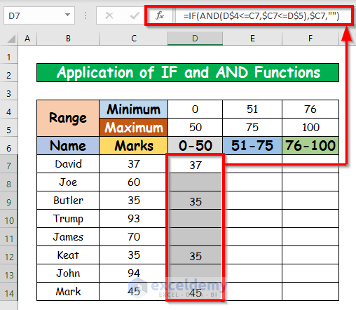
- Select D7, and enter the formula below.
=IF(AND(D$4<=C7,$C7<=D$5),$C7,"")- Press Enter. The return of the IF and AND Functions is 37.
- AutoFill the rest of the cells in column D.
- Enter the formula below in E7 and AutoFill the rest of the cells in column E.
=IF(AND(E$4<=C7,$C7<=E$5),$C7,"")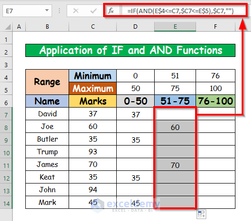
- Enter the formula below in E7 and AutoFill the rest of the cells in column F.
=IF(AND(E$4<=C7,$C7<=E$5),$C7,"")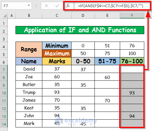
Step 2:
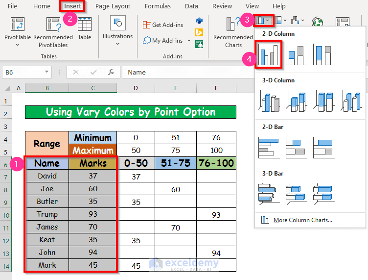
- Select your range in the Column Chart. Here, B6:B14 and D6:F14.
- Go to the Insert tab and select:
Insert → Charts → 2D Column Chart
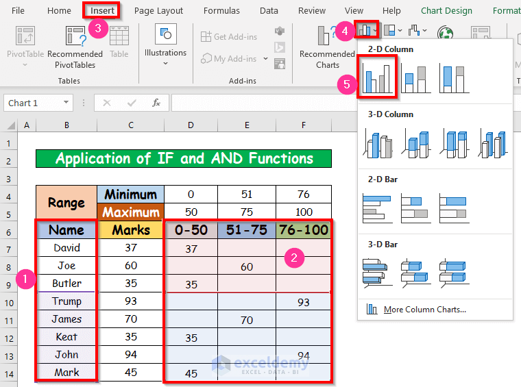
A column chart will be created.
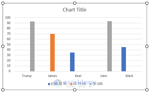
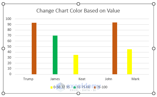
- Changing the color of the column chart: Here, the series color will change to Yellow when the value range is 0 – 50.
- Select the column Keat and right-click. In the Fill color option, select Yellow.
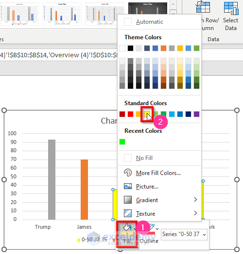
- Change the color to Green when the value range is 51 – 75, and to Dark Orange when it is 76 – 100.
The chart color changed based on cell value.
Read More: How to Change Text Direction in Excel Chart
Create a Pie Chart Color Based on Value
Steps:
- Select your range in the Pie chart. Here, B4:C12.
- Go to the Insert tab and select
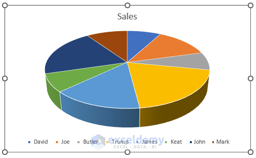
Insert → Charts → 3D Pie Chart
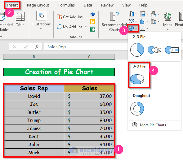
- A Pie chart was created.
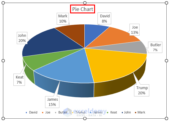
- Name your Pie chart.“ Pie Chart”, here.
- A Pie chart was created with color based on value.
Read More: How to Rotate Text in an Excel Chart
Download Practice Workbook
Download this practice workbook to exercise.
Related Articles
- How to Show Coordinates in Excel Graph
- How to Make Excel Graphs Look Professional
- How to Add Subscript in Excel Graph
<< Go Back to Formatting Chart in Excel | Excel Charts | Learn Excel
Get FREE Advanced Excel Exercises with Solutions!
