1. Descriptive Title
Ensure your chart titles provide insight into the data and include relevant context (such as location or source). Avoid leaving users guessing.
2. Remove Clutter
- Eliminate unnecessary gridlines.
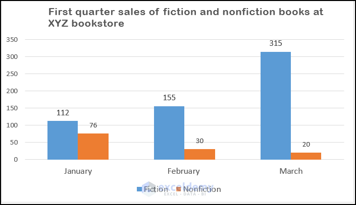
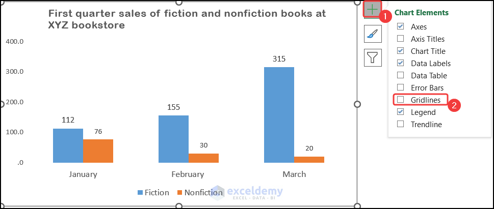
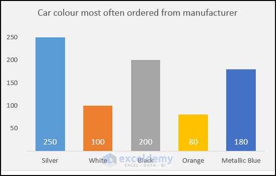
- Simplify the vertical axis by adjusting major and minor units.
-
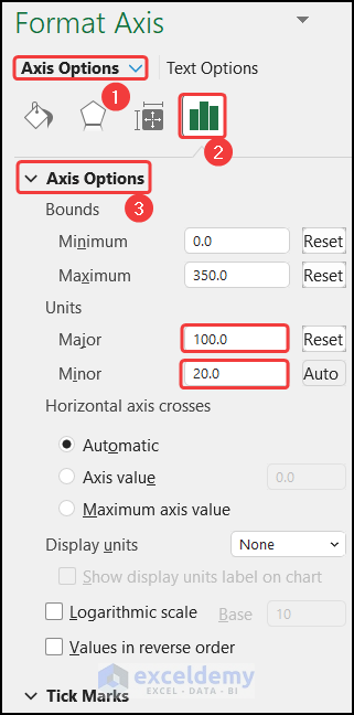
- Expand the Axis Options section and change the Major unit to 100, for the example below, and the Minor unit to 20.
-
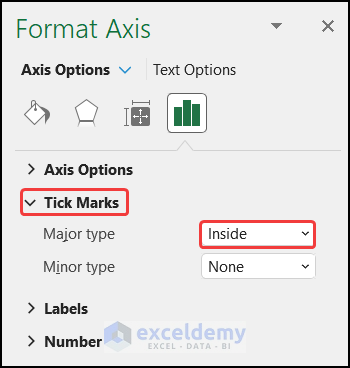
- Expand the Tick Marks section and make sure that for Major Type, Inside is selected.
-
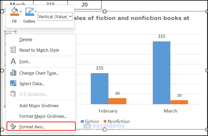
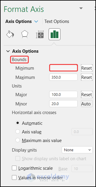
- Sometimes Excel sets the vertical axis maximum, way beyond the actual data points. To fix this follow these steps:
- Select the vertical axis then right-click and choose the Format Axis option.
- Sometimes Excel sets the vertical axis maximum, way beyond the actual data points. To fix this follow these steps:
-
-
- In the Format Axis panel, under Axis Options, Bounds, set the maximum to a lower value.
-
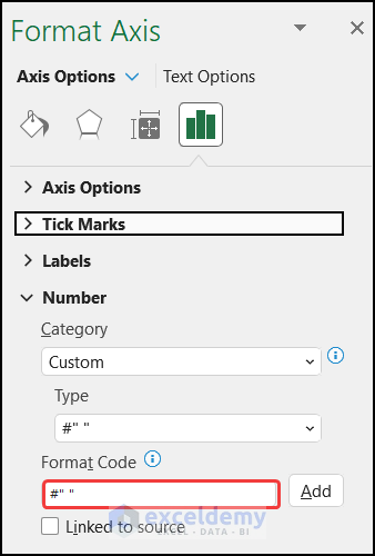
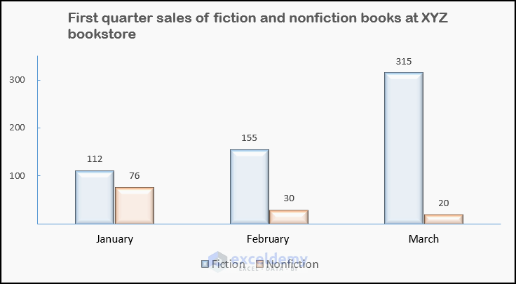
- Clear unnecessary zeros from the axis labels.
- The chart at the bottom also contains an unnecessary zero.
- To remove the zero right-click on the vertical axis and selecting Format Axis.
-
- In the Axis Options section, go to Number >> Category >> Custom, and insert the Format Code as #” “, to clear the zero.
- Click Add to add the custom format.
Your graph will be decluttered.
Read More: How to Rotate Text in an Excel Chart
3. Choose Suitable Chart Types
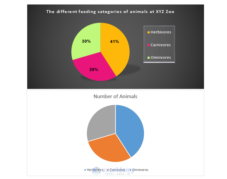
- For more than 4 categories, consider using a Pie of Pie chart or a Bar chart instead of a crowded Pie chart.
- Match your data to the appropriate graph type.

4. Keeping Consistency While Dealing with Multiple Charts on the Same Sheet
- Use Chart Templates to maintain a consistent look and feel across charts on the same worksheet.
- Save your preferred formatting as a template and apply it to other charts as needed.
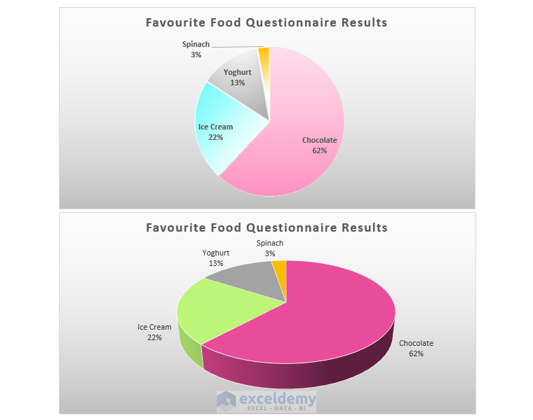
5. Avoiding Unnecessary 3D Graphs
- 3D charts can distort data perception. Compare the two Pie charts below:
- The first chart shows slices in their relative proportions.
- The 3D Pie chart introduces ambiguity regarding proportions.
Read More: How to Change Text Direction in Excel Chart
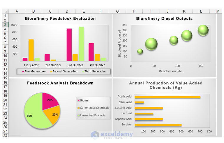
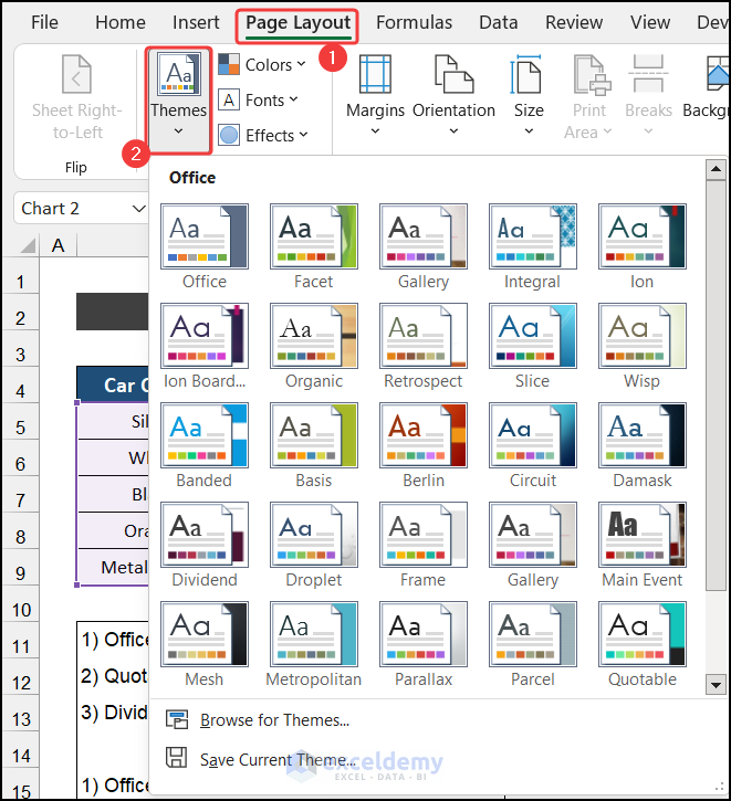
6. Leverage Built-in Themes:
- Excel’s built-in themes allow quick chart customization.
- To change the theme:
- Go to the Page Layout tab.
- In the Themes group, click the drop-down arrow and select a theme.
- Watch your chart update colors and fonts.
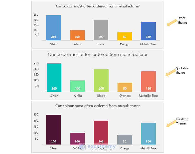
- Example: Default Office theme vs. Quotable theme vs. Dividend theme.
Read More: How to Add Subscript in Excel Graph
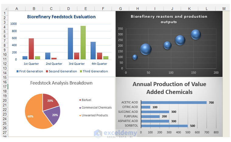
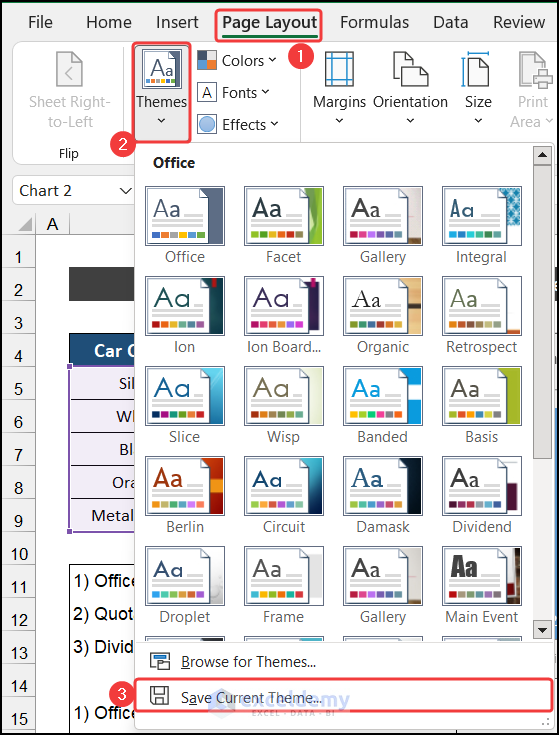
7. Customizing Your Own Theme
Create a unique theme for branding:
- Go to Page Layout.
- Click the drop-down arrow under Colors > Customize Colors.
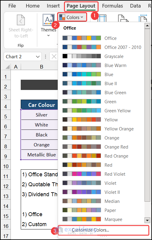
- Create a new theme by selecting colors, fonts, and effects.
- Save it.
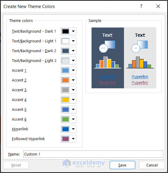
- Use Save Current Theme to apply your custom theme.
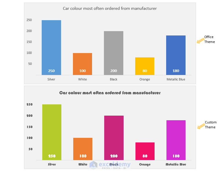
In the example below the same source data is used to create both charts. The chart above has the standard Office theme applied, whereas the chart below has a custom-made theme applied.
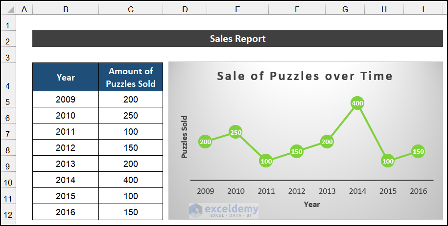
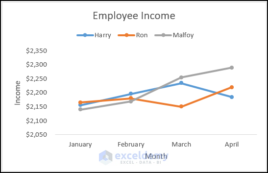
8. Distinguish Line and Scatter Charts
- Line chart:
- Vertical axis: Value axis.
- Horizontal axis: Category axis (equidistant points).
- Example: Puzzles sold per year.
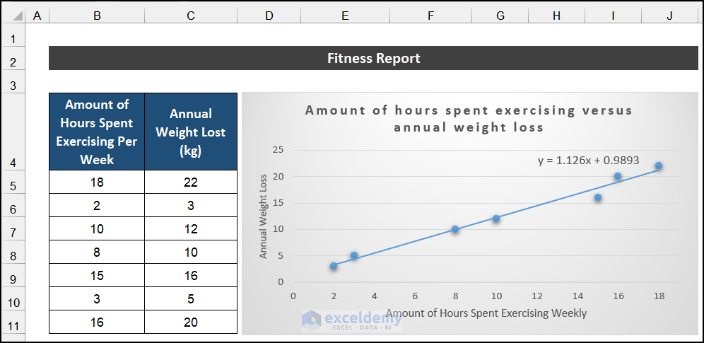
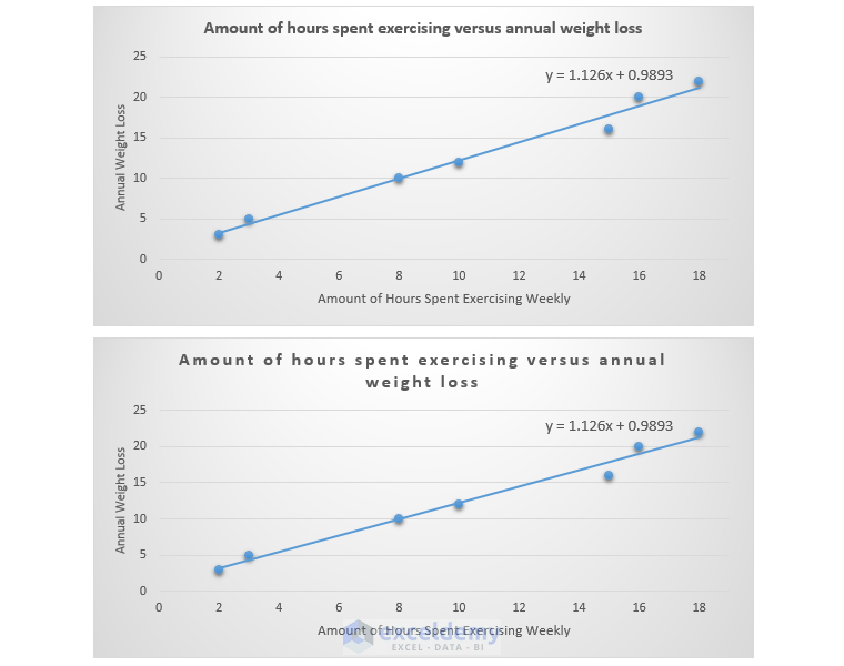
- Scatter chart:
- Vertical and horizontal axes display values.
- Illustrates patterns and relationships between variables.
- Example: Hours spent exercising vs. annual weight loss.
Read More: How to Show Coordinates in Excel Graph
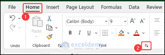
9. Space Out Chart Titles
Avoid cramped titles:
- Select the chart title.
- On the Home tab, in Fonts, adjust Character Spacing to Expanded (2 points).
- Now, change the Character Spacing from Normal to Expanded, and change the points to 2.
- Click OK.
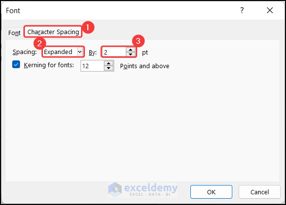
- This eliminates the “squashed” chart title look as shown in the top chart. The bottom chart has expanded character spacing.
- Enjoy a cleaner, more readable title.
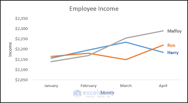
10. Replacing Legends with Direct Labels
- Legends can distract users. Instead, use data labels as legends directly on the graph.
- Modify text color to match line color for better readability.
Steps:
- Select Data Labels and click on More Options from the Chart Element menu.
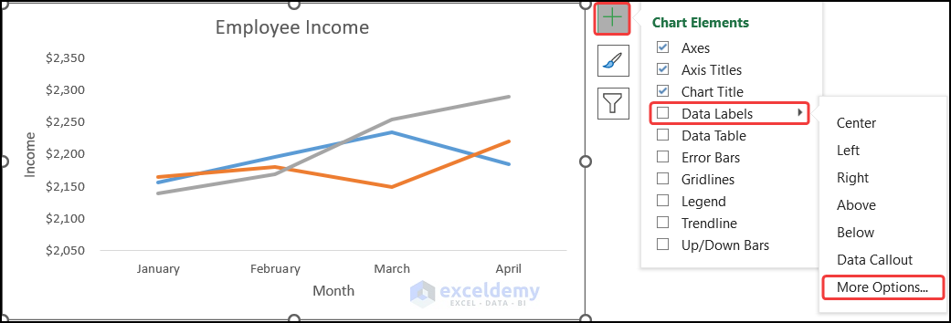
- In the Format Data Labels window, change the option from Value to Series Name.
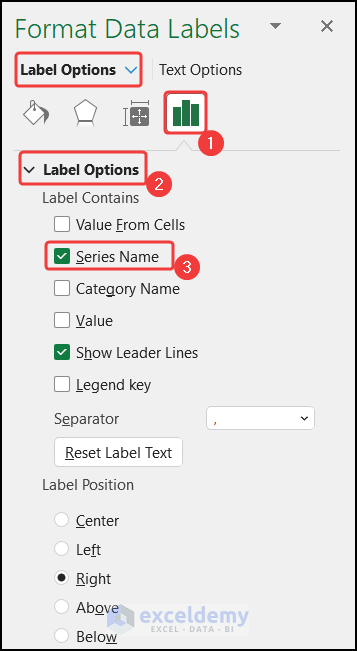
- Keep only necessary data labels and delete others.
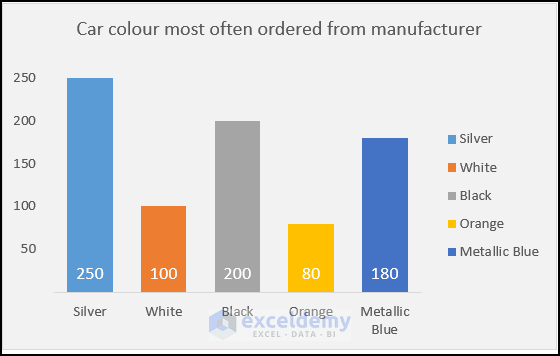
11. Remove Unnecessary Legends
- Legends clutter graphs. If category names are already on the horizontal axis, skip legends.
- Deleting legends creates more space for columns and improves readability.
12. Sort Dataset for Clarity
- Proper data sorting enhances graph clarity.
- If possible, sort data in ascending or descending order for a better view.
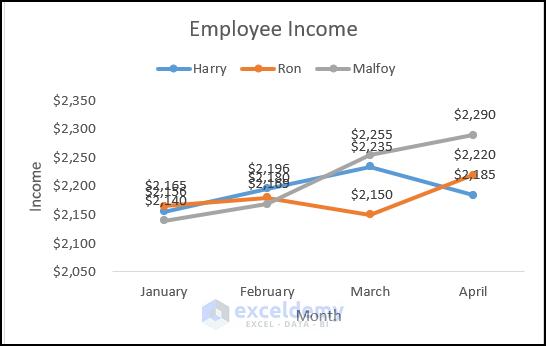
13. Clean up Unnecessary Axes
- Remove unnecessary elements from your chart, including axes.
- Example: If the data table heading serves as the horizontal axis, remove the redundant axis.
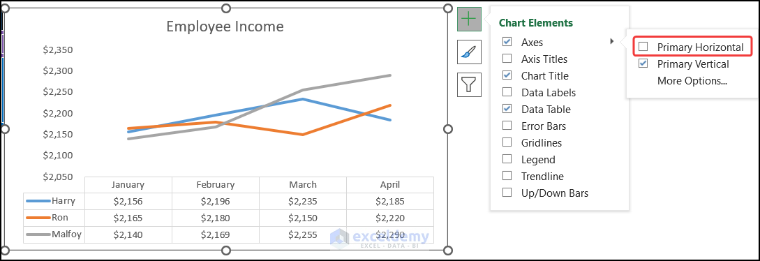
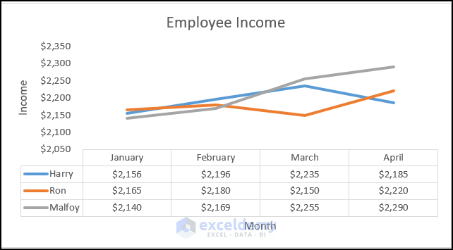
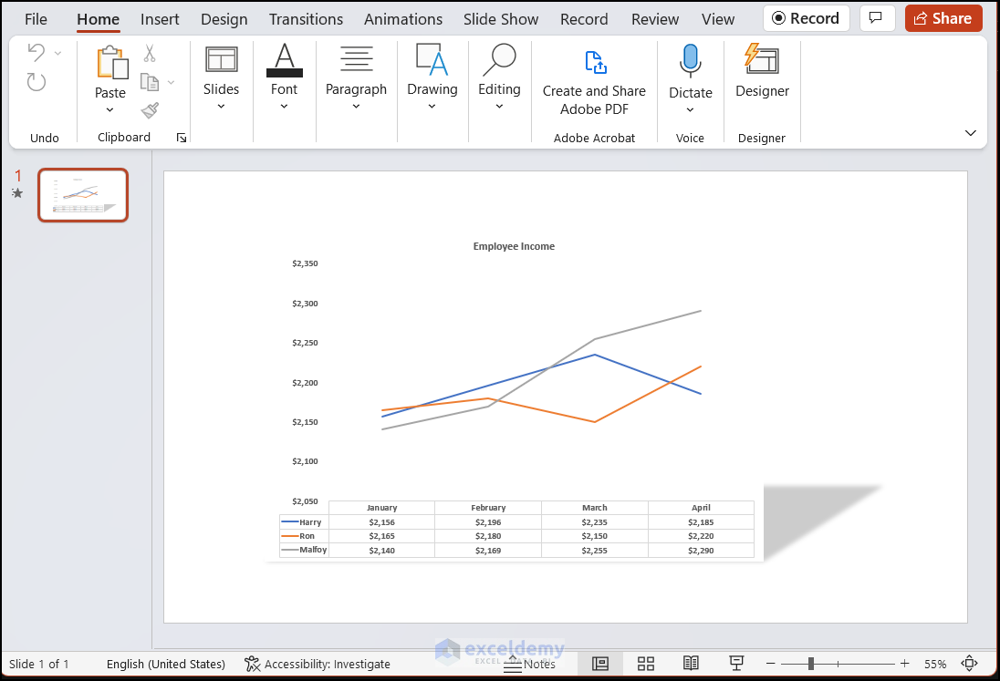
14. Use Separate Data Tables
- Data points as labels can be hard to read.
- Instead, add a data table below the chart using the Chart Elements icon.
- The data table provides clarity without duplicating the dataset.
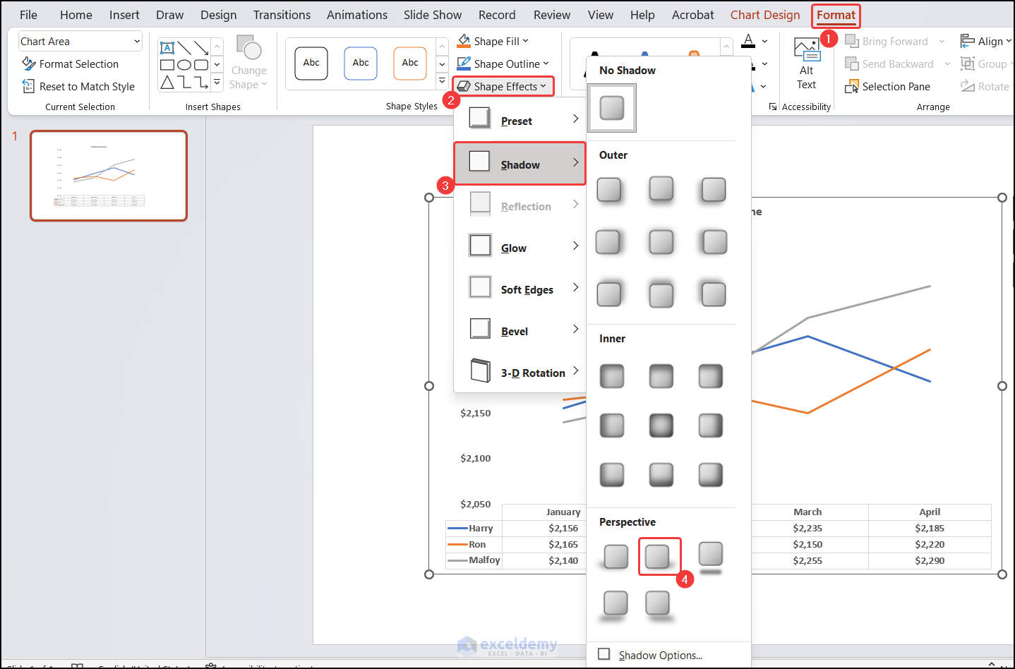
15. Animating Individual Chart When Making a Copy
- Choose the chart you want to copy and animate.
- Go to the Format tab in the Chart Tools context-sensitive options.
- In the Shape Styles group, click the drop-down arrow for Shape Effects.
- Choose Shadow and select Perspective Diagonal Upper Right.
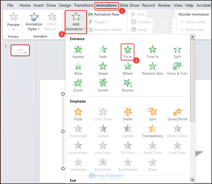
- Open PowerPoint and paste your chart onto a slide.
- Go to the Animations tab.
- Click the drop-down arrow for Add Animation.
- Choose Entrance Effect and select Fly-in.
- In the Animation pane, click the drop-down arrow by Effect Options.
- Under Sequence, choose By Series.
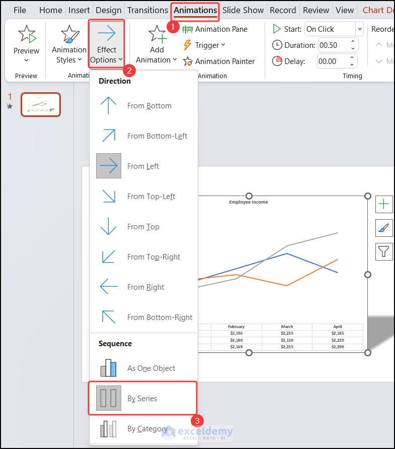
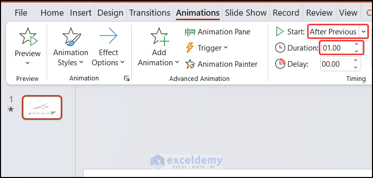
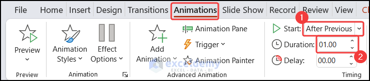
- Set this animation to start After Previous with a duration of 1.00s.
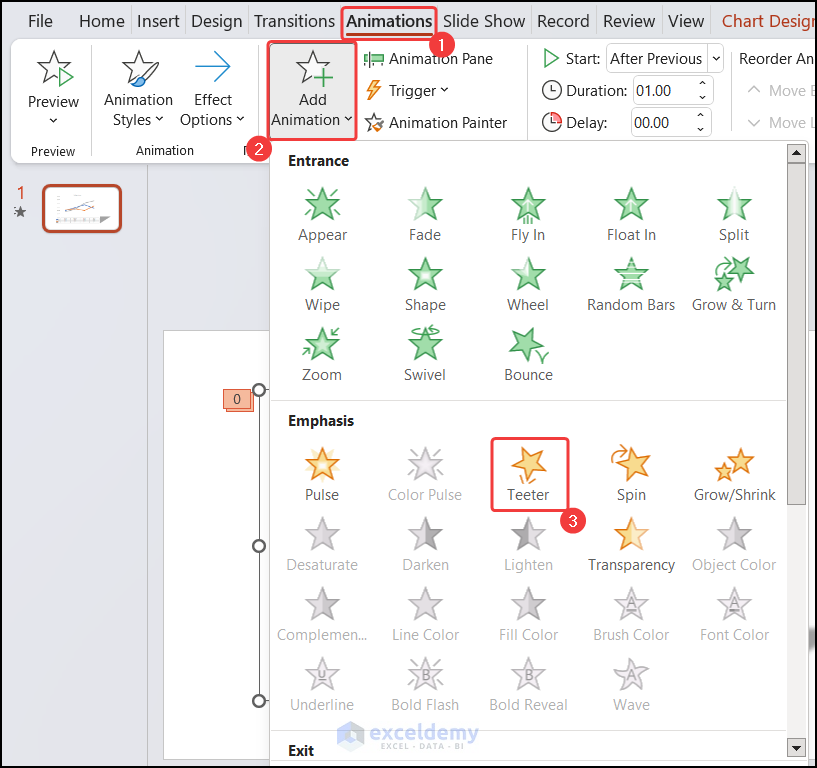
- In the Animation tab, click on the drop-down arrow of the Add Animation.
- Under Emphasis Effect, choose Teeter.
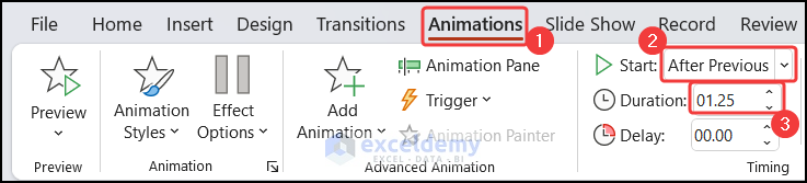
- Click on the down arrow on the second animation in the panel and choose the Start option as After Previous.
- With that animation still selected in the Animation Pane, in the Timing group change the Duration to 1.25s.
- In the Animation tab, click on the drop-down arrow of the Add Animation.
- Under Exit, choose More Exit Effects.
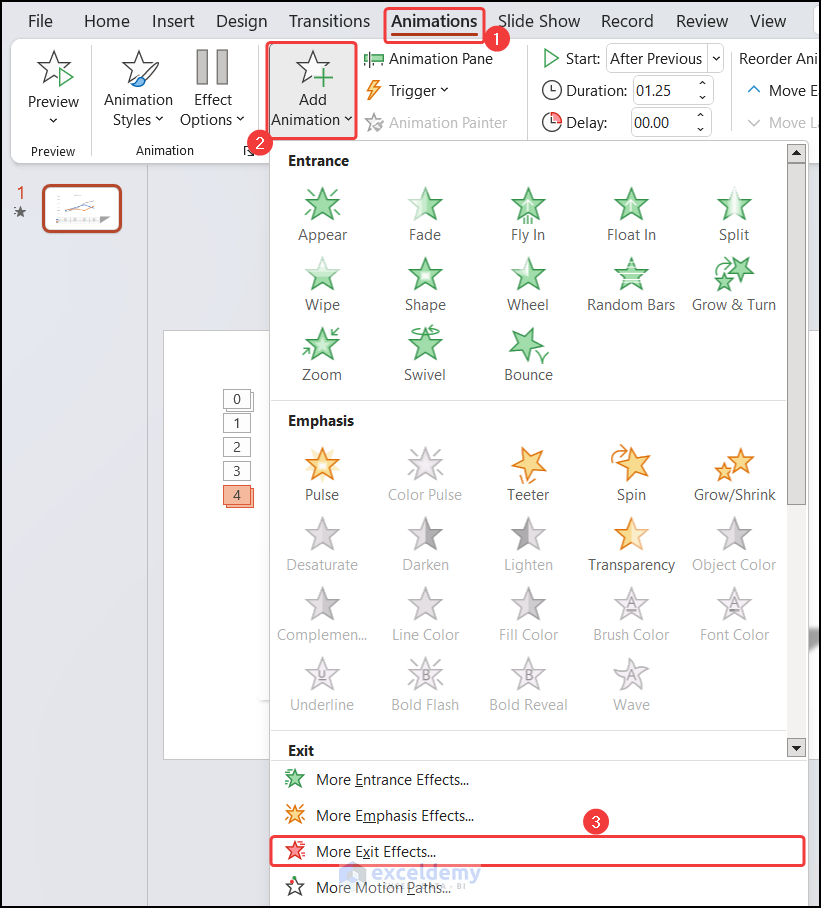
- In the Subtle section, choose Zoom.
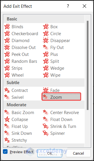
- Click the animation in the Animation Pane and set it to the Start option After Previous.
- In the Timing group, set the duration to 1.00s.
Now you have an animation sequence that highlights individual chart elements
How to Make Excel Line Graphs Look Professional
- Proper Title:
- Give your chart a meaningful title so viewers understand the data being visualized.
- Axes & Axes Titles:
- Clearly label both the vertical and horizontal axes.
- Help users understand the relationship between data points.
- Legends:
- Position legends appropriately.
- Ensure viewers can identify which line corresponds to which category.
- Eliminate Extra Elements:
- Remove unnecessary clutter (gridlines, extra labels) to enhance clarity.
- Data Labels/Data Table:
- Use data labels or a data table sparingly based on the dataset size.
Remember, a well-designed line graph enhances professionalism.
Download Practice Workbook
You can download the practice workbooks from here:
Useful Chart Related Links from ExcelDemy
- How to Change Chart Color Based on Value in Excel
- [Solved:] Vary Colors by Point Is Not Available in Excel
- How to Center a Chart in Excel
- How to Left Align a Chart in Excel
- How to Add a Vertical Dotted Line in Excel Graph
- How to Add Vertical Line in Excel Graph
- How to Add Border to a Chart in Excel
- How to Add Asterisk in Excel Graph
- How to Remove Chart Border in Excel
<< Go Back to Formatting Chart in Excel | Excel Charts | Learn Excel
Get FREE Advanced Excel Exercises with Solutions!

All blog will explain good knowledge…
Thanks, Subbu!