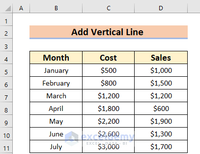
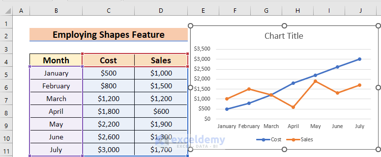
In this article, we will detail 6 ways to add a vertical line in an Excel graph. To illustrate, we’ll use the following sample dataset, which contains 3 columns – Month, Cost, and Sales.
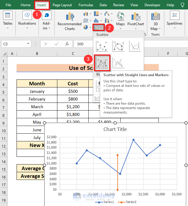
Example 1 – Adding a Vertical Line in a Scatter Graph
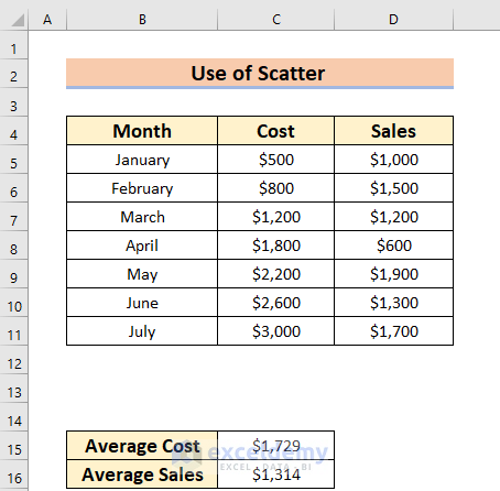
Suppose we want to add a vertical line to a Scatter Graph with the data Average Cost and Average Sales, which have been added below our dataset.
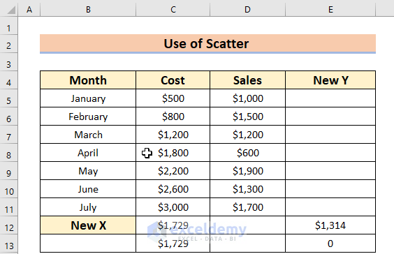
Let’s assume that the graph should be Cost vs Sales. The Cost value will be in the X direction (horizontally) and the Sales value will be in the Y direction (vertically).
Steps:
The X and Y values for the new point of the added line will be the Average Cost and Average Sales values respectively.
- Enter these values as follows:
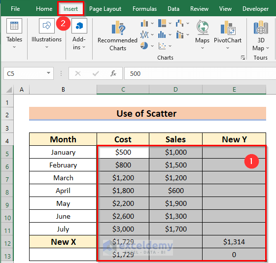
- From the Charts group, select Scatter.
- Select the Scatter with Straight Lines and Markers option.
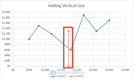
The following graph with an added vertical line will be added.
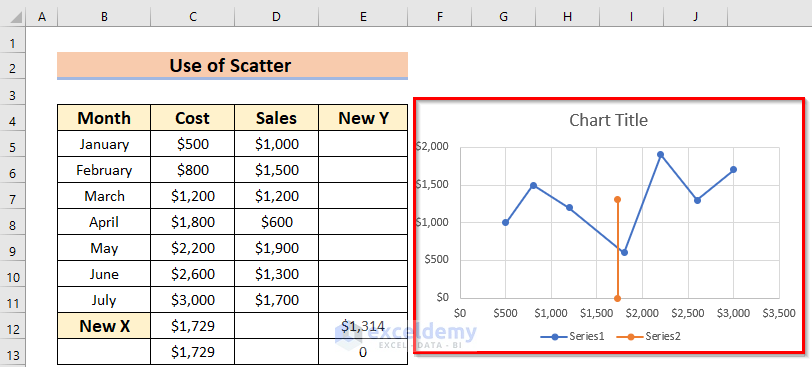
We also changed the Chart Title to “Adding Vertical Line”.
Read More: How to Add a Vertical Dotted Line in Excel Graph
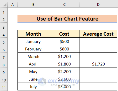
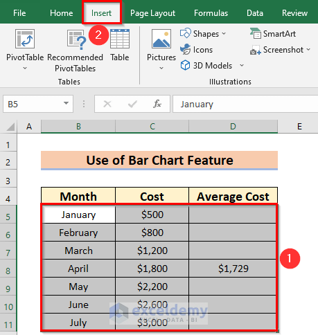
Example 2 – Using the Bar Chart Feature
Suppose we have the following dataset which has 3 columns – Month, Cost, and Average Cost.
Let’s create a graph using the Bar Chart feature and add a vertical line for Average Cost.
Steps:
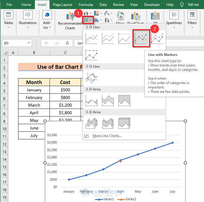
- From the Charts group section, choose 2-D Line.
- Choose Line with Markers.
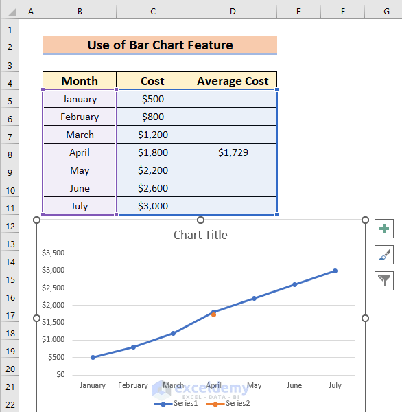
This is the result.
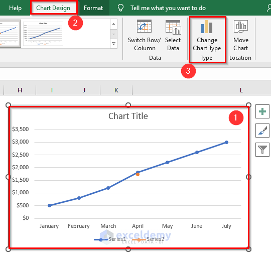
- Select the Chart.
- From the Chart Design feature, go to Change Chart Type under Type Command.
- Alternatively, right-click on the Chart and select Change Chart Type from the Context Menu.
Without selecting the Chart, the Chart Design feature will not be displayed in your ribbon.
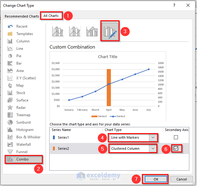
A dialog box named Change Chart Type will appear.
- Go to All Charts in the dialog box.
- From the Combo option >> select Custom Combination.
- Select Line with Markers for Series 1 and Clustered Column for Series 2.
- Check the Secondary Axis for Series 2.
- Click OK to return the changes.
Essentially, we need to select the Clustered Column to make a vertical line.
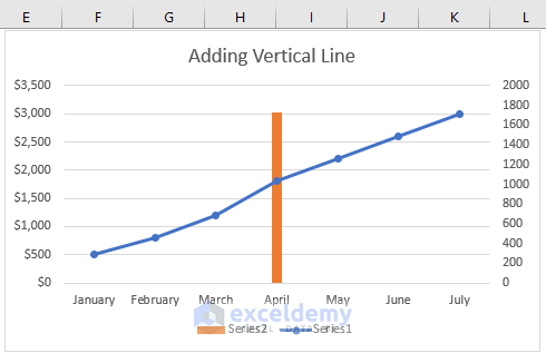
You will see the following line graph with a vertical line, located in April because that is where the value appears in the dataset.
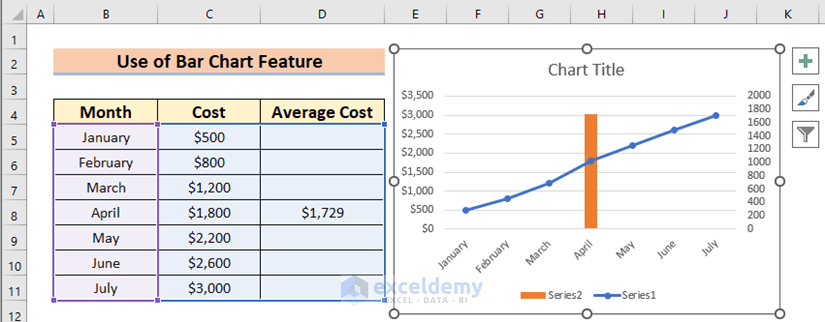
- Change the Chart Title to “Adding Vertical Line”.
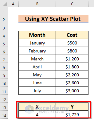
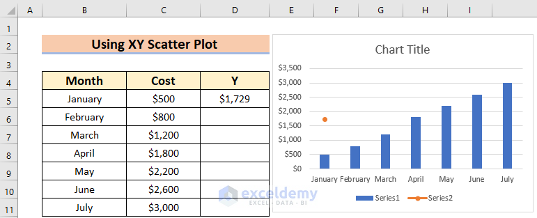
Example 3 – Applying the XY Scatter Plot
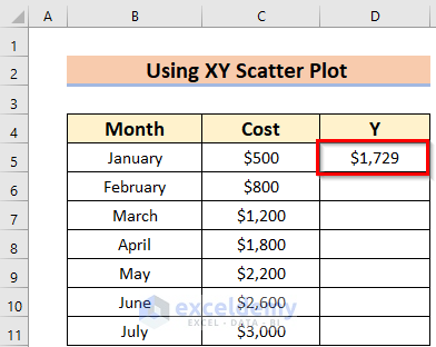
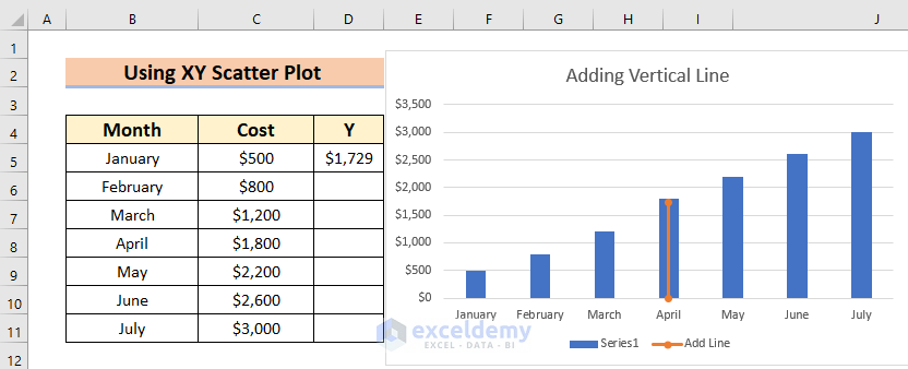
Suppose we want to add a vertical line in an Excel graph whose X value and Y value are 4 and $1729 respectively.
Steps:
- Enter the Y value in the D5 cell.
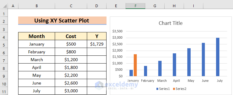
Now, we make the Bar Chart from data range B5:D11 using Method 1. Or briefly, follow these steps:
- Select the data range B5:D11.
- From the Insert tab >> select 2-D Column under Charts group section.
The following result is displayed.
- Right-Click on the Chart.
- From the Context Menu Bar >> select Change Chart Type.
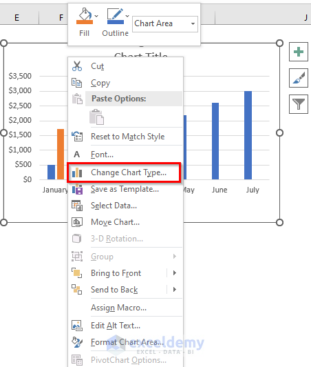
A dialog box named Change Chart Type will appear.
- Go to All Charts.
- From the Combo option >> select Custom Combination.
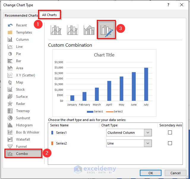
- From the Drop-Down Arrow adjacent to the Series 2 >> choose Scatter with Straight Lines and Markers.
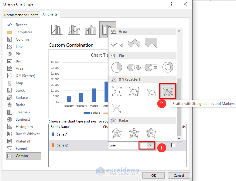
- Uncheck the Secondary Axis for Series 2.
- Click OK to return the changes.
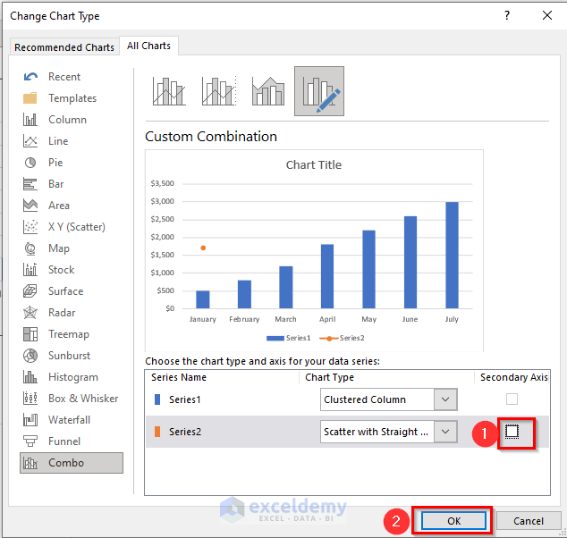
Now, you will see the following changes – we have changed the Bar of that vertical line into a Point.
- Select the point.
- Right-click on it.
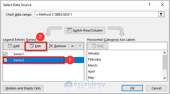
- From the Context Menu Bar >> choose Select Data.
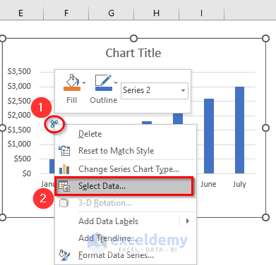
A dialog box named Select Data Source opens.
- Select Series2.
- Select the Edit feature.
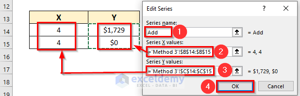
Another dialog box named Edit Series will appear.
- Enter or select the Series name in that dialog box – here, “Add”.
- Include the Series X values. Here, the range B14:B15.
- Include the Series Y values. Here, the range C14:C15.
- Click OK to get the Vertical line.
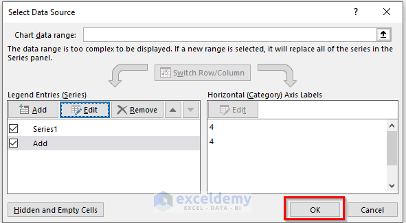
The Select Data Source dialog box will appear again.
- Click OK to return the changes.
The added vertical line appears on the Bar Graph.
Read More: How to Add Border to a Chart in Excel
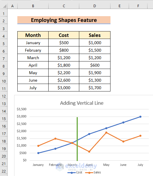
Example 4 – Using the Shapes Feature
The easiest way to add a vertical line in any Excel graph is by employing the Shapes feature.
Steps:
- Make the Graph in which we want to add a vertical line by following the steps of Method 1.
- From the Insert tab >> go to Shapes.
- Select the Line from the Lines section.
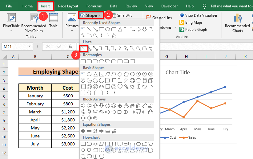
- Drag the Mouse Pointer to where you want to place the vertical line. You can simply change the Shapes location using the Mouse Pointer.
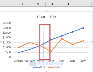
Let’s format the Line.
- Select the Line.
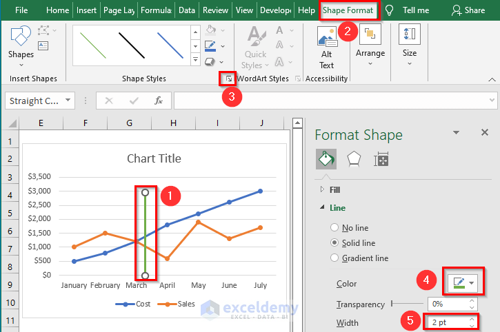
- From the Shape Format >> Click on the Drop-Down Arrow under Shape Styles.
- From the Format Shape menu, change the Line format according to your preference. Here, we changed the Color of the vertical line and made the Width of the shape 2 pt.
The added vertical line appears on the Line graph.
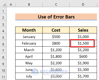
Example 5 – Using the Error Bars Command
Suppose we want to add a vertical line whose value will be $1500, situated in the D6 cell.
Steps:
- Make a Line graph from the whole data range (B5:D11) using the procedure in Method 2.
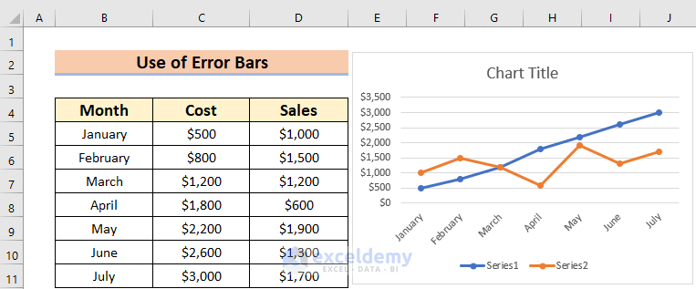
- Remove the other cell values from the Sales column.
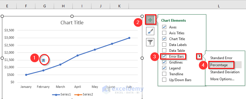
- Select the Point.
- Click on the + icon.
- From the Chart Elements >> check the Error Bars.
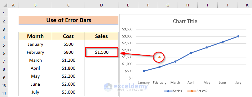
- From the Selection Arrow of the Error Bars >> choose Percentage.
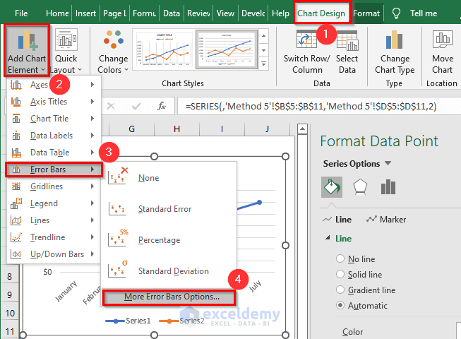
- From the Chart Design >> select Add Chart Element.
- From Error Bars >>select More Error Bars Options to open the Format Error Bars window.
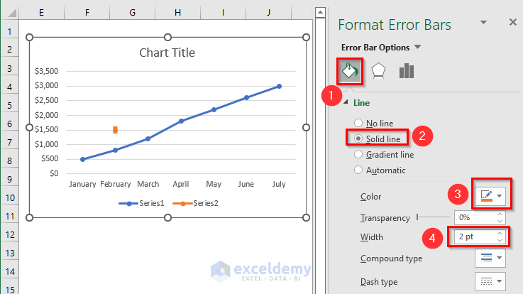
- From Format Error Bars >> select Fill & Line.
- Choose Solid line.
- Change the Color of the line and the Width. Here, we changed the Color to Orange and made the Width 2 pt.
The vertical line will not be visible yet.
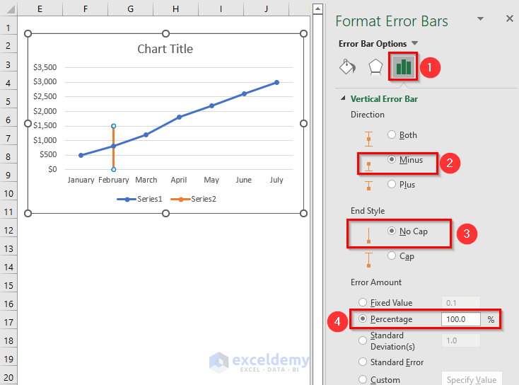
- From the Format Error Bars >> Go to Error Bar Options.
- From the Direction >> select any of them according to your preference. You can see the changes in the Chart instantly. Here, we selected Minus.
- From the End Style >> select No Cap.
- From Error Amount >>choose Percentage and make it 100%.
The added vertical line appears in the Line graph.

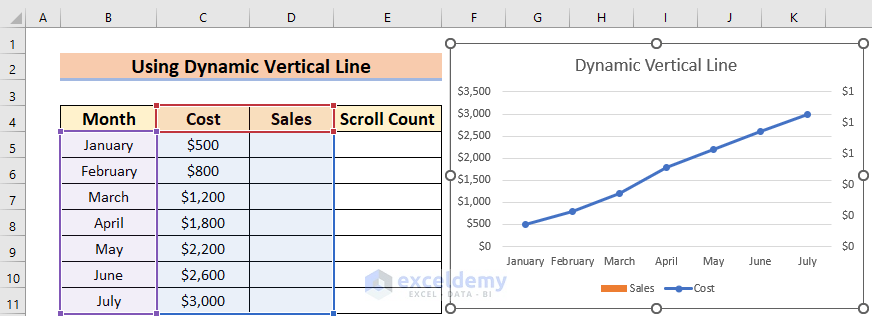
Example 6 – Adding a Dynamic Vertical Line
Now, the most interesting part, we can add a Dynamic vertical line in an Excel graph using the IF function and the MATCH function.
Steps:
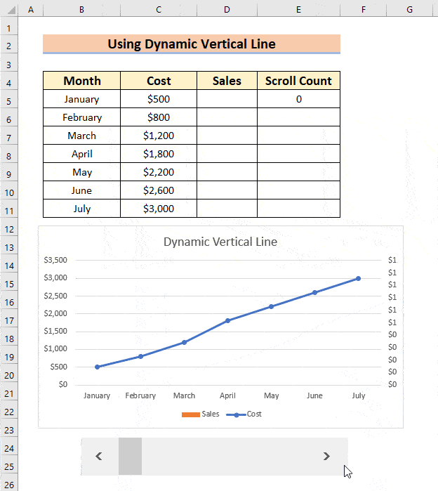
- Plot an Excel graph in which we will add the dynamic vertical line. Include a blank cell range like D5:D11 where we will place the data for the vertical line.
- Go to the Developer tab.
- From the Insert command >> choose Scroll Bar from Form Controls.
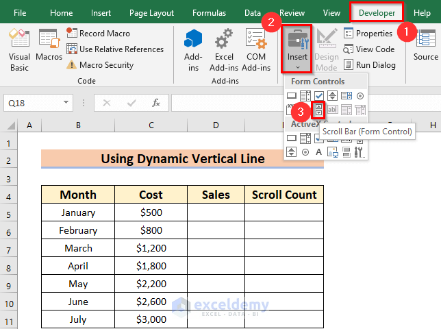
- Drag your mouse pointer to a suitable place to add the Scroll bar.

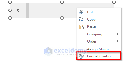
- Right-click on the Scroll bar.
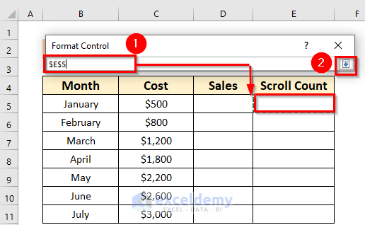
- From the Context Menu Bar >> choose the Format Control option.
A dialog box named Format Control will appear.
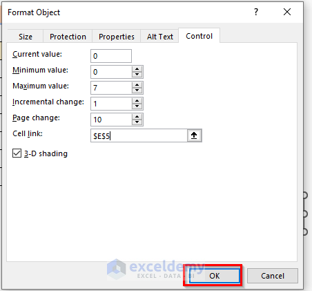
- From that dialog box >> Go to the Control option.
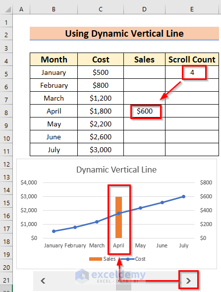
- Select the Maximum value range up to which we need to scroll. Here, 7.
- Link the cell by selecting the Drop-Down Arrow of the Cell link.
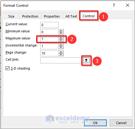
- Select the cell where we want to link the Scroll bar. Here, cell E5.
- Click on Drop-Down Arrow to go back to the main Format Control dialog box.
- Click OK.
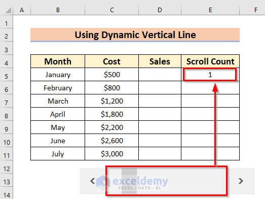
Now, if we change the Scroll bar we will see the result under Scroll Count.
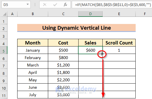
- Select the blank cell included in the chart, D5.
- Enter the following formula in the D5 cell.
=IF(MATCH($B5,$B$5:$B$11,0)=$E$5,600,"")- Press ENTER to make the changes.

Formula Breakdown:
MATCH(lookup_value,lookup_array,[match_type])
- lookup_value = $B5: This is the look-up value for which the MATCH function will search in the array. The dollar sign $ denotes that the Column range is fixed.
- lookup_array = $B$5:$B$11: This is the look-up array where the MATCH function will search for the value B5. The dollar sign $ denotes that the array is fixed to B5:B11.
- [match_type] = 0: This function will search for the exact match.
- In the IF function, we use a logical_test where if the values are equal to the Match value then it will return 600 else it will return a blank space.
- Drag the Fill Handle to AutoFill the corresponding data into the rest of the cells D6:D11.
The result appears in the data table. According to our scrolling, $600 will be shown in the D Column.

You can see that the graph will change automatically. The vertical line is generated in April because our scroll count was 4. If we change it, then the position of the vertical line will change accordingly.
For a better understanding, see the GIF below.
Things to Remember
- In the case of Method 4, if you change the position of the graph the shape will not change automatically. Wherever you shift the graph, you’ll have to shift the vertical line manually.
- For Method 1, you must use Scatter from the Chart groups section.
Download Practice Workbook
Related Articles
- How to Center a Chart in Excel
- How to Left Align a Chart in Excel
- How to Add Asterisk in Excel Graph
- How to Remove Chart Border in Excel
<< Go Back to Formatting Chart in Excel | Excel Charts | Learn Excel
Get FREE Advanced Excel Exercises with Solutions!
