Dataset Overview
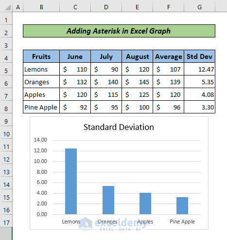
Let’s start by introducing our dataset. We have a table containing various fruit items, their prices over three months, averages, and standard deviations. Below the table, there’s a graph displaying the standard deviation for different fruits.
Our objective is to add an asterisk to the Lemons column in the graph, highlighting its highest standard deviation.
Method 1 – Add Asterisk Using Text Box
- Insert a Text Box:
- Go to the Insert tab in Excel.
- Click on Text and select Text Box.
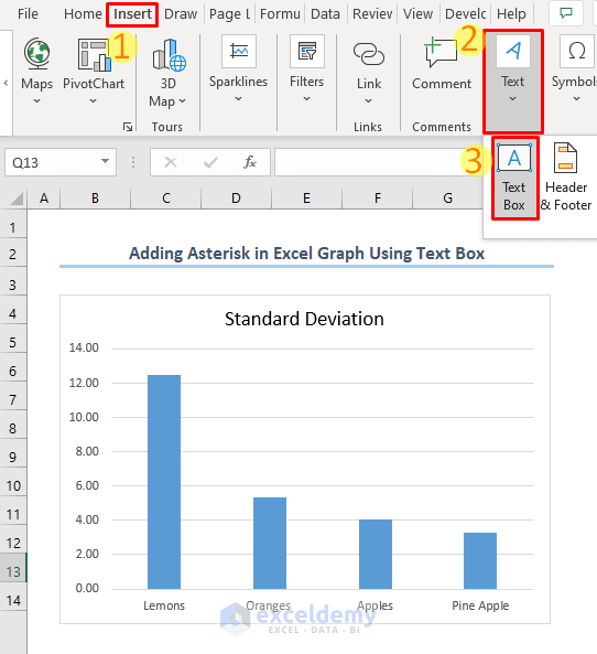
- A cursor will appear, allowing you to draw a text box on your graph.
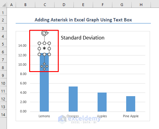
- Place the Text Box on the Lemons Column:
- Position the cursor over the column representing Lemons in your graph.
- Type the asterisk (*) into the text box.
- Click anywhere outside the graph to finalize its placement.
Method 2 – Use Data Labels
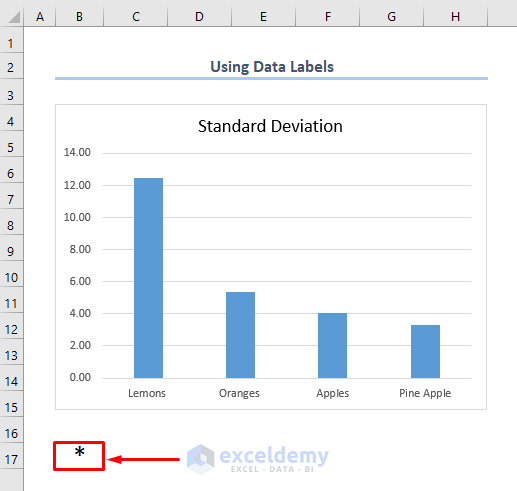
- Type an Asterisk in a Cell:
- In any cell of your worksheet (for example, cell B17), type the asterisk (*).
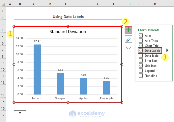
- Apply Data Labels to the Graph:
- Select the entire graph.
- Click the plus sign (+) next to the graph (Chart Elements).
- Choose Data Labels.
- Data labels will appear on each column of the graph.
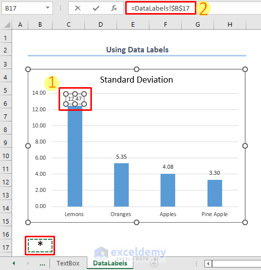
- Customize the Data Label for Lemons:
- Double-click the data label for the Lemons column.
- In the formula bar, enter = followed by the cell reference (B17) containing the asterisk.
- Press ENTER.
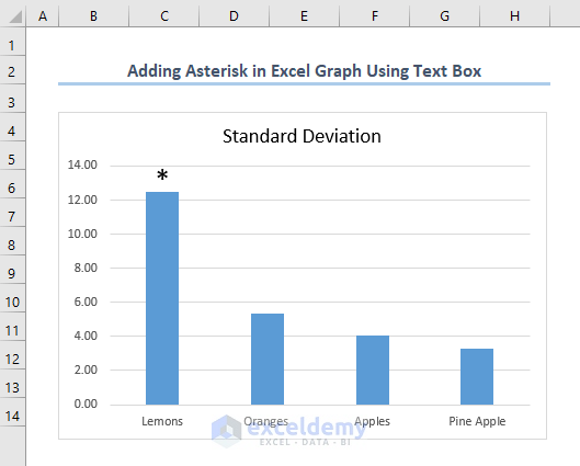
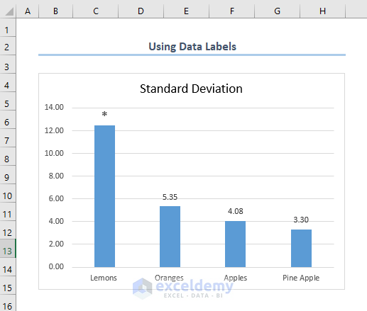
The result will display the asterisk on the Lemons column in your graph. You can adjust the font size of the asterisk for better visibility.
Download Practice Workbook
You can download the practice workbook from here:
Related Articles
- How to Center a Chart in Excel
- How to Left Align a Chart in Excel
- How to Add a Vertical Dotted Line in Excel Graph
- How to Add Vertical Line in Excel Graph
- How to Add Border to a Chart in Excel
- How to Remove Chart Border in Excel
<< Go Back to Formatting Chart in Excel | Excel Charts | Learn Excel
Get FREE Advanced Excel Exercises with Solutions!
