How to Plot a Graph in Excel
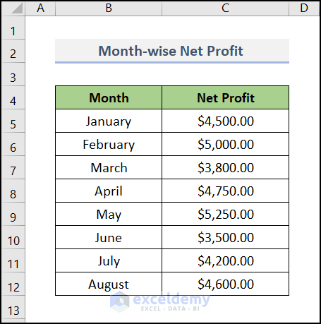
You first need to plot a graph in Excel. Then you will be able to show the coordinates in that graph. It is possible that some of us may not be able to plot a graph in Excel. Luckily, we will show you the steps to be followed to plot a graph in Excel here. Here we use a month-wise net profit of a company. Here we have used Microsoft 365 version, you can use any other version.
Steps:
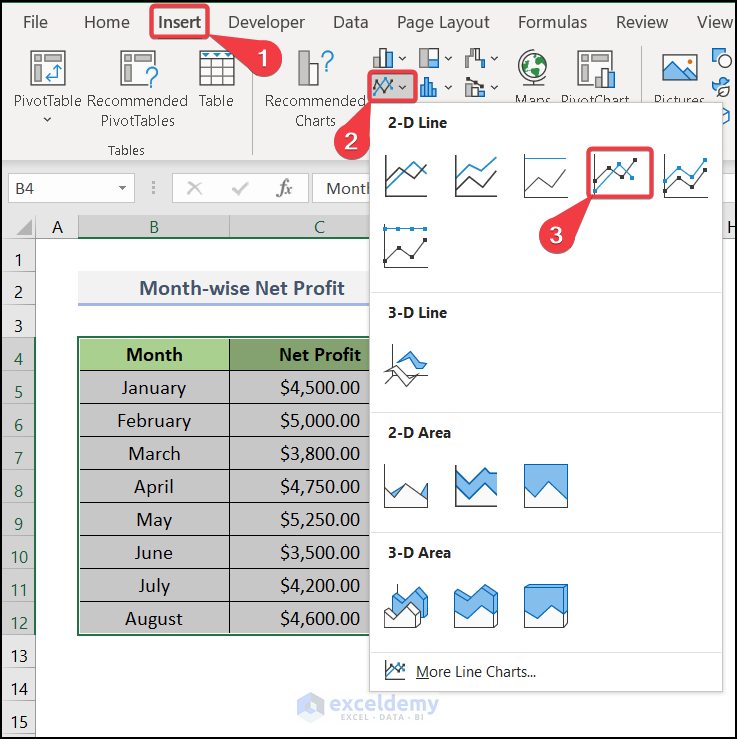
- Select the entire range of your dataset.
- Go to Insert tab >> pick Insert Line or Area Chart under the Charts option.
- Here, you can see the different kinds of graph models available. We used a 2-D line model here.
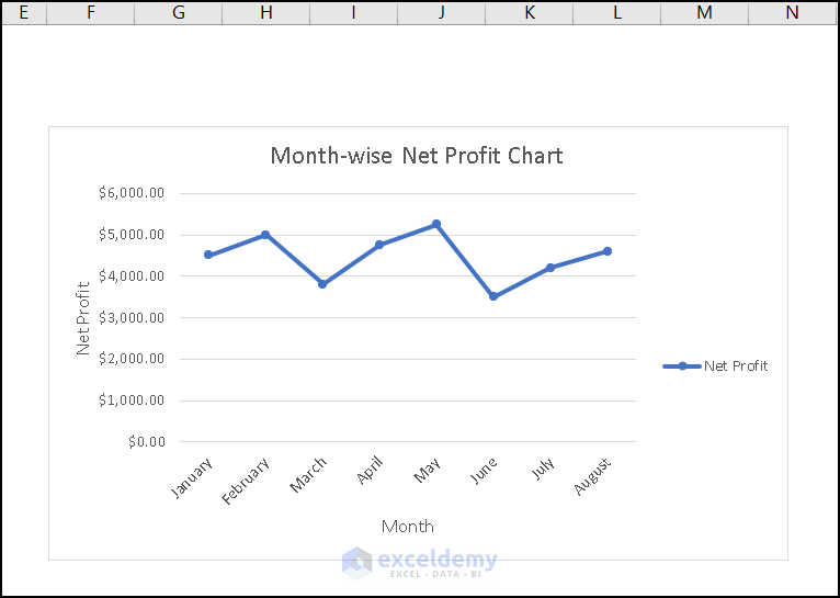
A graph will be plotted according to your dataset. You can change the graph appearance through Format Data Series.
Method 1 – Using the Format Data Label Option
Steps:
- Plot the graph and show the Data Labels.
- Right-click on any data and go to Format Data Label.
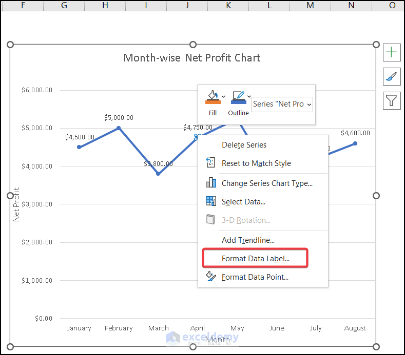
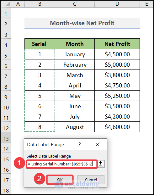
- A dialog box will pop up.
- Select the entire range you want to show. Here we selected the range of $B$5:$B$12.
- Press OK.
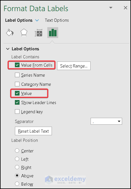
- A new sidebar named Format Data Labels will appear.
- Check the Values From Cells and uncheck the Value under Label Options.
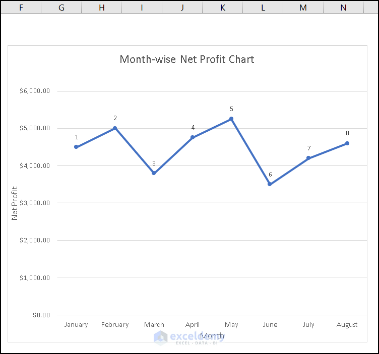
Your serial numbers will appear above your data point. We have added our results.
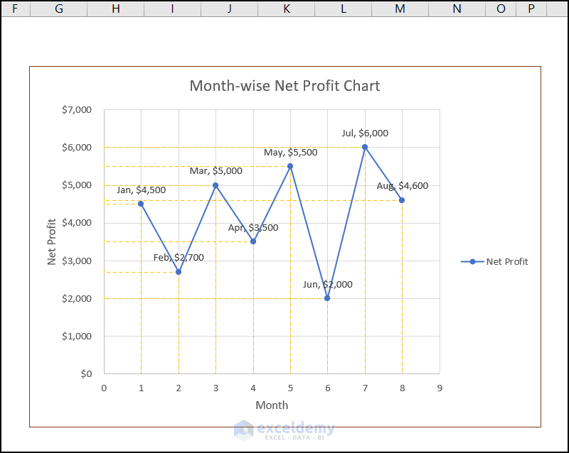
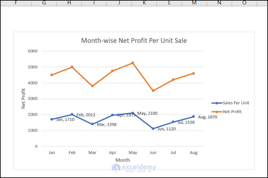
Method 2 – Utilizing Error Bars to Show Coordinates in Excel Graph
Steps:
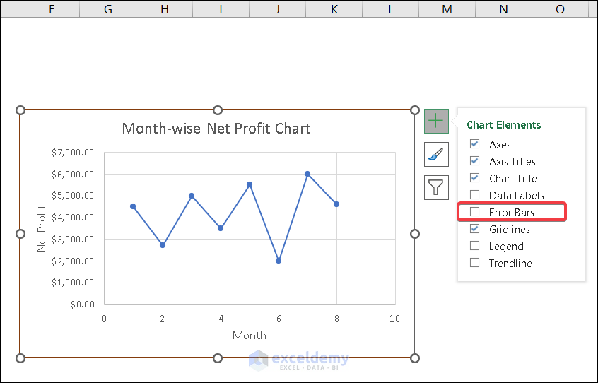
- Select the chart.
- Go to Chart Design >> under Chart Elements. You need to move to Error Bars.
- Under the Error Bars section, go to Percentage.
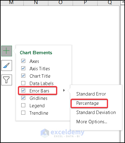
- A dialog window named Format Error Bars will appear.
- Select Minus. That will create a left-sided line from your data point.
- Make the Percentage 100. It will create a line connected to the Y-axis.
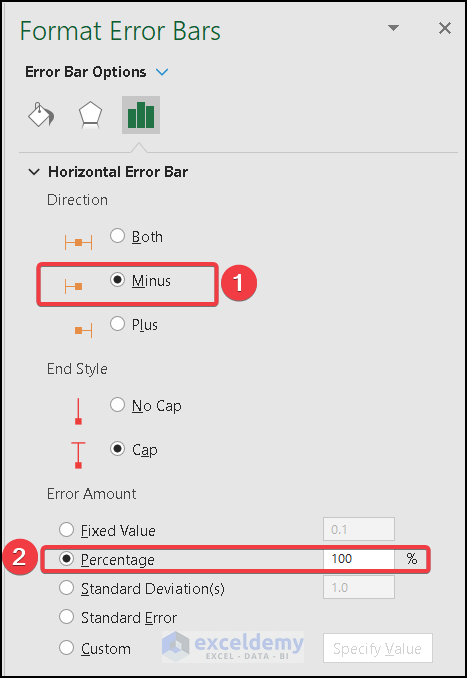
- Right-click on any point of the graph and select Format Error Bars.
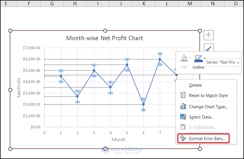
- A window will appear.
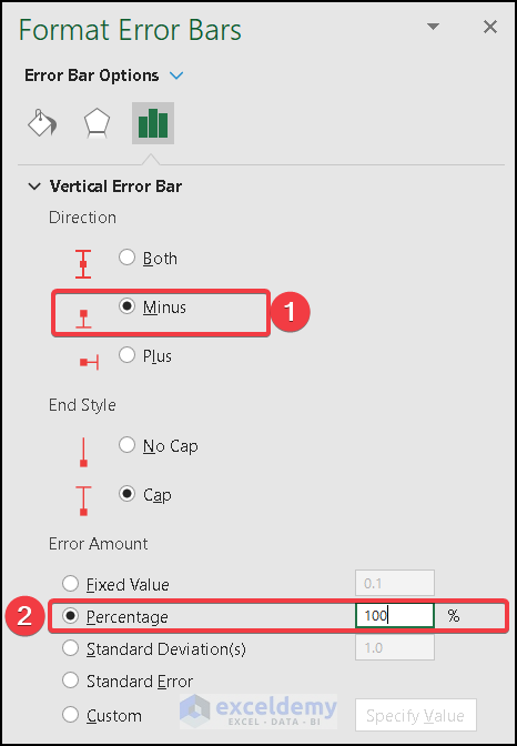
- Select Minus and make the Percentage 100.
- You can show the (x,y) value by Format Data Label.
- Check the X Value and Y Value. This will help show the X-axis value and the Y-axis value.
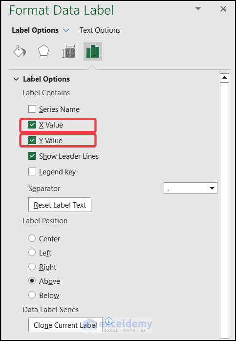
- Your coordinates for the corresponding data point will be displayed, and you can format the color and outlook of the line to make them attractive.
Read More: How to Add Subscript in Excel Graph
How to Show Coordinates for Secondary Axis in Excel Graph
Steps:
- Pot a graph with the dataset.
- Select any of the data points and go to Format Data Series.
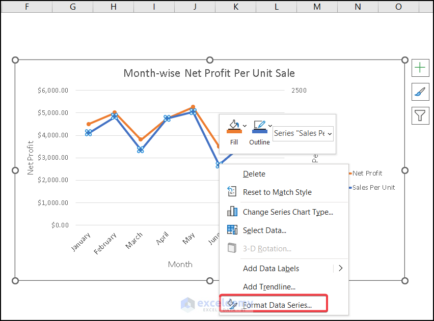
- Under the Format Data Series, select Secondary Axis.
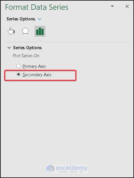
- A secondary axis will appear, and you can format the graph according to your preference.
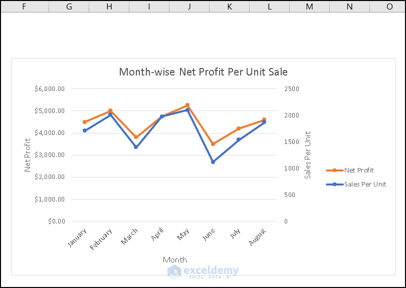
- We have shown the coordinates for our secondary axis for their corresponding values.
You’ll get the following output after adding (x,y) values. Also, you can apply the first method to display coordinates using serial numbers.
Read More: How to Change Text Direction in Excel Chart
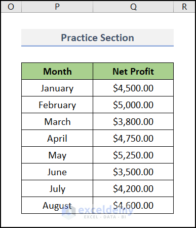
Practice Section
We have provided a practice section on each sheet on the right side for you to practice.
Download the Practice Workbook
Related Articles
- How to Make Excel Graphs Look Professional
- How to Change Chart Color Based on Value in Excel
- [Solved:] Vary Colors by Point Is Not Available in Excel
- How to Rotate Text in an Excel Chart
<< Go Back to Formatting Chart in Excel | Excel Charts | Learn Excel
Get FREE Advanced Excel Exercises with Solutions!
