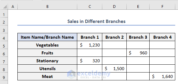
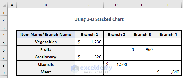
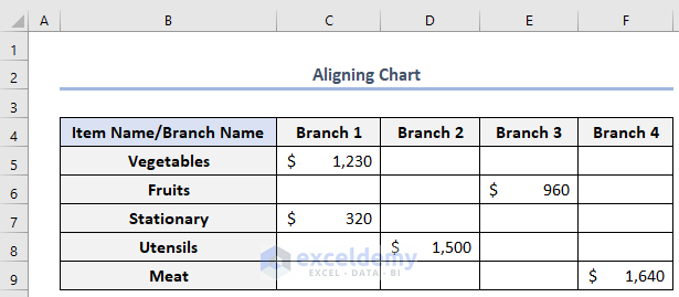
In this article, we’ll discuss how to center a chart in Excel. To illustrate, suppose we have the dataset below named Sales in Different Branches.
Let’s create a chart from this data and then center it.
Method 1 – Using Format Data Series to Center a Chart in Excel
We can use the Format Data Series window to center charts. Let’s use it on our dataset.
Steps:
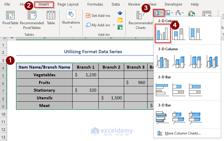
First we’ll create the chart:
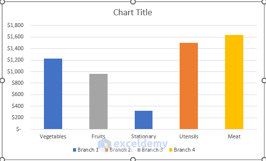
- Select the whole dataset > Go to the Insert tab > Insert Column or Bar Chart > Select the 2-D Clustered Column option.
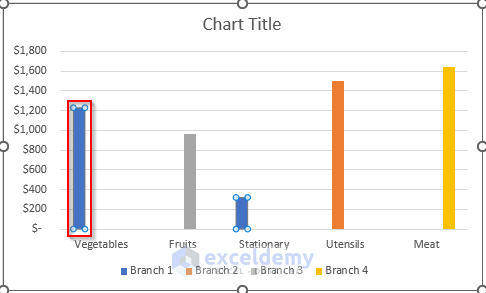
A chart will appear, but the chart bars are not centered with the bar titles.
- Double-click on any bar on the chart, for example Vegetables.
The Format Data Point window will appear.
- Change the Series Overlap to 100% and click ENTER.
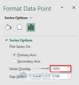
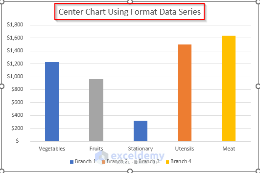
As a result, the width of the bars has been increased and all the bars are centered on the bar titles.
- Change the Chart Title to Center Chart Using Format Data Series.
Read More: How to Add a Vertical Dotted Line in Excel Graph
Method 2 – Using a 2-D Stacked Column Chart to Center a Chart in Excel
We can center the chart directly if we use a 2-D Stacked Column chart. We’ll use the same dataset to draw the chart.
Steps:
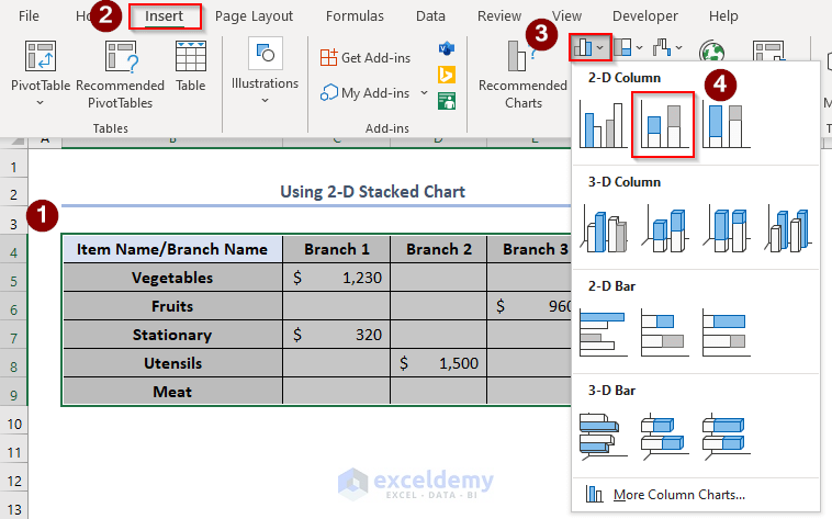
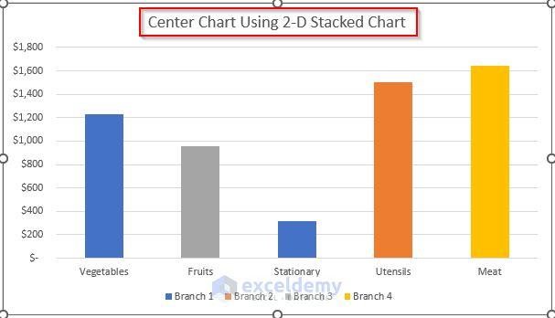
- Select the whole dataset.
- Go to the Insert tab > Insert Column or Bar Chart dropdown > Select the 2-D Stacked Column chart.
Our chart will look like this. The bars are auto-centered to the bar titles.
- Change the Chart Title to Center Chart Using 2-D Stacked Chart.
Read More: How to Add Vertical Line in Excel Graph
Alignment of Two Charts in Different Positions
We can align two charts in different positions such as to the top, bottom, left, right, center, and so on. Let’s apply these techniques to our dataset.
Steps:
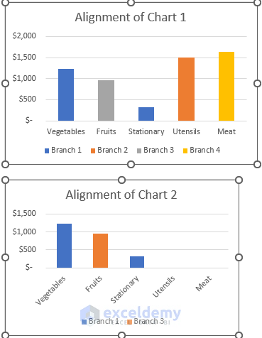
We have made two charts from the above dataset named Alignment of Chart 1 and Alignment of Chart 2. The two charts are not aligned properly.
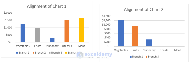
- Select the first chart > hold the CTRL key and select the second chart > go to Shape Format > click Align.
Different Alignment options will appear.
- Select any of them. For example, for Top Alignment select Align Top.
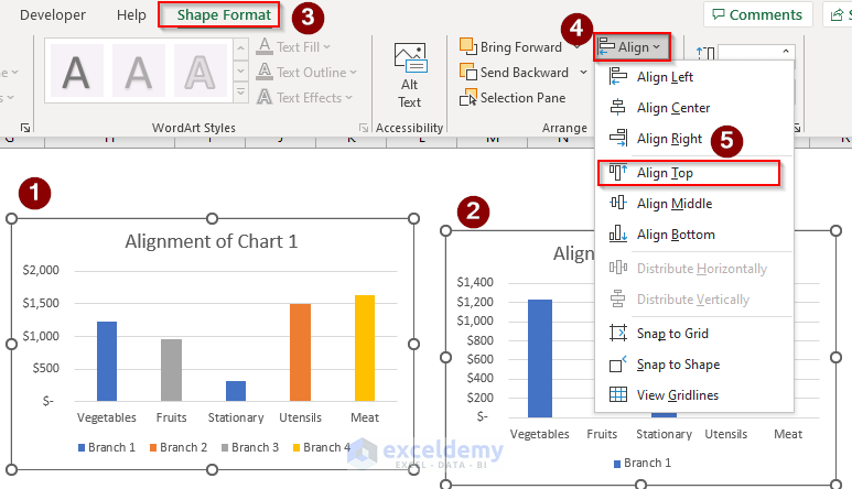
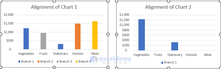
The two charts will Align Top like this:
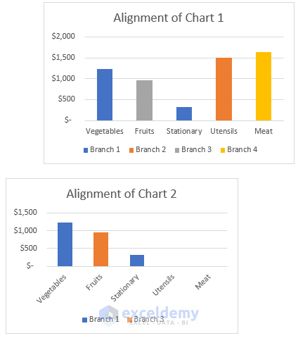
Similarly, we can align the two charts at the bottom by selecting the Align Bottom option.
Suppose now we have the two charts which are not aligned vertically, and we want to align these charts to the left.
- Go to the Align option and select Align Left.
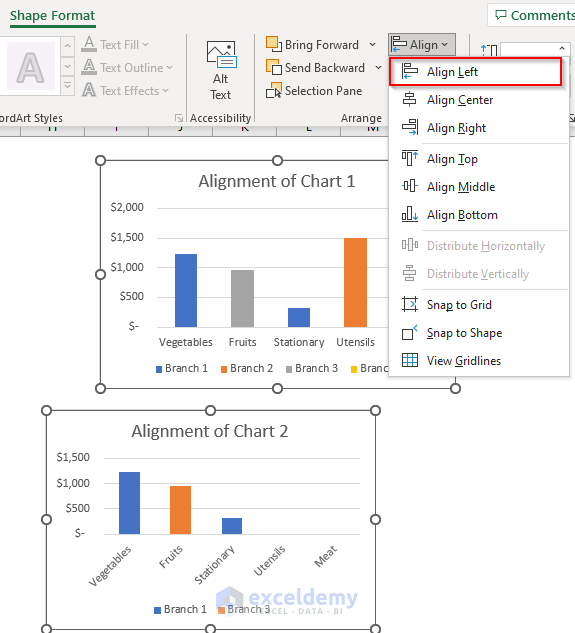
The left alignment of the charts looks like this:
Similarly, we can Align Right, Align Center or Align Middle by following the same procedure.
Read More: How to Left Align a Chart in Excel
Things to Remember
- In the first method, while selecting the bars to open a Format Data Point window, double-click the bar to open the window.
- In the second method, as result of choosing the 2-D Stacked Column bar, the Series Overlap in the Format Data Point window will become 100% automatically, so there is no need to change it manually.
Download Practice Workbook
Related Articles
- How to Add Border to a Chart in Excel
- How to Add Asterisk in Excel Graph
- How to Remove Chart Border in Excel
<< Go Back to Formatting Chart in Excel | Excel Charts | Learn Excel
Get FREE Advanced Excel Exercises with Solutions!
