If you are looking for how to add border to a chart in Excel, then you are in the right place. We frequently have to create charts in Excel for different statistical analyses or other reasons. To show or represent the chart properly we need to add borders. In this article, we’ll try to discuss how to add border to a chart in Excel.
How to Add Border to a Chart in Excel: 3 Useful Methods
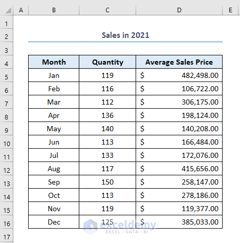
There are a couple of ways to add borders in Excel. Those are very handy to use. To show that we have made a dataset named Sales in 2021 like this. It has column headers of Month, Quantity, and Average Sales Price.
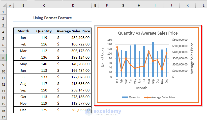
We have made the following chart based on the above dataset like this.

Now, we’ll see how we can add borders to this chart.
1. Using Format Feature to Add Border to a Chart
We can use the Format feature to add borders. We just need to follow some simple steps.
Steps:
- Firstly, right-click on the chart.
- Secondly, go to Format > select the icon of Shape Outline > pick any Theme Color from the color options. Here, we have selected orange

- Fourthly, we need to select the Border Weight. So, select Border Weight and then choose any of the weight options.

- Eventually, a border will be added to our chart like this.
2. Applying Double-Click on the Chart
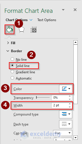
We can also add borders by working in the Format Chart Area. To open this we need to double-click on the chart.
Steps:
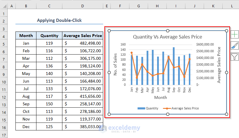
- Firstly, double-click on the chart area.

- Eventually, a Format Chart Area window will appear.
- Secondly, in the Chart Option, select Solid Line > select a color in the Color box ( Here, we have selected blue color) > choose a width in Width box ( Here, it is 2 pt)
- Consequently, we’ll get a border of blue color to our chart like this.
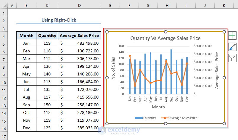
3. Using Context Menu (Right-Click) of Chart
To add a border to a chart, we can also use the Context Menu of the chart, the menu you will get by right-clicking on the chart.
Steps:
- Firstly, right-click on the chart.
- Secondly, select Format Chart Area.

- Thirdly, similarly as before, in the Chart Options, select Solid Border > pick a color in the Color box > select a width in the Width

- Consequently, a border will be added to the chart like this.
Read More: How to Add Vertical Line in Excel Graph
How to Remove Chart Border in Excel
We can remove the chart border in Excel very easily by following some simple steps.
Suppose, we have a border to the following chart of the picture below.

We need to remove this border from this chart.
- After double-clicking on the chart area, this Format Chart Area will appear.
- Here, select No Line in the Chart Options.
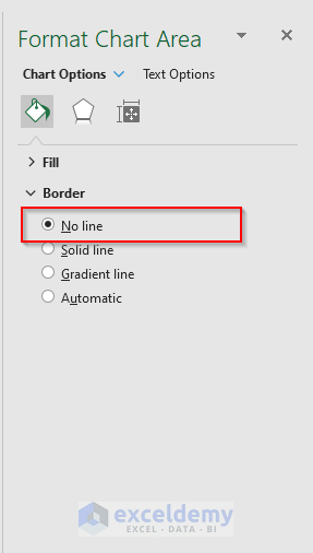
- Eventually, the border of the chart is removed like this.

Read More: How to Add Arrow in Excel Graph
Things to Remember
While adding Border Weight, we need to pick larger values from the options if we need to make our border thick.
Download Practice Workbook
Conclusion
That’s all about today’s session. And these are the ways to add a border to a chart in Excel. We hope this article will be beneficial for you. Don’t forget to share your thoughts and queries in the comments section. Stay connected and keep learning.
Related Articles
- How to Center a Chart in Excel
- How to Left Align a Chart in Excel
- How to Add a Vertical Dotted Line in Excel Graph
- How to Add Asterisk in Excel Graph
<< Go Back to Formatting Chart in Excel | Excel Charts | Learn Excel
Get FREE Advanced Excel Exercises with Solutions!
