Dataset Overview Let’s start by introducing our dataset. We have a table containing various fruit items, their prices over three months, averages, ...
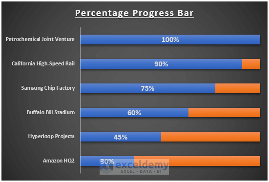
Dataset Overview Let's use the following dataset: Method 1 - Using a Bar Chart You can show the percentage progress bar by inserting a Bar ...
Introduction to Target Line in Excel Graphs When you want to compare performance against a specific goal, adding a target or goal line to an Excel ...
Step 1 - Make a Dataset We'll include the values for Date, Measured Weight (lbs), Target Weight (lbs), Target Weight Low (lbs), and Target ...
The following dataset has the monthly sales amount and forecasted sales. Using the forecasted sales, we will draw a horizontal line. ...
In many cases, we might need to create a scatter plot with multiple series of data. The next thing we need to do after creating such a type of ...
Suppose you have created a chart in a spreadsheet on the basis of some gathered data. But when you create a chart in an Excel sheet, both the ...
Method 1 - Group Adjusting Lineup of Source Data in Excel Chart STEPS: Select the whole data in range B4:D11. Go to the Insert tab on the ...
Step 1- Set Budget Categories Enter the budget categories in B5:B10, here. Step 2 -Enter Budget Amounts Enter ...
What Is a Grouped Bar Chart? A grouped bar chart is also known as a clustered bar chart. It displays the values of various categories in different ...
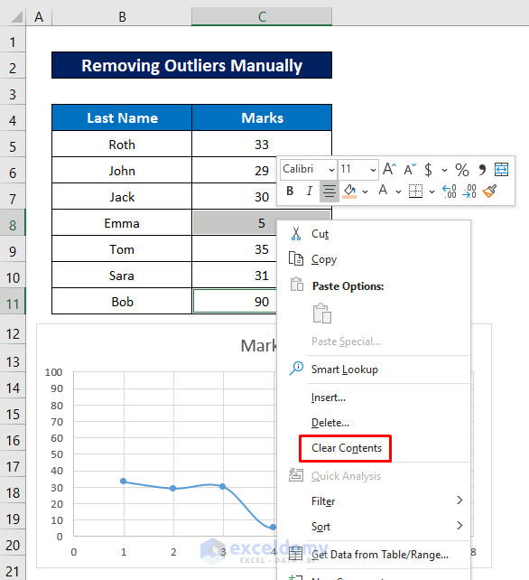
This is the sample dataset. Method 1 - Removing Outliers Manually in an Excel Scatter Plot Steps: Press and hold CTRL key and ...
Method 1 - Applying Pivot Chart to Group Dates in Excel Inserting a Pivot Chart Step 1: Highlight the range then go to the Insert tab > Click ...
Method 1 - Showing Outliers in Box and Whiskers Chart Steps: Select range C5:C16. C5 and C16 are the first and last cells of the Brand Value ...
Method 1 - Histogram with Bell Curve for Student Marks Steps Enable the Data Analysis Tool. Go to the File tab in the ribbon. Select the ...
Method 1 - Insert Shapes to Create a Flowchart in Excel Go to the “Insert” ribbon and choose “Shapes” from the “Illustrations” section. ...
Advanced Excel Exercises with Solutions PDF