Excel Charts

How to Create a Google Map with Excel Data (With Easy Steps)

Step 1: Prepare the Worksheet Suppose we need to collect some employees' detailed addresses: Put their name in column A. Place the street ...

How to Add Notes in Excel Chart (2 Easy Methods)

While working with Microsoft Excel, sometimes we need to add some extra notes to a chart. We can easily add notes in Excel charts. Adding notes to a ...

How to Edit a Line Graph in Excel (Including All Criteria)

  Types of Line Graphs in Excel Here's an overview of line graph options for Excel. Line: Shows trends over time for large datasets. ...

How to Edit Pie Chart in Excel (All Possible Modifications)

We will use this sample dataset with a pie chart to illustrate the different modification aspects. Modification 1 - Change Chart Color ...

How to Add Custom Error Bars in Excel (2 Examples)

  Method 1 - Excel Custom Error Bars with Similar Error Values for All Data Points To add custom bars with the same variance for all data ...

How to Plot Points on a Map in Excel: 2 Effective Methods

STEPS: Select all cells of the dataset. Go to the Insert tab, select 3D Map, and select Open 3D Maps. After selecting Open 3D ...

How to Refresh Chart in Excel: 2 Effective Methods

Method 1 - Creating a Table to Refresh Chart in Excel Step 1: Select the data range. From our dataset, we will select B4 to D10 for the ...

How to Add a Scroll Bar to a Chart in Excel – 6 Steps

This is an overview. Step 1 - Create an Excel Chart from the Dataset Select the whole data. Go to the Insert tab and choose a ...

How to Edit Chart Data in Excel (5 Suitable Examples)

How to Create a Chart Based on Data in Excel If you want to change the chart Data Range automatically with the modifications of rows/columns, change ...

How to Add Error Bars in Excel (3 Suitable Ways)

Using error bars is one of those frequent tasks that we do to describe a dataset precisely. If you are looking for ways to add error bars in Excel, ...

How to Add Vertical Error Bars in Excel (with Easy Steps)

A lot of times, we work with different kinds of charts in Excel. Charts or graphs help us to analyze the data more effectively. Moreover, we can also ...

How to Remove Horizontal Error Bars in Excel (4 Quick Methods)

Horizontal error bars in charts that we create help us a lot to see margins of error and show standard deviations. But sometimes we need to get rid ...

How to Add Horizontal Error Bars in Excel (With Easy Steps)

Today, we will discuss step-by-step procedures to add horizontal error bars in Excel. Generally, error bars indicate the errors in results and show ...

How to Switch Rows and Columns in Excel Chart (2 Methods)

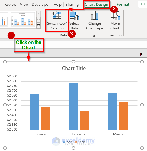
This tutorial will demonstrate how to switch rows and columns in an excel chart. Suppose we are creating a chart in excel or working on an existing ...

How to Calculate Average Tenure of Employees in Excel: 2 Suitable Ways

Method 1 - Combine DATEDIF, TODAY, and AVERAGE Functions to Calculate Average Tenure of Employees 1.1 Dynamic Date Steps: Select cell D5, and ...

Close the CTA

Advanced Excel Exercises with Solutions PDF


ExcelDemy
Logo