This tutorial will demonstrate how to switch rows and columns in an excel chart. Suppose we are creating a chart in excel or working on an existing chart. During the time of working, we may need to modify the chart’s legends. For instance, we need the rows of data on the horizontal axis to appear on the vertical axis rather. So, to solve this we can switch rows and columns to get the data in our expected form.
How to Switch Rows and Columns in Excel Chart: 2 Easy Methods
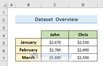
This article will discuss 2 methods to switch rows and columns in an excel chart. We’ll use the same dataset for both methods to demonstrate how they work. In the dataset, we can see the sales amounts of 2 people for January, February, and March.
1. Use ‘Chart Design’ Tool to Switch Rows and Columns in Excel Chart
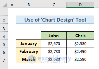
We will use the ‘Chart Design’ tool to switch rows and columns in an Excel chart in the first method. To illustrate this method we will use the following dataset. To make you understand the process better first we will create a chart with the following dataset. Next, we will switch rows and columns in that chart.
Let’s see the steps to perform this method.
STEPS:
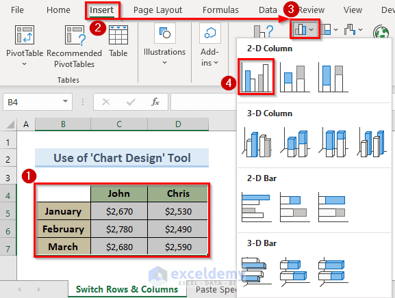
- To begin with, select cells (B4:D7).
- In addition, go to the Insert tab.
- Furthermore, click on the ‘Insert Column or Bar Chart’ drop-down.
- Then, select ‘Bar Chart’ from the drop-down which will give us a chart for the above dataset.
- Now, click on the chart.
- Moreover, a new tab named ‘Chart Design’ is available now.
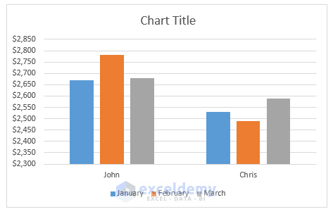
- After that, from the ribbon click on the ‘Switch Row/Column’ option.
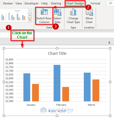
- Lastly, we get the result like the image below. We can see that the rows and columns of our previous chart have been switched in the new chart.
Read More: How to Switch Rows and Columns in Excel
2. Switch Rows and Columns in Excel Chart with Transpose Option from Paste Special Feature
We will switch rows and columns in Excel charts using the Transpose option from the ‘Paste Special’ feature in the second method. For instance, in this method, we will alter the legends in the Excel dataset whereas in the previous example, we did that after creating the chart. Follow the below steps to perform this action.
STEPS:
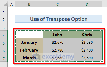
- Firstly, select the cell (B4:D7) and press Ctrl + C to copy the data.
- Secondly, select cell B10.
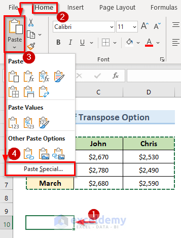
- Thirdly, go to the Home tab.
- Select the Paste From the drop-down menu select the option ‘Paste Special’.
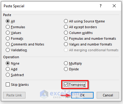
- So, a new pop-up window named Paste Special appears.
- Then, check the option Transpose and click on OK.
- As a result, we can see the rows and columns of our previous dataset are altered in the image below.
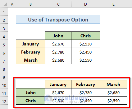
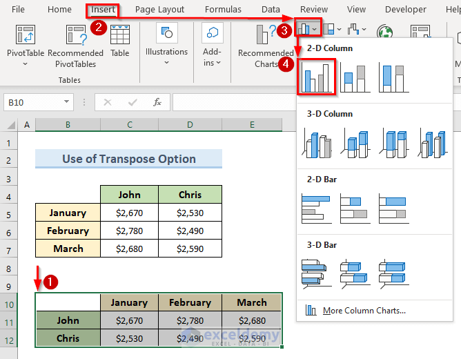
- Next, select cells (B10:E12).
- Then, go to the Insert tab.
- After that, click on the ‘Insert Column or Bar Chart’ drop-down.
- Moreover, select ‘Bar Chart’ from the drop-down menu.
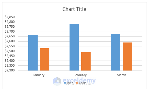
- Finally, we can see the results in the image below. The rows and columns of the dataset have been switched in the Excel chart.
Read More: [Fixed!] Rows and Columns Are Both Numbers in Excel
Download Practice Workbook
You can download the practice workbook from here.
Conclusion
In conclusion, this article provided a comprehensive overview of how to switch rows and columns in excel charts. Use the practice worksheet that comes with this article to put your skills to the test. If you have any questions, please leave a comment in the box below. We’ll do our best to respond as soon as possible. Keep an eye on our website for more interesting Microsoft Excel solutions in the future.
Related Articles
- How to Add Rows and Columns in Excel
- How to Find Difference Between Rows and Columns in Excel
- Excel VBA to Set Range Using Row and Column Numbers
- [Fixed!] Missing Row Numbers and Column Letters in Excel
- How to Lock Column Width and Row Height in Excel
- Excel VBA: Get Row and Column Number from Cell Address
- How to Delete Empty Rows and Columns in Excel VBA
<< Go Back to Rows and Columns in Excel | Learn Excel
Get FREE Advanced Excel Exercises with Solutions!
