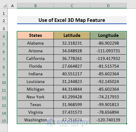
STEPS:
- Select all cells of the dataset.
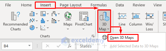
- Go to the Insert tab, select 3D Map, and select Open 3D Maps.
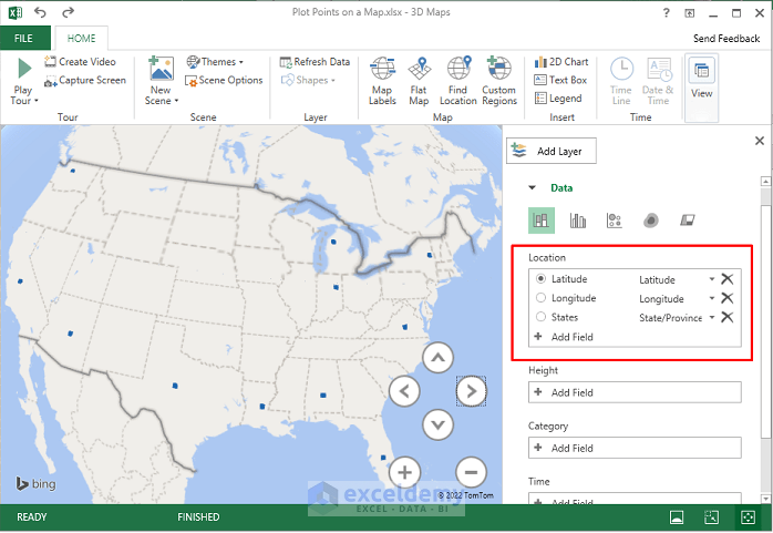
- After selecting Open 3D Maps, you will see the map with points in a new window.
- The map is automatically updated because Excel understood the dataset clearly. You can see that from the Location box.
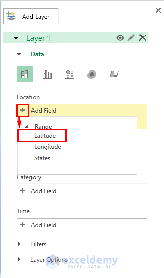
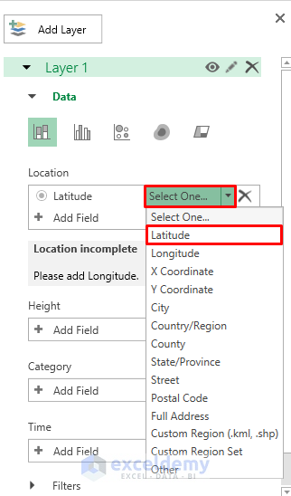
- But if it’s not updated automatically, you must add the latitude and longitude fields.
- Navigate to the Location box and click the plus (+) icon.
- Select Latitude.
- Click on Select One and select Latitude from the drop-down menu.
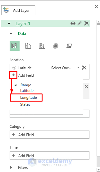
- Follow the same procedure to add Longitude.
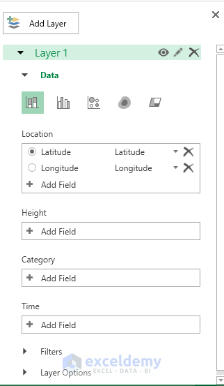
- After adding Latitude and Longitude, the Location box will look like below.
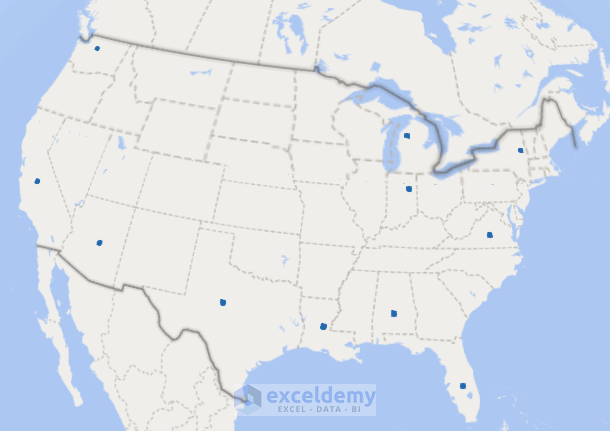
- The map will look like this. The points of the states are visible on the map.
- Select ‘Change the visualization to Bubble’ and add States in the Category section.
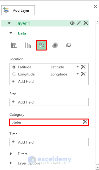
- The points will get bigger and each point will show a different color.

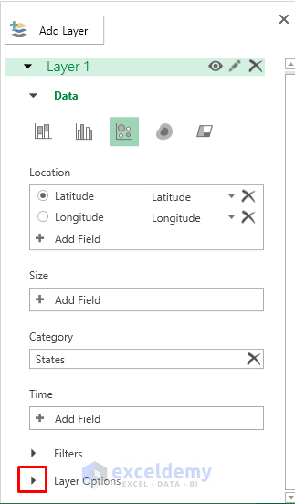
- To resize the points, expand the Layer Options menu.
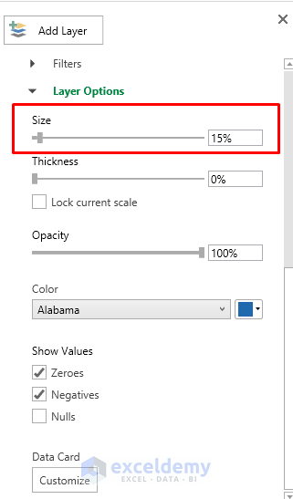
- Decrease the size of the bubbles using the Size option.
- Your map will look like the screenshot below.
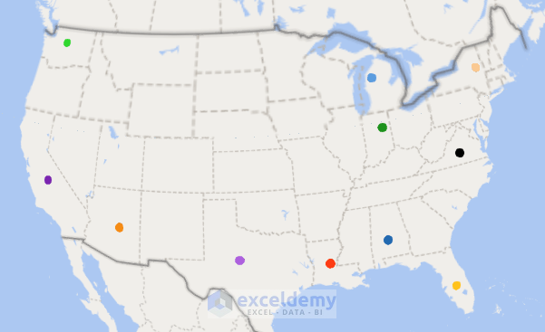
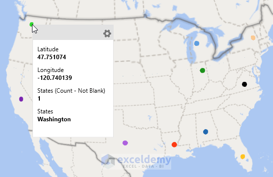
- You can see the information if you place the cursor on a point.
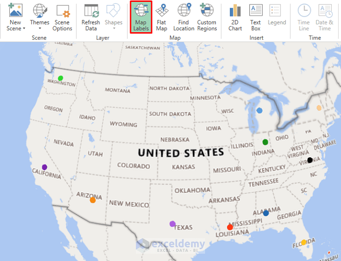
- Turn on the ‘Map Labels‘ option to see the map with the name of the states.
Method 2 – Use Map Option to Plot Points in Excel
STEPS:
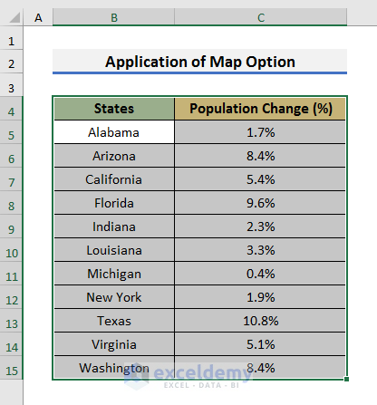
- Select a cell in the dataset and press Ctrl + A. It will select all the used cells in the worksheet.
- Use the mouse to select all cells of your dataset.
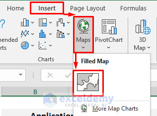
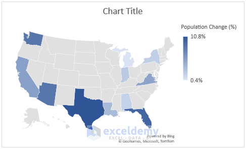
- Go to the Insert tab and select Map. It will open a drop-down menu.
- Select the Filled Map icon from there.
- You will see the map on the Excel sheet.
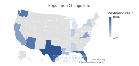
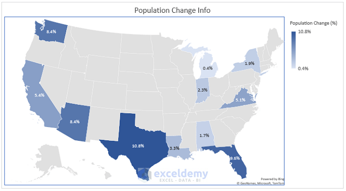
- Change the Chart Title to make the map more understandable.
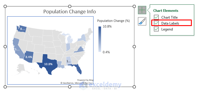
- Click on the map, and a plus (+) icon will appear.
- Check Data Labels from there.
- Put the cursor at the bottom left point of the map and the cursor will change into a double-headed arrow.
- Expand or resize the map according to your needs.
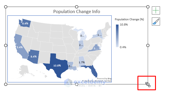
- You will see the data points of population change on the map.
Download Practice Book
Download the practice book here.
Related Articles
- How to Map Data in Excel
- How to Make Route Map in Excel
- [Fixed!] Excel Map Chart Not Working
- How to Create a Google Map with Excel Data
- How to Make a Population Density Map in Excel
- How to Plot Cities on a Map in Excel
<< Go Back to Excel Map Chart | Excel Charts | Learn Excel
Get FREE Advanced Excel Exercises with Solutions!
